Petco is an American pet retailer selling pet food, products, and services. The Petco app is designed to expertly help pet owners pamper their pets both online and in stores. The mobile application provides pickup and delivery service and pet owners can manage and track their pet’s complete health and needs, they can also book vet visits and grooming appointments as well as redeem the rewards.
Well-designed Features
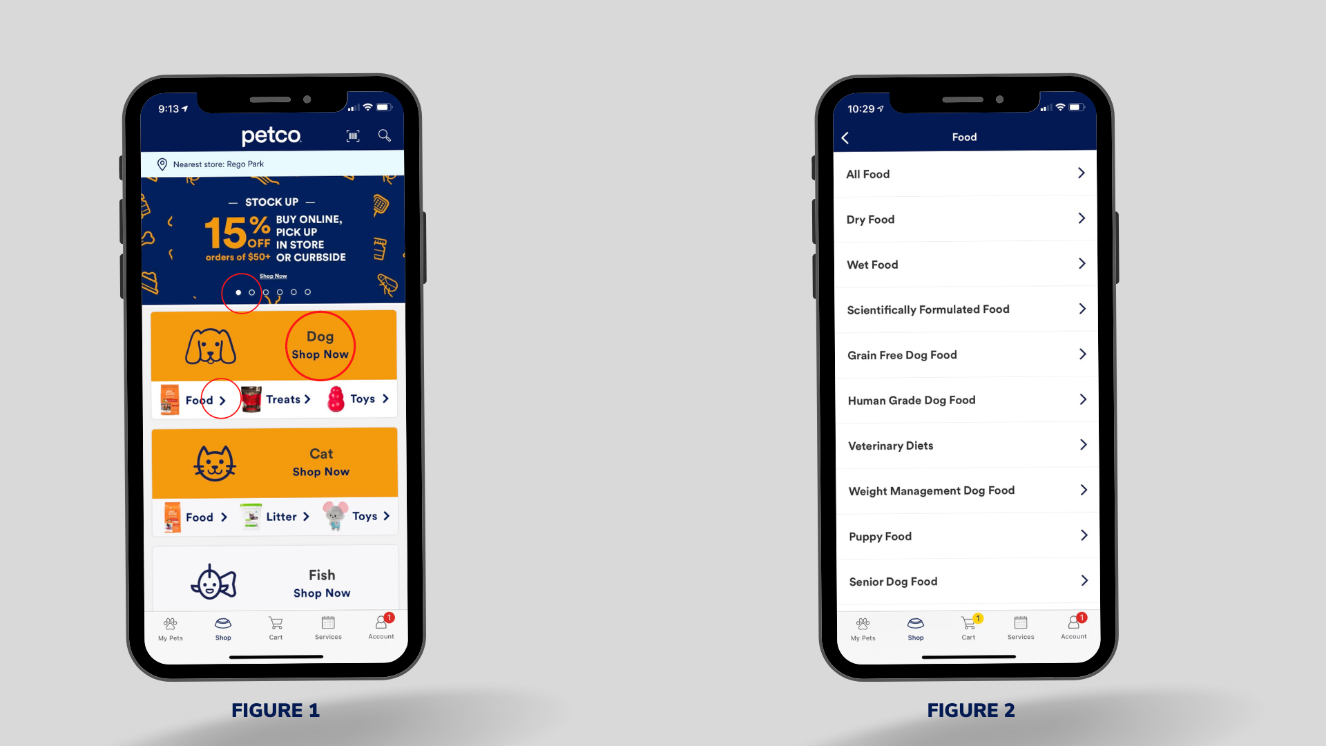
The home page of the App shows different types of animals (Figure 1) including dogs, cats, fish, etc., and lists some common categories of pet products (such as food, treats, and toys), and when the users choose a category from the home page, more options (Figure 2) will be available in the next page. By doing so, the discoverability and affordance have been well taken care of on the home page. Users can see the available options and easily choose the products they are looking for. The arrows next to each product category, “Shop Now” buttons, and the search bar are acting as signifiers to indicate the users where to tap, and the dots on the promotion posters also tell users to swipe to see more. These signifiers also eliminate the gulf of execution.
One of the interfaces of the Add Your Pets (Figure 3) feature uses natural mapping, when the users choose the size of their pet, the paw icons (from small to large) and the sliders help them select the size efficiently. The punch card for grooming also shows the orders so users know how to activate the next coupon (Figure 4).

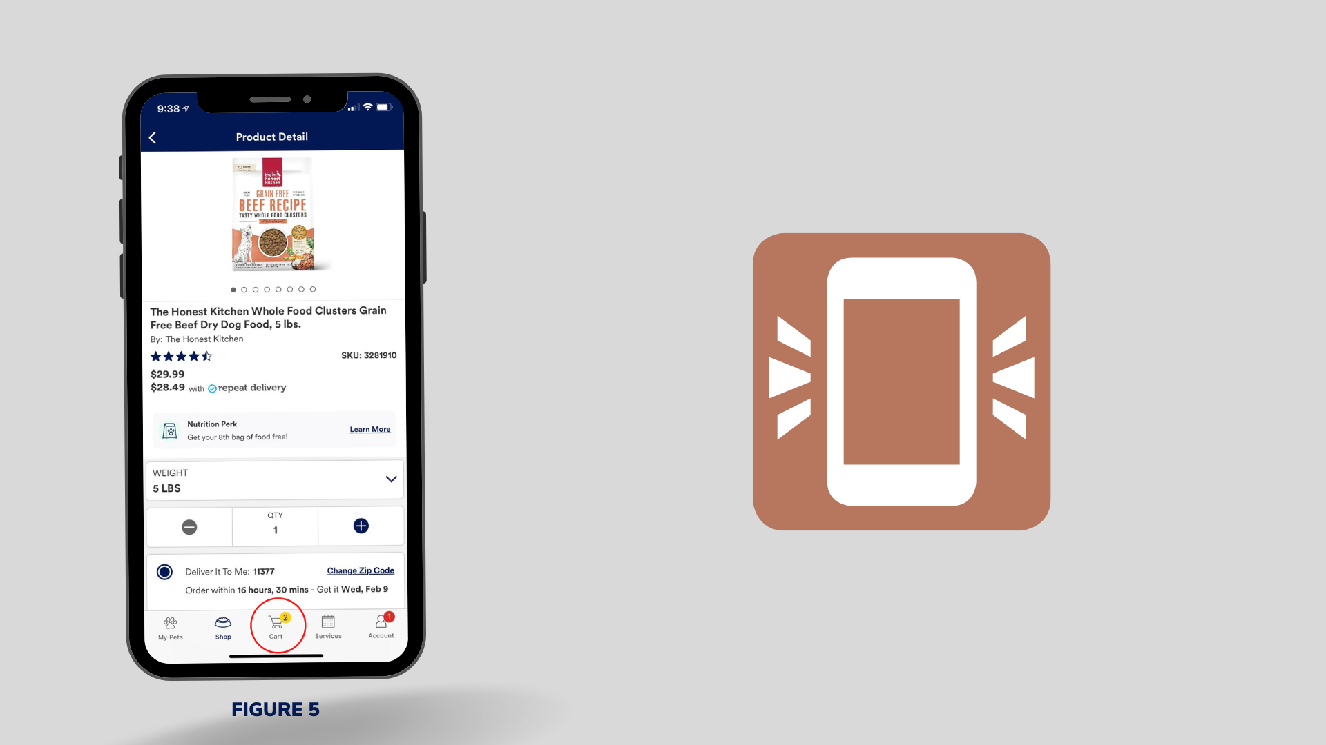
If the user would like to purchase an item for delivery (for example, a bag of dry food) or pick it up in the store, they need to select the quantity and tap the “Add To Cart” button (Figure 5), the number above the cart icon at the bottom navigation bar will change and the phone will vibrate to notify the user the item has been added to the cart. The updated number and vibration eliminate the gulf of evaluation, so users know that they have successfully added the item they want to the cart. It also communicates the results of the action by giving immediate feedback to the users.
Designs need to be improved
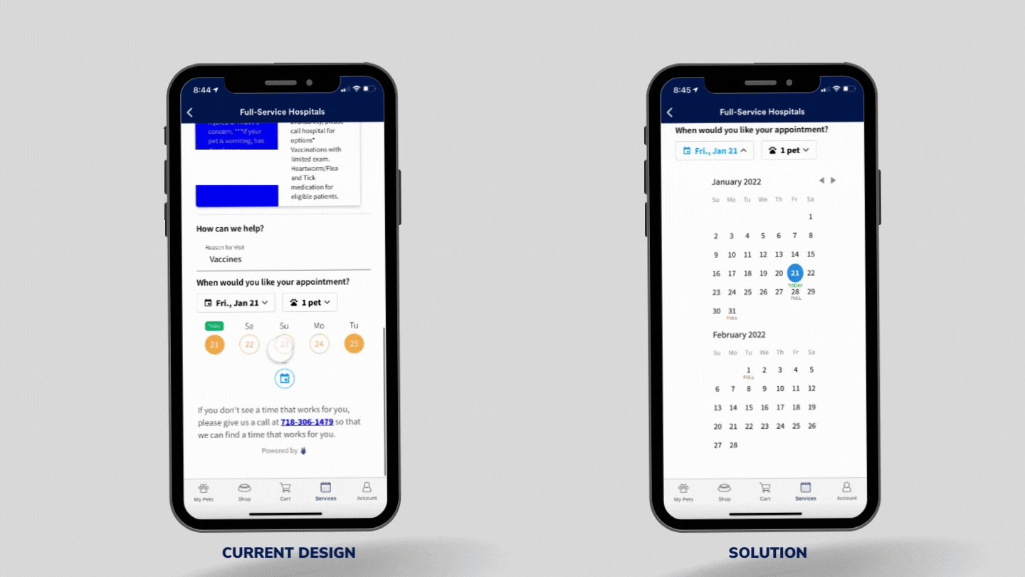
When the users try to book a vet appointment on the App and don’t see the dates they want, they can tap the calendar icon, but it only shows all the dates without telling the users which dates are available to book, though the users could spend time clicking each date and check the availabilities by themselves, this doesn’t show the affordance to the users, they easily get confused about what they can do with those dates and will waste their time exploring.
Solution
Add the text “FULL” below those dates that are not available for booking, so users don’t need to waste their time to check everything, and when users tap one of those available dates, the selected date will turn green with a pop-up window showing all the time slots. The unavailable slots are greyed out to avoid unnecessary clicks and duplicated bookings.
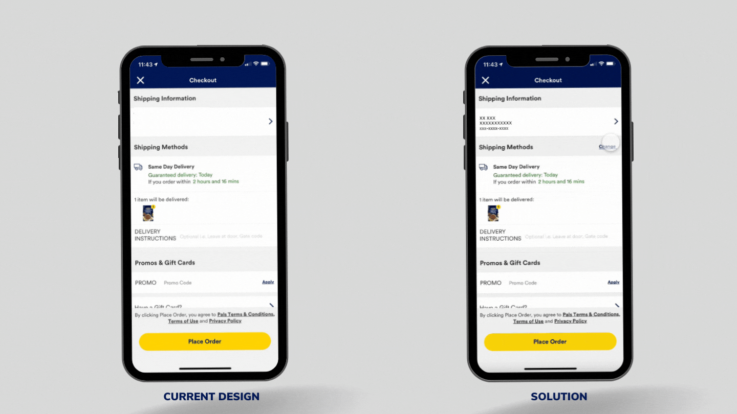
When users make slips or mistakes, they should have the chance to fix them at their earliest convenience. In this App, when users want to purchase a product, when they choose to pick it up from the store, there is no option to change the delivery method if they change their minds when checking out.
Solution
Add a “Change” button next to the Shipping Methods to allow users to change the methods on the check-out page.