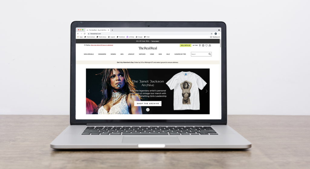
The RealReal is an online consignment store that buys and sells authenticated luxury clothing, accessories and home goods. The website interface is designed for the conventions of consignment stores, in which the user may be a buyer, seller, or both. This critique assesses the balance and usability of these two potential pathways for the user.
Signing In
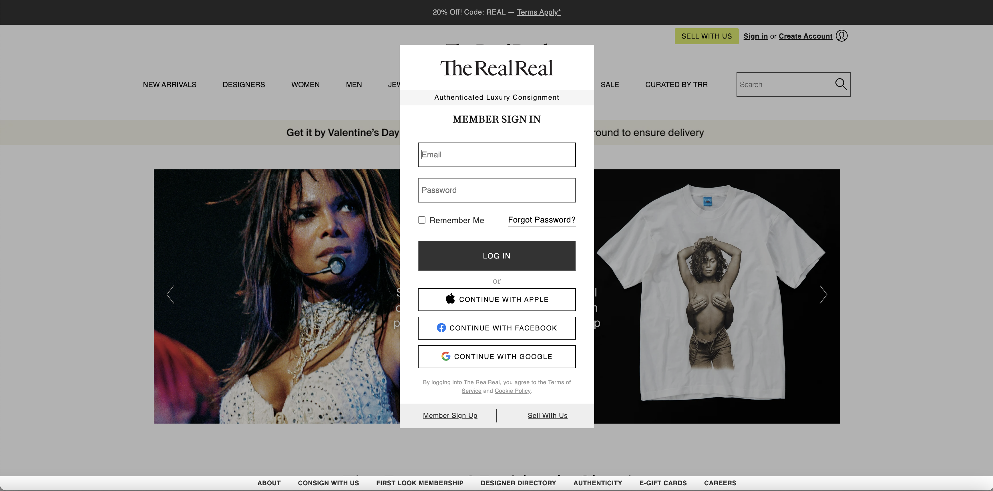
It’s required for the user to either sign in or create an account before accessing the site; this reinforces the duality of buyer and seller as a RealReal customer, because you need to be a member in order to sell. The designer used logical constraint within the interface by eliminating the option to click out of what seems to be a pop-up window. There is no “x” in the upper corners of the small window, and clicking out of the window has no feedback. This tells the user the only way to close the popup and access the site is through signing up. This constraint isn’t immediately clear to a user– they will most likely rely on their knowledge in the head of pop-up windows and first search for a way to close out of it immediately. It’s possible the designer wants to entice the user to stay by keeping the homepage in the background, but if an account is required to access the site a better design would involve an intro signup/sign-in page that fills the entire screen.
Shopping For An Item
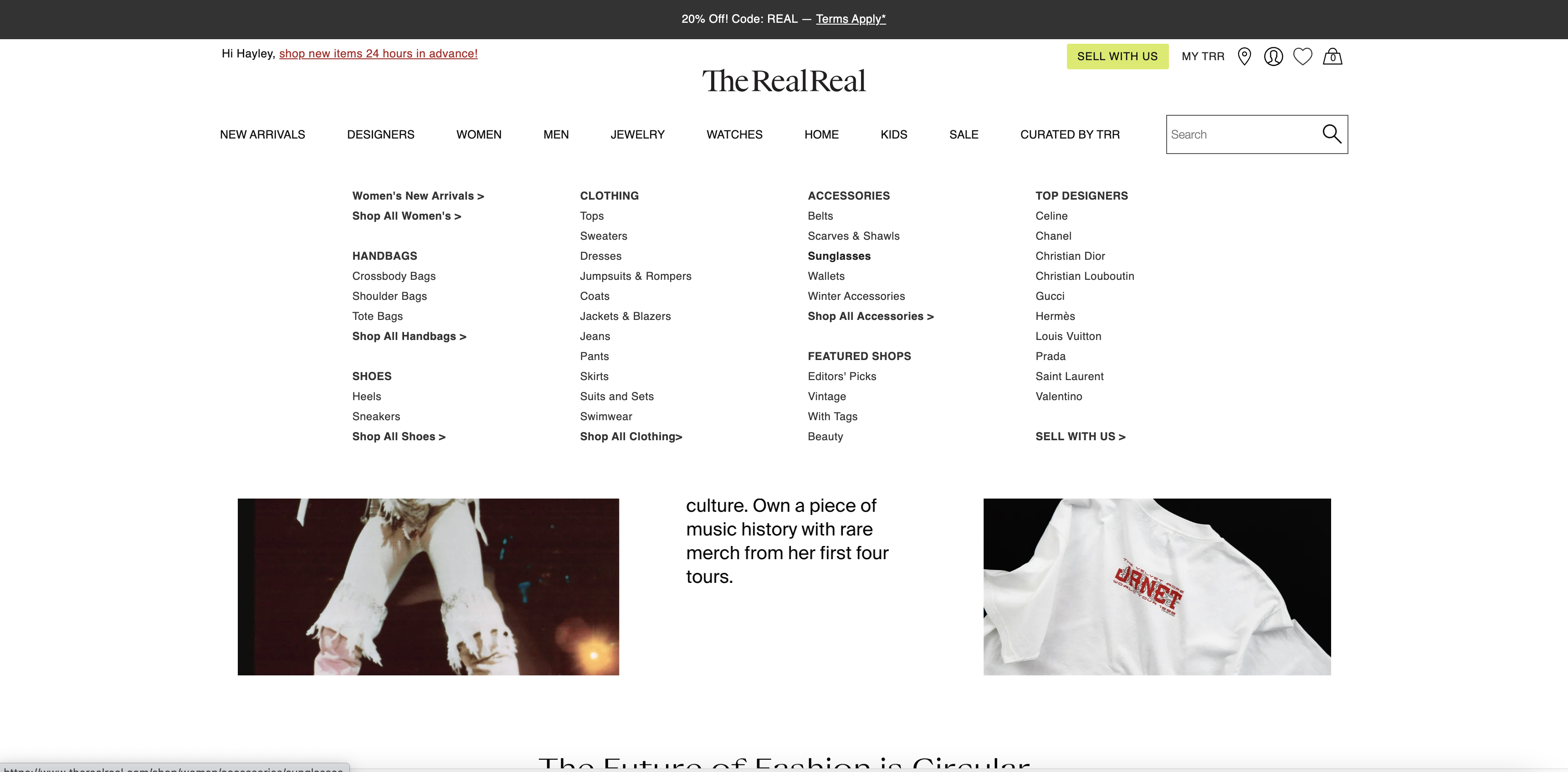
Once the user sets up an account, they have two possible main goals– shopping or selling. Let’s assume the user wants to shop consignment designer sunglasses on The RealReal. The main navigation bar on the homepage has exceptional discoverability– when the user hovers over the “Women” label, a menu opens with every category and subcategory. The bold and capitalized titles are signifiers for main categories that encapsulate all the labels underneath. If a user is looking to shop for a particular type of item like sunglasses, the layout and design of the labels affords for easy and efficient navigation to accessories, then sunglasses. However, if the title signifiers weren’t clear, the menu would have poor visibility and look too cluttered, in turn affecting the discoverability.
Add to Cart
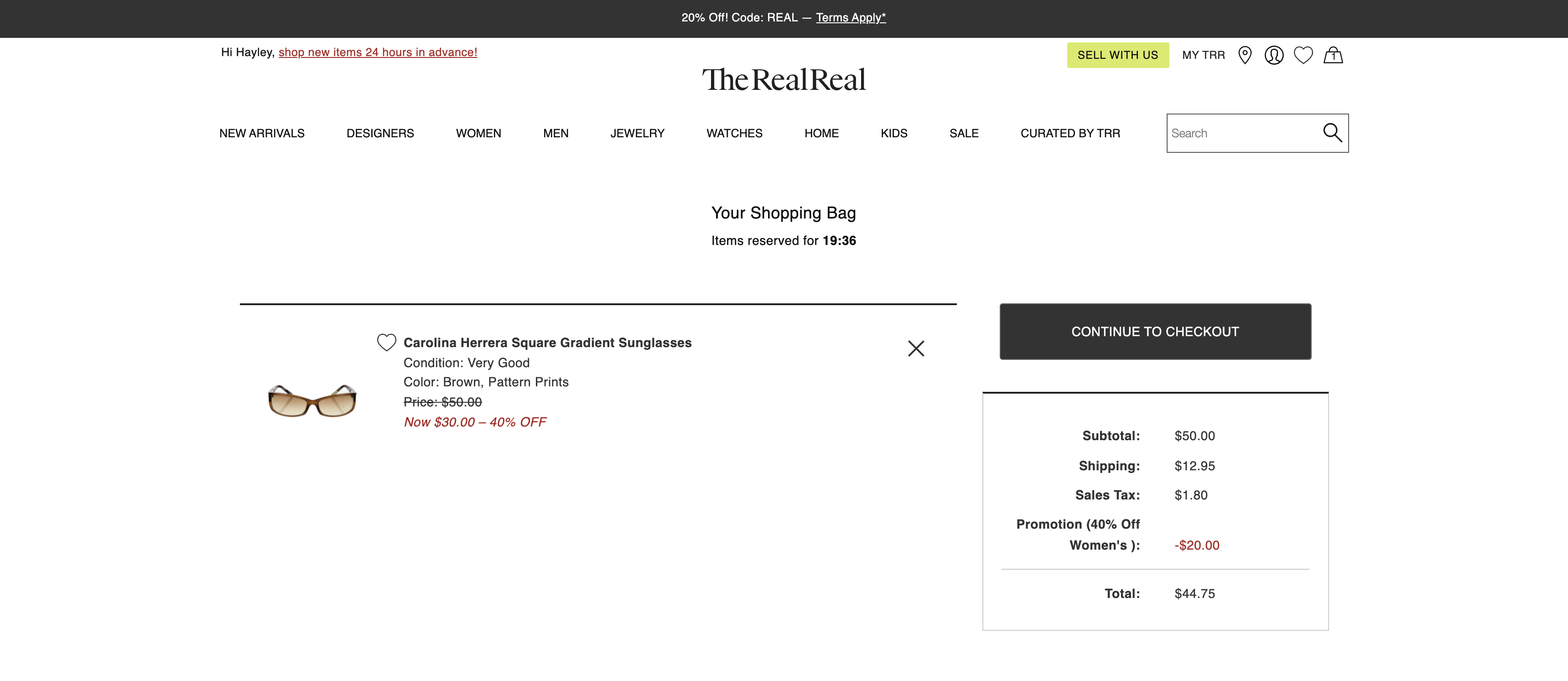
When an item is added to cart, a countdown clock of 20 minutes starts before the item is kicked out of the cart and becomes available for someone else to snatch up. This can be analyzed through the lens of visceral processing– seeing a countdown clock can cause an immediate reaction of stress and even panic for a user. When the clock gets to 10 minutes, a box pops up across the bottom of the screen to notify the user and keep the clock on the page, increasing urgency and again causing the user to rush. When time is up, the window changes prompting the user to re-add the item to the cart, with no links or directions to find that item.
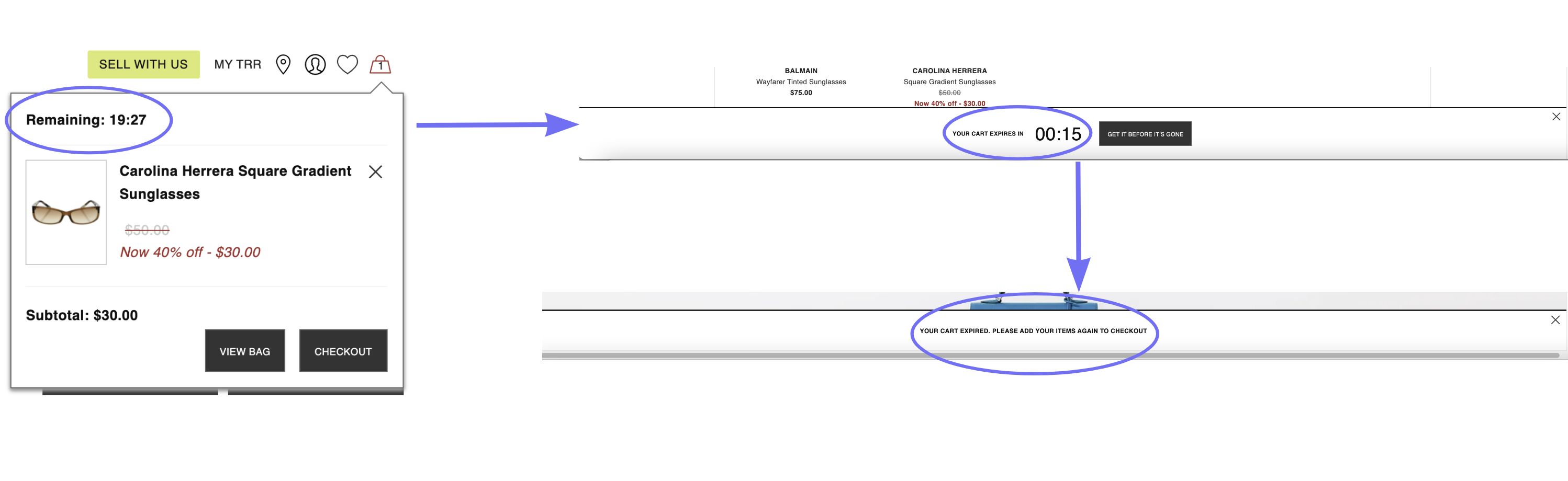
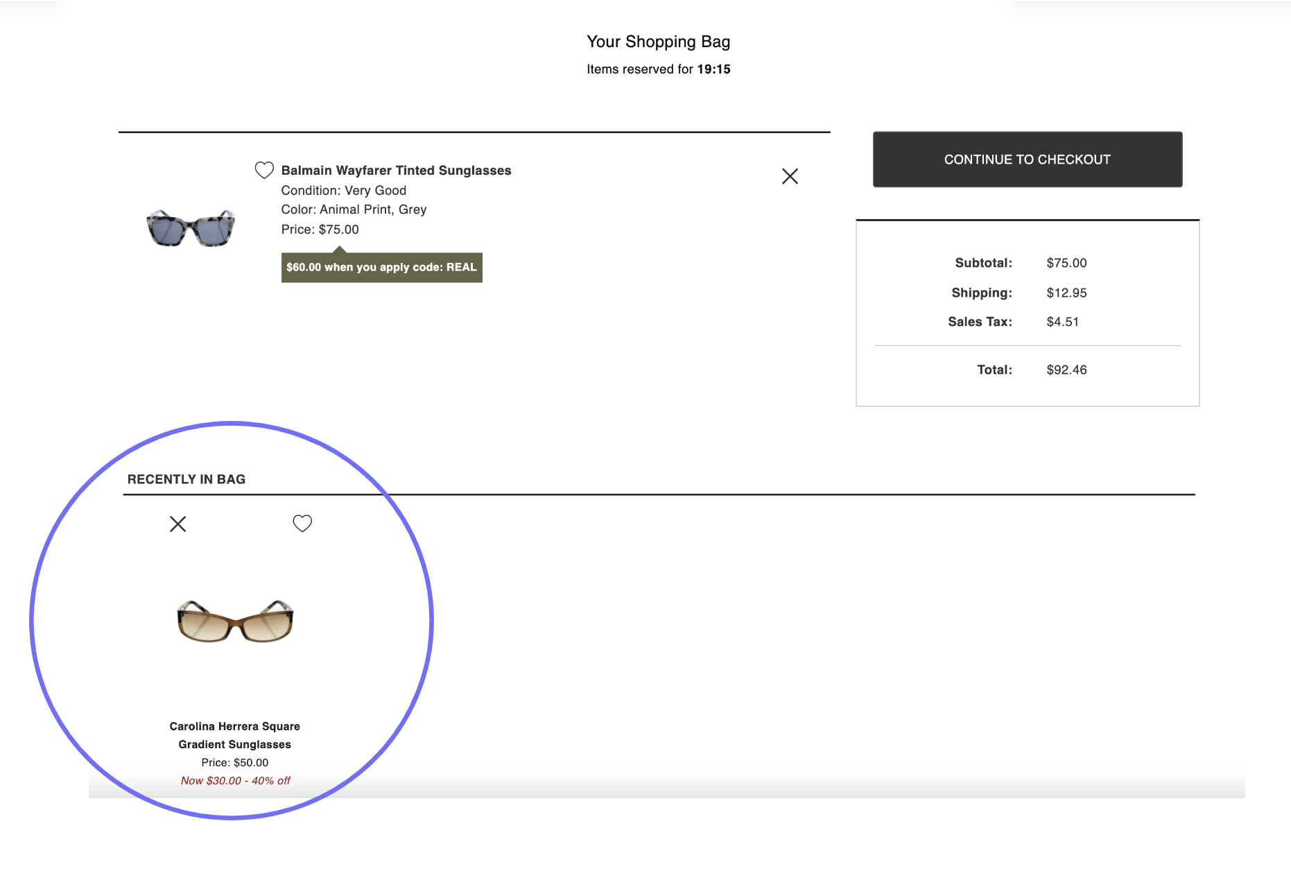
The user doesn’t know what happens next, negatively impacting behavioral processing and discoverability as well. A new user wouldn’t know where to find the item they lost besides retracing their initial steps to locating the item in the first place. After doing some searching, one can find the lost item in the “Recently in Bag” list at the bottom of the Shopping Bag page. A quick and easy design recommendation would be to add a link to “Add your items” in that bottom notification box that leads to the “Recently in Bag” list, or even a link to the item itself.
Selling Items

The Sell With Us button is large and filled with a bright chartreuse color on the top of the page, indicating how important this action is to The RealReal– after all, users’ items are the company’s only source of inventory. Because it’s the only graphic item on the homepage with filled color, it’s a clear signifier for a main action a user can take (selling).
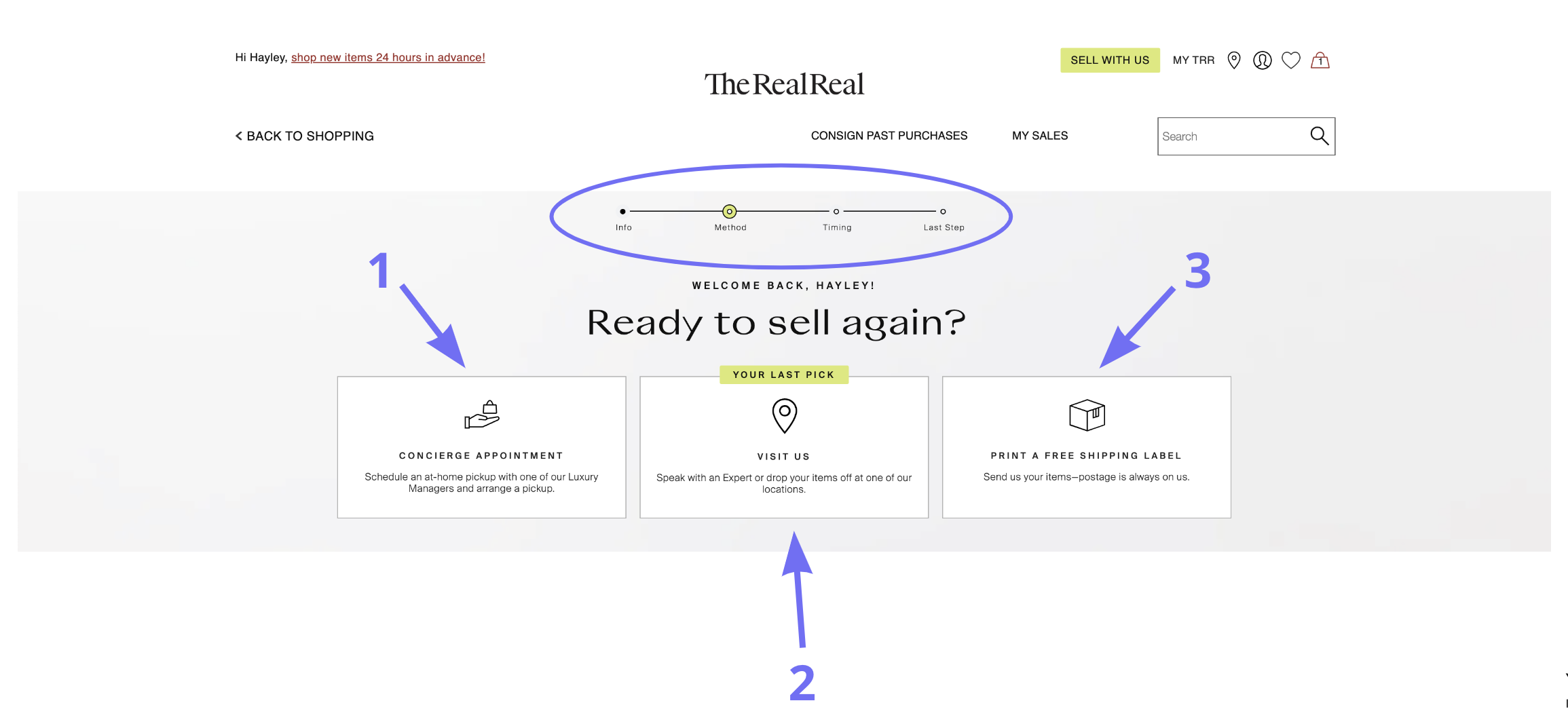
On the sell page, there is a line showing each step of the process, visually mapping the order and number of steps the user will take to complete the selling task. It also displays three clear options for how to sell. Through mapping and limited, clear options this landing page sets the expectation for the user and conveys the ease of selling with TRR.
Top Navigation and Profile
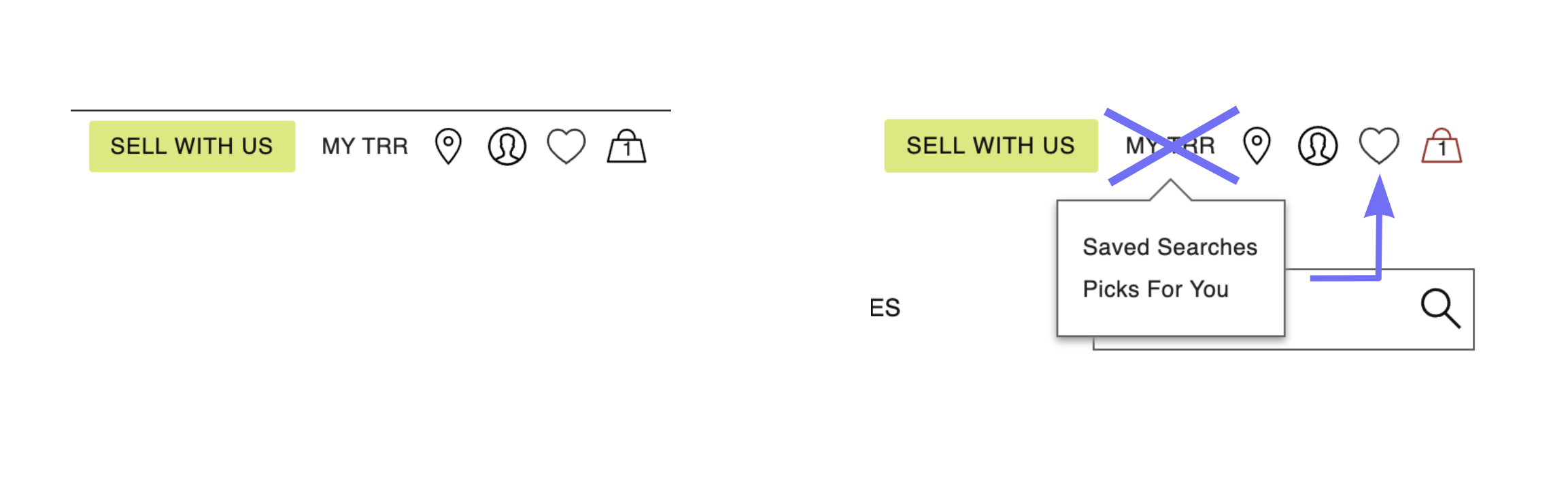
The four icons to the right of “Sell With Us” and “My TRR” in the top navigation bar use common e-commerce conceptual modeling to indicate their function, and each is a signifier that affords the expected next step. The map pin indicates a list of store locations, the human outline represents the user’s profile information, the heart is liked items and the shopping bag leads the user to their cart. The option in the nav bar that may cause confusion is “My TRR”; this could mean the same thing as the profile icon and cause a slip. For example, the user may want to change their shipping address and click on “My TRR”, only to find “Saved Searches” and “Picks For You”. A design recommendation is to get rid of the title “My TRR” and add “Saved Searches” and “Picks For You” in a menu under the heart icon, along with “Your Likes”.
Conclusion
Overall, the desktop website for The RealReal is designed efficiently for the goals of buying and selling luxury goods. With a few tweaks to the sign-in process, the shopping cart interface and the top navigation, the site would become an even more understandable, seamless and enjoyable experience for the user.