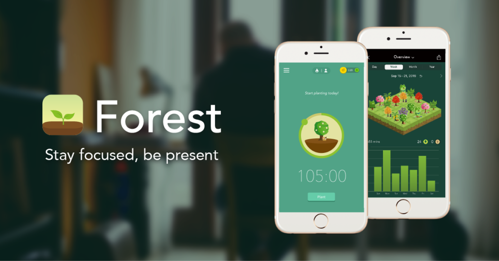
Forest is one of the most popular self-help mobile applications, which helps users focus and avoid distracting scrolling. The main idea is quite simple — users plant virtual plants that will grow during their selected focusing time. Exiting the app or stopping the timer will lead to a shriveled plant that cannot be removed from one’s personal forest. This application represents an overall good design with an emphasis on simplicity that promotes discoverability and understandability, but there are minor issues with signifiers and feedback, as well as a growing problem of featuritis.
MAIN SCREEN

The main screen reinforces discoverability because it contains only the most important information, including basic settings, the visual of the plant’s progress, and reward points. The signifiers are straightforward because the timer is activated with a push of a single button, while an additional menu helps to choose a specific mode with explanations. For example, the deep focus option warns that it automatically returns the user back to the app if the user attempts to leave. However, not all affordances are easily perceived for new users, particularly the planting settings that pop up only when one taps the screen. This is a significant oversight because planting options contain some of the most important settings, such as focused time and the type of plant. Therefore, the main screen should include an evident signifier, preferably a button, which will inform users instead of forcing them to guess. The most suitable location for this button would be right under the timer settings.
FEEDBACK

The feedback is immediate and informative in response to every action. Changing the plant type results in a different visual, pressing the “plant” button starts the countdown, and selected settings are highlighted in contrast to the ones that are greyed out. While the timer is on, the message above the plant visual changes depending on how much time is left, offering either encouragement (“You’re almost there”) or admonishment (“Put down your phone”). The amount of time that has passed also influences the plant’s visual, gradually developing from a sprout into a full-fledged tree or flower. The feedback even responds to the indirect interaction of attempting to leave the app, reminding users to avoid distractions and providing a button for immediate return.
These details demonstrate that Forest is highly responsive to the user’s actions and choices, but it could still be improved with a confirmation prompt after setting the timer. Users who select especially strict settings that prevent them from using their phones at all might struggle if they accidentally start focused time. There is an option to undo the command within 10 seconds after pressing the button, but the text offering this option is too small compared to other design details. Therefore, the initial confirmation message would be a better option to improve the user experience.
NAVIGATION BAR
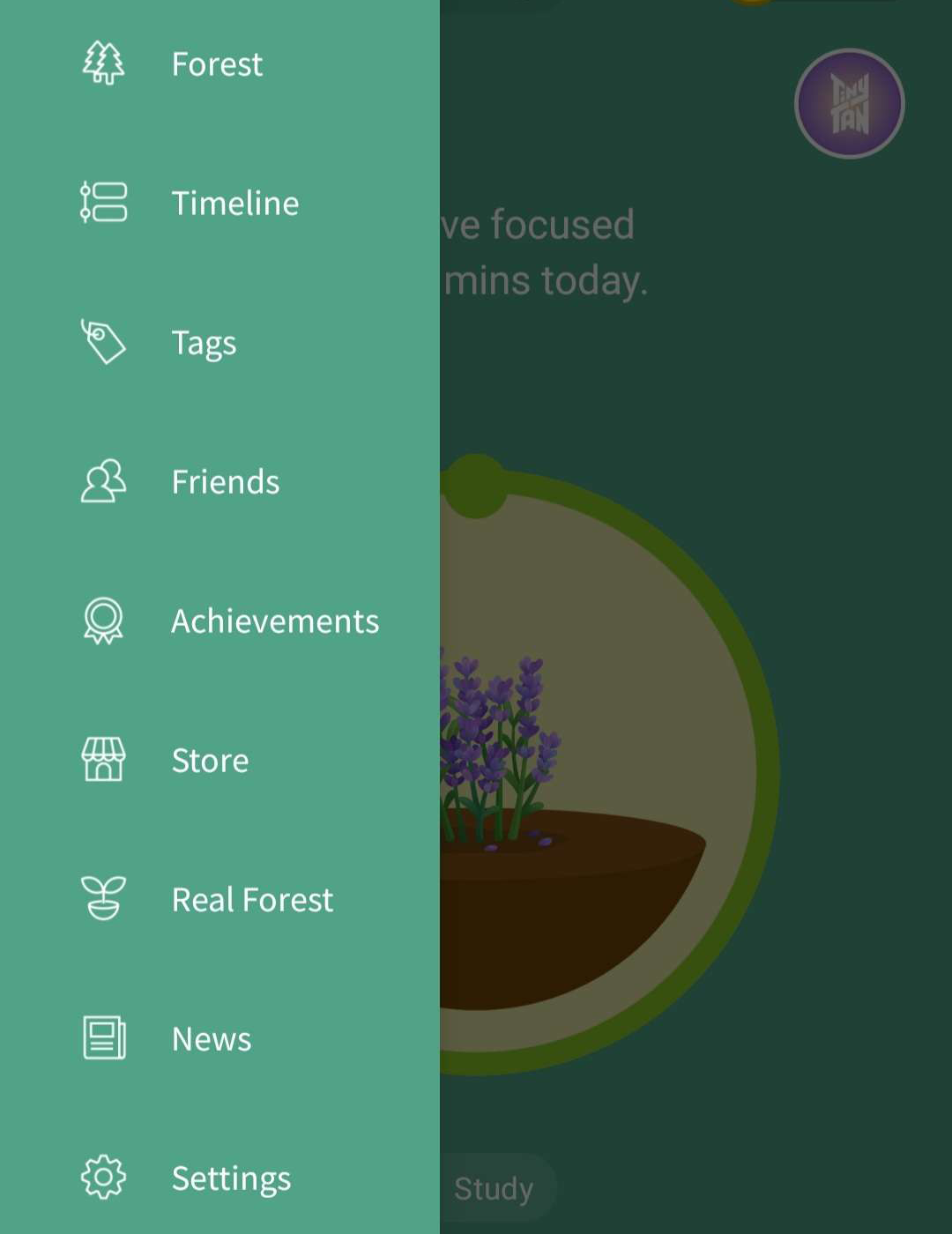
Finally, the conceptual model turns confusing when it comes to the detailed menu, which has been expanding with the app’s increasing popularity. The developers fell into the trap of featuritis by continuously adding new features that unnecessarily complicate the user experience. For example, they included two different sections for tracking personal progress, “forest” and “timeline,” but these sections provide the same information with different visuals. I would suggest removing the timeline section altogether because it does not contribute anything to the app and complicates the navigation. Similarly, the tag section only repeats the information and options from the planting settings and does not add anything new, which is why it should be removed.