
LinkedIn is a networking platform that connects professionals across various fields and doubles as a job portal with thousands of opportunities posted every hour with 310 million active users every month (source). This critique focuses on the iOS app in dark mode, app version 9.24.2093
Getting Started
Once the user has logged into their account, on the bottom right corner of the navigation bar, there is a suitcase icon with a textbox that reads “Jobs” that the user has to click to access the job portal – these signifiers make discoverability of the affordances possible. The screen provides immediate feedback with the change in interface from the homepage, and a white bar appears over the icon in the navigation bar to provide additional feedback that the user has successfully navigated to the jobs page.
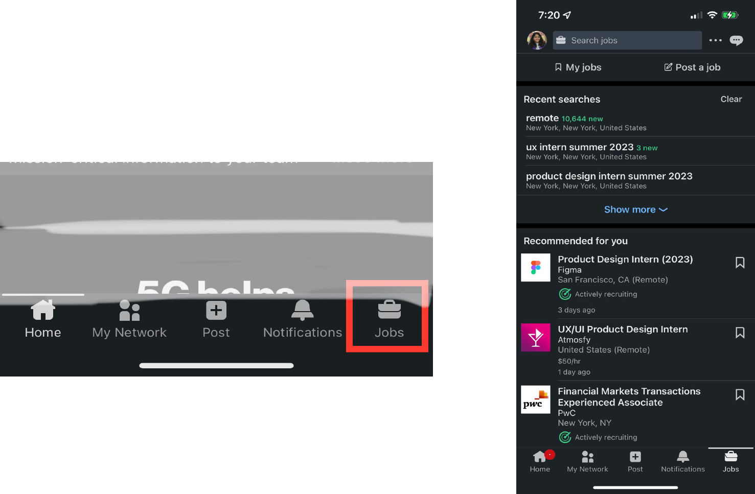
The first image shows the navigation bar at the bottom of the screen, with the red box enclosing the jobs icon
The second image shows the jobs screen that is displayed when the jobs icon from the first image is clicked
Exploring Jobs
The job page provides discoverability for multiple affordances, and the user has to use knowledge in the head from other mobile applications to navigate the content by using finger gestures to scroll to the bottom of the page. The application also provides sufficient knowledge in the world/interface with the signifiers (icons and text) to provide discoverability.
The application provides good mapping for the icons and text – for instance, the “My Jobs” section has an icon that indicates “bookmarks” on a digital interface that closely resembles bookmarks in physical books.
There is immediate feedback when the user clicks on ‘my jobs’ as the screen changes to a new page and the top of the page displays ‘My Jobs’ and the user can discover the affordances through the signifiers and feedback on the buttons that change color and indicate the action to be taken (i.e click). Even if the user navigates to another part of the application, when the jobs icon is clicked, they are led to the last subpage that they visited (in this example the saved jobs). The user can use swipe gestures or click the icons to navigate back to another page.
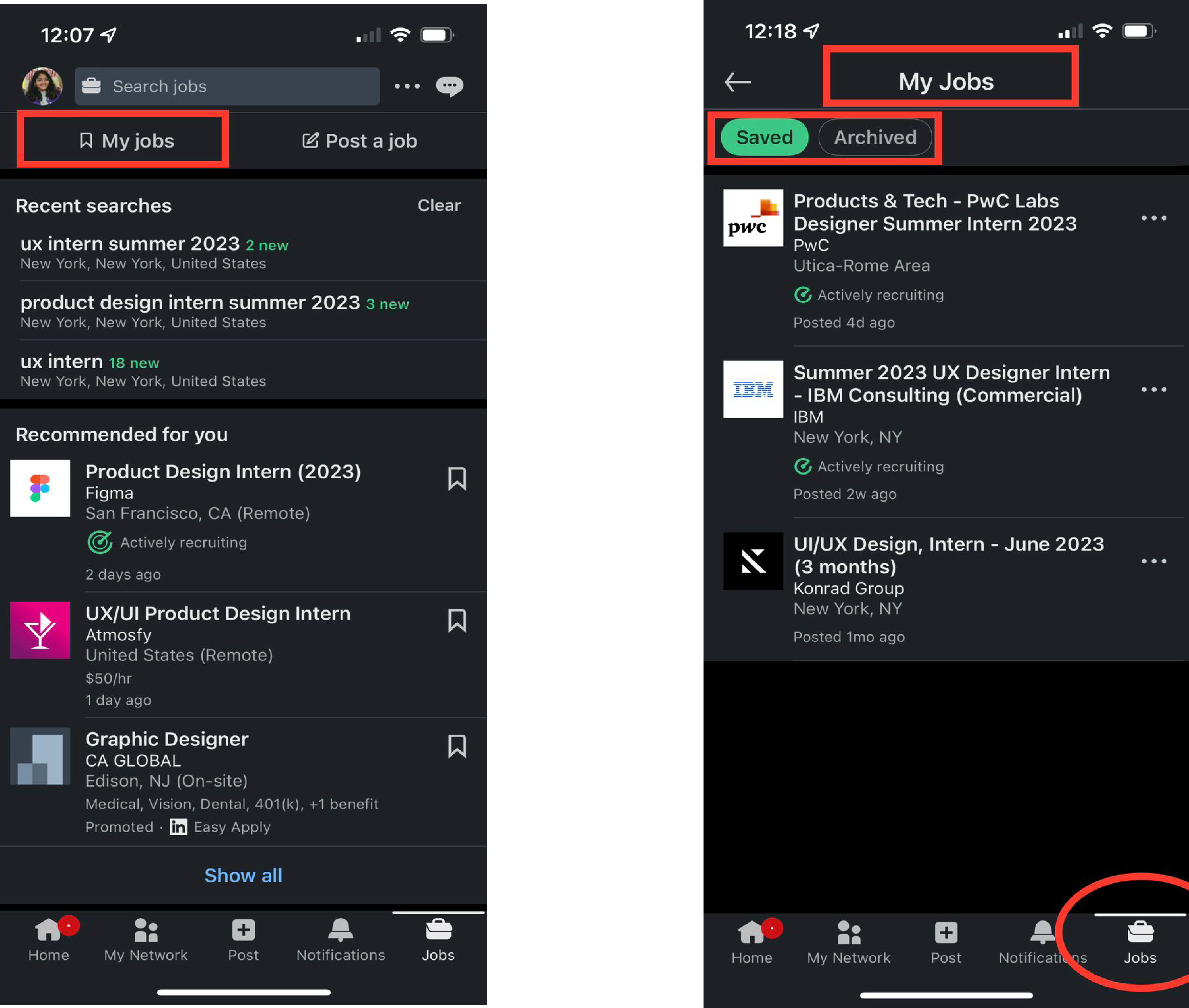
The first image highlights the discoverability of various sections of the page, focusing on the ‘my jobs’ sub section
the second image displays the subpage loaded onto the screen and highlights the white bar in the bottom navigation bar that indicates which page the user is in.
Search for jobs
On the top of the page, there is an affordance to search for jobs that is discovered through the text signifiers as well as the presence of the transparent rectangle bar that relies on knowledge from the digital world. As soon as the user clicks on the search bar, the app provides feedback by a change in layout, and affords region, title, skills and company based search with text and icon signifiers. It tries to improve job discoverability by reminding the user of past searches, and providing suggested searches based on the user profile.
Once the search has been requested, postings show up in relation to the details provided, and a plethora of filters show up. The user can either click on the icon for filters (based on knowledge of the digital world), or navigate through the filters by a swipe gesture that is constrained to the space – however, it might be a very accessible gesture due to the space limitation. There are interface constraints that do not let a filter be applied without confirmation from the user after making an alteration. The user cannot apply required filters before entering the search.
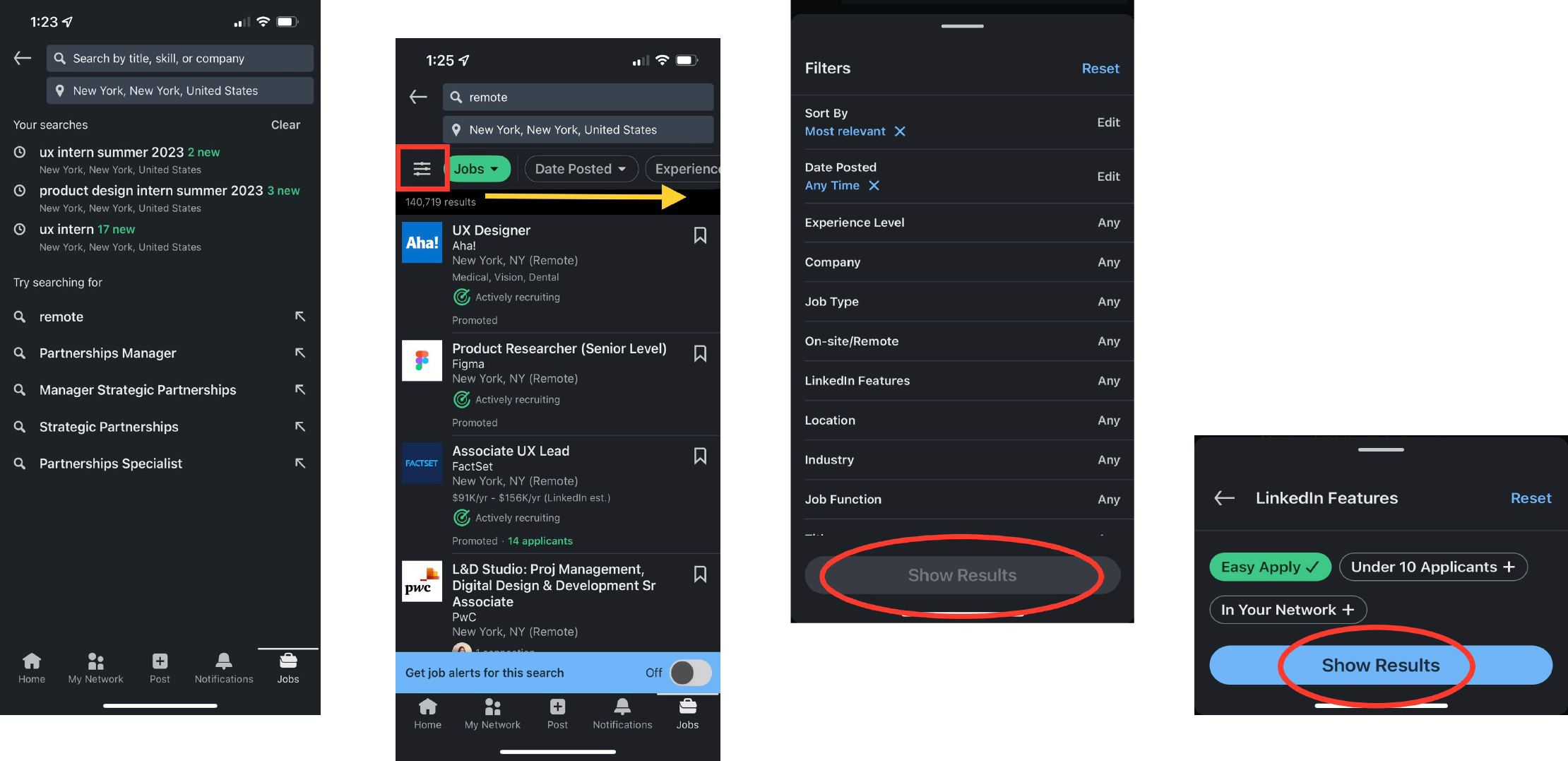
The first image displays the search bar once clicked, the second image displays the page after the search has been performed – the red box indicating the icon for filters, and the yellow arrow indicating area for scroll gesture, the third image is an expansion of the filter box and displays the constraint embedded to not apply search unless confirmed (as shown in the fourth image)
Job postings
When a posting is clicked, it pops open a new section that includes key and expanded details about the job, the company, and affords exploring the job poster to learn more. There are signifiers to either apply, or save the job posting (while only the save icon shows up in the list view in the search). As the user scrolls, an opportunity for job discoverability is provided with an affordance to set up notifications for similar jobs. As the end of the posting approaches, the user is encouraged to look at other jobs.
However, as the user tries to scroll back up or exit the job posting, the interface automatically changes from subsections within the app, to a new tab format that provides a physical constraint in the interface – the user cannot close the tab/posting without clicking on the ‘x’ icon on the top left corner.
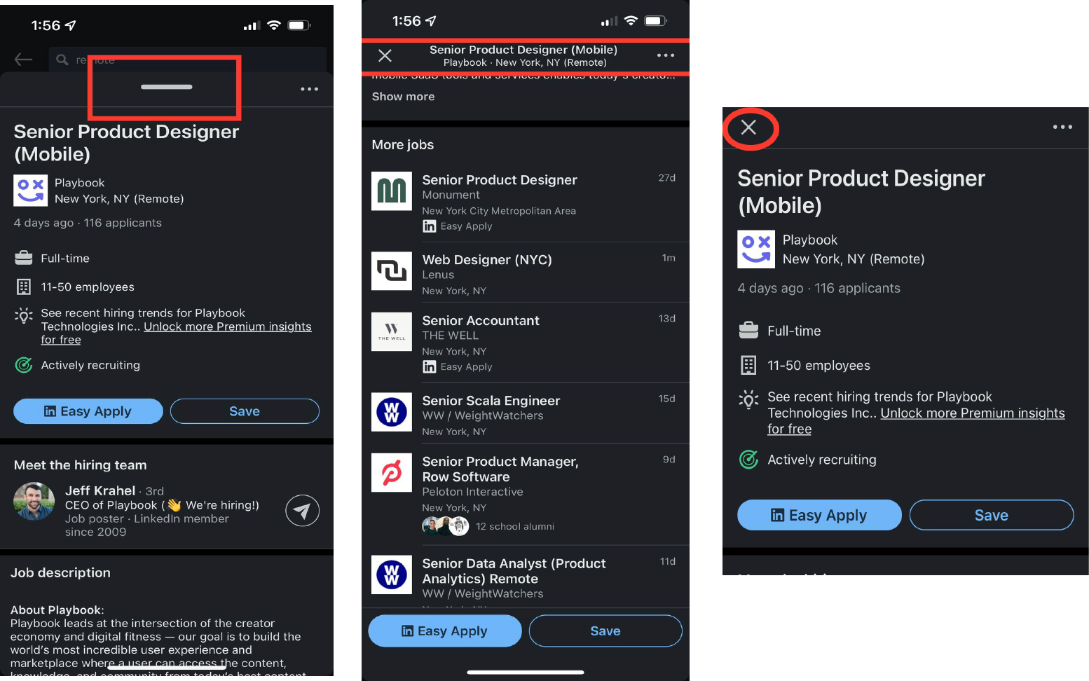
The first image displays the job posting that expands upon clicking the list view in search, the red box highlights the signifier indicating “swipe up to read more”, the second image displays the screen as the user continues to scroll, and highlights the change in page format where the expected scroll down to exit feature doesn’t exist, but a press “X” to close button shows up, the third image displays the screen when the user has scrolled all the way up – but it does not match the beginning state (as shown in the first image)
Conclusion
Job search on Linkedin is highly discoverable with a range of affordances and signifiers that match the system image of the application. The application is well mapped with the exception of a few irregularities in gestures. There is a constant presence of feedback in the form of notifications and vibrations when an action is taken, and constraints exist to minimize any slips and mistakes.
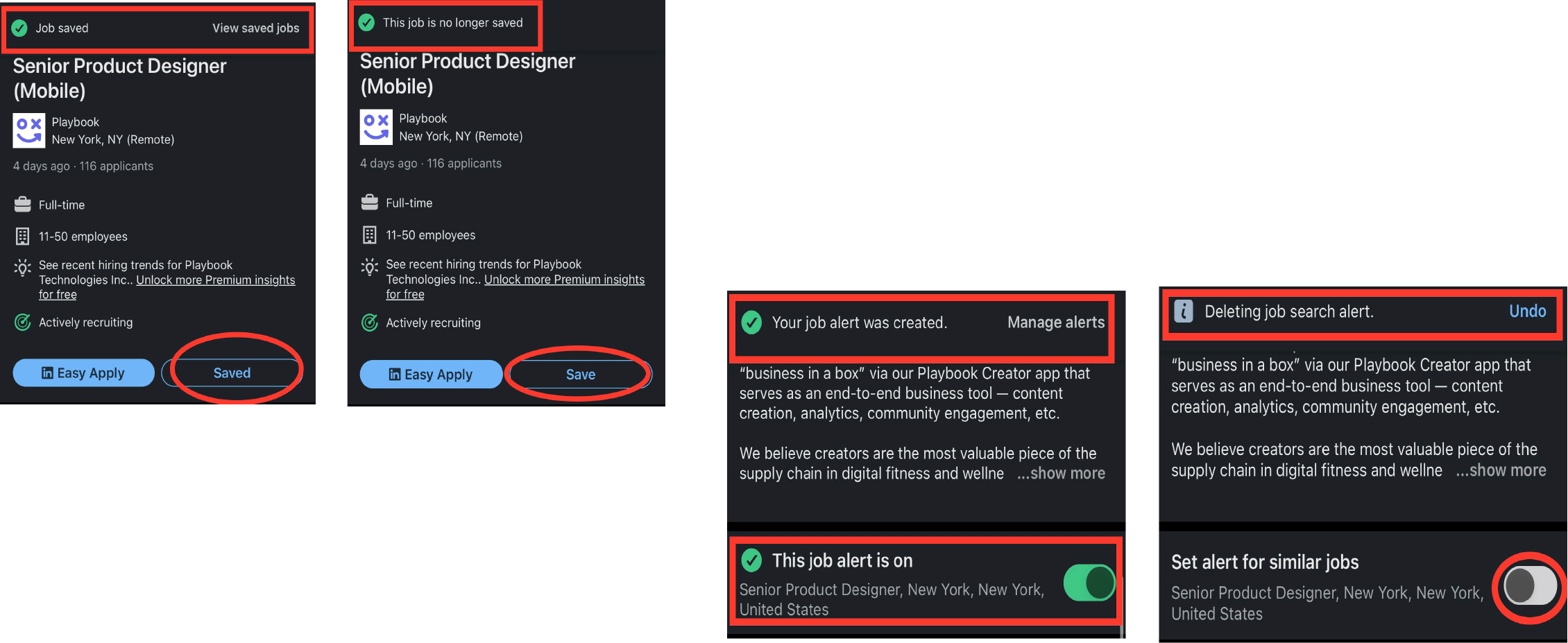
the first two images indicate the feedback that is displayed when the user chooses to click on the highlighted buttons in the job posting, the second image highlights the feedback when the user chooses to enable alerts or disable them for a job posting