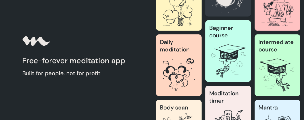
Medito is a simple and free-to-use meditation app available on iOS and Android. It was developed by the Medito Foundation, a non-profit organization dedicated to improving mental wellbeing through the cultivation of mindfulness and meditative practices. The app includes features such as audio for guided meditation sessions, a meditation timer, and content for improving sleep.
Conceptual Model and User Goals
Before jumping into the critique, it makes sense to reflect on the needs of the app’s potential users, in order to assess if it addresses their goals. For a mobile-literate user, Medito’s relatively limited functionality lends itself to a simple and easily-grasped conceptual model of how the app works, with negligible chance of a serious disconnect between the designer model and the user model. The system image that bridges these two models is presented entirely by the app itself, with little to no need for reading documentation or watching tutorials. In this way, the design displays robust ease of learning through exploration (Wharton et al., 1994, p.1).
For the purposes of this critique, a novice user is defined as one who is new to both the app and meditation; her be-goal in using the app is to learn about meditation and begin to build a meditative practice, and her daily do-goal might be to progress through Medito’s series of “beginner courses” in meditation. An experienced user, by contrast, has been using the app for some time to meditate consistently; her be-goal is the maintenance and development of this practice, and her reoccurring do-goal is simply to meditate daily.
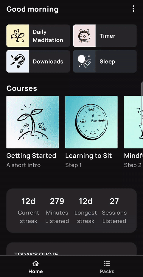
Homepage and Daily Features
The app’s homepage is an admirable example of simple but effective human-centered design, which ensures a user’s “needs are met, that the product is understandable and usable…and that the experience of use is positive and enjoyable (Norman, 2014, 219). It does this by anticipating the needs of both novice and experienced users, with good discoverability of relevant features for both.
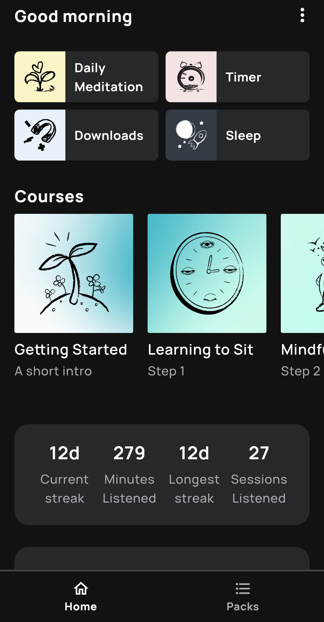
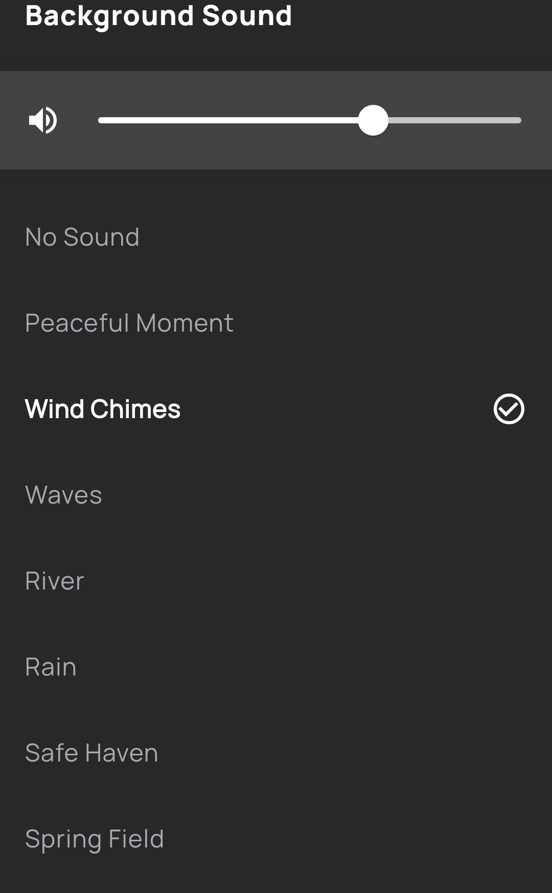
The features one might expect experienced users to employ frequently — including the daily meditation, the meditation timer, and the nightly sleep content — are conveniently and conspicuously situated at the top of the page. This layout decision is an example of excellent mapping: it makes intuitive sense that the features that are used daily are grouped together and easily accessible. This accessibility allows an experienced user who is looking to begin her daily meditation to bridge the gulf of execution with a very simple action sequence: she merely has to open the app and tap the first icon, clearly signified by a “Daily Meditation” label. This takes her to an intermediary screen, in which she can select a narrator and duration. Note that this also helps bridge the gulf of execution, by anticipating the needs of different users (such as those that are short on time, or not yet comfortable enough with meditation to practice for more then a short period). After specifying these options, she taps “Begin,” and the selected meditation plays automatically, providing immediate audio feedback informing her that her action sequence is successful, thereby bridging the gulf of evaluation. Unsurprisingly for a meditation app, the narration of these sessions is calming and pleasant, and can be enhanced by a selection of optional soothing background sounds. This elicits an immediate and positive visceral response from the user, placing her in an appropriate mindset for meditation.
Downloads
The main menu includes a “Downloads” section, which allows a user to store content locally for listening when offline. This functionality affords another way of bridging the gulf of execution and completing the user’s goal by anticipating issues caused by service outages, slow internet, or memory-lapse slips on the part of the user, such as when she forgets to do her daily session and later finds herself without internet access. Of course, this involves the user anticipating such a situation, and taking the initiative to download the content beforehand. A simple way to address this would be to have some local content download automatically when the app is installed. Another potential feature to address these slips would be a function such as a notification or alarm that reminds the user to meditate at a specific time (an example of the app incorporating prospective memory). Since the ultimate be-goals of the majority of users involve consistent practice and building a routine, the app’s features should make this as easy as possible.
Beginner Courses
For a novice user, the “Getting Started” label on the homepage signifies a natural place to begin learning. It is situated at the far left of a common digital affordance: a horizontal swipe menu. This displays course packs that are meant to be completed in sequence, in another example of natural mapping: arranging the courses in a progression from left to right, simple to advanced, makes sense both spatially and conceptually.
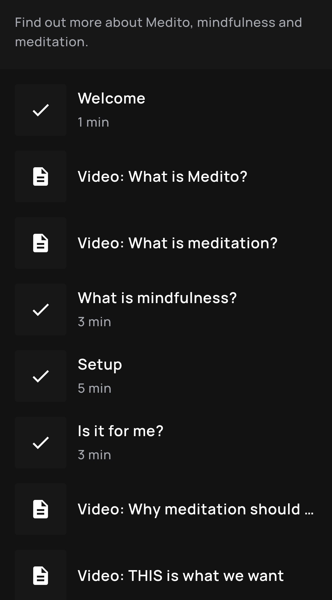
Tapping a course opens a list of audio sessions to be completed in order. Note that sessions that have already been completed are indicated with a checkmark, while sessions yet to be completed are accompanied by a “play” arrow. This is an example of the app using simple signifiers to provide knowledge-in-the-world: the user does not have to rely on his knowledge-in-the-head to determine the last session he listened to. Unfortunately, the app does not mark completed video content in the same way, potentially leading to some confusion.
Session Complete Screen
When the user reaches the end of the audio session, he is presented with the following screen:
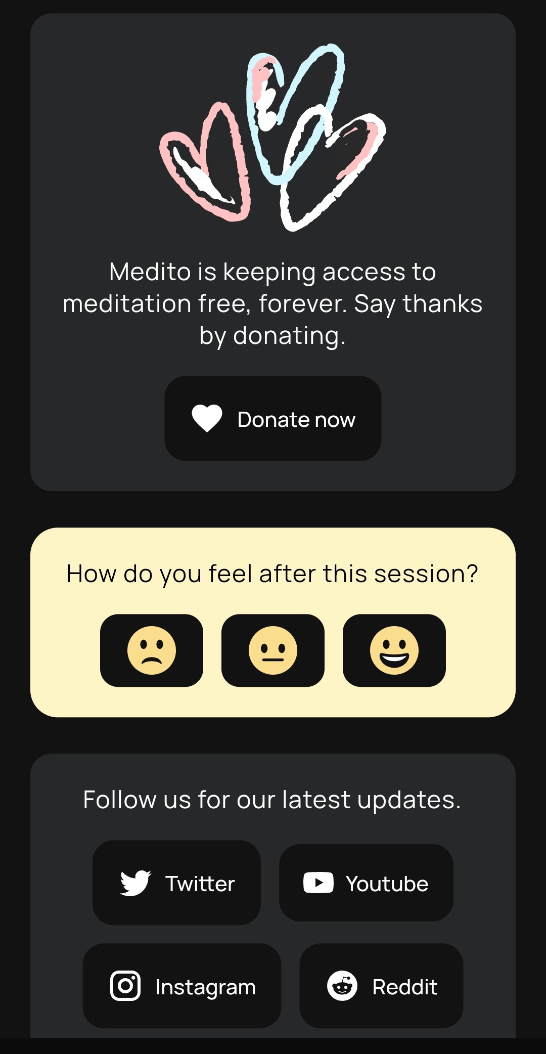
While the screen indicates obliquely to the user that the session is over through its dissimilarities with the previous one — thereby providing a measure of generic feedback — it could be improved. A message of encouragement or reflection, or a reminder of how far along the user is in her current course, would make for more informative and enjoyable feedback. Alternatively, incorporating the meditation tracker widget from the homepage could remind the user how this session adds to her cumulative progress, potentially encouraging her in her continued practice.
Note that there is no way to advance from this screen to the next session in the course. At first I considered this an annoying design oversight; on reflection, it is actually a clever use of constraints. By not adding this functionality, this app is teaching the user to progress through the sessions in the manner intended by the program’s designers. These courses are not meant to be rushed through as fast as possible; instead, they are supposed to be consumed thoughtfully and deliberately, helping the novice user/meditator to gently and mindfully build a daily practice.
The app could go further to ensure a novice user is progressing through the material in the intended way by implementing an interlock constraint, which “forces operations to take place in proper sequence” (Norman, 2014, 142). For example, if a user has not completed the “Mindfulness” course pack, she would not be able to access the next pack, “Deepen Your Practice.” Of course, the designer would have to keep in mind that limiting functionality can lead to user frustration, and would have to weigh the relative importance of the user’s ability to engage with the app in her own way versus the benefits of following the designer’s “preferred” path through the features.
References
Norman, D. (2013). The design of everyday things. Basic Books.
Wharton, C., Rieman, J., Lewis, C., & Polson, P. (1994). The Cognitive Walkthrough Method: A Practitioner’s Guide. In J. Nielsen, & R. Mack (Eds.), Usability inspection methods (pp. 105-140). John Wiley & Sons, Inc.