Introduction
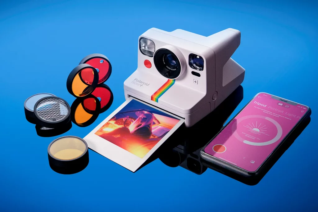
Polaroid APP is an application that allows Polaroid camera users to connect their cameras to the application via Bluetooth. It includes the functions of taking photos with various modes, integrating physical camera tools, applying creative tools to edit the photo, and printing photos out.


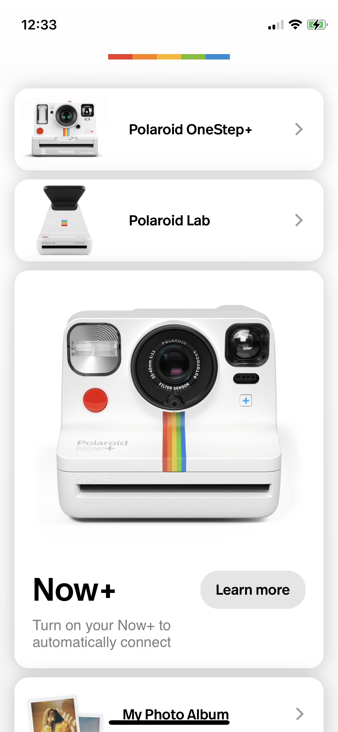
Landing Page
Pros
When users open the app. It displays different devices that can be connected to the IOS application. Each device is labeled with separate white bars. It divides each part and demonstrates discoverability as it is easy to know which button users should tap to connect. In addition, upon the landing page, target polaroid users could identify which model they are looking for to connect with its exact physical appearance and proceed, thus conceptual mode is reflected as well.
Moreover, under the appearance image, it shows Bluetooth disabled, it is a signifier that guides the user to turn on their Bluetooth in order to connect with their device when they want to proceed to the next step. Once Bluetooth turns on, it gives positive feedback as Figure 4. From Figure 2, when users scroll down to the bottom, each icon on the right column corresponds to each function, which is another signifier of different actions for users to tap on.
Furthermore, when clicking each button of the device it leads to the corresponding device mode page immediately, which gives users instant feedback on their progress.
Cons
However, from figure 3, users can find it confusing when they scroll down to the bottom of store visits options. Primarily, the application targets only Polaroid Camera users, as such users have the knowledge of where to get film types and cameras. Hence the visit store page is an insufficient constraint that misleads users to the Polaroid store page.
Solution
The application can delete the bottom page as it does not fulfill the primary needs of target users and may cause unnecessary misleading actions. The other way could be adding the advertisement ” Visit Polariod.com to Explore” before entering the landing page.
Navigation and Modes page
Pros
When users tap on the three different devices selection, the current mode displays black text, and all other modes display grey text on the top. Users will be naturally guided to swipe right as they can only swipe right with the row of grey texts, they are constrained to perform the correct action while it left users with no other options. In addition, a signifier is labeled as each time the swiping right action gives the clue that grey texts turn to black texts. Moreover, users could easily discover the icons of the shutter button, close-up and flash on the bottom and make their action decision.
Cons
However, it can cause confusion that for Polaroid Now+, function icons are located at the bottom left, while for Polaroid OneStep+ and Polaroid Lab, those icons are on the top right. Those functions are frequently used by camera users and such mapping design will lead users to pause and be confused with actions. Moreover, there are guides for certain modes of Now+ while they are not adapted to Onestep+ though modes are similar. It causes confusion for new users to get started with no clues, which reflects no clear signifiers.
Solution
The App can rearrange the functions icons on the side location to allow users to easily understand. For example, traditionally flash, timer and shutter buttons are on the top of a physical device, and the design can be reset to move all function icons to the top row. Moreover, guide words or sentences can be added to each mode’s page when users switch between them.