
Relay is an independent courier company who contracts directly with restaurants, liquor stores, among others. They manage all the delivery system for the restaurant through an app, and having the riders available all over the areas of operation. Thus, the riders can pick up the food and delivery it as soon as possible.
Relay operates in cities such as New York, Philadelphia, and Washington DC. They have helped a lot of restaurants to increase their profits, cutting the fee margin that apps like Doordash and Grubhub charge both the restaurant and the customer.
Homepage
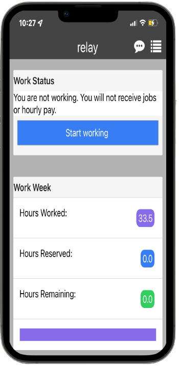
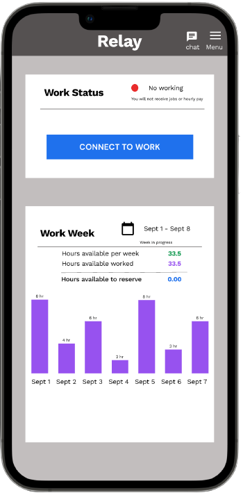
The homepage is really hard to understand if you do not have any previous knowledge about the app. First of all, the top navigation is missing labels so the visibility and accessibility are not great. Therefore, the idea to add labels would give the user a better intuitiveness. Secondly, the work status block is lacking in hierarchy, and its affordance is not quite clear. I propose adding a color red to show an off-line status to improve the feedback, and a different label for the button to increase the affordance. Lastly, the work week block is a little complex. The visibility and mapping are not the best because the user can have confusion in knowing which week is that. Thus, the design solution shows a bar chart of per days worked where we can find how many hours the user has worked during the week mentioned. Plus, in order to increase the mapping, we added a calendar icon and the date period.
Shift Viewer
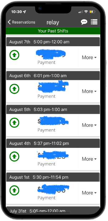
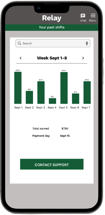
The shift viewer shows a huge list of elements that can be overwhelming for the user. There is no search bar and is not even organized per week worked. We added three essential elements to the design solution. First, the search bar will give the user a better discoverability just in case that they need an old report so the user does not have to go item by item. Second, as the user or rider gets paid per week, we suggest a filter per week adding arrows to each side as signifiers. Also, adding a chart bar would add consistency and visibility. Finally, we include a total earned for the period and the exact date when the user will get the money. Just in case that there is something, we come up with a direct button to contact support.
SCHEDULE
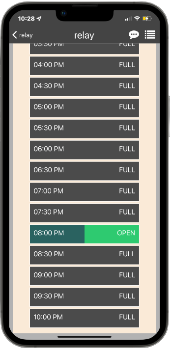
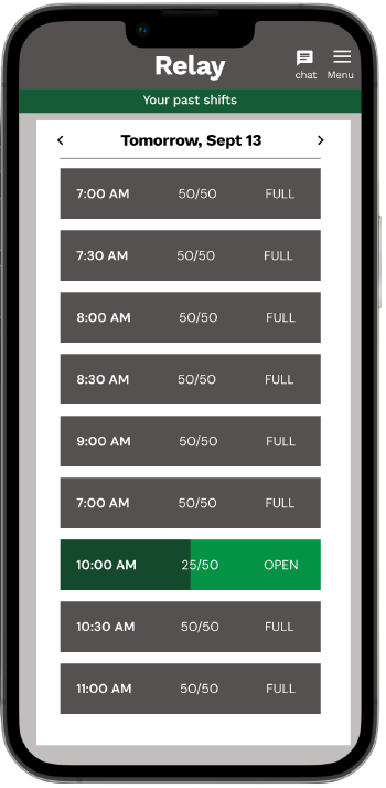
Even though the scheduled user interface is not bad at all, it is missing some design principles. We recommend adding a fixed title that in this case would be the day of the week. Hence, the user will have a greater degree of constraints and discoverability. Besides this, it would be more appropriate to the user knowing the exact number of spots per hour. Thus, not only having the abstract color bar showing the availability but also the exact number to enhance the affordability
conclusion
Relay delivery app (rider side) is used for a great variety of people with different backgrounds and education. Making an app the simplest way possible would diminish biases and add more inclusiveness to all users. Hence, the usability of the app would be more intuitive and easy to understand to the user.