Client Overview
Big Reuse is a non-profit organization that runs multiple circular economy programs in the New York City area to “divert waste to landfills and reduce greenhouse gasses in the atmosphere.” Their website was created in order to communicate the organization’s story and mission, update their activities, and call for donations from the general public, donors, and the environmental community. The client recently underwent a website refresh exercise using Shopify and was looking for support in evaluating the effectiveness of the redesign.
Goals
Specifically, the client had three goals in mind for the usability study:
CONTENT COMPREHENSION
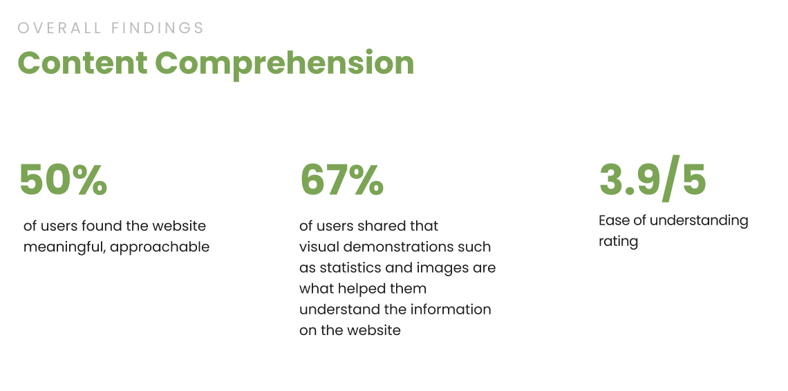
Determine if audience’s can understand Big Reuse’s story and mission, and the impact of their money donations.
VISUAL IMPRESSION
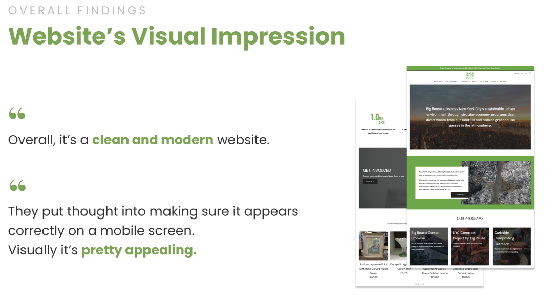
Discover user’s impressions of the Big Reuse website visuals and imagery.
USABILITY
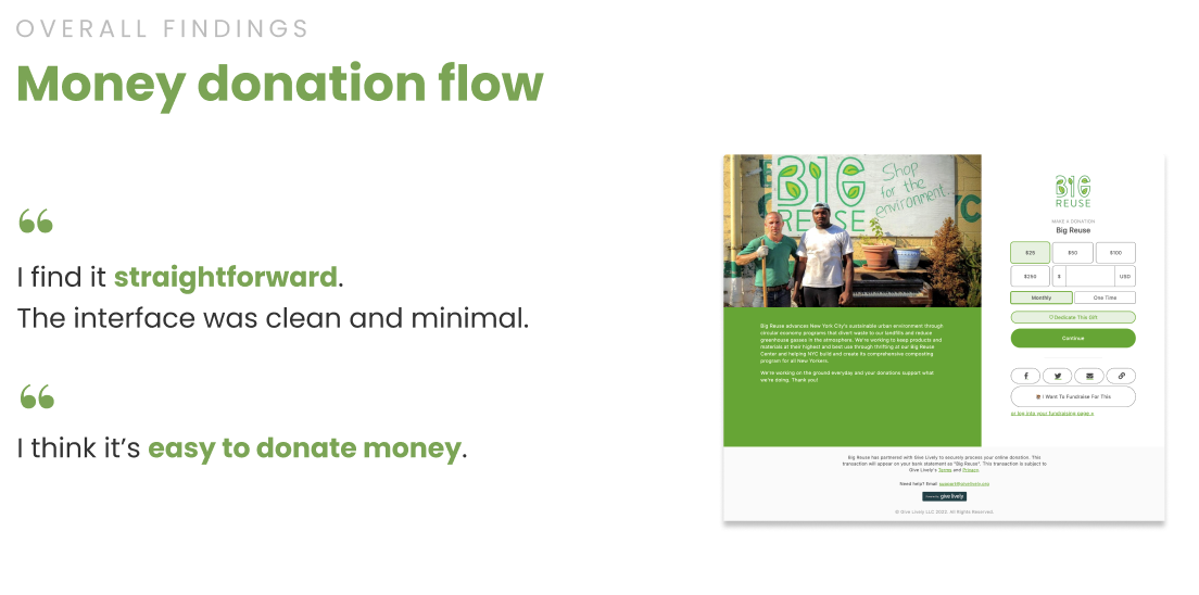
Evaluate the overall usability of the website with an emphasis on the monetary donation workflow.
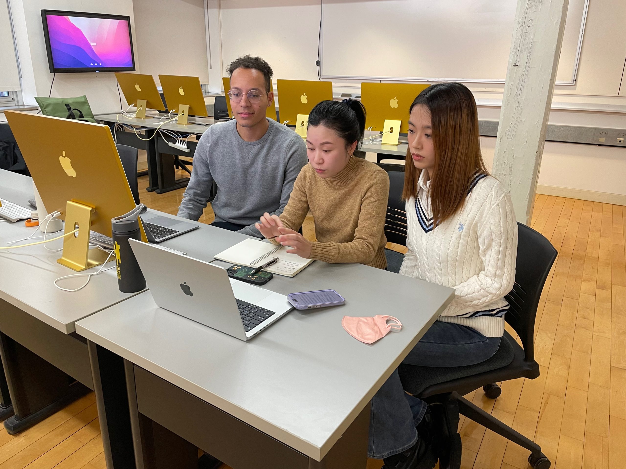
Our Team
Steven Haverlock
MS Information Experience Design
Hailee Hoa Luong
MS Information Experience Design
Xueying Liu
MS Information Experience Design
The research team consisted of three graduate students in the Pratt Information Experience Design Master’s Program. I led the overall project management, data analysis and report content development for my team.

Our Process
Our Process consisted of six key steps:
- Objective Alignment: The research team reviewed the client briefing document, prepared a list of questions for the client and then met with the client for one hour to help shape the study. Following the client meeting, we were able to define our three key research objectives and shift into test planning.
- Test Planning: This phase consisted of becoming more familiar with the moderated user testing research methodology and then defining our scenario and user tasks for the usability study. We also made the decision to conduct tests remotely via Zoom at this stage.
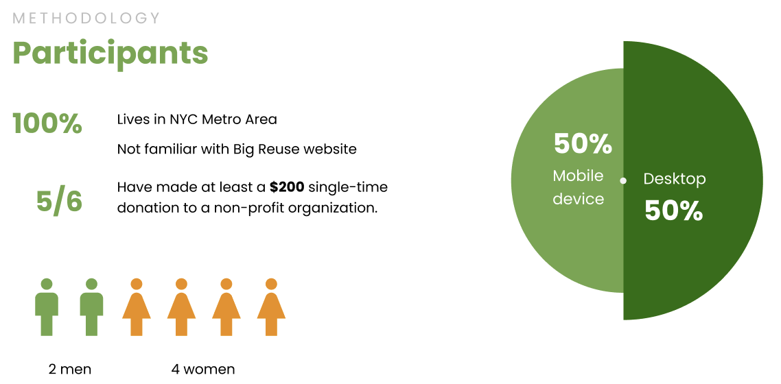
- Participant Recruitment: Participants were recruited via email, discord and informal networks using this Google Form. Three primary eligibility criteria were determined in concert with the client:
- First-Time Users (not familiar with Big Reuse)
- Lives in NYC Metro Area
- Previously donated to a non-profit organization.
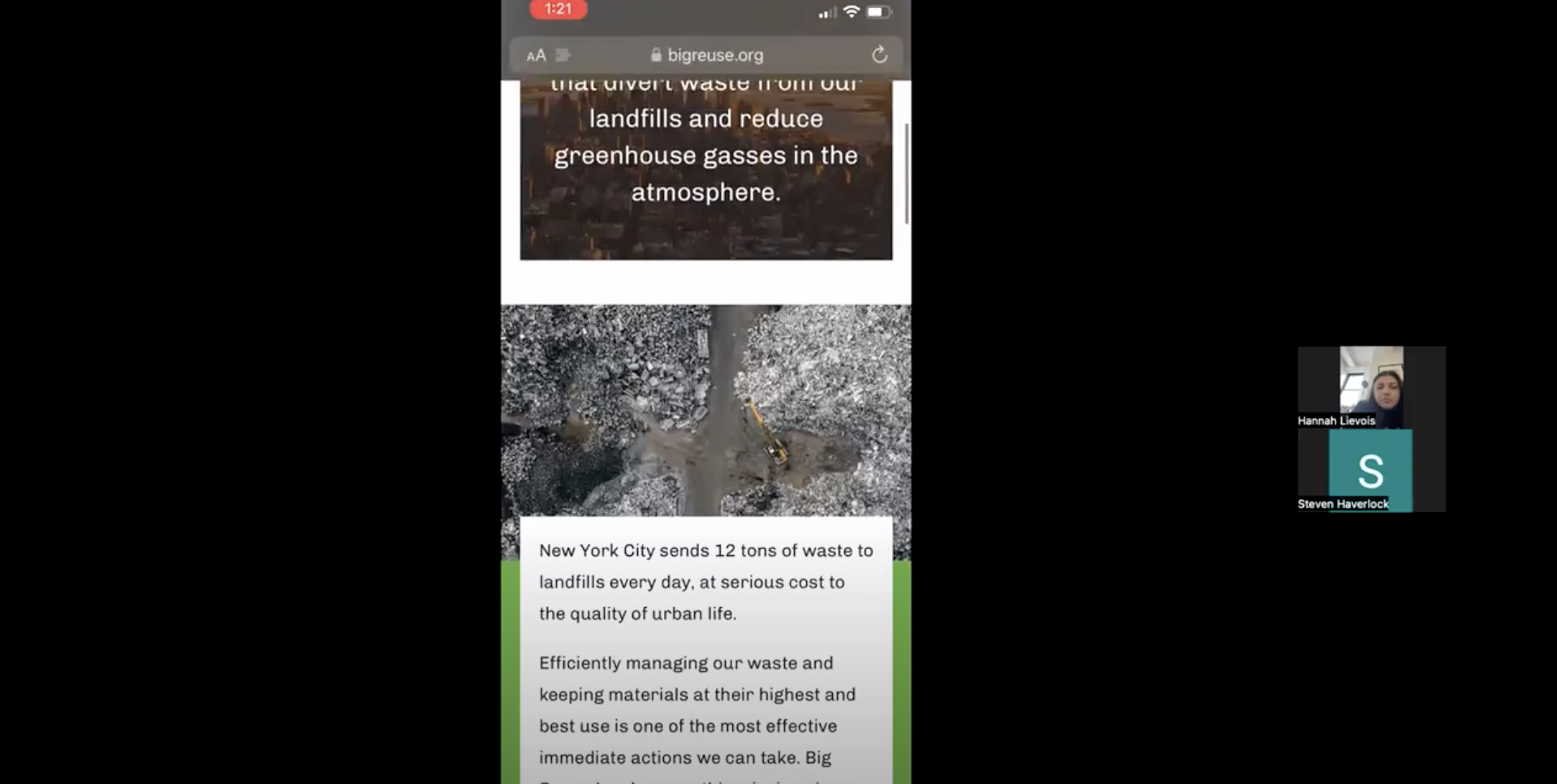
- Test Execution: Tests were conducted remotely via Zoom with the recruited participants. Each team member conducted two interviews with participants who either used a mobile or desktop device to access the website.
- Data Analysis: The data analysis was conducted using a mix of quantitative metric analysis in Excel and affinity diagramming in Figma for a qualitative thematic analysis.
- Reporting Findings: Finally, we condensed our analysis into a digestible presentation and report in order to communicate our findings to our client concisely and effectively.

Methodology
The Big Reuse usability study was performed using the moderated user testing method, also referred to as a usability study. A moderated user test is, “a real-time interview with someone who uses your product or service.” (Diallo, 2022) This method is considered the gold-standard in usability testing as the users recruited are representative of one’s target demographic and the researcher is able to collect higher volume and quality data given their active engagement in the study.
Participant Breakdown
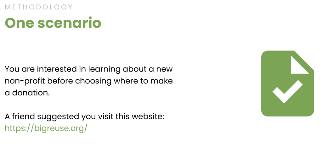
Testing Scenario
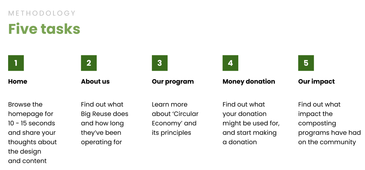
User Tasks
Remote User Testing Sessions
Tests were conducted via Zoom with users and recorded for further review post-session.
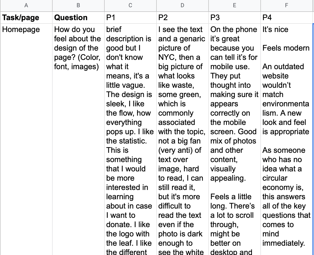
Data Analysis
Quantitative metrics were calculated using an Excel spreadsheet of participant data, while qualitative insights were thematically analyzed using the affinity diagramming methodology in Figma.
Findings & Recommendations
Our final evaluation report is linked below. The following is a summary of the key findings and recommendations we developed as a research team.
Key Findings
After conducting 6 testing sessions and analyzing data, we gleaned valuable feedback from users.
Recommendations
Amidst the positive overall findings we identified four key areas where the user experience could be meaningfully improved based on our analysis of user testing results.
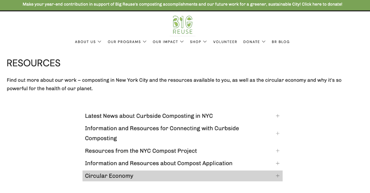
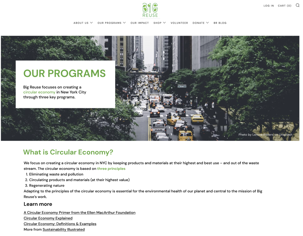
Recommendation 1: Clarify the meaning of circular economy and better embed resources.
The concept of Circular Economy is foundational in understanding the mission and purpose of Big Reuse. However, participants struggled to define and learn more about the concept of circular economy. This comprehension issue was one of findability – users could not easily locate the relevant information on Circular Economy as it was nested in the Resources page that users rarely navigated to.
To address the findability issue, we recommended embedding the information into the “Our Programs Overview” page where most of our users went to search for this information initially. By matching the user’s expectations of where to find key content, we increase the likelihood that the user successfully comprehends the story and mission of Big Reuse.
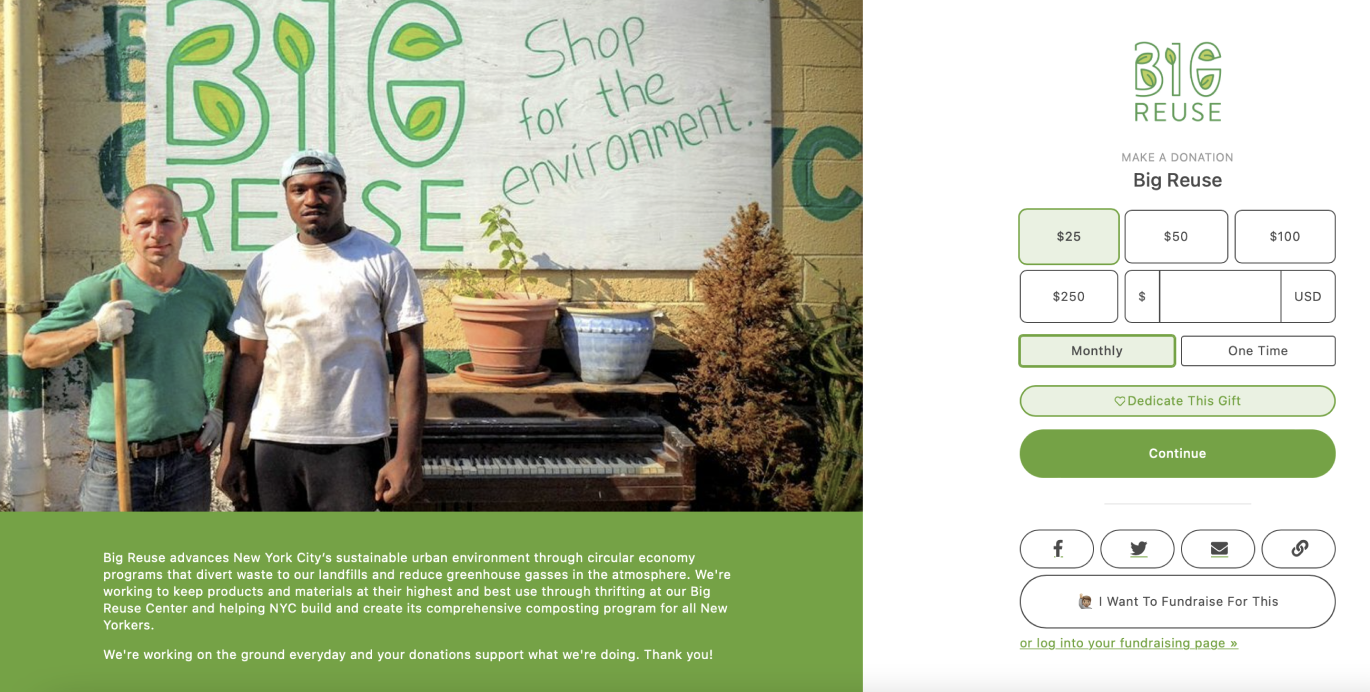
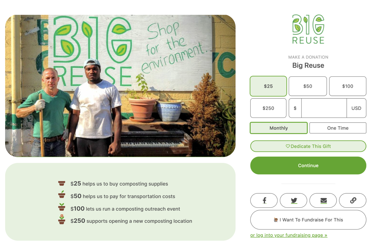
Recommendation 2: Optimize the Donate page by making clear how donated money is being used.
One of the key features of the Big Reuse website is the ability to make a monetary donation to support the organization’s efforts and further the mission of Big Reuse. Fortunately, no usability issues were identified with the process of making a monetary donation. However, detailed information on how donated money would be used did not exist causing users to question the value and meaning of a donation.
An opportunity exists to clarify either key organizational priorities or describe the value of a donation in more tangible terms. Users shared that transparency compels them to donate, that is – they want to know what their money will support with more detail than the high-level mission statement. Helping users to visualize and see the value of their donation would likely compel them to donate more and reduce drop-off rates due to absence of information.
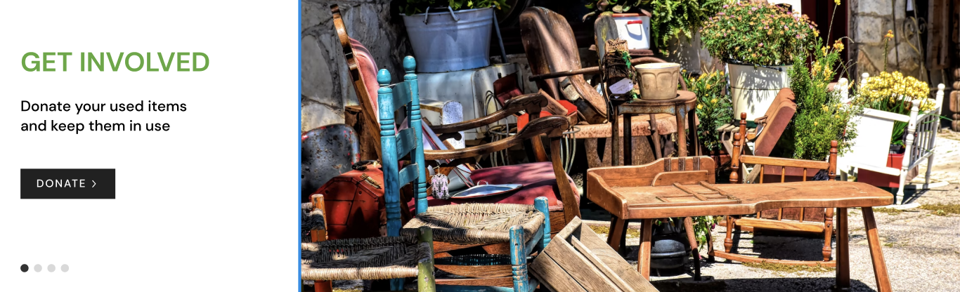
Recommendation 3: Improve the use of images by avoiding showing text over photos, and selecting photos that are relevant to the presented content
Participants faced challenges on the site when images were displayed as a background of the text, and when images showed little relevance to the linked content. Background images were difficult for users to read and irrelevant images caused confusion and distraction from the overall message.
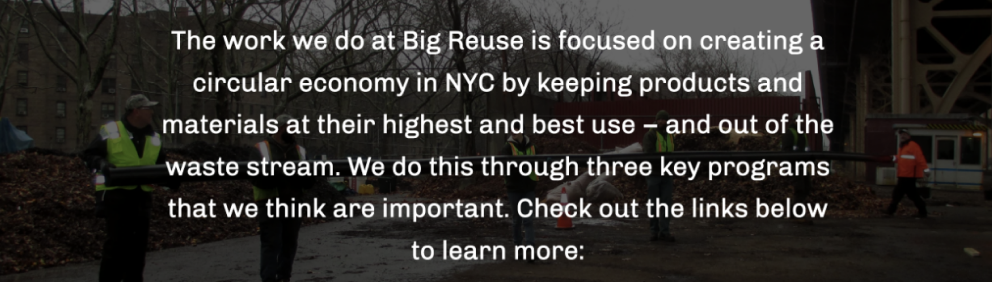
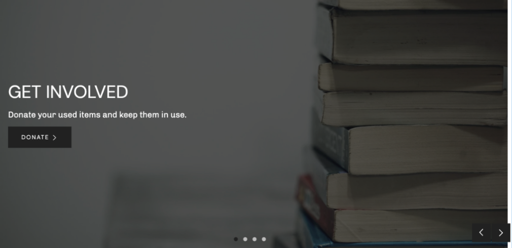
To address these concerns with image use, we recommended that the client avoid displaying text over photos on the website and select photos that are more relevant to the associated content / labels.
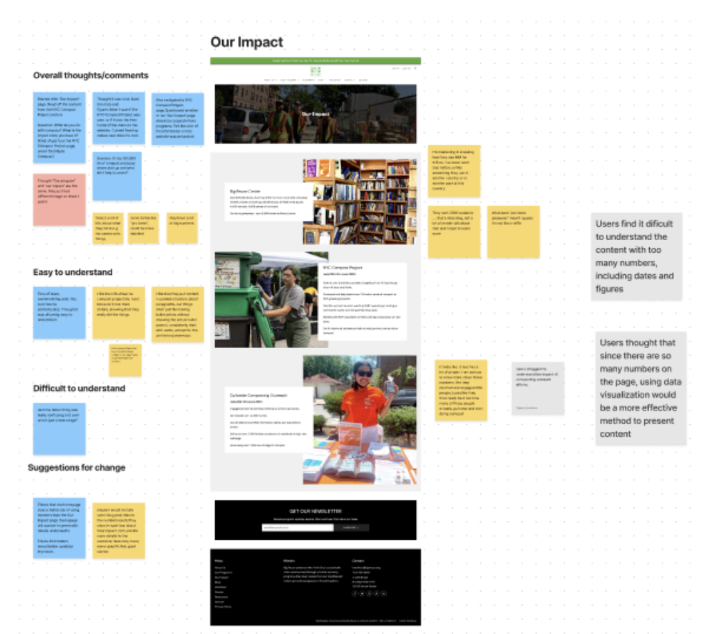
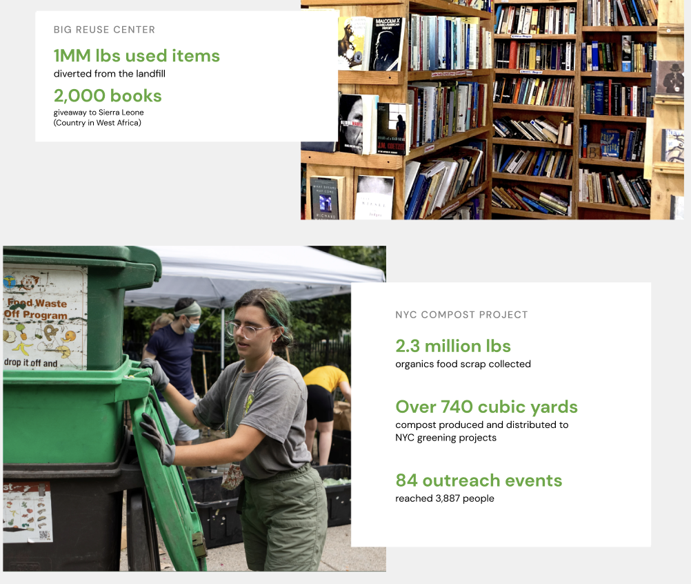
Recommendation 4: Improve the content readability by enhancing visual hierarchy for text and number-heavy content
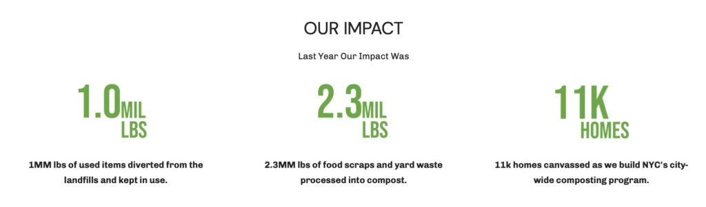
In the test, participants were asked to find out what Big Reuse does, how long they’ve been operating, and find out what impact the composting programs have had on the community. These tasks were created to test user’s comprehension with two pages on the site, including the “About us” and the “Our impact” page. All six participants (100%) agreed that both the ‘About Us’ and ‘Our Impact’ pages were either too text-heavy or number-heavy. Overall comprehension was being diminished with the overwhelming page content.
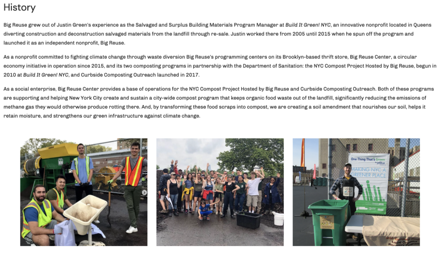
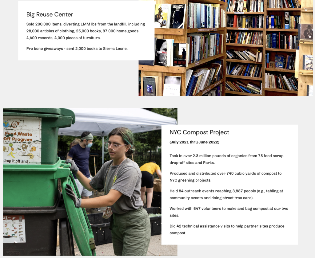
All of the content on the webpage was accurate and meaningful, it simply required some reformatting to convey an impactful message. We used principles of visual hierarchy and typographic design to make the content more digestible for the user.
Conclusion
To culminate the project, we met with our client Big Reuse for one hour over Zoom to review the results of our usability test and share the recommendations outlined above. The client was very grateful for our advice and we discussed our suggestions in detail. We are confident that the client has what they need to make improvements to their website based on the objectives outlined.