Project overview
Context
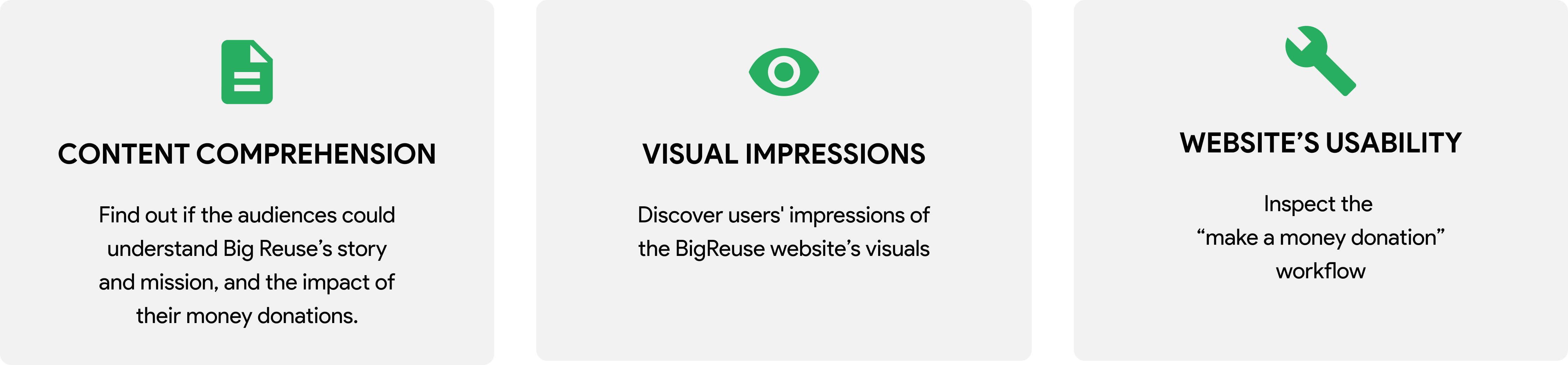
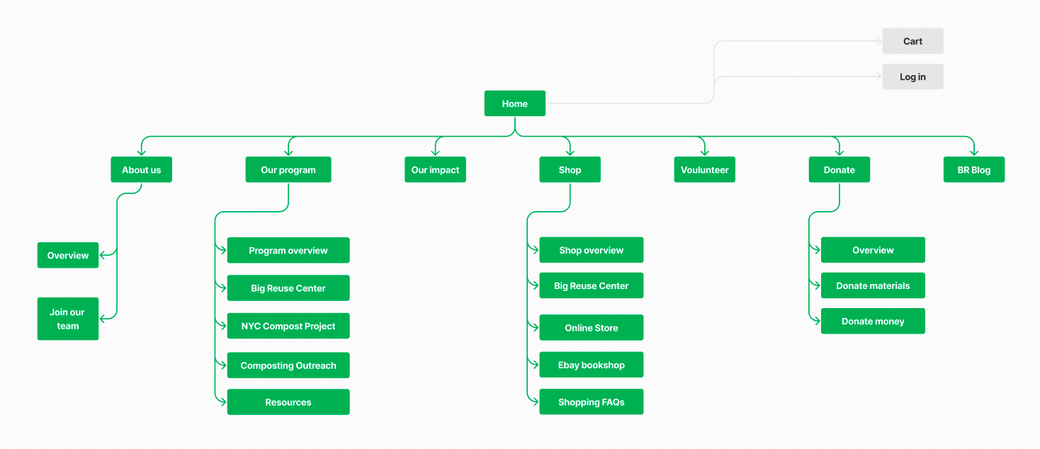
Big Reuse is a non-profit organization that runs different programs in the New York City area to “divert waste to landfills and reduce greenhouse gasses in the atmosphere.” (Big Reuse, 2022) The Big Reuse website was created in order to communicate the organization’s story and mission, update their activities, and call for donations from the general public, donors, and the environmental community. The client came to us after they implemented a refresh of their previous website, and wanted us to conduct the study to evaluate the new website version.
Evaluation focus
Process
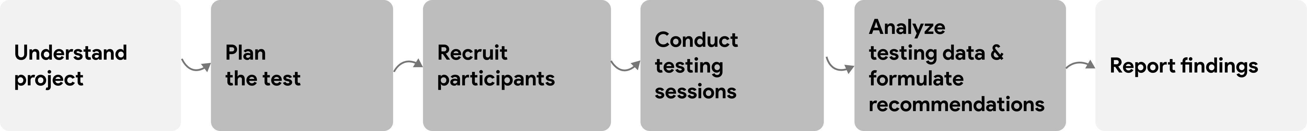
Understand the project
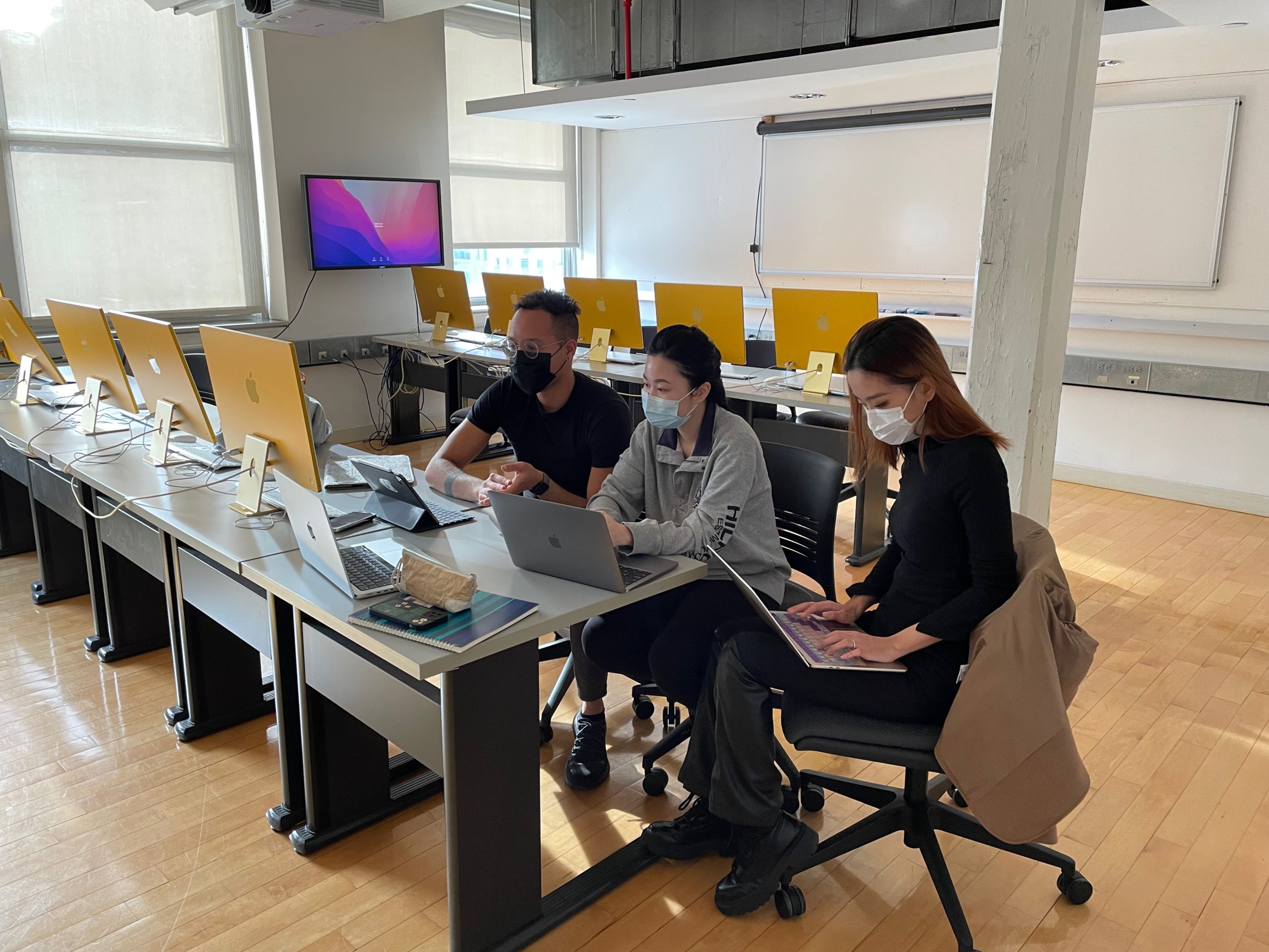
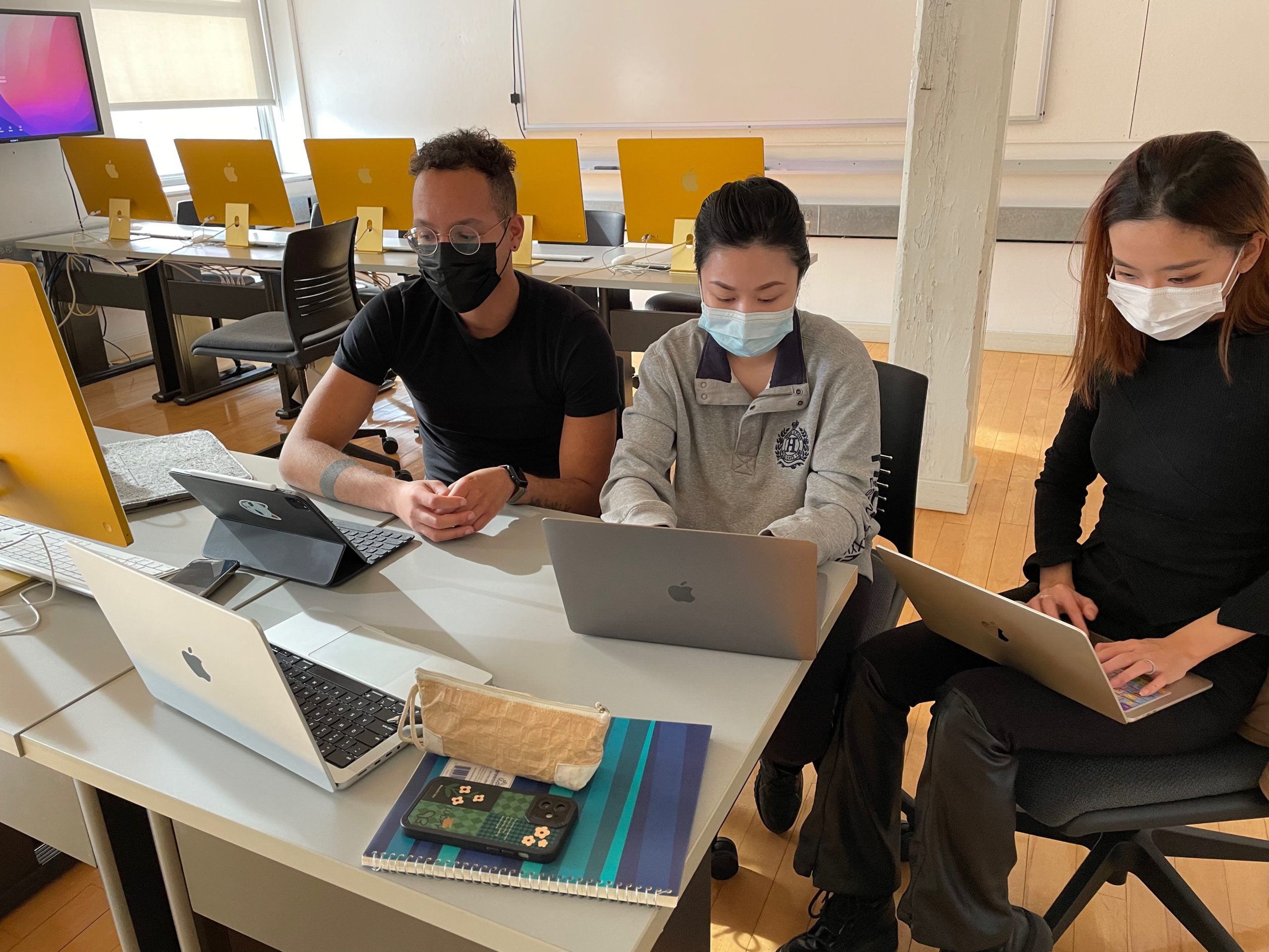
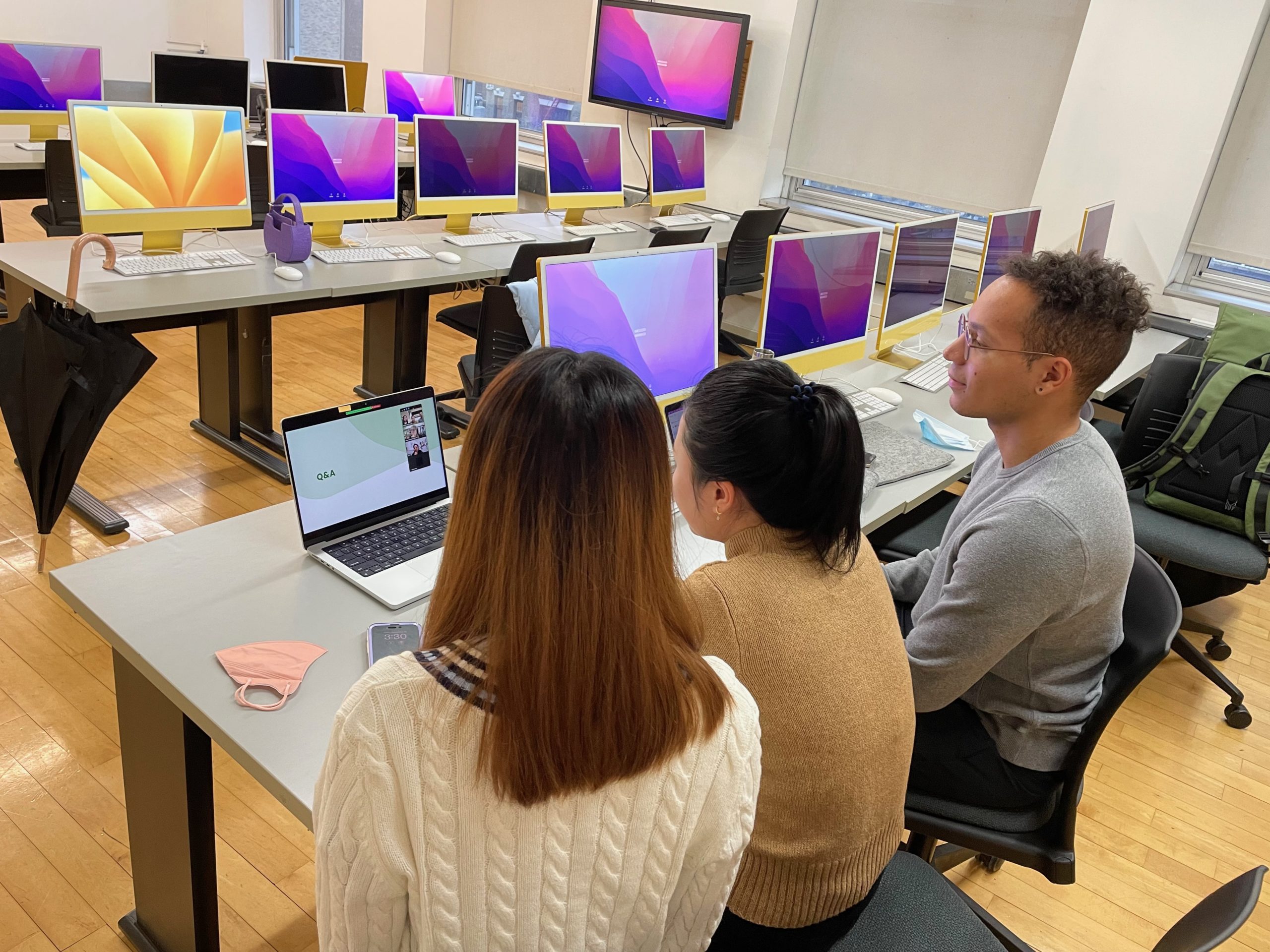
Testing the website remotely
The usability study was performed using the moderated user testing method. Often considered the gold-standard in usability testing, this method involves users as participants, and UX experts as moderators, working together in a controlled setting. The recruited users are representative of a target demographic and the UX expert is able to collect a large volume and quality data through the study.
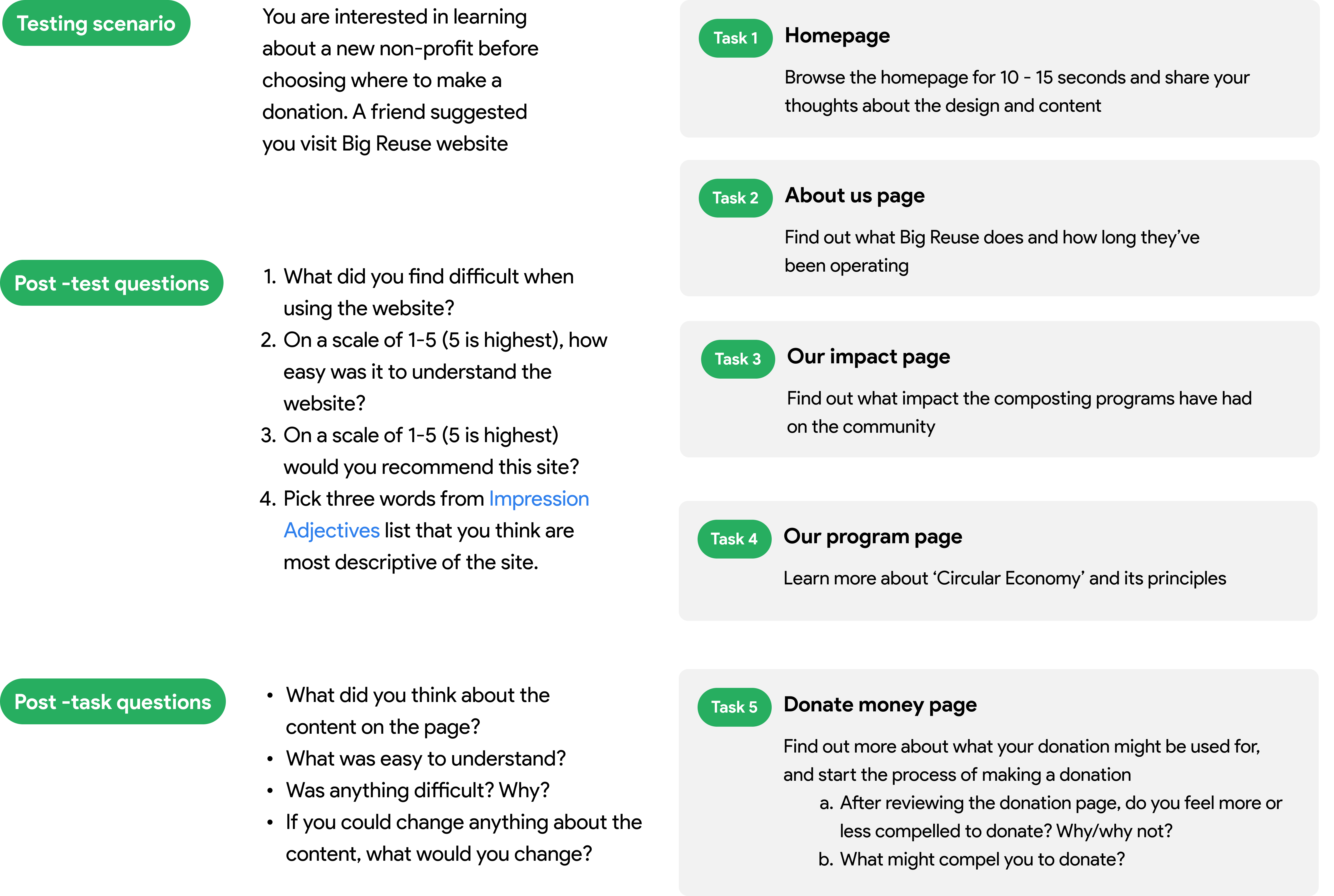
1. Designing the test
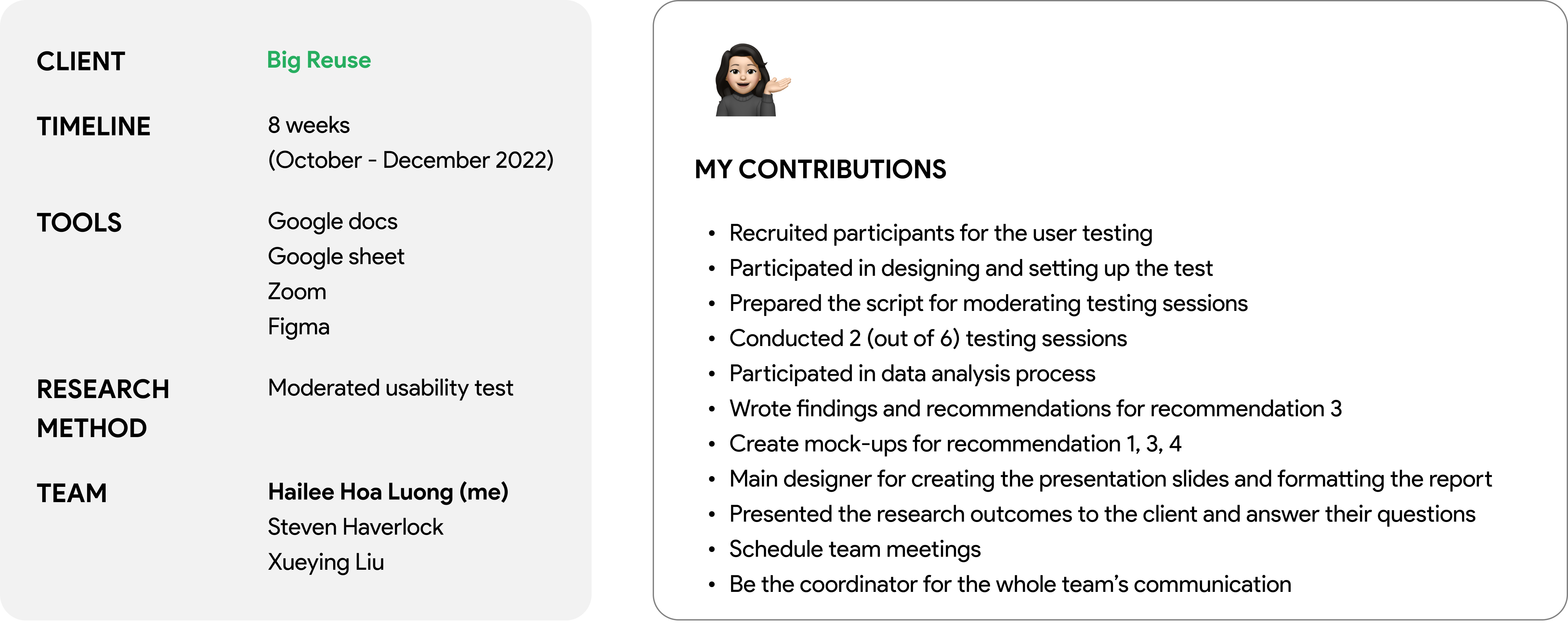
2. Recruiting participants
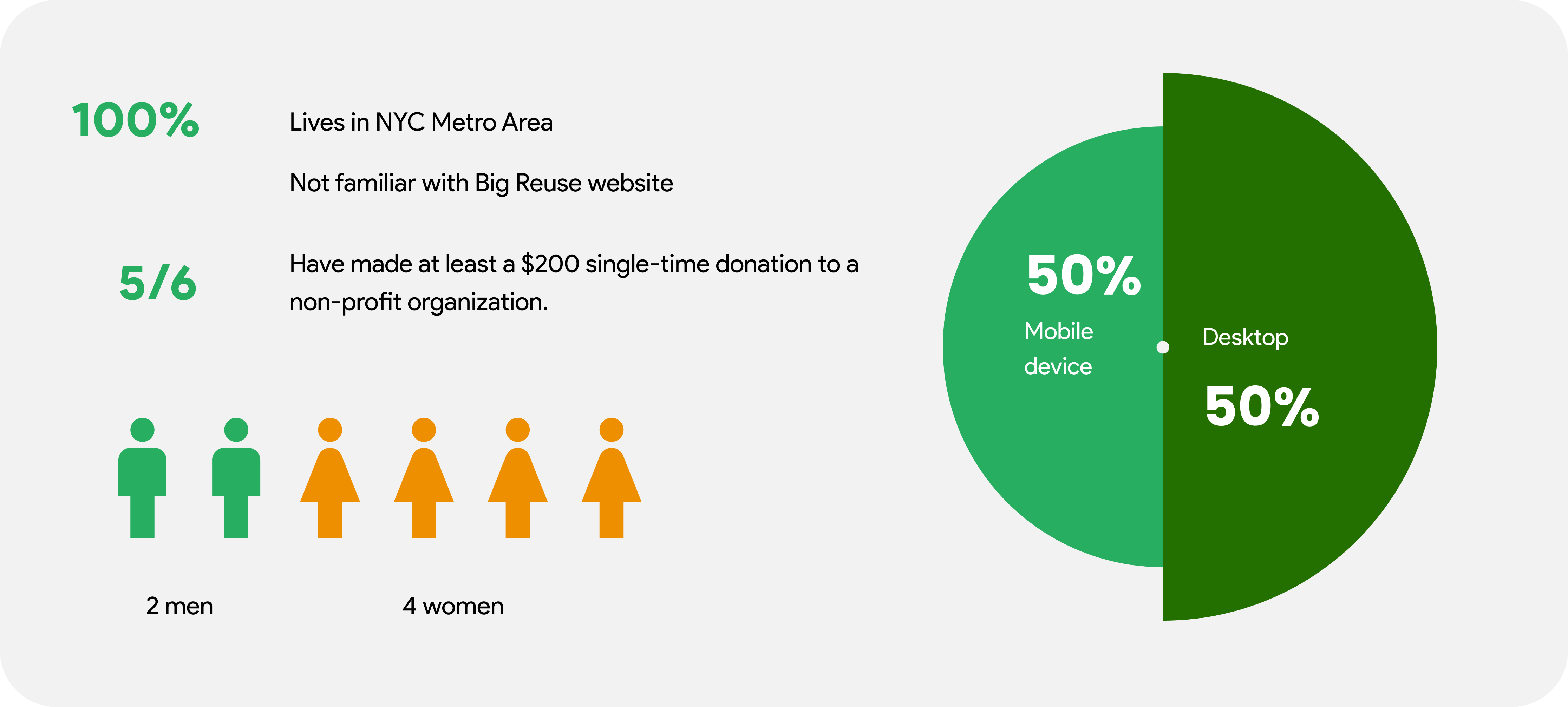
Based on the project’s goals defined by our client, we determined the ideal user profile for the study. Via emails, and discord chatting platform, a screening form was sent out to recruit participants for the test. Six participants were ultimately recruited for this study with the following profile.
3. Conduct user testings
Before conducting the test with our recruited participants, I conducted 2 pilot tests with my friends to test our testing plan and make changes if needed. The pilot tests went well and we confirmed our final testing plan.
The participant was asked to share their screen and “think aloud” while completing tasks on the website.
4. Analyzing data
After each testing session, I reviewed the recording, captured notes and log them into a shared Google spreadsheet.
The findings were aggregated after that, and affinity diagramming was the method implemented by the whole team to sort out findings.
By conducting analysis of the findings, and discussing further within the team, we identified the key usability problems on the website and formulated the recommendations.
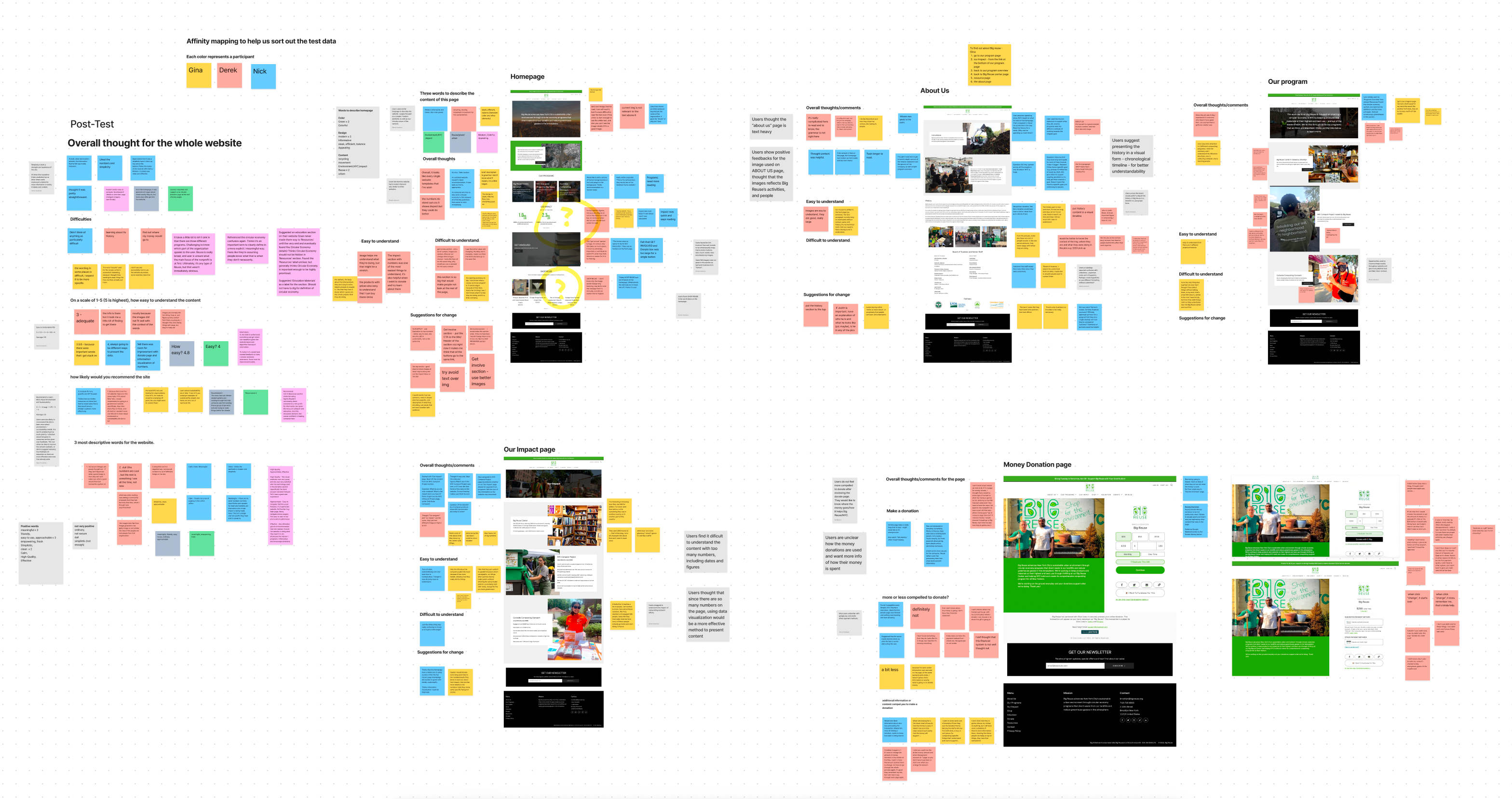
Overall findings
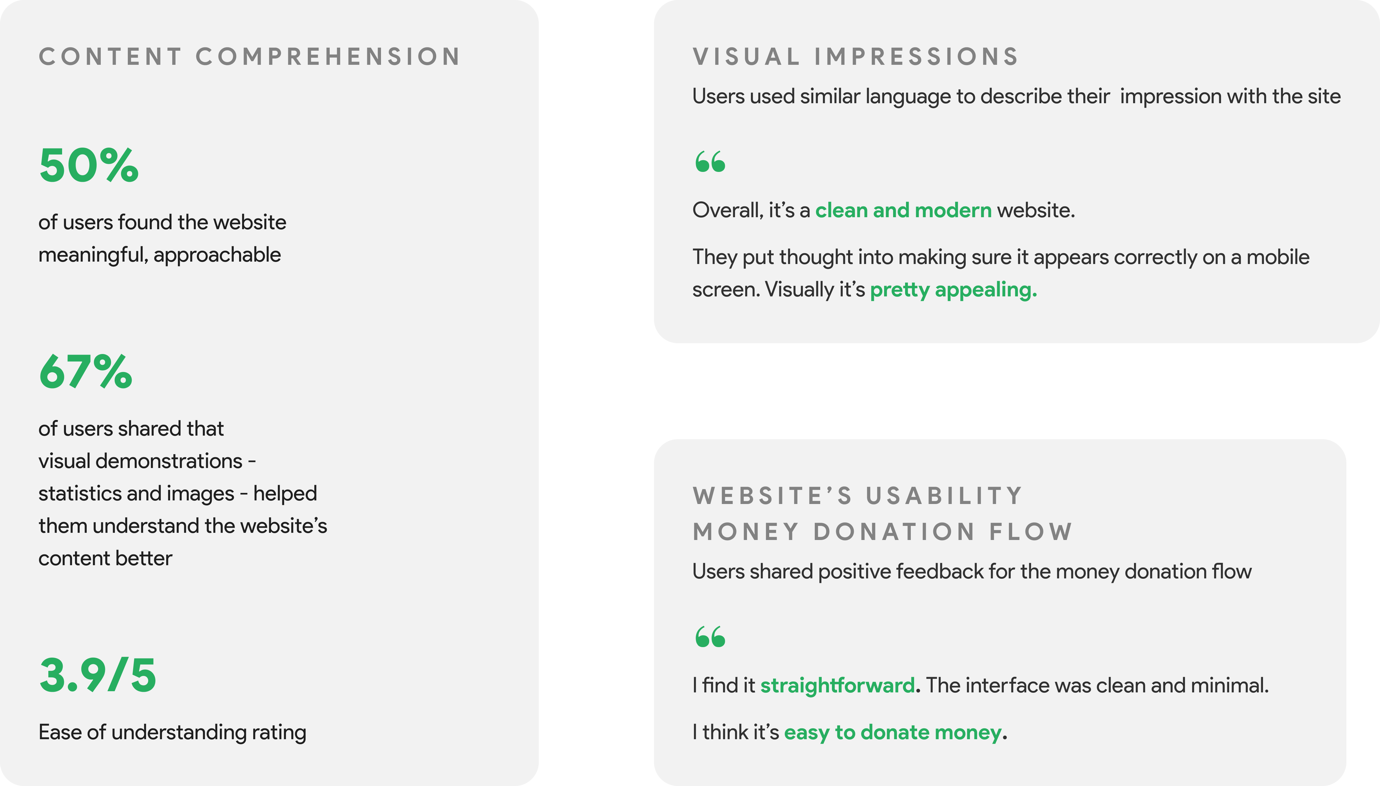
Findings are mostly positive, but there are rooms for improvements
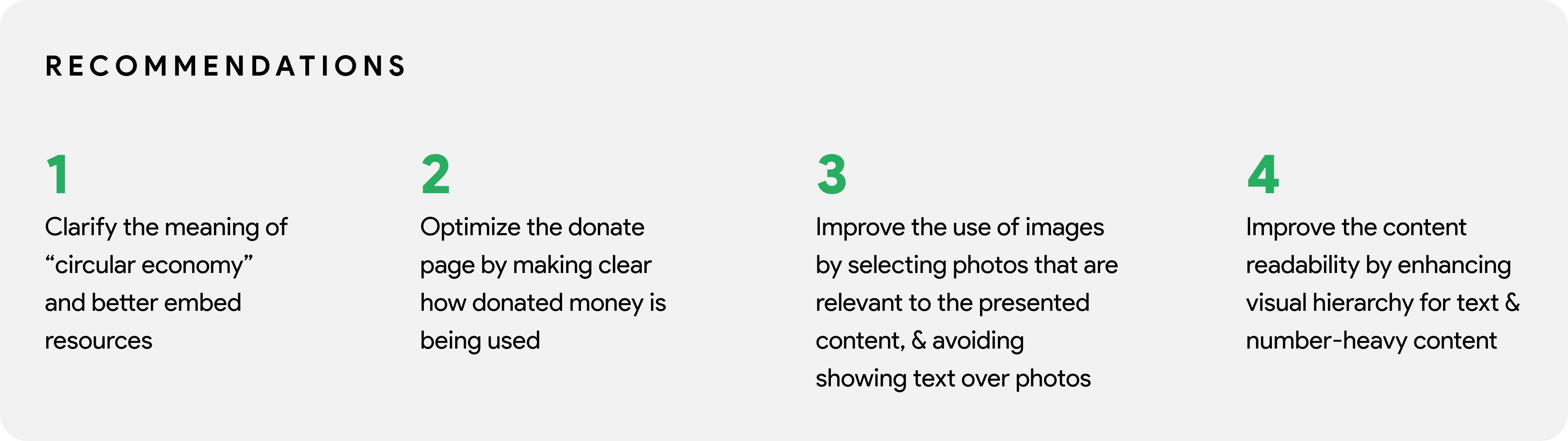
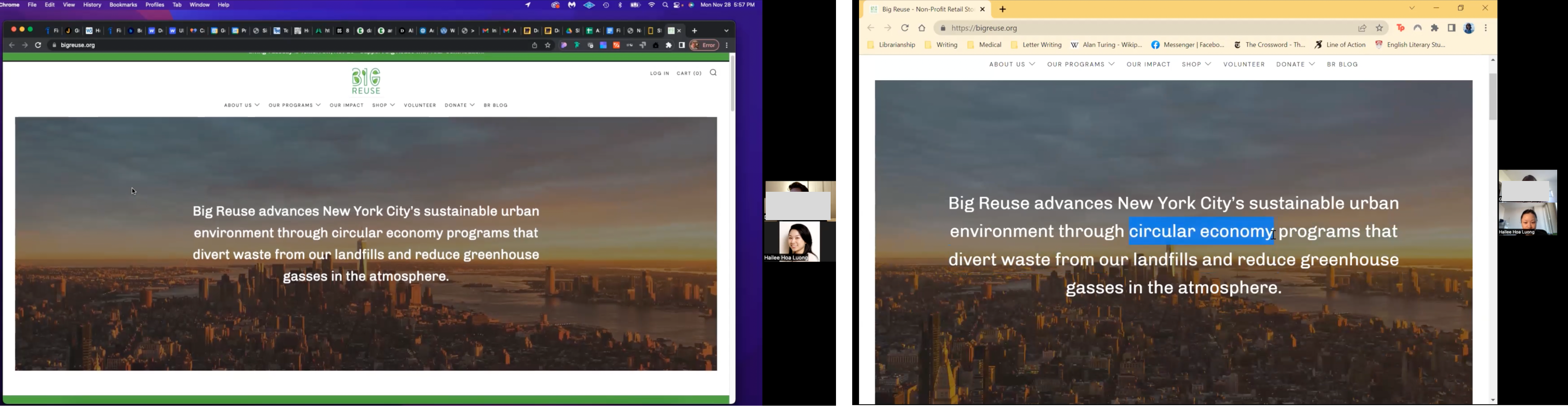
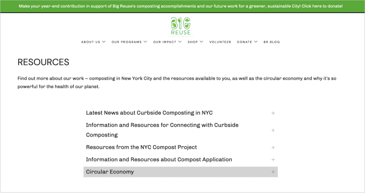
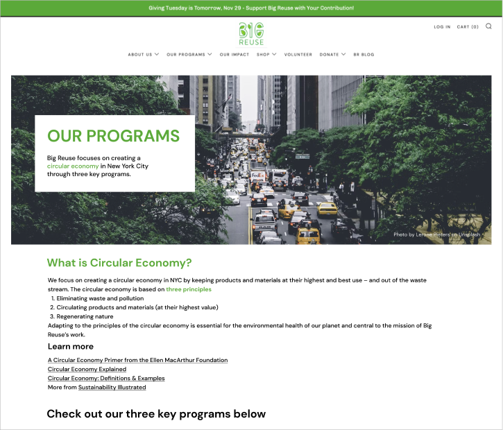
recommendation 1: Clarify the meaning of circular economy and better embed resources.
The concept of Circular Economy is foundational in understanding the mission and purpose of Big Reuse. However, on the current website, users struggled to locate the relevant information on Circular Economy and ultimately confused its definition with other pieces of content.
We recommend embedding key pieces of information from the ‘Resources’ page in other more commonly explored areas of the website. Our study showed that ‘Our Programs Overview’ is a strong candidate for placing the Circular Economy definition and resources because it matches user’s mental model to come here first to seek out this information. Placing key information in areas that match the users’ expectations should greatly improve their understanding of Big Reuse’s mission and efforts.
User quote: ”The way they treat this info now seems like it’s an afterthought.”
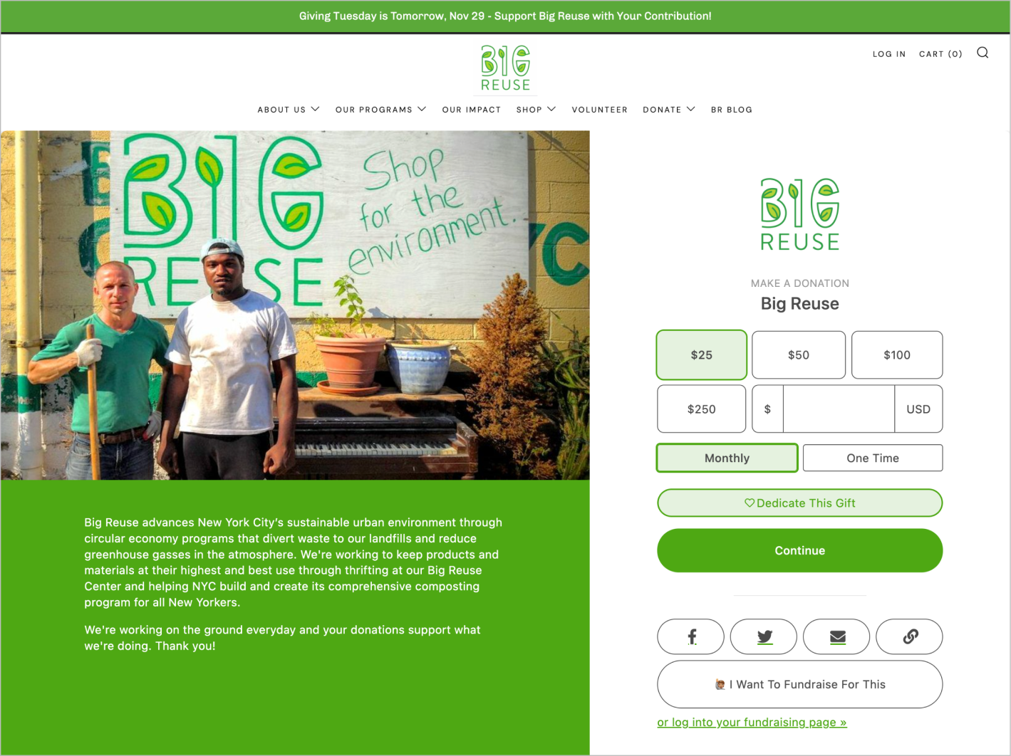
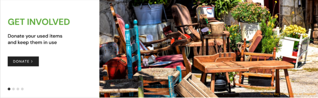
recommendation 2: Optimize the Donate page by making clear how donated money is being used.
One of the key features of the Big Reuse website is the ability to make a monetary donation to support the organization’s efforts and further the mission of Big Reuse. During the test, users struggled to complete the task, “find out what your money donation might be used for.” Detailed information on how donated money would be used did not exist, causing users to question the value and meaning of a donation.
Through the study, we found that transparency compels users to donate. They want to know what their money will support with more detail than the high-level mission statement. Our recommendation is to provide examples of what Big Reuse could accomplish with certain donation amounts, which allows users to see how their donation will make a tangible impact, beyond the broad mission of the organization. Helping users to visualize and see the value of their donation would likely compel them to donate more and reduce drop-off rates due to absence of information.
User quotes:
“I would assume it would go to Big Reuse, but I have no clue how they’re gonna use it.”
“It’s a little funny not knowing exactly what your money is going to. I want to see something like, “right now we’re focused on x or y.””
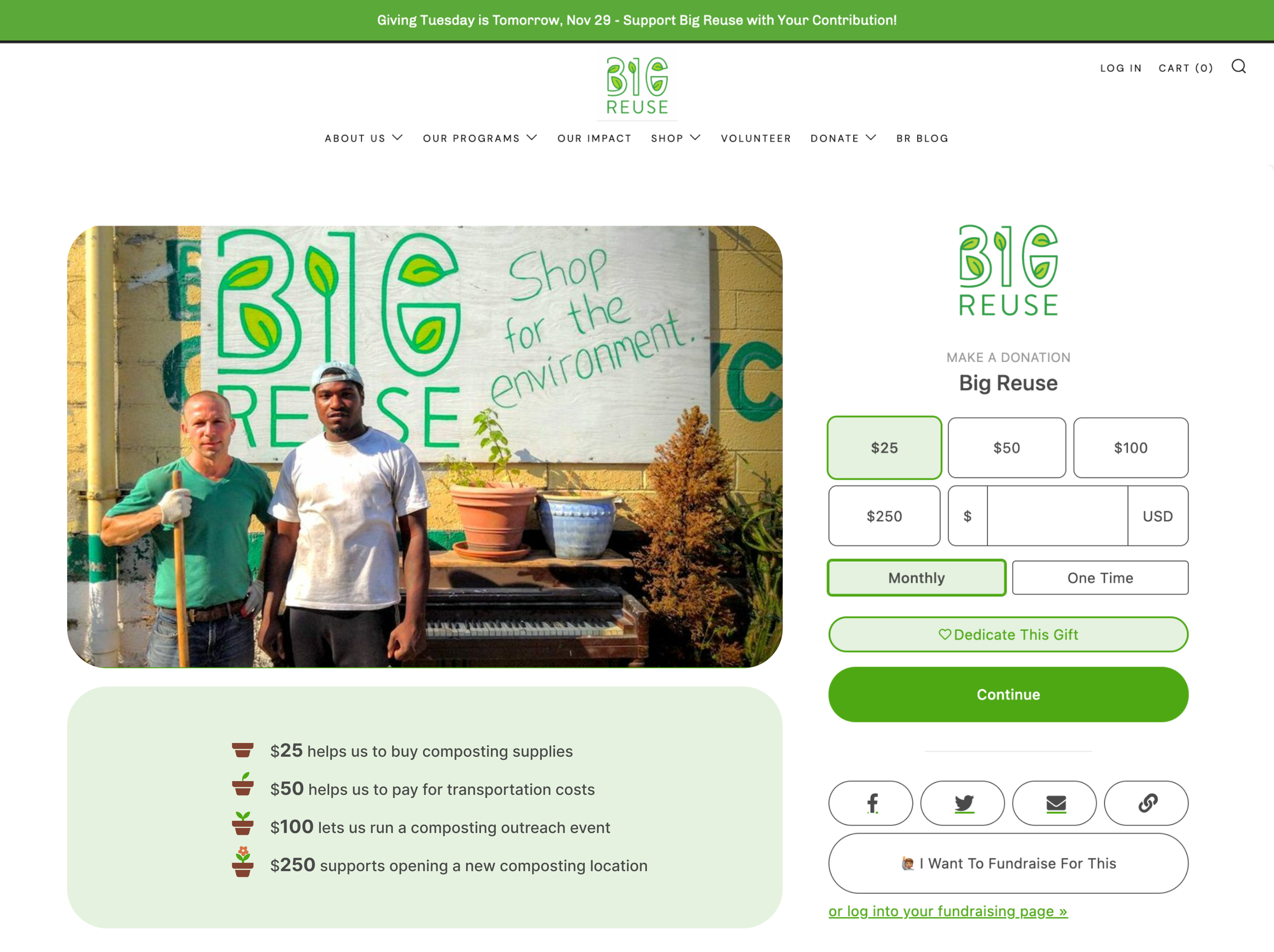
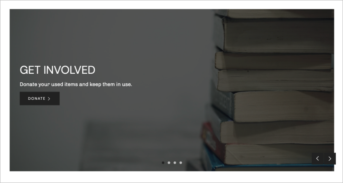
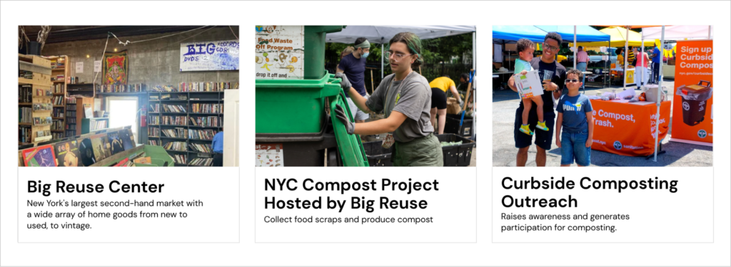
recommendation 3: Improve the use of images by avoiding showing text over photos, and selecting photos that are relevant to the presented content
During the test, three out of six participants (50%) shared the struggle of reading the content that are displayed over an image. An image background with a lot of details and uneven color caused low color contrast between the text color and the image, making it hard to read. Moreover, users stated that the image in the background created distraction because while they were reading, they were also trying to see the image in the back.
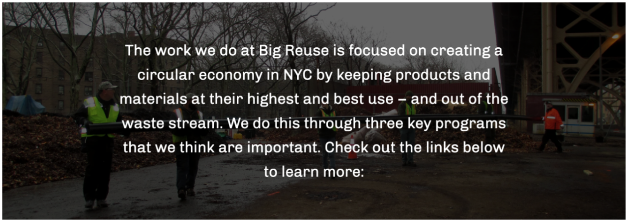
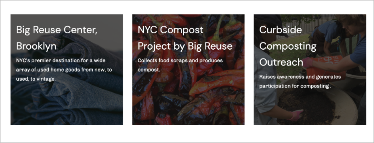
Irrelevance between images and associated content causes confusions for users. Users commented that some images look general and contain little relevance to the linked content that they think the images were generated from stock photos websites. In addition, there are images on the website that send the wrong message to the audience.
User quote: “The photo looks nothing relating to the text next to it, why is there a dog there? I first thought they were doing things with dogs, but they’re really not.”
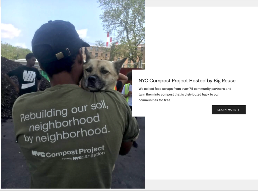
User quote: “The photo looks nothing relating to the text next to it, why is there a dog there? I first thought they were doing things with dogs, but they’re really not.”
Solution for images: Avoid displaying text over photos
This mockup shows an example of showing text and image together. The legibility of the text is higher by using a solid color for the background. In addition, by not putting an overlay, or text on top of the photo, it is much clearer for users to look at and enjoy it.
In this example, with picture and text clearly displayed, it is easier for users to read the title of the link to different programs run by Big Reuse.
Solution for images: choose photos that are more focused, and relevant to the presented content.
This is a good example of both using and displaying an image on the website. First of all, there is a strong connection between the text and the image that makes them parts of a coherent message. Secondly, by not having the picture as the background, viewers can now see clearly the title, the button, and the pagination.
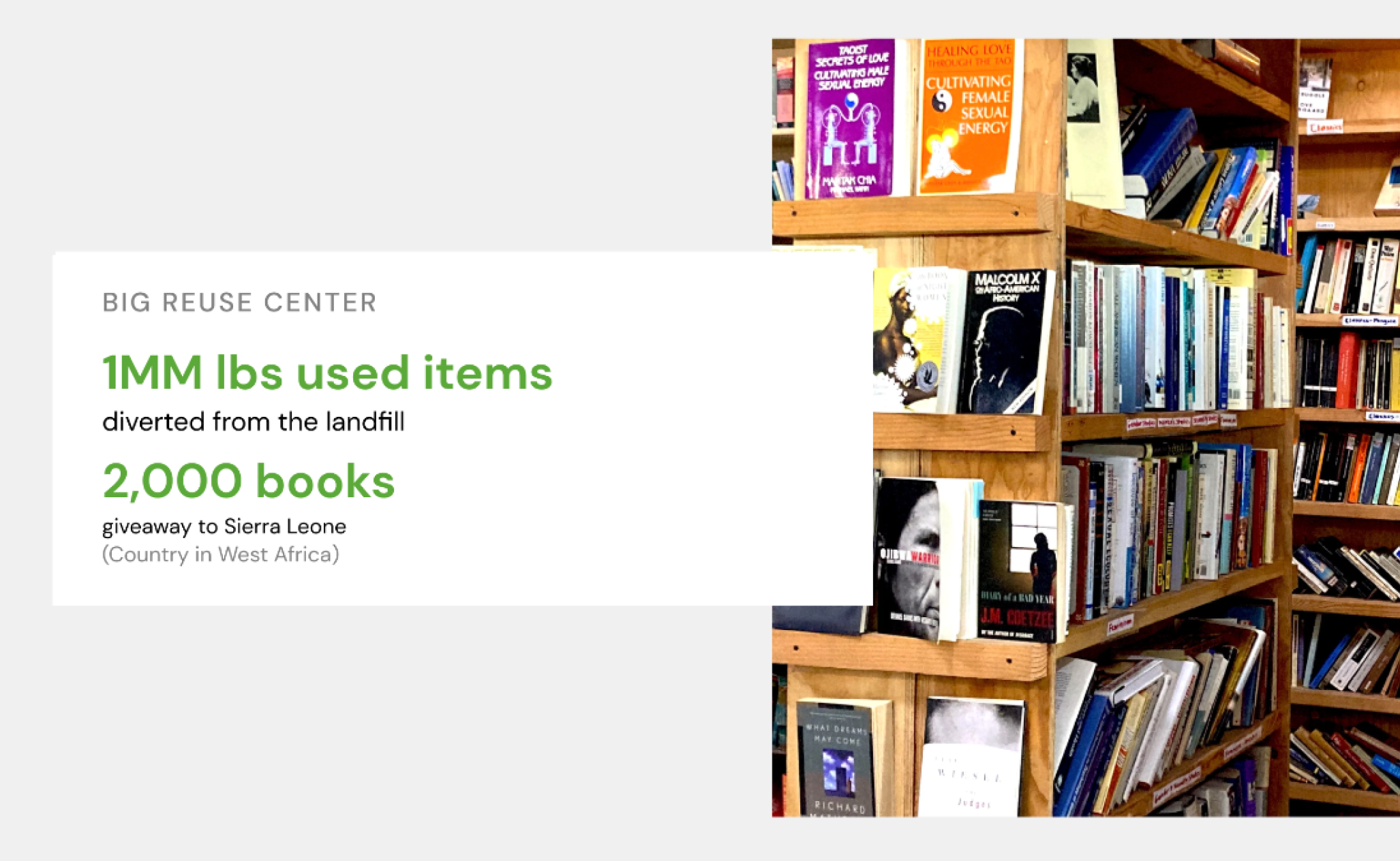
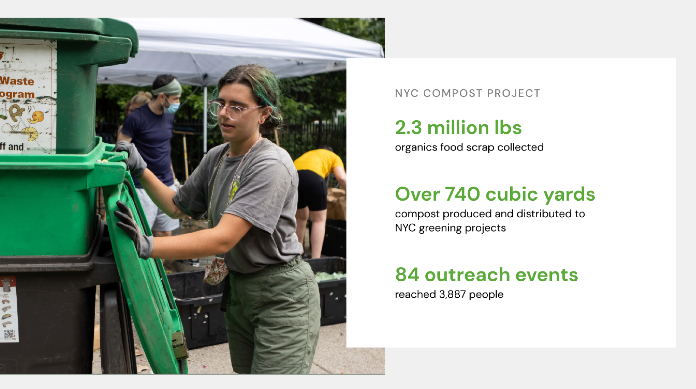
recommendation 4: Improve the content readability by enhancing visual hierarchy for text and number-heavy content
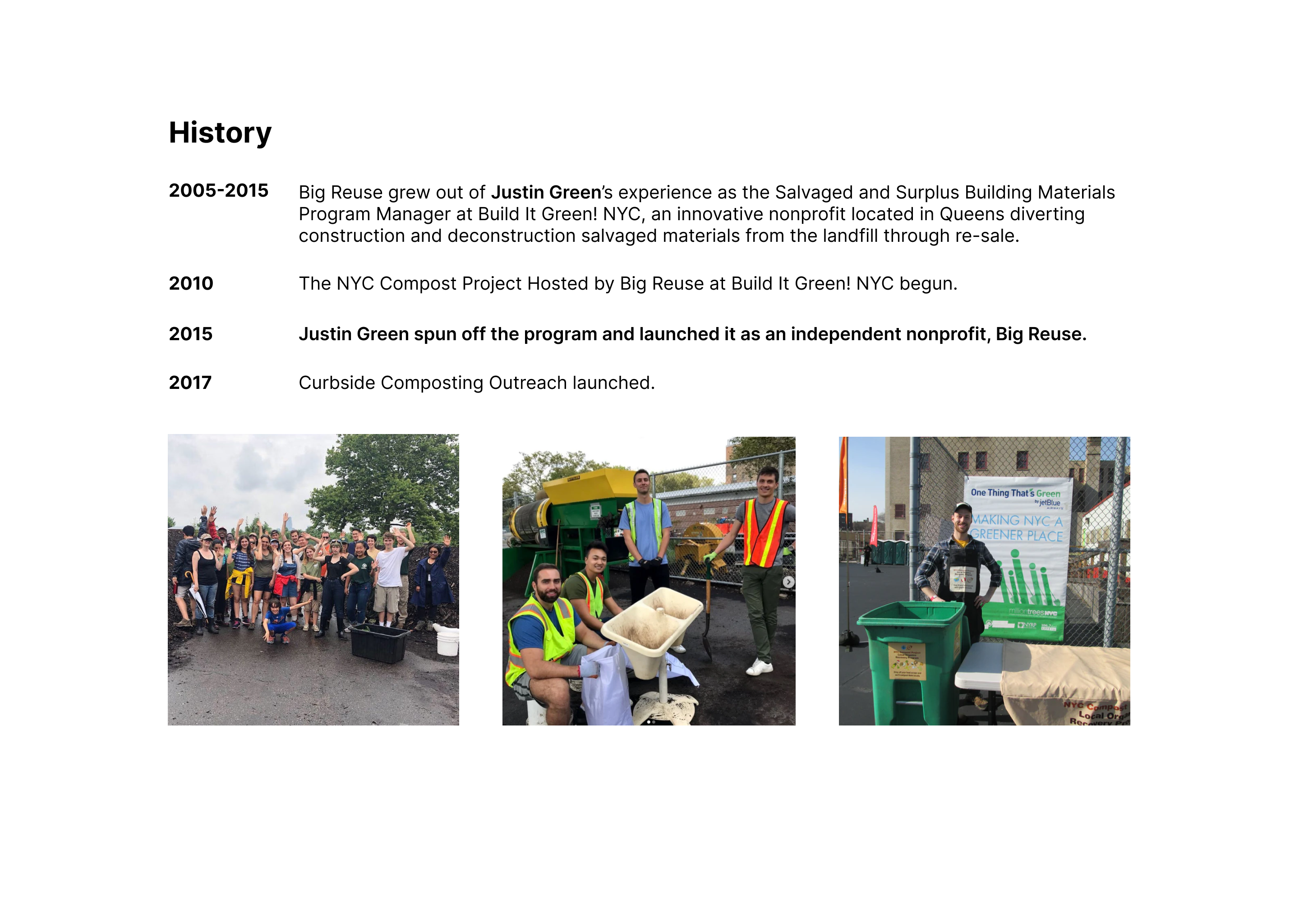
In the test, participants were asked to find out what Big Reuse does, how long they’ve been operating, and find out what impact the composting programs have had on the community. While most of the users in our study understood what Big Reuse does, all of them expressed their confusion about the date in the history part on the About us page. It was difficult for users to find important information about Big Reuse in a block of text. On the “Our impact” page, users were overloaded with too many numbers.
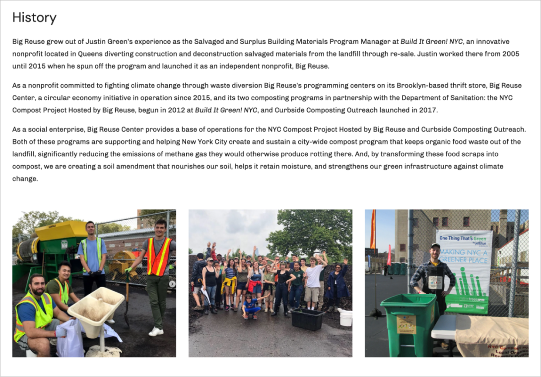
User quote: “It seems like the years are a little confusing about if they have started since 2015 or 2010.”
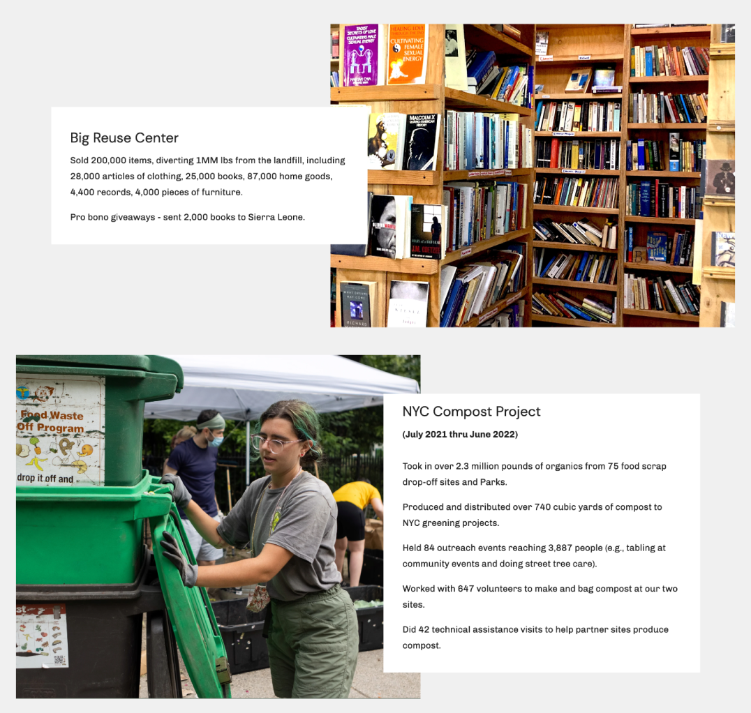
“Hard to keep straight what number applies to what, and can’t determine whether or not it’s impressive or the scale.”
“Sometimes you get a little lost in all the numbers.”
Solutions for content readability
On the About us page, we recommend using a two column layout to show the history information. By separating the important dates and the events, and keeping them in a vertical timeline, it is clearer for viewers to see the dates directly and know what happened to Big Reuse during that period.
On the “our impact” page, we recommend using larger and bold text for key numbers to increase visual hierarchy. In addition, implementing whitespace around blocks of text and color contrast will help audiences capture the important information easier.
Conclusion
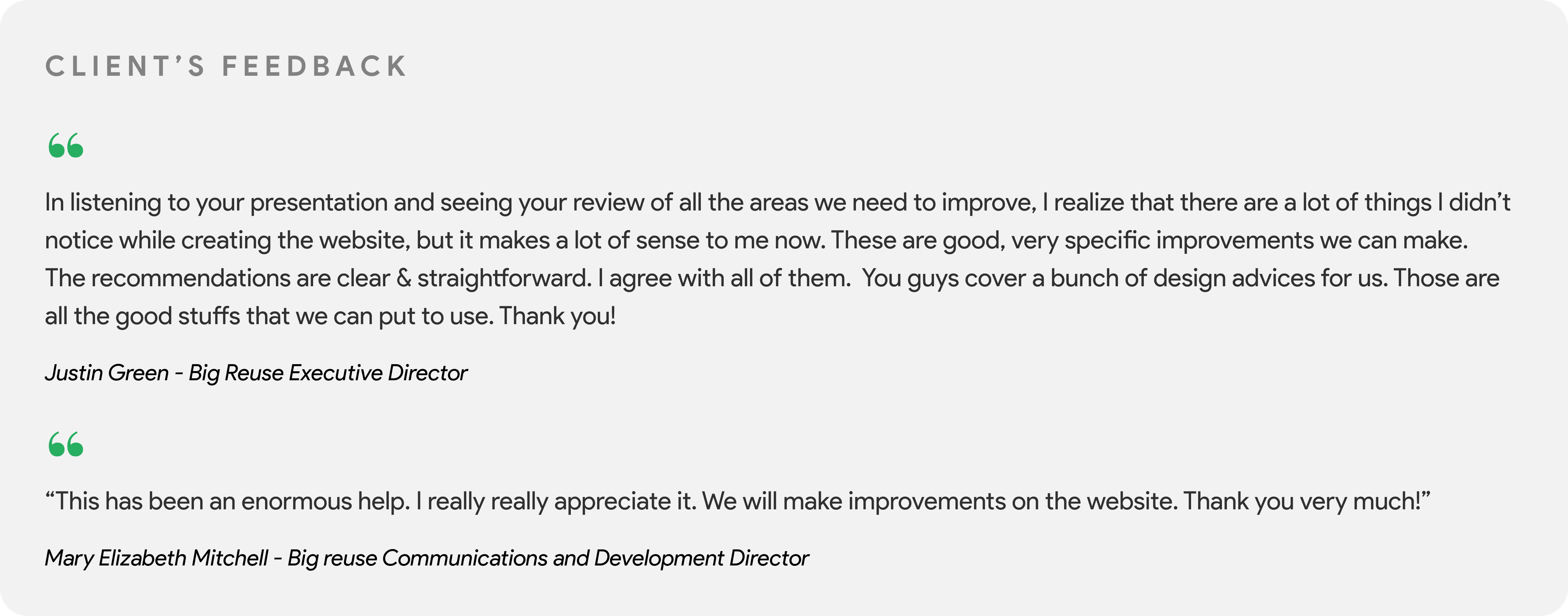
Findings from the study and recommendations were delivered to our client in a final report and a presentation.