
MYmta application for iOS is an all-in-one solution from New York MTA. It serves the transit users in and around New York City, having schedules, maps and alerts (including real-time updates) for Subway, Buses, LIRR and Metro North trains. The app itself seems to be running a slightly modified version of the mobile website as the visuals and interactions remain the same across platforms.
Homescreen
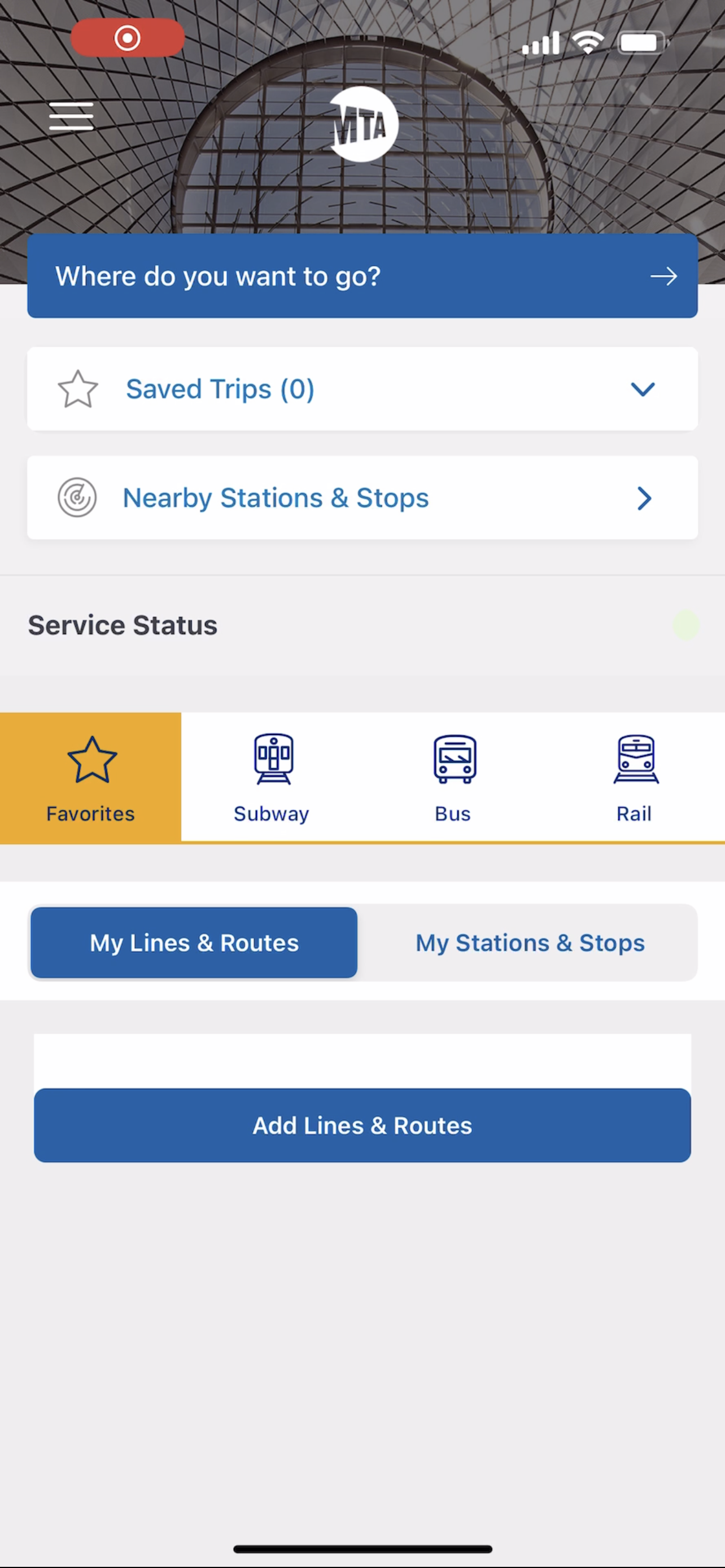
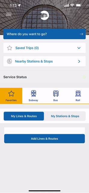
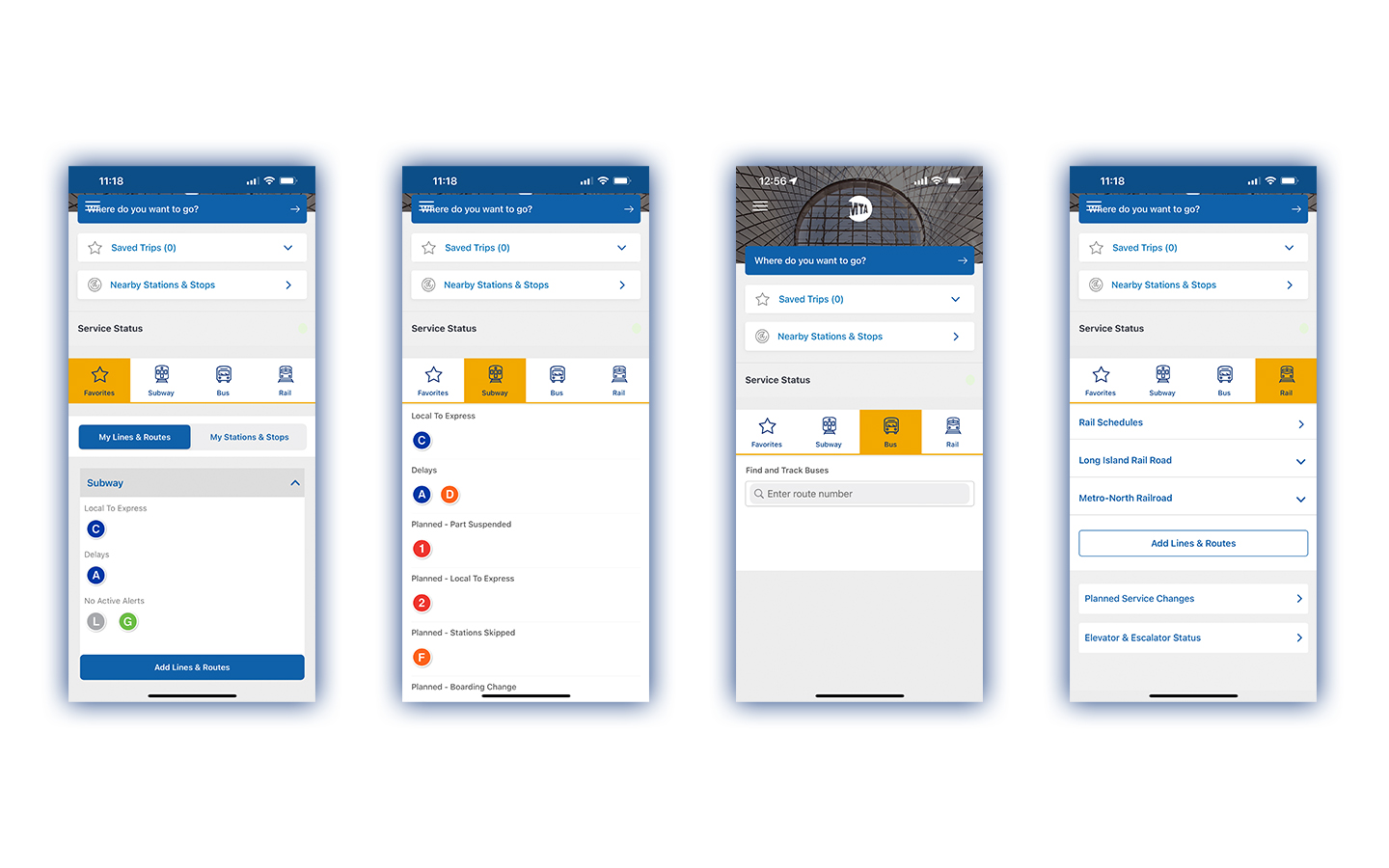
The homescreen displays a few options with ‘Where do you want to go?’ button distinguished as the primary interaction. The button is colored differently but lacks the search symbol that could improve discoverability.

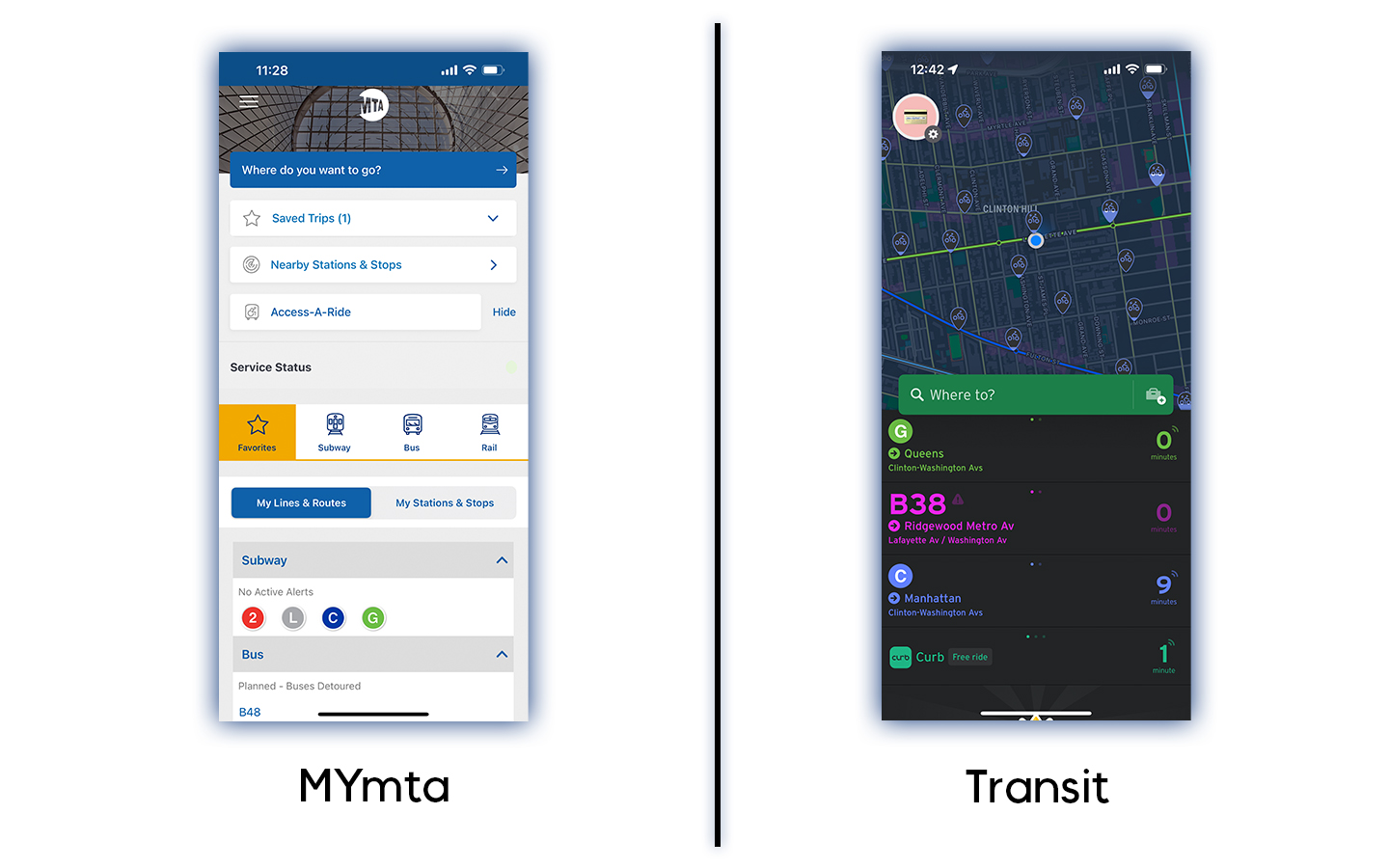
While the app provides many options to see nearby transit lines, the user needs to go into the ‘Nearby Stations and Stops’ CTA (call-to-action) button. Instead, the app could switch to a more intuitive landing page like ‘Transit’ app which lands you on what is nearby and the possible destinations using those transit lines as soon as you open the app. This enhances ‘discoverability’ of transit lines nearby without having to dig through options.
Personalization
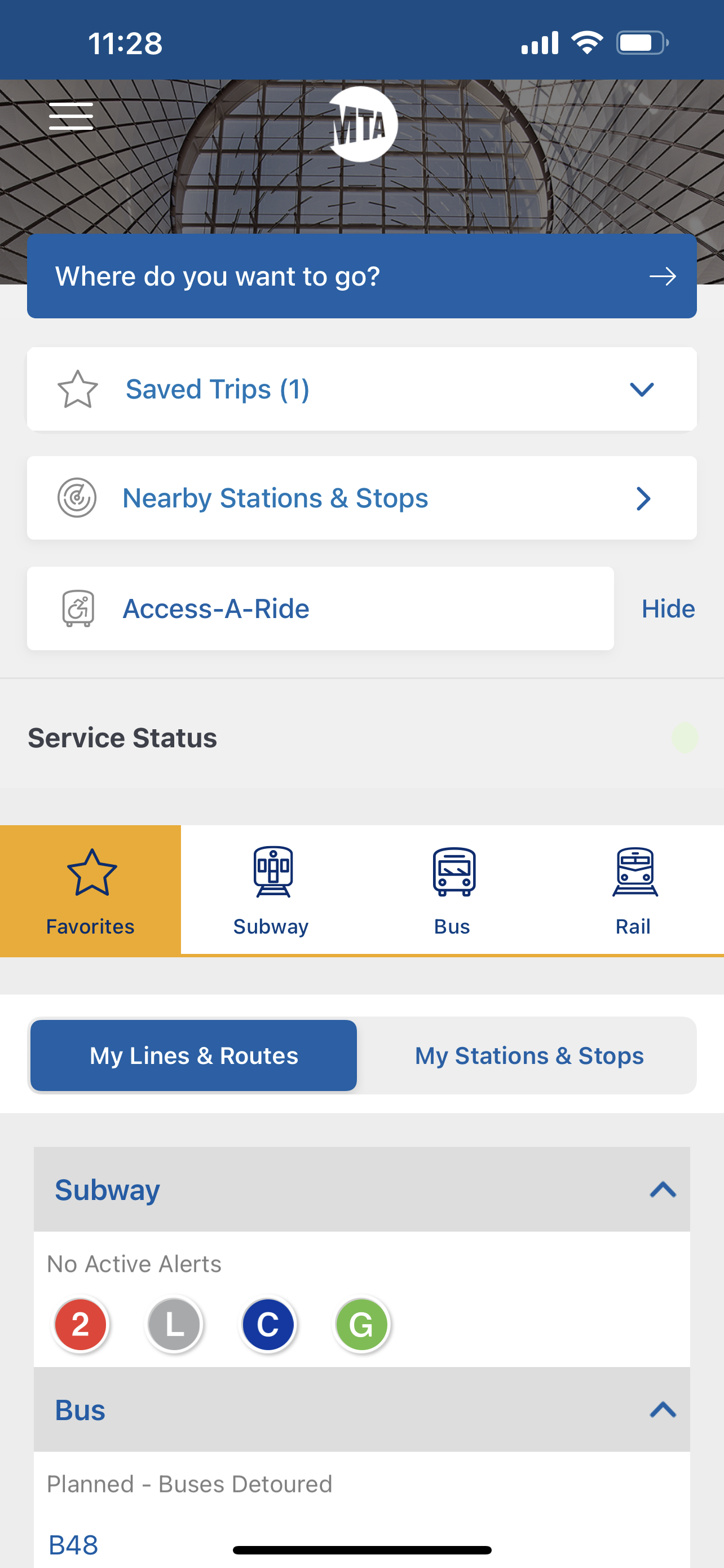
The app advertises personalization, this claim is somewhat justified as the user can save routes, favorite subway lines and buses. One could also remove elements from the home screen for a clearer interface for a more ‘minimal interface’.
The app heavily relies on the user’s input and personalization as the default tab is favorites and it would not show any information if the user has not set any favorites. The alerts are also only visible for the selected transit lines which might indicate all the transit lines are fully functional.
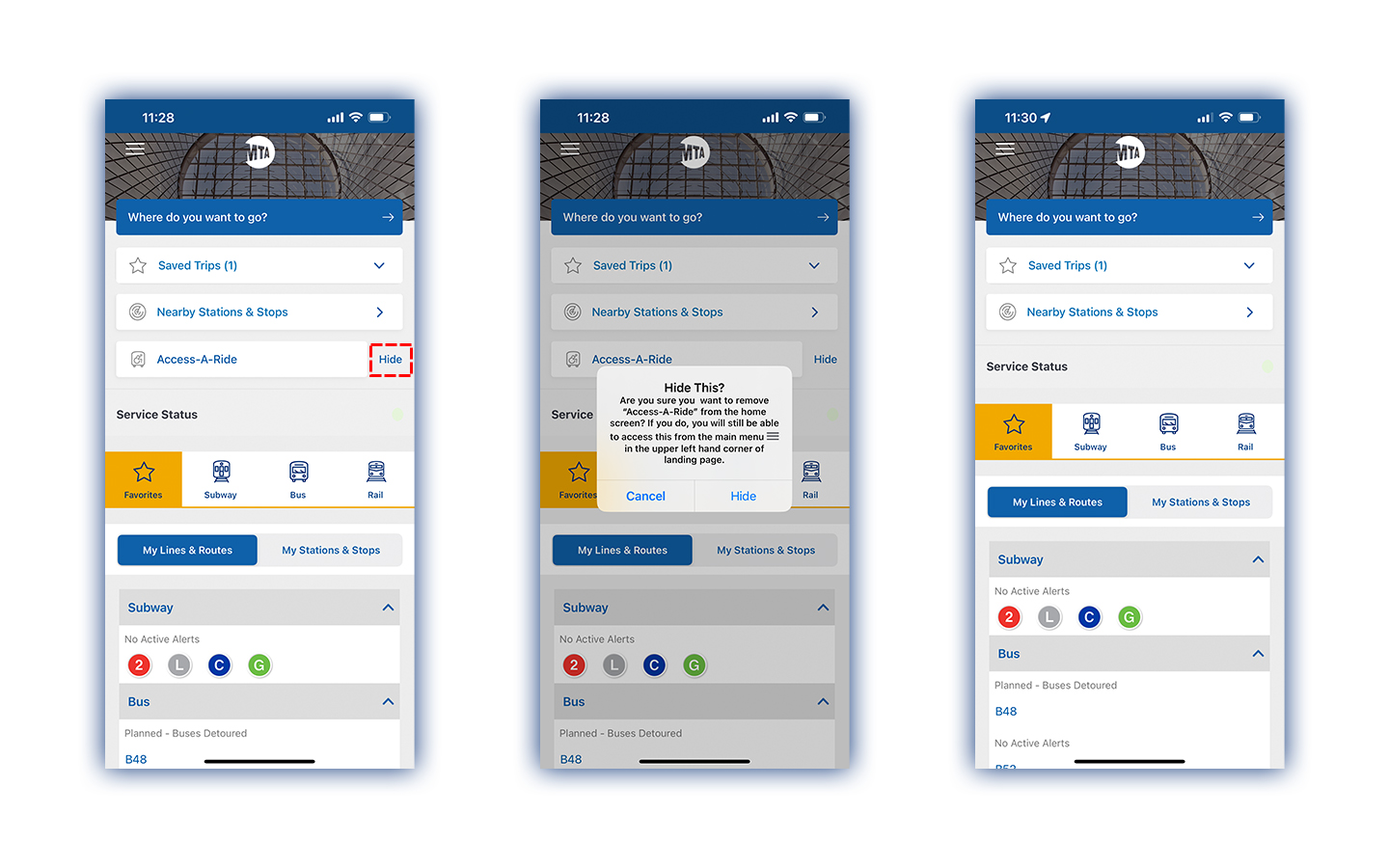
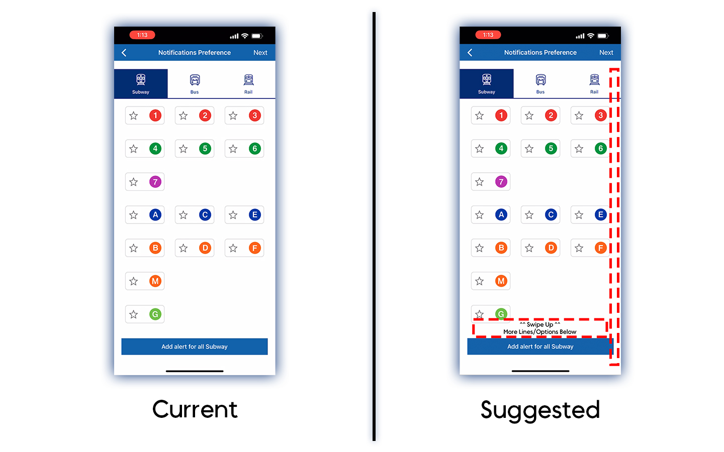
Adding subway lines to favorites is an easy process, but the interface lacks signifiers that might be helpful for the user, for instance the screen listing subway lines for selection looks like all the options are displayed however there are items beyond what is displayed. This particular screen can be improved by adding a scroll bar or adding a label indicating there is more content below.
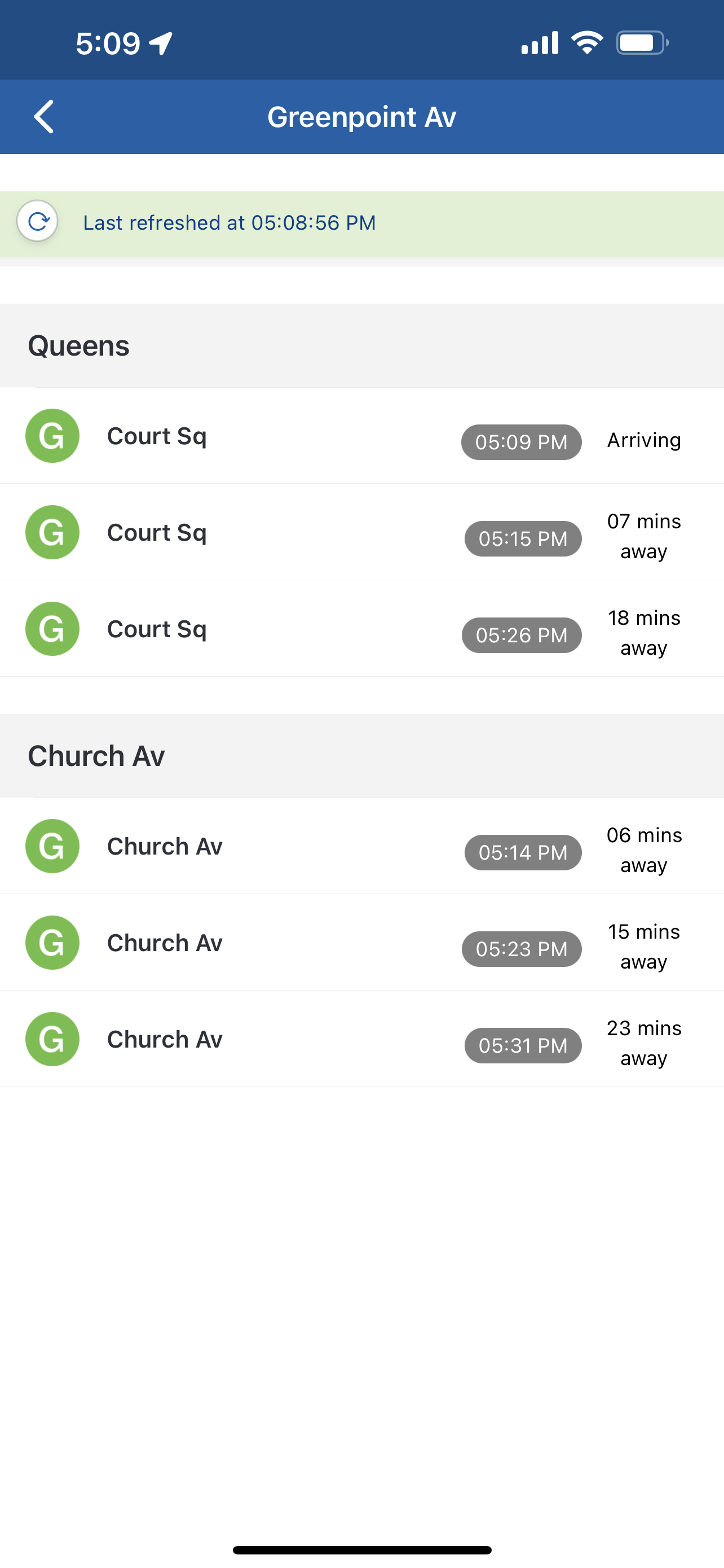
Train – Stations, Tracking and Alerts
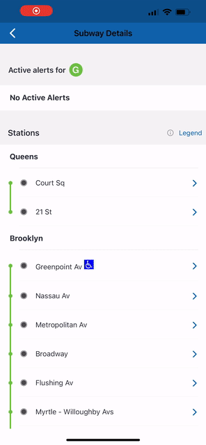
When the user reaches the details page for a particular subway line, active alerts (if any) are shown on the top, followed by the list of stops for that train. However, the stop in the closest proximity is not indicated. The user must have ‘declarative knowledge’ about the area and nearby stops. Once the user clicks on a stop they can then see the trains scheduled at that stop.
Consistency
The MYmta app also struggles with consistency, the 4 tabs on the bottom half of the screen have a different display for each one of them, the arrangement and points of interaction change completely amongst each. One might show you all the available options white the other one shows you a search bar. I have been using the app for a while now so I remember how each tab works but, it is evident that the app relies on the user to ‘learn their way around the app’. The app may not be easy to navigate for first-time users.
Conclusion
The MYmta app tries to achieve a lot of things on a single platform but, instead of making things easier for the commuters it poses as another process to learn. The app has a lot of information and functionality built-in but struggles to deliver it in a seamless manner. The navigation throughout the application can be improved by making searching for destinations and nearby transit stops the main focus of the homescreen. A lot of visual disparities can be improved by using a different and dedicated interface for the application rather than just trying to make the website fit into the application. Overall, the MYmta app could improve by adding more consistency across the board and adding constraints to avoid errors and slips.