Spotify is a music streaming service that can be used by subscription. With a mission to “unlock human creativity”, their goal is to provide a platform for artists to showcase and sell their music, and a space for millions of fans to enjoy and share music as well.
Like many applications of this day and age, they aim to maintain a minimal interface and smooth workflow– however, there are multiple points of improvement despite providing a generally positive user experience.
Log-in Page
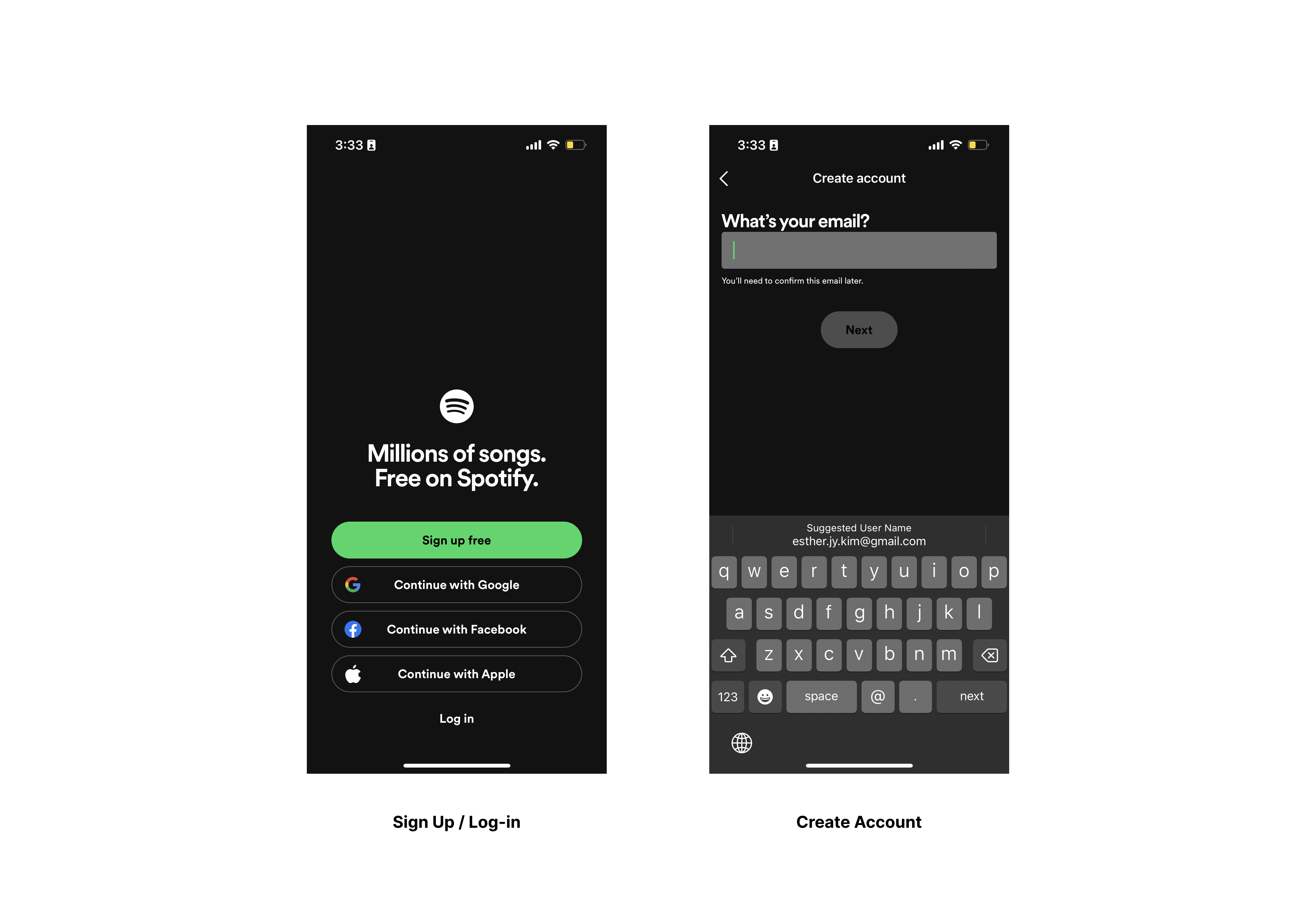
This is the first page that users will encounter upon downloading the mobile application. This page affords users the ability to sign up, or log-in, whether through another application, or through entering a username and password. Feedback is immediate on all 5 action items on the first page, with immediate redirection to the next step. However, it is worth noting that while 4 of the action items are white bold text, the “Sign up” button has a different visual design. While discoverability seems not to be a problem, the discrepancy between the action items prevents from a clear indication of where users should act.
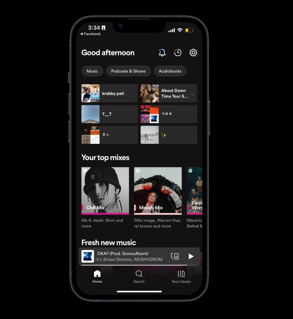
Browse/Search Music
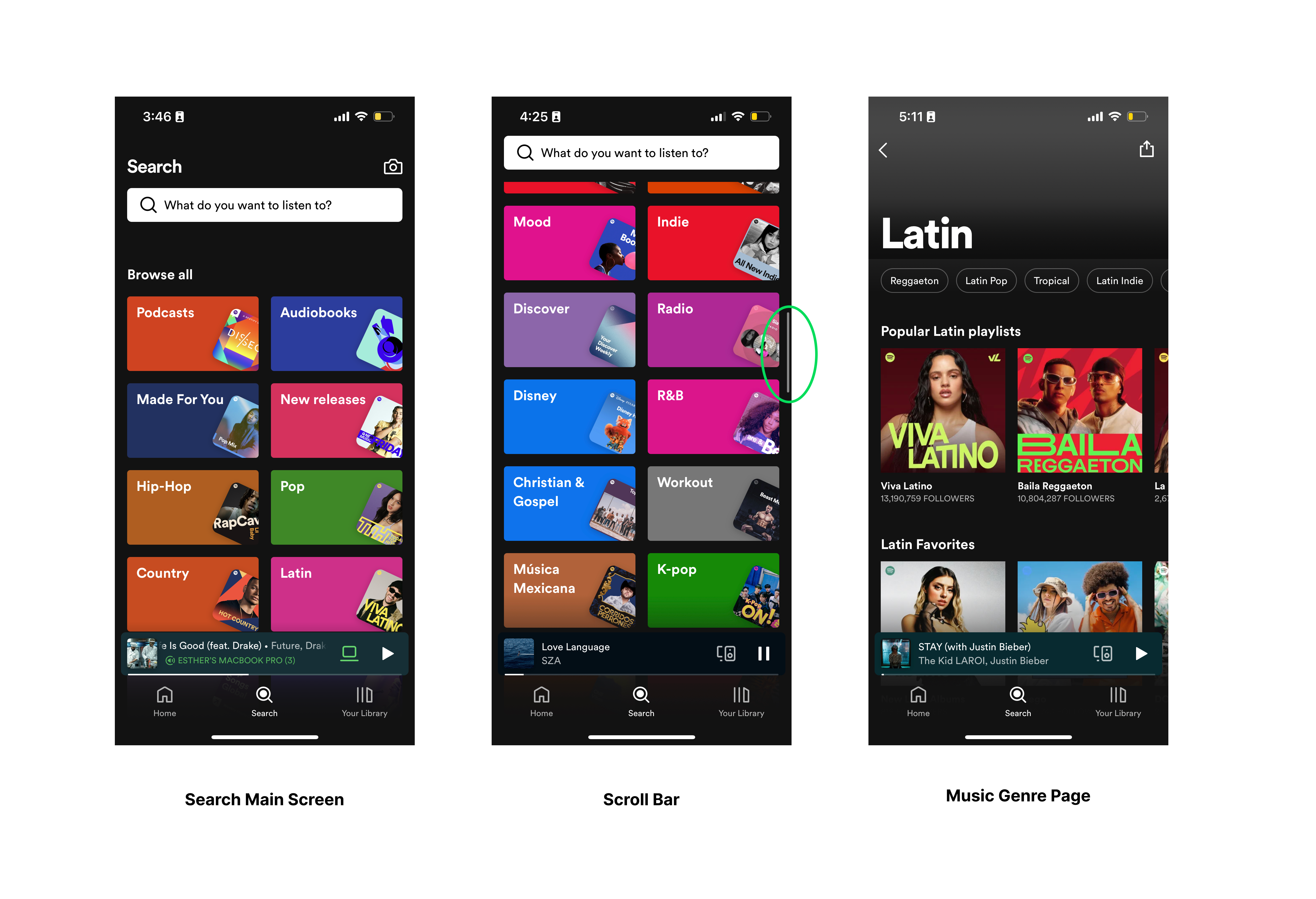
The Search screen is quite simple and direct, and allows for high discoverability for music pages. Users can directly navigate to this screen by pressing the “Search” icon on the navigation bar. Then, they are presented with a large search bar and a list of icons that present a handful of music genres. This page also efficiently signifies to the user when they are at the bottom of the list, how much further they have left on the page. Spotify effectively makes use of constraints by including a scroll bar on the side, so that users will not be confused as to where the list ends.
Navigation Bar / Button Design
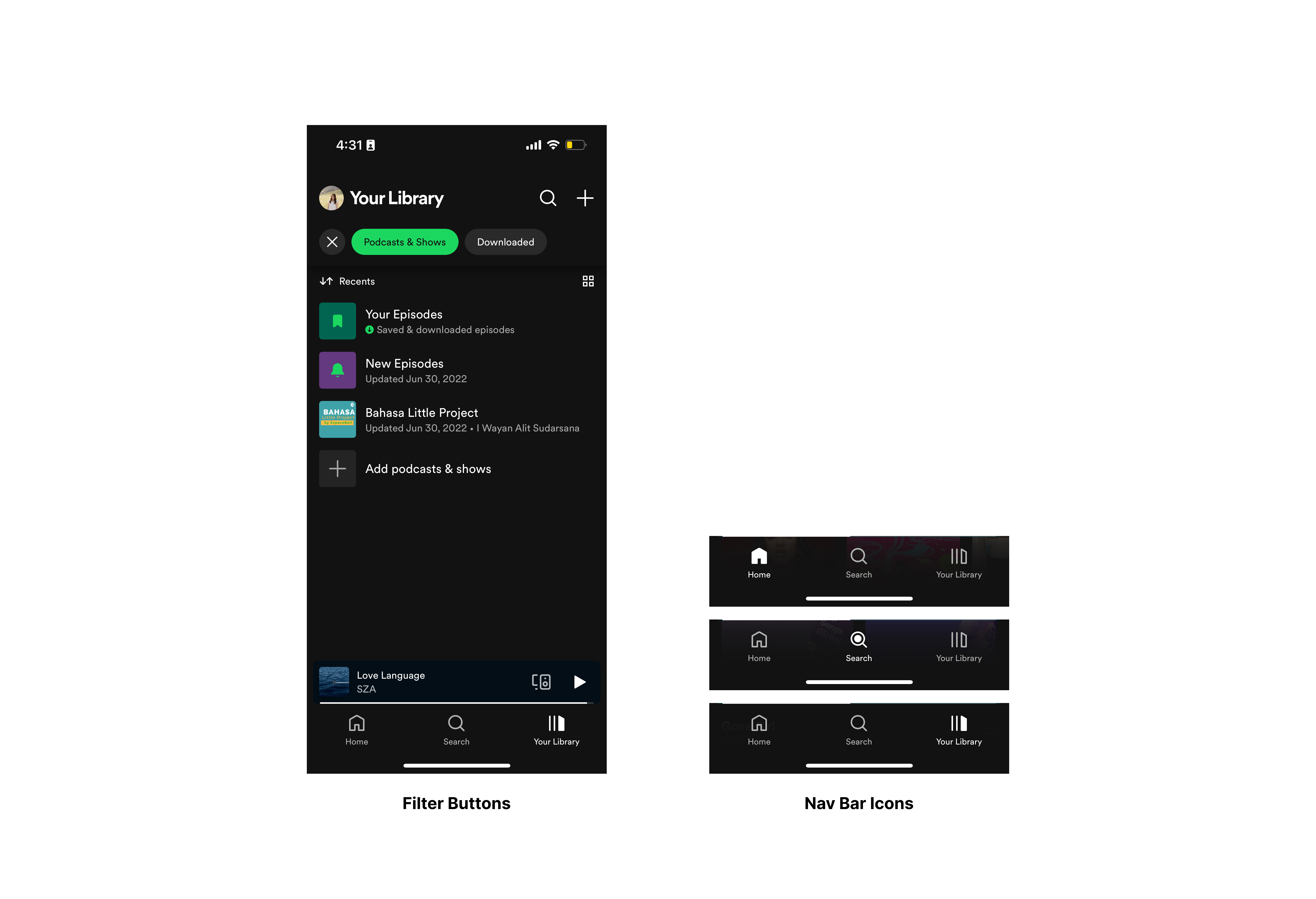
Overall, the application has done a great job of designing with natural mapping. For example, this navigation bar, which remains at the bottom of the screen throughout the entire application, gives users a clear understanding and idea of how to accomplish different tasks and needs throughout the application. With the navigation bar, however, keeping the inactive icons as a white outline, and having the “active” form be a filled green icon might do a stronger job of indicating to users which page they are on, and it would be consistent with the active button shown in the “Filter Buttons” image.
Liking Songs
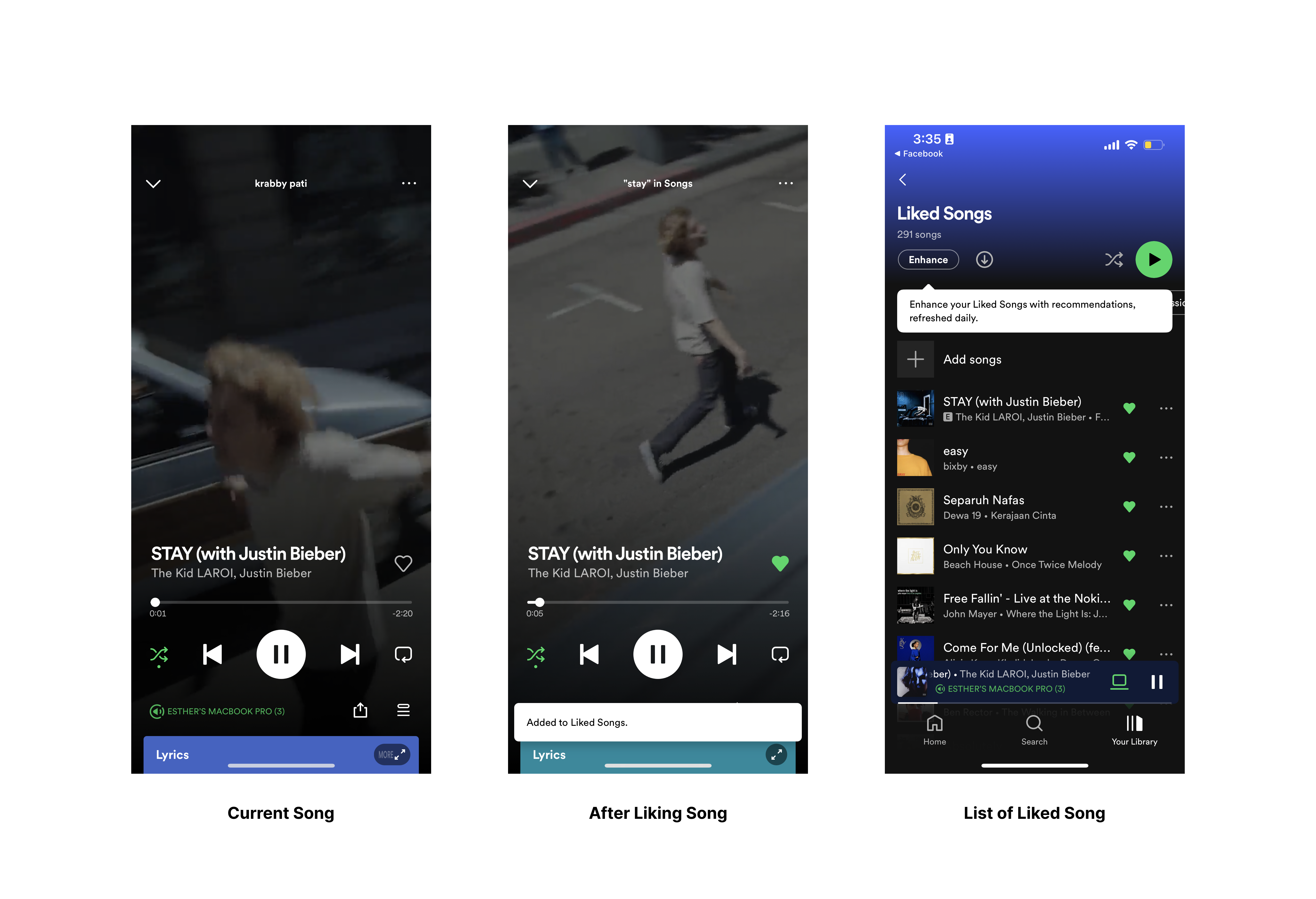
The process of liking songs on Spotify was another example of favorable feedback. However, the layout of multiple icons and shapes might confuse first=time users, and they may not be fully aware what exactly they can press and how to like a song. A slight adjustment that could improve this would be to increase the line weight of the heart to be the same as that of the other line-based icons, such as the shuffle or repeat buttons.
Conclusion
Spotify does a great job at increasing the likelihood of users to discover new music, while also streamlining the process by including features like the genre list, or suggested/curated playlist icons on the homepage, etc. Feedback is clear and immediate for all action items I tested, although it might be worth it to include some more animated or noticeable feedback on the pop-up bars when songs are “liked” or added to playlists. Generally, one of the main issues that arises within the Spotify mobile application is the strength of its signifiers. Because of the inconsistency of design across buttons, links, and other actionable items, confusion arises as to what indicates an active item, an inactive item, or a disabled item.