Method
Moderated User Testing
Client
Airpals
Timeline
6 weeks, March – May 2023
Team
Anne Kuo, Lalita Chavan, Mary Haws, Priyanka Jain, Sara Sarmiento
Tools
Google Docs, Google Sheets, Google Forms, Zoom, Figma, Doodle
Introduction
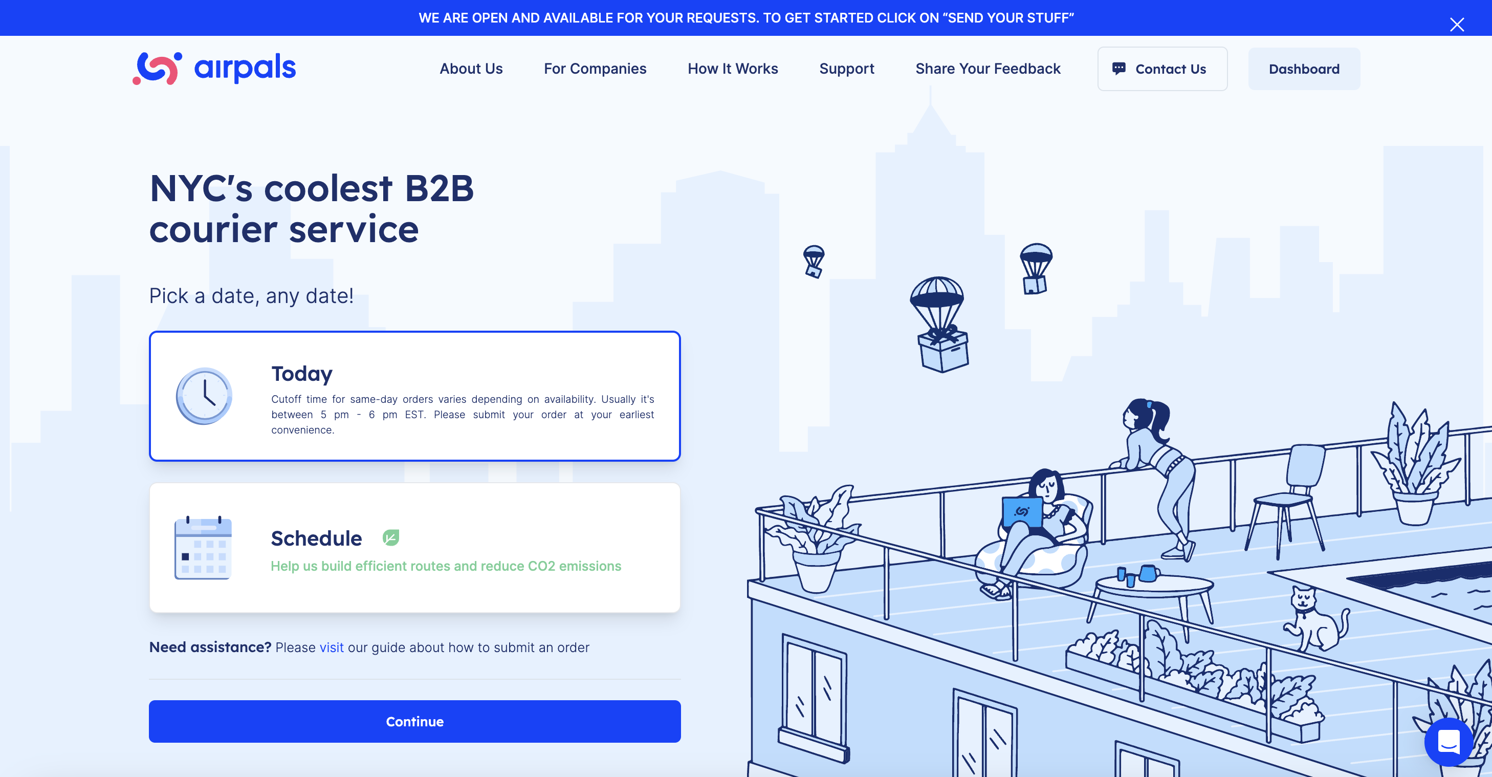
Airpals is a B2B courier service based in New York City. Airpals is a relatively young company, operating with a small team with few resources to spare for research, thus our usability testing was especially valuable to the company. Our usability evaluation focused on their order form for scheduling a courier pickup and delivery, which is at the heart of the business. We recruited participants who fit the company’s user profile—people working in New York City based companies who would use a delivery service for work—to conduct moderated user testing of the interface. After analyzing our results, we provided Airpals with 6 recommendations for larger issues, and an additional 4 recommended adjustments for smaller, but nevertheless important, issues.
Recommendations
- Streamline the flow for inputting parcel details
- Clarify pick-up & drop-off instructions
- Improve flexibility and consistency for time selection
- Reinforce user control when editing order details
- Increase error salience with more signifiers
- Provide feedback and flexibility for address selection
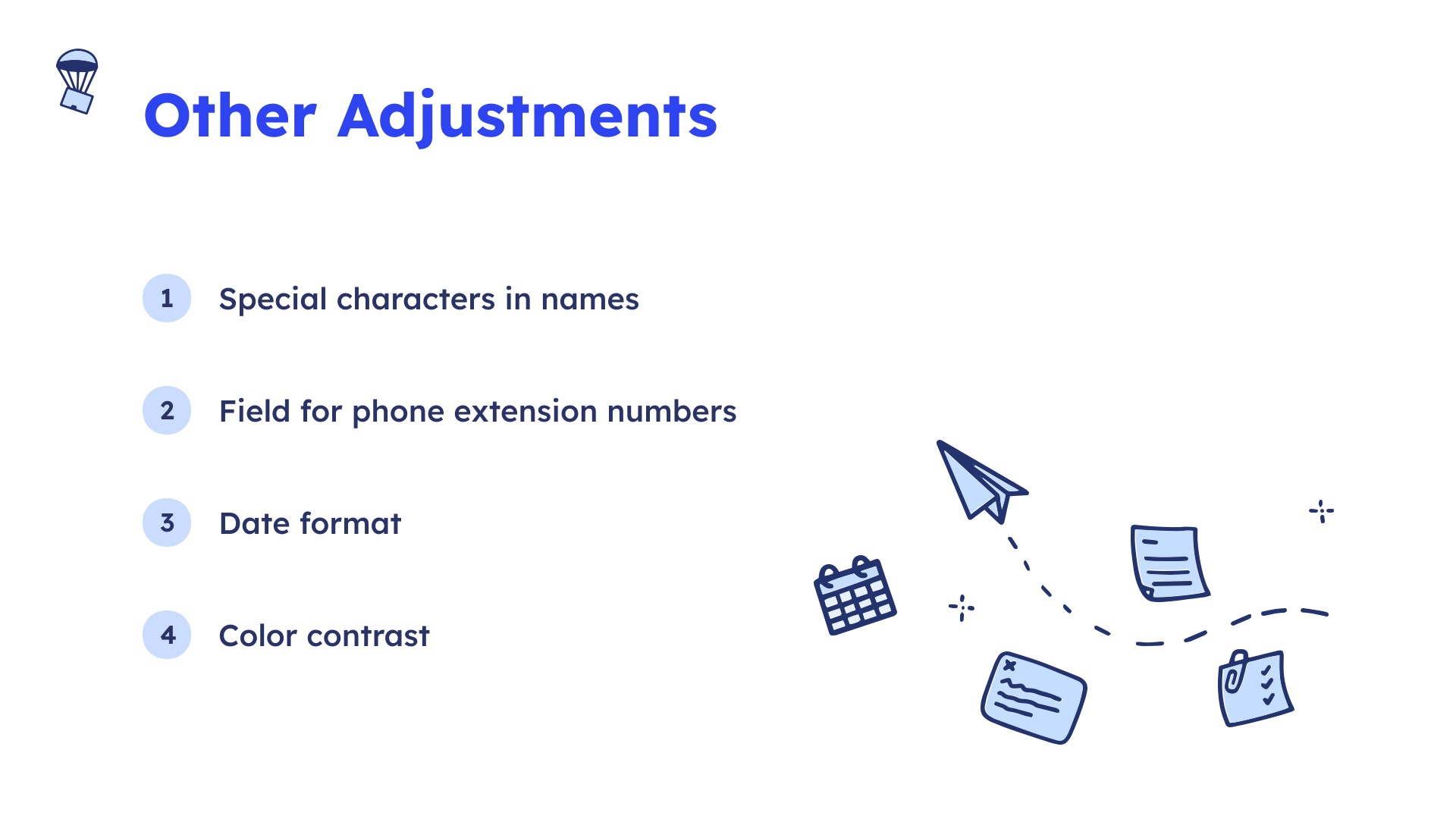
Adjustments
- Accept special characters in names
- Add a field for phone extension numbers
- Ensure consistency of the date format
- Increase the color contrast
My Contributions
As a team we all fully contributed at every step of the process—planning, recruitment, moderating testing and taking notes, data analysis, preparing a presentation and report, and communicating with the client throughout. As the only person on the team who had lived and worked in New York City for a long time though, I offered inside knowledge of the professional world in NYC, and was able to recruit two participants from my social network who specifically use courier services for work. I also contributed as a copy editor, and was able to offer additional support to the team in the form of project management recommendations over the course of the study based on my experience having managed large projects with tight timelines in the past. When it came to preparing our presentation and report, I took responsibility for our 6th recommendation, as well as an additional 4 smaller recommendations that we dubbed “adjustments”, and wrote the conclusion for our report.
Evaluation Focus
The evaluation focused on the core of the Airpals website—the form for placing an order for a courier delivery service. The order flow consists of 6 pages—when, where, time, how, pay, and review. The “How” page had especially been a pain point for Airpals, so we paid particular attention to that page during testing. This was the page that took the longest for users to fill out, and users were also neglecting to add “pick-up” and “drop off” notes, which were essential for couriers to be able to access buildings for pickups and deliveries.

Preparation
To kick-off the project, we first met with the Airpals team to discuss their concerns and goals. Based on that initial meeting, we established the scope of our testing and our user profile. We then prepared a detailed plan and script for testing, recruited participants that fit our user profile, and scheduled remote testing sessions.
Test Planning
As the order form is the backbone of the Airpals website, we were always going to center most of our testing around that. However, we also considered several other facets for inclusion in the testing, such as finding the order form and order tracking.
We were interested in user behavior after placing an order. To simulate the whole order process, we discussed having participants attempt to track an order after placing an order, but we could not find a way of realistically simulating order tracking. We discussed having participants view a pre-generated confirmation email, but also felt that would be too artificial. To gather more information on user behavior after completing the task of placing an order, we eventually decided to ask users what they would typically do next after placing an order.
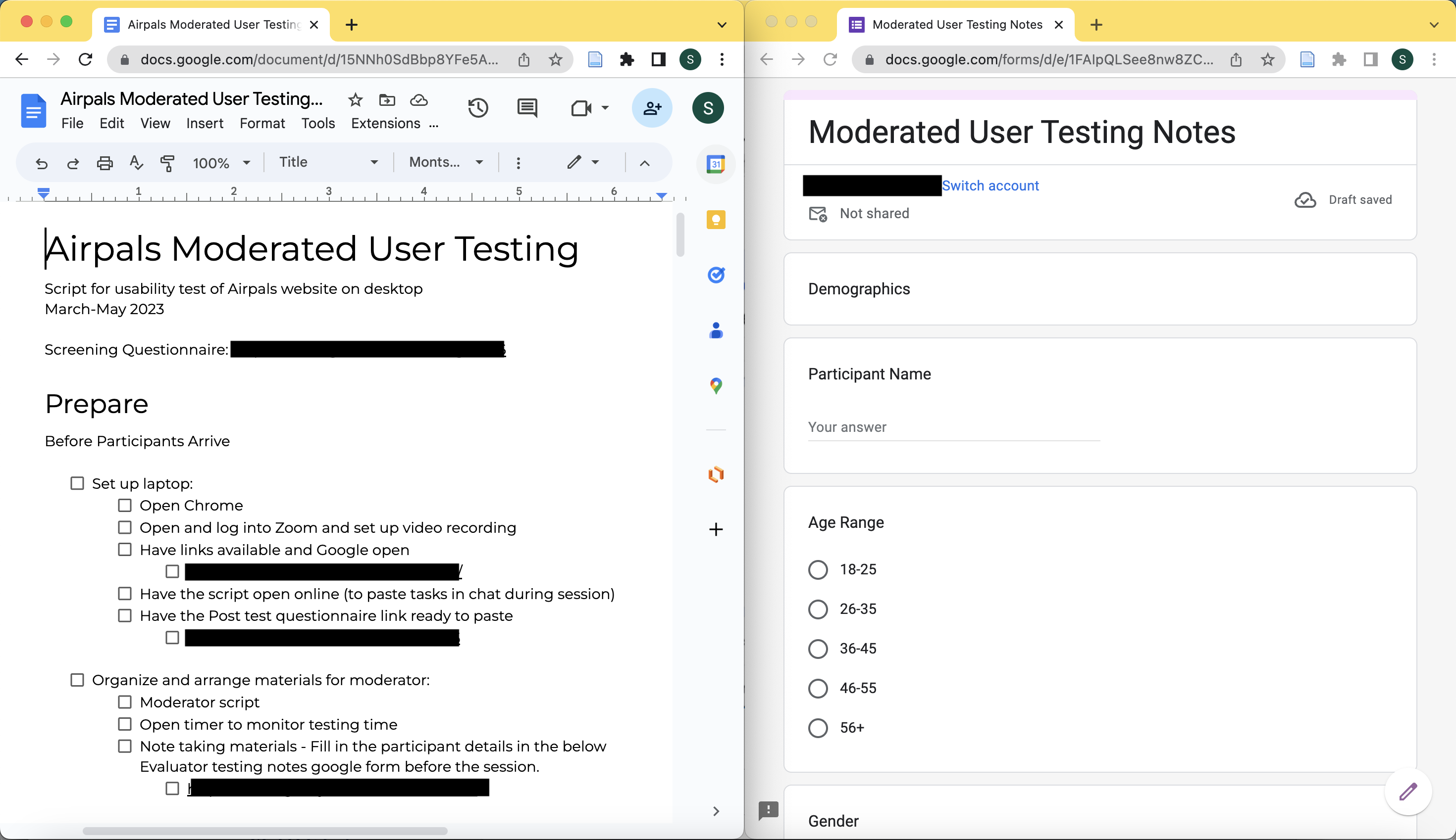
After careful consideration, we settled on keeping the test focused on the order form, which in and of itself was a lengthy and detailed process. We then developed a detailed script for us to use for testing, as well as a google form for note taking during testing to facilitate data analysis later.
Our scenario for testing was:
Just like you have used delivery services before, you will be using Airpals today to send a package to me at the Pratt Institute Manhattan campus (144 W 14th St, New York, NY 10011) from work. Think about the last thing you had to deliver or something that you deliver frequently and what items you were sending.
Our final task was:
Locate and complete the order form to send a package to me with delivery on the next business day. Remember to think about the last package you sent or one that you’ve sent before when filling out the form details.
Participant Recruitment
The user profile we developed was based on user profiles and insight Airpals shared with us. As their users came from a broad range of industries, we decided not to restrict our participants based on industry. Most importantly, Airpals is based in New York City, so we restricted participants to people working in companies based in NYC. We also wanted participants that would realistically use a courier service for work.
To recruit participants, we created a screening questionnaire in google forms that asked basic demographic information, and would screen participants for our specific criteria—NYC based work and likely to use a courier service. In our recruitment screener we chose not to use the word “courier”, but instead said “third party service” as we did not want to exclude people that may have used something like uber to send things around the city. However, in retrospect, we should have used the more specific language, as some of the people we recruited had actually not used a courier service and had used services like FedEx or UPS to make deliveries for work.
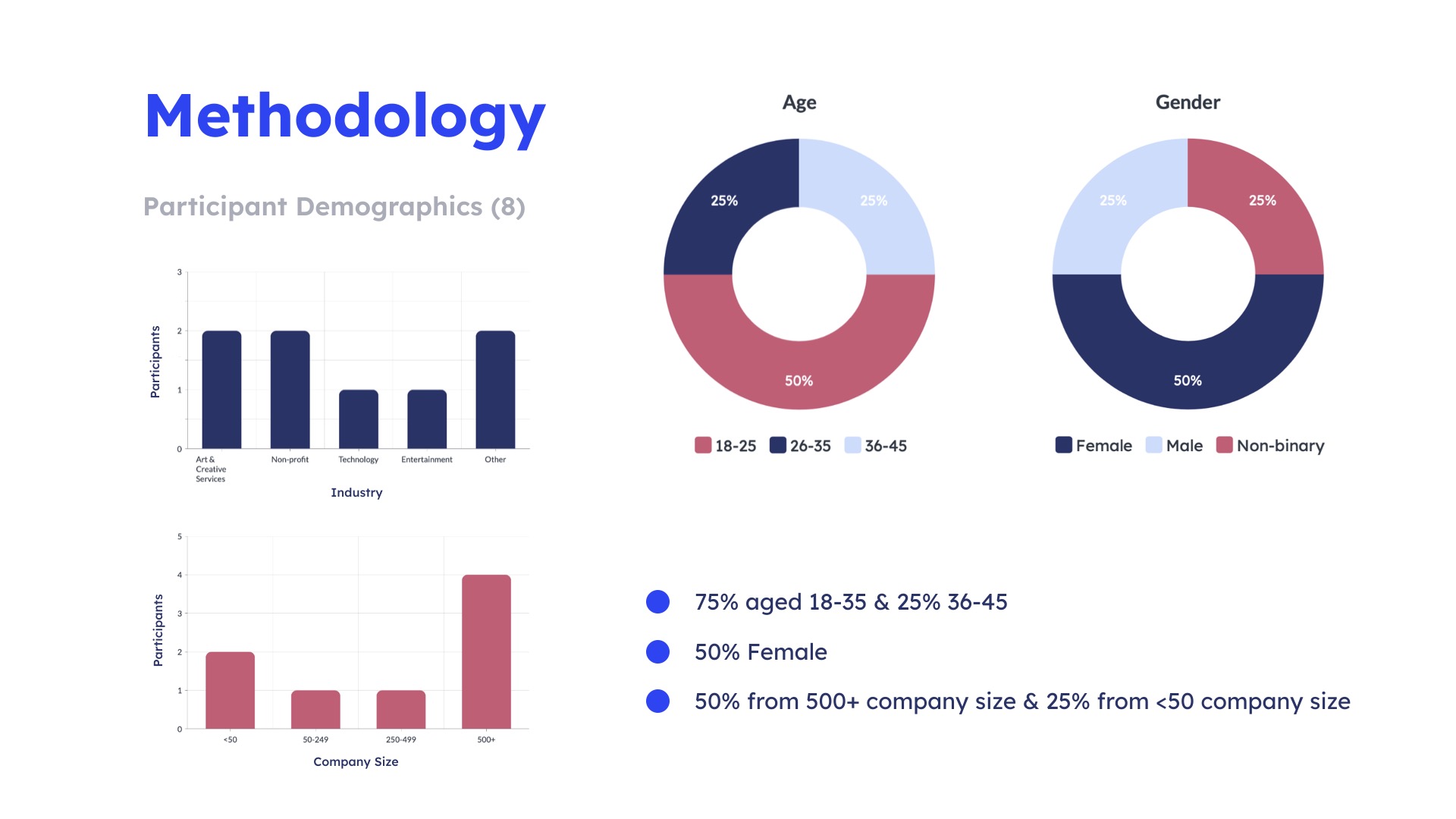
We sent the screener out to the Pratt listserv. Most of our participants came from the listserv, but those of us with contacts also reached out to people in our social network. I recruited a former coworker who I know frequently had to have things sent around the city, and another friend who had used a courier service frequently in their last job responded to my appeal over social media. In the end we recruited 12 participants, ran tests with 11, and counted 8 for our final analysis as the remaining 3 had not adequately met our target user criteria.
Remote User Testing
We scheduled each moderated user testing session using Doodle. For each session we scheduled one team member to be the moderator, guiding the testing process and using our script, and another team member to take notes in the google form we created for this purpose. Tests were conducted over zoom. We only had one cancellation at the last minute as the participant was not comfortable with being recorded. Each session lasted around 30 minutes.
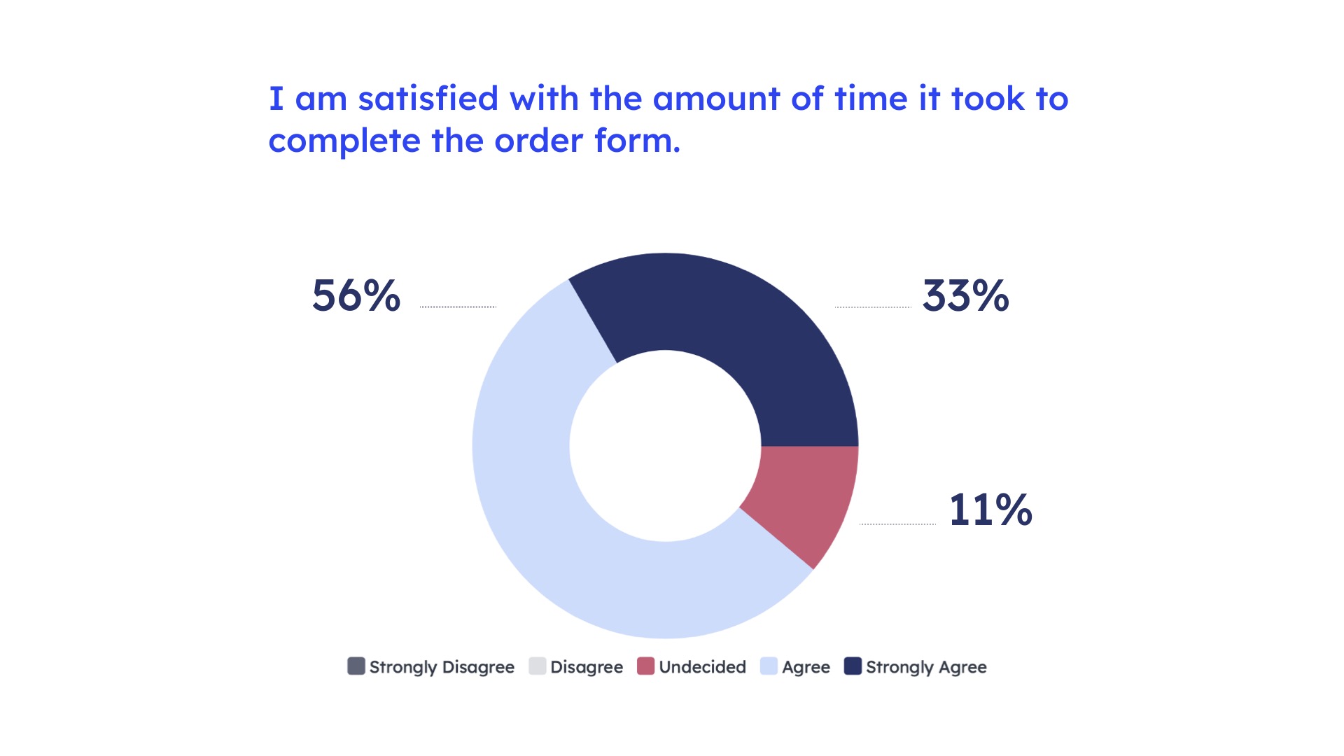
In each session we collected further demographic information from our participants, had them fill out the form while thinking aloud, and at the end asked them several follow up questions, beginning with what they would typically do next. Some participants answered the question without prompting as they instinctively clicked on links to track the delivery or to share order tracking with colleagues. We also had our participants fill out a google form after testing that used likert scales to collect more quantitative data. We were able to schedule our sessions such that we each had the opportunity to moderate at least two sessions, and note take for an additional two sessions.


Results
While participants overall found the order form intuitive and easy to use, we did uncover several issues ranging in severity.
Analysis
We used digital grouping to help us analyze our results. We entered all the issues our participants encountered into a spreadsheet, categorized them by what the issue was and its nature of the issue, then sorted the sheet by “what”. This grouped all our problems, allowing us to see which ones were experienced by the most participants. We then narrowed down which issues we wanted to focus on, starting with the most frequently occurring, which also involved the biggest redesign suggestions. Moving down from the biggest issues, we encountered some smaller issues and observations that had only been experienced by one or two participants, but which we still felt were important and worth mentioning. We wound up with 5 major recommendations and 5 smaller adjustments. I took responsibility for creating our slides for our presentation on the adjustments, but found as I was doing so that one of the adjustments was not so small after all, and so we moved it into our “recommendations” category and dedicated more time to a suggestion for rectifying the issue. In the end we had 6 recommendations and 4 adjustments.

Recommendations
Our first two recommendations were also our biggest, interrelated, and our suggested solutions were quite complex, even though we had in fact dialed back the complexity of the solution we proposed. As this was for the section of the order form that the client had already expressed was a problem area—the “How” page— we had already known that this was likely to be an area where we encountered issues during testing. As it was, item information and sender and receiver information and notes were all on the same page. Our first recommendation was to change the “how” page to “what” and have it exclusively focus on the item being sent. Some of our participants had used the pick-up and drop off notes sections to give information on handling instructions for the item, as opposed to access instructions for the building, which is what Airpals wanted users to put in the notes sections. While this was not included in the report, three of our pilot testers had also used the notes section for handling instructions. Having multiple categories of information and so many fields was leading users astray.
Our two step solution was to move sender, receiver and pick up and drop off notes to the “where” page, where they naturally related to the address information, and which shortened the newly renamed “what” page, which we then offered further recommendations on. We proposed several refinements to the “what” page that would help clarify the different fields and also added a field for special handling instructions of the parcel as this was something that we found through observation participants often wanted to provide. However, if we had had our druthers, we would have rearranged the whole order flow, starting with “where”, followed by “when”—which would be a combination of the “when” and “time” pages—and proceeding to “what”, “pay” and “review”. However, this would have been a drastic change, requiring redesigning the home page as well. We felt that our proposed solutions would be more palatable as well as more manageable. These two issues were very impactful and we spent a lot of time deliberating as a team what the best solution would be.


The other recommendations and adjustments that I took charge of as we wrote up our analysis for our presentation and report were recommendation #6 (previously an “adjustment”) and all four adjustments. We spent some time deliberating what to call our adjustments. We had started out calling them minor edits, but as I worked on them I concluded that they weren’t really minor at all, but could be quite impactful, they were only minor in the sense that they were quick and, hopefully, easy edits for Airpals to make. Additionally, as I worked on the issues experienced in entering addresses, I realized that the issue was too complex and belonged in our recommendations for more robust issues.
The sixth recommendation pertained to address selection. Users had to select an address from a dropdown list. If our participants copy/pasted in an address, it would disappear from the form when they went to the next field. If they typed out the address and moved on to the next field without selecting from the dropdown, the form automatically selected an incorrect address. Additionally, to correct an incorrect address, the participants were not able to click the field to highlight it, they had to press an x first to clear the field. Our recommendation was to make it clearer to users that they must select from the dropdown by providing an error message if they had not, and to allow users to edit the text directly by clicking on it—as they instinctively did—without having to clear the field first by clicking on the x.

Adjustments
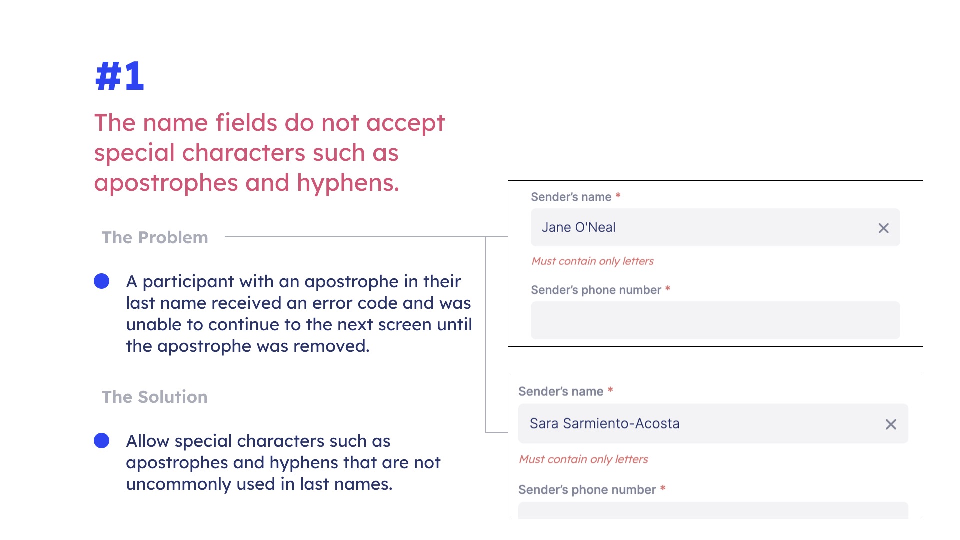
Our first adjustment was to allow for special characters in names. The name fields did not accept apostrophes and hyphens in names. While only one participant encountered this issue, there was only one participant that had an apostrophe in their name who would have discovered this issue. I tested the field to see if the same issue would happen with a hyphen, using my own last name (though I don’t typically use a hyphen), and discovered that this would be an issue as well. We recommended that Airpals allow for special characters common in names in the name fields.
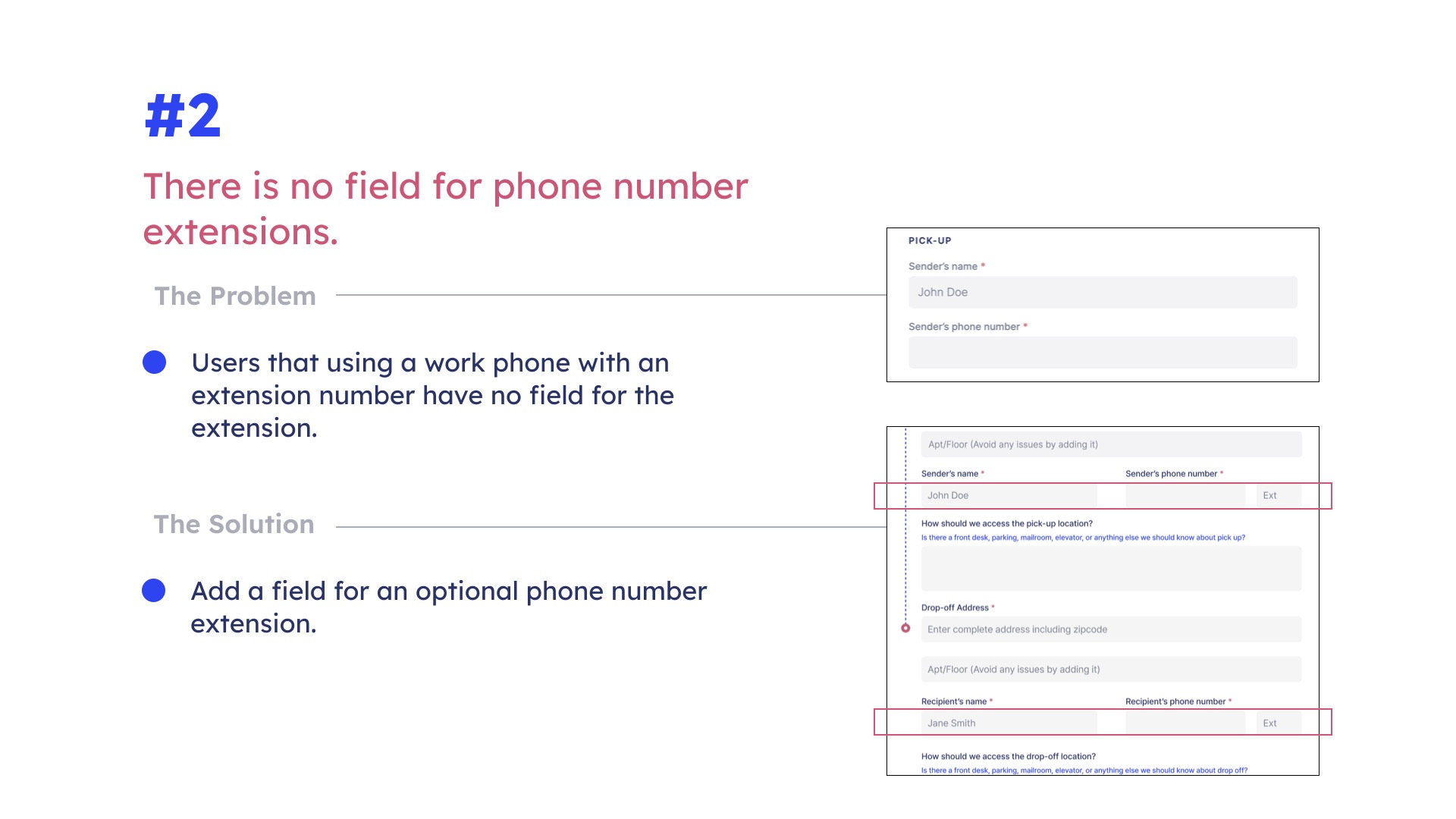
The second adjustment was also only noted by one participant, but again, that did not signify that it was not important. The problem was that there was no field for a phone number extension. As Airpals is a B2B business, it was especially likely that someone may be using a work number with an extension. We recommended adding an additional optional field for phone extensions.
The third adjustment was noticed by a very observant participant, the date on the order review page was arranged according to international conventions as opposed to US conventions. As the company is NYC based, we recommended changing the date format to follow US conventions: month/day/year.

The final adjustment was noted by two of our participants, who observed that the text on the website could do with more contrast. We checked and found that indeed the contrast ratio was 3.67:1, below the minimum recommended ratio of 4.5:1. We suggested increasing contrast to meet accessibility standards for visual impairment.

Conclusion
I feel that we as a team were very thorough in our analysis, and exhaustive in our recommendations. We delivered in depth analysis and proposed solutions for issues the client was aware of, but also uncovered several other issues that were completely unknown to them. As I believe they have not conducted usability testing previously, our feedback was especially salient. They invited us to check back with them in six months to see how they had incorporated our feedback. The adjustments they will hopefully be able to incorporate quickly, but most of our recommendations are very involved and will take a while to be incorporated, however they choose to do so.
Despite uncovering 6 different large issues and 4 additional smaller issues, none of our participants were completely stymied by the order form, everyone was able to complete the process. In our final presentation, the client was prodding us to tell her if anyone was really frustrated, she wasn’t afraid to hear the worst, but there were no catastrophic issues to report. Our recommendations, while plentiful, should make the order process smoother and more intuitive, but none of them are fixing an issue that was previously insurmountable. While Airpals is a newer product and still in the minimum viable product stage, they have created a completely usable product that they should be proud of.