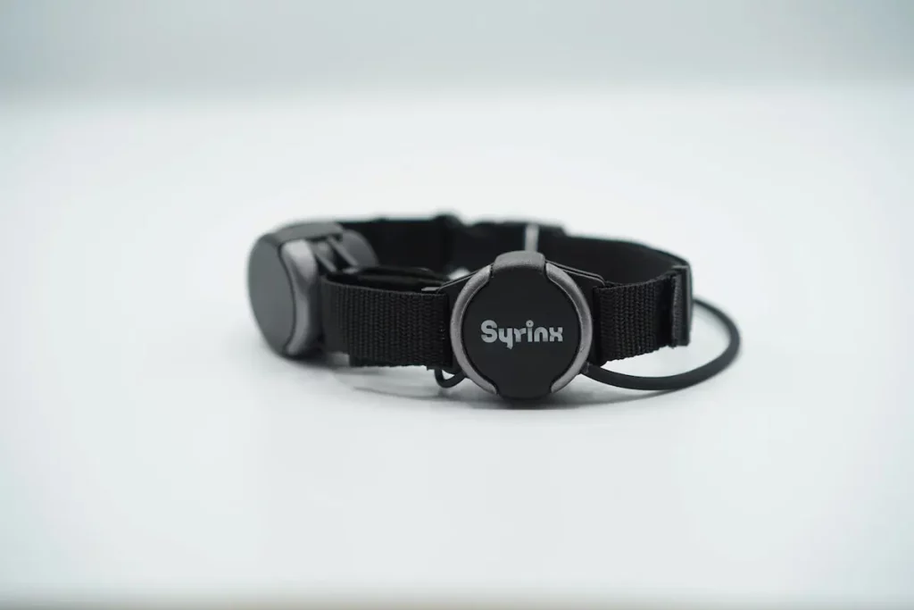
Design Critiques

What makes some designs good and others bad? Why do some designs work while others don’t? Posts in this category offer thoughtful design critiques of modern digital interfaces, with commentary inspired by Don Norman’s “The Design of Everyday Things.”

Design Critique: Joe & The Juice (iOS)

Joe & The Juice is a juice bar/coffee shop chain that has over 300 locations in the world. The iOS App was first released in 2019 and is now available in 13 operating countries. With its App, customers are able to make orders, earn points and receive benefits.

Screenshots compiled to one image to showcase Carbon Health app on ios three images side by side

Design Critique: Carbon Health App (v. 1.8.76 iOS)

A “Seamless” of sorts for healthcare, Carbon Health defines itself as a “modern, tech-enabled healthcare provider designed from the ground up to put patient-care first” (Carbon Health website). The company’s B2B2C (Business-to-Business-to-Consumer) business model works by offering technology solution to clinics around the U.S. and ultimately to consumers (patients) to help “deliver a uniquely seamless …

Design Critique: Carbon Health App (v. 1.8.76 iOS) Read More »

Design Critique: Leke Fitness Application

Leke Fitness is a chain gym brand in China. Its business includes gym operation and professional trainer service. I started using their service last summer and the overall experience is good. To experience their whole services, the user has to be either a member of a gym, or the user can book a trainer service and use the gym for free with limited-time access. Many different types of human-computer interactions occur in the process but I will focus on their mobile application.

Design Critique: Pratt.edu (Web site)

Pratt.edu is the official website for Pratt institute through which all of the information necessary for students can be accessible. Processes such as registration, accessing bills, accessing MyPratt, OnePratt, and etc. is available through this portal which makes it a vital element through every student’s collegiate career at Pratt. Now in order to assess this …

Design Critique: Pratt.edu (Web site) Read More »

Design Critique: Bilibili (Website)

Bilibili is an original video plus animation platform(it includes app and website) with its identical feature called bullet comments(flying comment on the screen sent by the viewers), forming community culture and topics as the viewer interacts with the platform. It contains a wide variety of videos and categorizes as many sections, such as education, living, finance, etc.

Design Critique: Instagram (iOS app)

Instagram is a social-networking platform where you connect communities with digital contents. With years of iteration, it has advanced many features to cater different user groups and evolved into a marketing and merchandising channel. This design critique will discuss v 172. iOS app version in Asia Pacific as some features may not be available in different …

Design Critique: Instagram (iOS app) Read More »