Design Critiques

What makes some designs good and others bad? Why do some designs work while others don’t? Posts in this category offer thoughtful design critiques of modern digital interfaces, with commentary inspired by Don Norman’s “The Design of Everyday Things.”

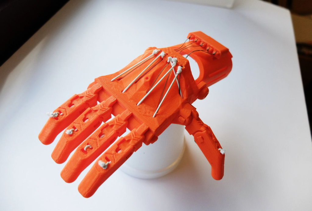
Assistive Technology: Samsung electronics wearable robots

At CES 2019, Samsung Electronics introduced a new wearable device that was called “GEMS”. GEMS is a short version of “Gait Enhancing & Motivating System” and as the name suggested, GEMS is a wearable robot that helps people who need walking assistance, especially those who have weakened leg muscles or are in a recovering process […]

Assistive Technology: Samsung electronics wearable robots Read More »

Design Critique: Google Sheets (Web App)

Google sheets is a spreadsheet editor belonging to the Google Workspace collection of applications. Users may create, share, and edit spreadsheets simultaneously with other users for remote productivity and collaboration. While a mobile app now exists, here we’ll be focusing on the widely used web-based application through the lens of Don Norman’s The Design of Everyday

Design Critique: Google Sheets (Web App) Read More »

Design Critique: Craft (iOS App)

Craft is a free note-taking application lauded for its minimalist interface. Through this application, users can create notes, organize documents, and search for specific documents or keywords. Furthermore, Craft’s block-based content structure enhances the note-taking experience by enabling users to create subpages, shift content around, and upload multimedia all within a note.  Navigation Bar The

Design Critique: Craft (iOS App) Read More »