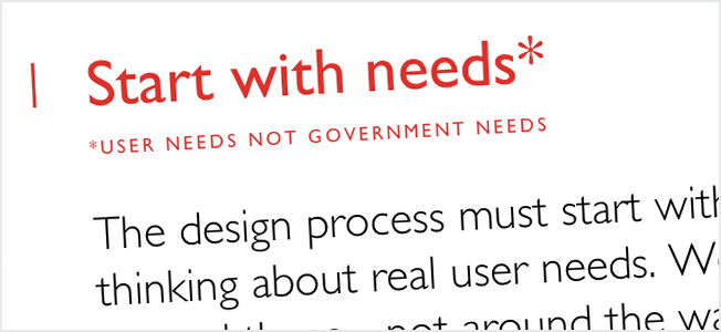
Over the past five years, federal, state and local governments have demonstrated their growing realization that good design can have a tangible impact on citizen engagement and public service delivery. Initiatives like the creation of the NYC Digital Playbook, a digital experience design guide for New Yorkers, and Usability.gov are evidence that governments are taking a leap to meet the bar that’s been set by the Ubers and Turbotaxes of the private sector. Despite the push to refocus web-based government services around a user-centered design process, bureaucratic constraints often create a series of roadblocks involving legislation, budgets, complicated processes, and transitions. Thus, government service design deserves an approach that extends beyond redesigning digital interfaces, and rethinks the many components of service delivery, from underlying processes and government policies, to accompanying digital tools. This holistic, all-encompassing approach is referred to as ‘service design.’
A blog post on gov.uk called “What we mean by service design,” attempts to unpack the complex challenges faced government designers and explains why thinking digital is simply not enough to deliver a successful service. According to the post, “The work of government service designers is informed – and often driven by – digital but we don’t exclusively work building websites or digital things. Some of the biggest challenges in service design are in the transitions between physical, offline, and digital transactions” (Downe). The most successful designs are ones based in archaeology, wherein designers take inventory of the systems already in place, untangle them, reconfigure them, and stitch them together to form a coherent service (Edgar). In addition, designers must consider each layer of service “front to back,” with user-facing components at the ‘front’, internal processes and supporting policy in the middle, and finally, financial and governance structures of the service at the “back” (Downe). It should be kept in mind that digital tools are only utilities within the overall service, which may also employ delivery channels such as phone, physical material, and face-to-face interaction to enhance accessibility and meet user needs.
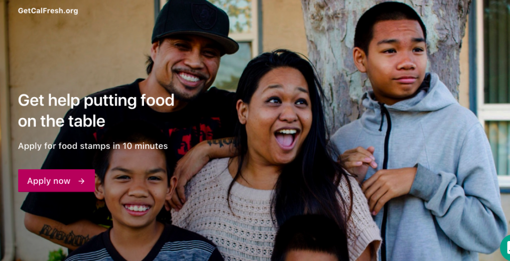
In Downe’s description of service design, she makes clear that digital and material (which includes processes, budget, policy, governance, etc) must work in tandem to deliver a comprehensive service, and that if one of those components fails, the entire service can suffer. Her blog post recalled the theme of recent NY Times called “Code Breakers: Why is it so Hard to Make a Website for the Government?”, which traces the creation of GetCalFresh, a service intended to turn California’s long winded food stamp application into a three step digital process. In the article, the designers – a government-contracted team from the civic-minded tech non-profit Code for America – faced the task of translating complicated legislation into an understandable process. The first breakthrough came when one designer identified that, despite the wordiness of legislation and the clunkiness of GetCalFresh’s precursor MyBenefits CalWin, the only information legally required to file for food stamps was the applicant’s name, address, and signature (Lu). The designer’s breakthrough was distilled into a sleek-looking prototype which contained an application for food stamps that users can fill out in mere minutes.

Problem solved, right? Little did the design team know that demonstrating a competent digital prototype was only the beginning.
Challenges arose when the design team decided to abandon the clunky, labyrinth-like MyBenefits CalWin website and build GetCalFresh into a user-friendly standalone website (Lu). Unfortunately, because MyBenefits CalWin lack an API, the Code for America team had no reasonable way of funneling applicant’s information from their standalone GetCalFresh site to the MyBenefits database. To put it simply: because GetCalFresh was built externally from MyBenefit CalWin, when users pressed “submit” on their food stamp applications, the state would neither receive nor process the information. To the design team’s dismay, GetCalFresh’s user-friendly interface was not enough to adequately improve the service. In fact, some of their proposed solutions, such as faxing applications from the GetCalFresh website to MyBenefits CalWin, would create more labor for the state’s clerical employees, who would have to manually enter information into the CalWin database (Lu).
The GetCalFresh design team would eventually solve their database issues, but they would encounter more difficulties along the way involving securing funding to iterate on the product, and hire operational staff needed to streamline back-end processes and government relations. In the words of the article’s author Yiren Lu,”it would be a hollow improvement to give CalFresh a better application site without, say, making sure that reminder letters were sent out before an appointment or that the customer-support lines were adequately staffed” (Lu). GetCalFresh is a perfect example of good interface design and good code alone are not enough to ensure the sustainability of a government service.
There is a lot at stake when public services are delivered poorly. For example, low-income residents do not receive food stamps, and filing for unemployment is unnecessarily difficult. Unless each component of the service is immediately understandable, members of the public face challenges receiving the resources they need to survive. In many ways, GetCalFresh is evidence that embracing Louise Downe’s approach to service design is more necessary than ever when designing for government. Integrating design disciplines, or considering design from a procedural, material, policy-based and digital perspectives, is the only way to create sustainable services that citizens can effectively use and understand.
Downe, Louise. “What We Mean by Service Design.” Web log post. Gov.uk. N.p., 18 Apr. 2016. Web. 11 Nov. 2016. <https://gds.blog.gov.uk/2016/04/18/what-we-mean-by-service-design/>.
Downe, Louise. “Common Challenges with Government Services.” Web log post. Gov.uk. N.p., 22 Apr. 2016. Web. 11 Nov. 2016. <https://designnotes.blog.gov.uk/2016/04/22/common-problems-with-government-services/>.
Edgar, Matt. “90% Archaeology: My Notes and Reflections on Service Design in Government 2015.” Weblog post. Matt Edgar Writes Here. N.p., 29 Mar. 2015. Web. <https://blog.mattedgar.com/2015/03/29/90-archaeology-my-notes-and-reflections-on-service-design-in-government-2015/>.
Lu, Yiren. “Code Cracking: Why Is It So Hard to Build a Website for Government?” NY Times. N.p., 10 Nov. 2016. Web. 11 Nov. 2016.
