CamScanner is a mobile scanner application, which helps people to scan files in a quick and convenient way. Users can use it to snapshot office documents and manage images. CamScanner has three main features: 1. Being available anytime to scan and send scans to anywhere, even out of the office. 2. Enhancing image quality automatically and easy to export the files in multiple ways. 3. Being able to extract texts from images for further editing and sharing with OCR (Optical character recognition).
Here, I am going to use Norman’s terminology and concepts based on his book “The Design of Everyday Things” to identify the positive and negative designs of the overall appearance, scan process, and other functions of CamScanner.
1. Overall appearance
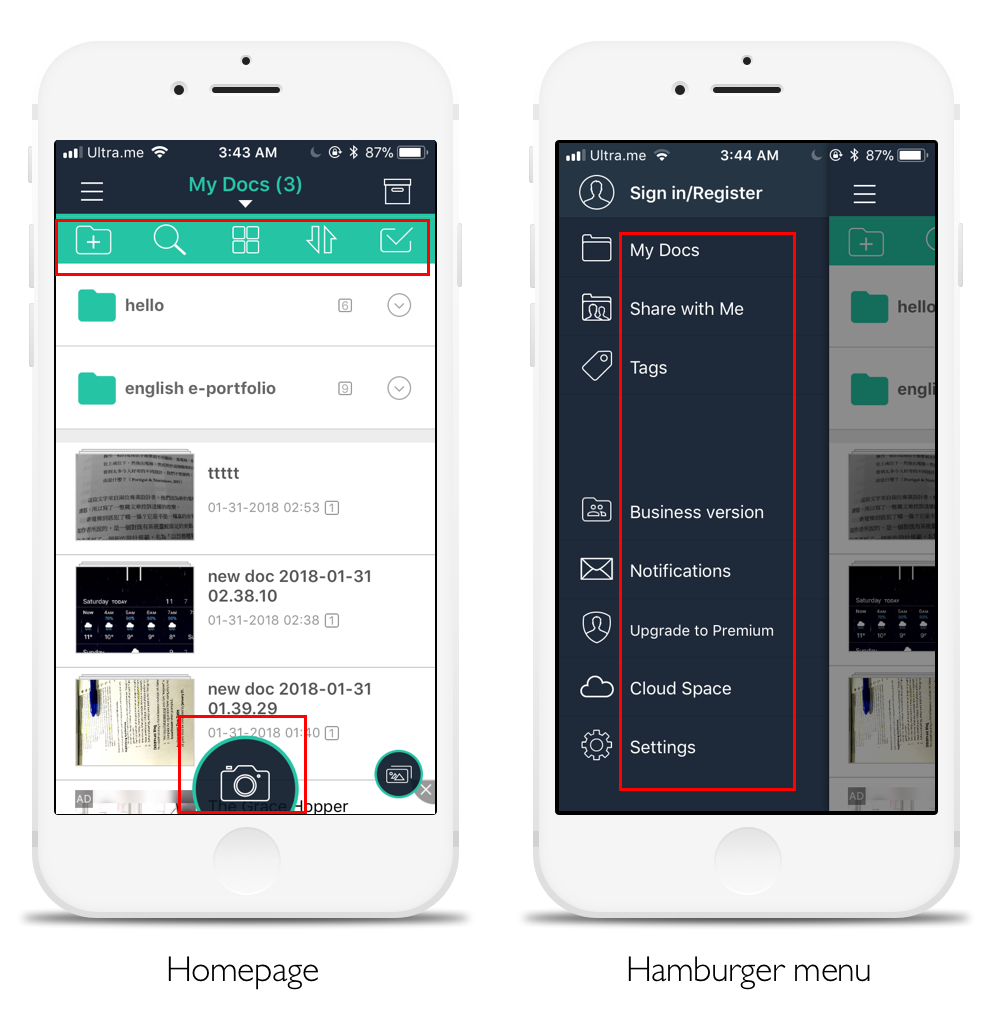
The appearance of the homepage is pretty understandable and discoverable. The design of icons is clear and to signify what the functions are and effectively uses the common knowledge of icon meanings that people have in the head, such as the camera icon means taking photos. Also, in the hamburger menu, it provides brief words next to the icons as clues to signify the functions and also to reduce the memory load for people to remember each function that each icon represents.
2. Scan process
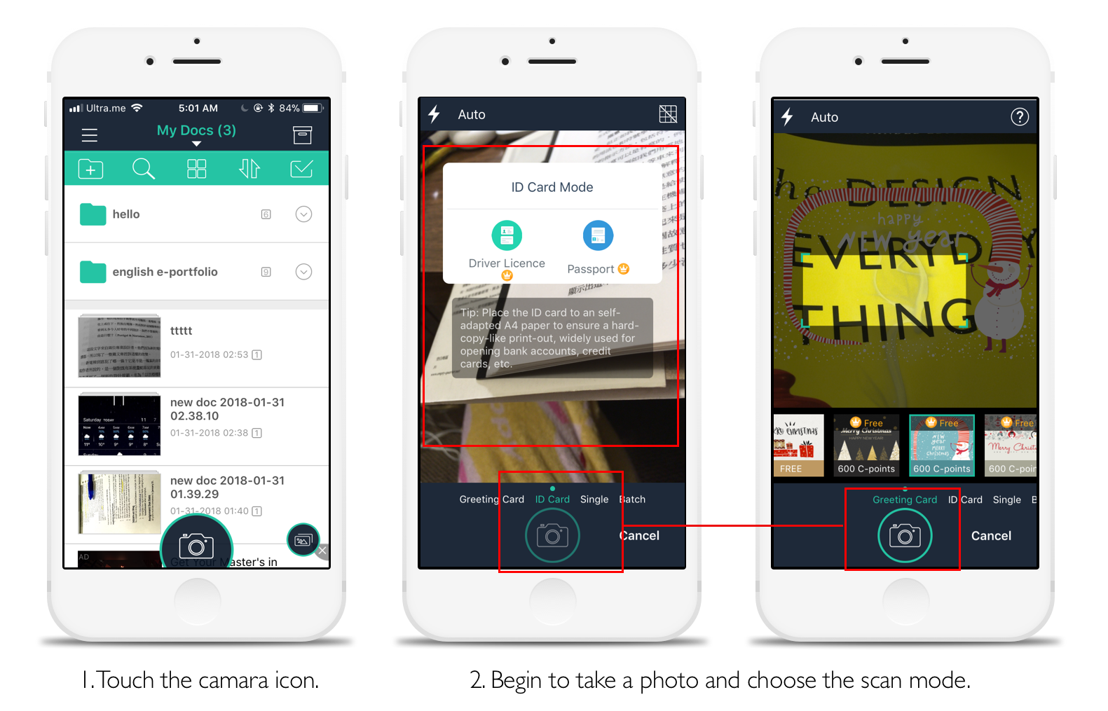
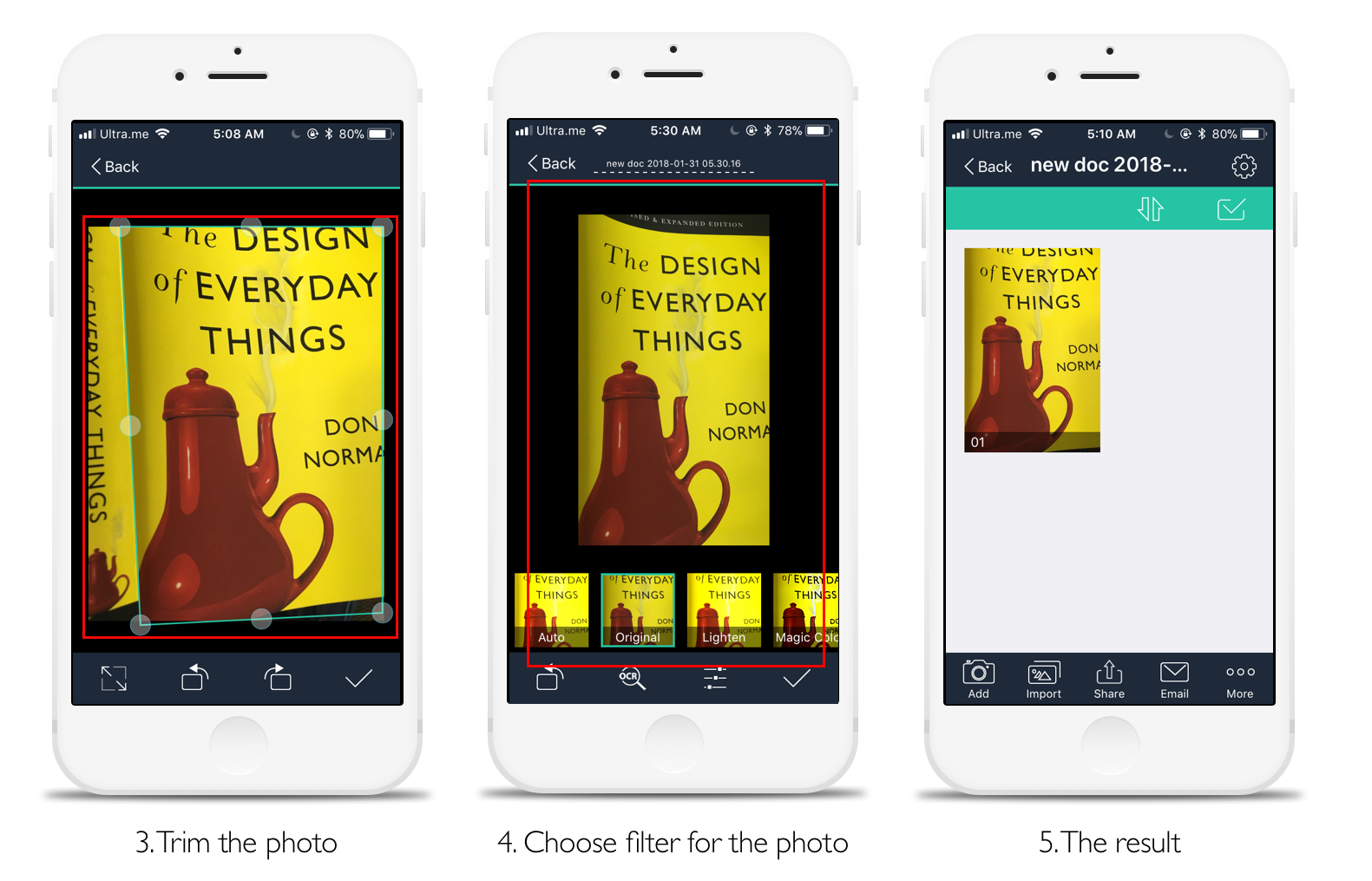
CamScanner has a very fast and smooth scan process, and I analyzed the reasons as follows: It has a strong feedback, which provides users the instant reflection to know the result of the behavior during the whole scan process (step 2 & 4). For example, when choosing the scan mode, ID cards, a pop-up window shows up to remind you of what type of mode you are choosing now. It also uses green color as a signifier to hint that you are in the ID card mode now. Besides, before confirming to choose driver license or passport of the ID card mode, it uses a forcing constraint function—lockouts on the camera button, to prevent users from entering next step. Furthermore, when trimming the photo, it offers the natural mapping (best mapping) that users can directly adjust and control the trimming frame with their finger.
3. Other functions
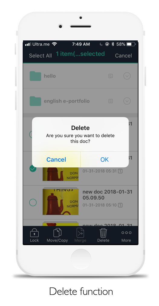
For the delete function, it delivers a very good example of a lock-in forcing function. This makes it difficult to delete images unintentionally and make sure users do the desired operation.
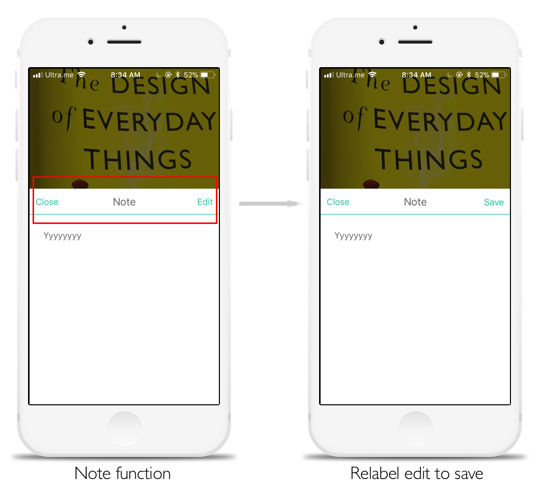
The only negative design I found at the app is there is no feedback or saving button after making notes on the scanned image, so it is a little confusing that users might not know whether the notes have been saved successfully. Also, the edit button here is meaningless, since users still can go straightly to edit notes without touching the edit button. Therefore, I would recommend relabeling edit to save, which is a much clearer signifier to save notes.
Overall, CamScanner has a great conceptual model. The system image of the app goes really well and is pretty clear for the scanning process, delivering a great communication with users. Also, the learning curve of operating the app is very smooth and short for a first-time user. I almost could not find things that are really troublesome and violate Don Norman’s design principles. According to App store, its rating is 4.9 out of 5 with lots of positive reviews, which is really a great product!

