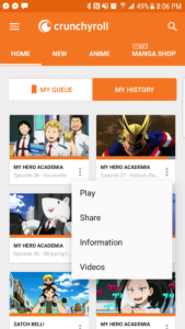
Crunchyroll is an American licensing company and online community that serves as an online streaming service for Japanese Anime and Asian media. Originally founded by a group of University of California, Berkeley graduates in 2006, Crunchyroll’s distribution channel serves over 23 million online community members worldwide. While the full website offers greater scope of content, the mobile application grants users the ability to execute the company’s core function of online streaming.
The title page of the app utilizes an interface that makes me believe the creators of the app fabricated the app with an activity centered design in mind, meaning that it is presented with a generic design meant for the general population. While there are individual preferences made available on the title page, the nature of the streaming service model dictates its universal appeal. This idea is also related to system image, where various experiences give users an impression about what a device ought to do, and how it can be accomplished. The streaming service model has been perfected over the years, and Crunchyroll’s interface, signifiers, feedback, and mapping are all indicative a successfully integrated system image.

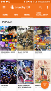
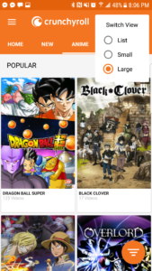
With this in mind, the title page interface appropriates several key signifiers, giving users simplistic and easy clues to follow on how to proceed in successfully executing tasks(picture of home screen). Along with the title page, most of the steps following movement past the initial screen provides easy mapping, clearly dictating the relationship of options under each tab, and easy audio feedback that details the right or wrong course of action; this feedback is also representative of sound as a signifier. In regards to clearly defining the content and the possible areas of interest within the app, an undo option available should any knowledge mistakes be made, the design is mostly successful in creating a simple, easy interface. This is represented by the creators designing for error, which accommodates for not only when users reach their goal directly, but when they make choice that might not lead to success. Regardless of its activity centered design, there is still a level of individuality present.

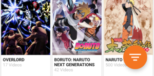
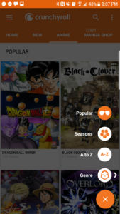
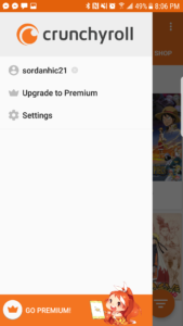
However, there are several signifiers that rely heavily on convention in order for the user to move forward, examples being the illustrious hamburger on the top left corner, and the small icon on the bottom right corner; users know what it does, but the design doesn’t correlate to its function. However, the content in each icon, once clicked, is categorized well and much less ambiguous and reliant on convention.
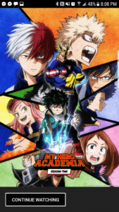
The main problem area of the app is when the user clicks on a specific show, which brings up an image of show’s main cover, but doesn’t offer any other signifiers on how to proceed to gaining information. The show’s title is located at the bottom of the page, but clicking on it and performing an action slip, as most users would do, does not yield a successful result. It was by sheer luck that I did a slip, meaning that I performed the right action but did so badly; I got frustrated and starting swiping my finger in every direction. At first, I believed my action slip to be representative of the paradox of automation (the faith in machine perfection) with the fault being mine, but it was definitely closer to a poor gulf of execution. To help improve this function, I would suggest a small arrow shaped signifier pointing up to help signify that the title needs to be swiped in order to move forward.

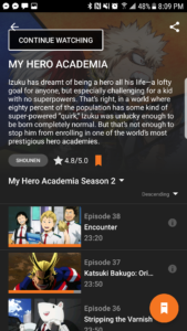
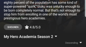
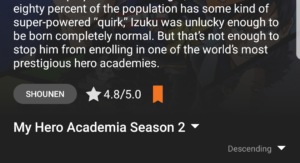
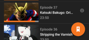

Once in the show’s informational section, the only slightly confusing area relates to a small icon placed in the bottom right hand corner, which, when clicked, makes an identical flag appear next to the show’s rating. Unless the user is better versed with the app, based primarily on arbitrary knowledge of the workings of the title page interface, they wouldn’t have any idea why this icon exists, or what it signifies. The only affordance given in this circumstance is a small plus sign when unclicked, and a small minus sign when clicked.
Overall, the Crunchyroll app a product of good design, but it relies heavily on conventions and generic interfaces. I appreciate the discoverability of almost every aspect of the app, and how each one promotes a certain degree of understanding. Despite the app’s flaws, I still enjoy using it immensely.
