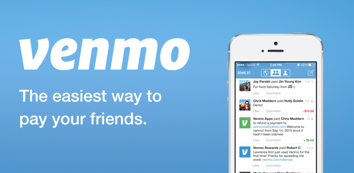
Venmo is a mobile payment sharing application that allows people to transfer money from one user to another acting like somewhat of a digital wallet. In order send money, users must link their bank to Venmo so to off-load payments. It also acts like a social media platform in which people can ‘like’, ‘friend request’, comment on posts, and additionally, it contains three separate newsfeeds including personal, your network, and global.
In my research for this critique I have found that this application has quite the positive response from other users, including myself, which shouldn’t be too surprising since roughly 10 million people have downloaded the app (Venmo doesn’t release numbers of users externally). While overall the the interface is easy to use and look at it there are some flaws in its operational design. These flaws include the cap on the amount of money one can send and labeling/hierarchy issues. Using the design principles and concepts of Don Norman from his book “The Design of Everyday Things,” I will support my claims of design choices that were good and could use improvement.
1. Intuitive Payment Process
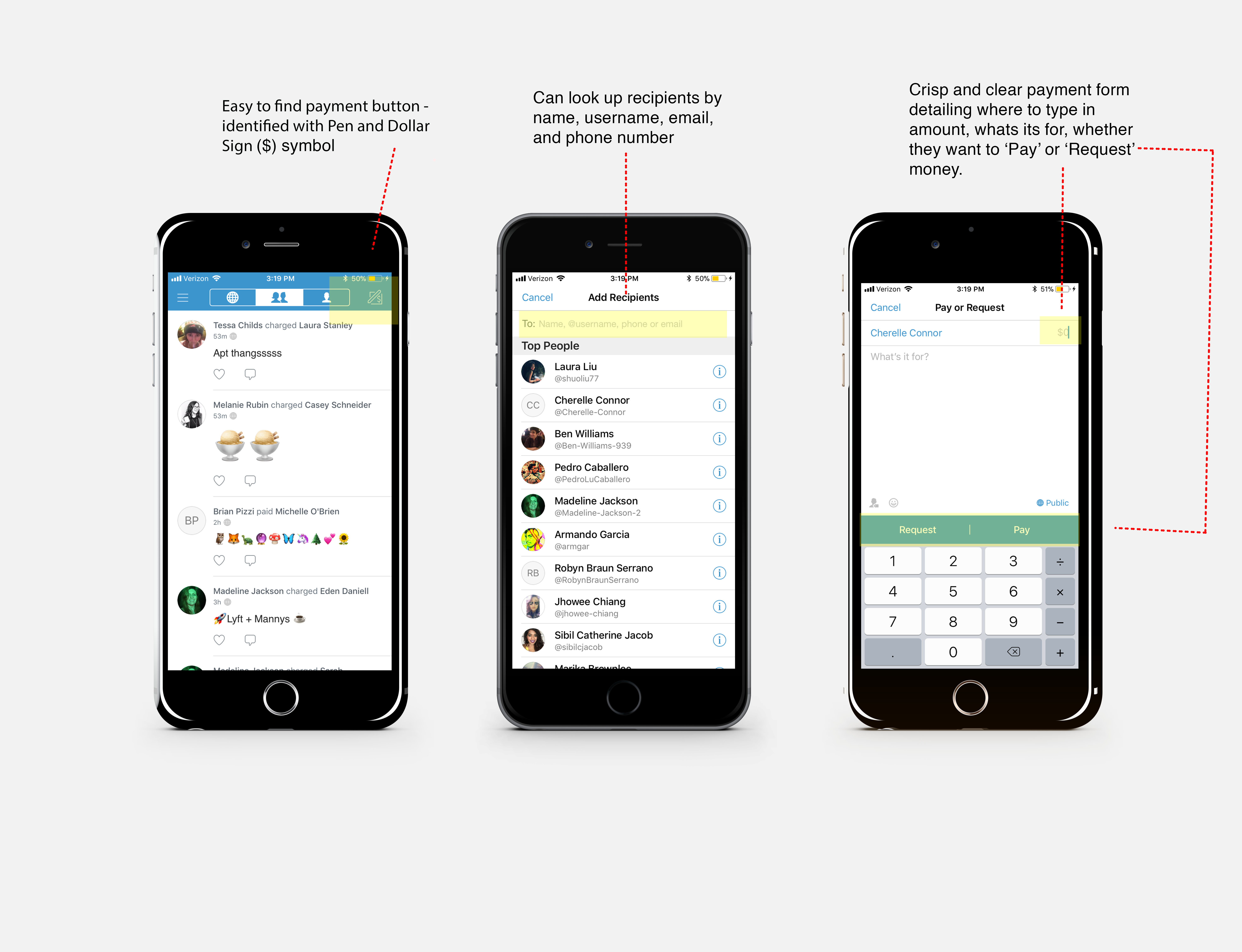
Upon downloading and creating an account the home screen already provides where two options for send money. In the top right corner there is a ‘pen’ and ‘dollar’ sign icon that signifies that this is where the user should tap so to transfers cash. It notes that one can add recipients by name, username, phone, or email. This is an affordance for different options to add people. Additionally by tapping the menu button they can also search for people so there are two ways they can add a user. Feedback is measured by the payment being immediately posted in the personal newsfeed as well as in the network newsfeed. The gulfs of execution and evaluation in tapping the ‘pen and dollar sign’ button, filling out the form (complete with recipient, payment amount, ‘what’s it for’), and then pressing ‘Pay’ or ‘Request’ are easy to execute as well as provide a good evaluation of that action by it popping up in the newsfeeds.
2. Social Sharing
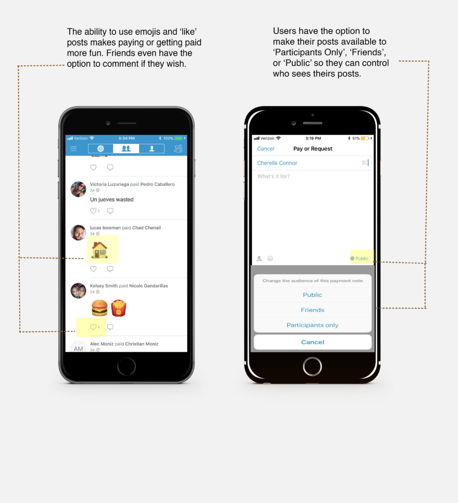
The social aspect of the design is represented by post descriptions allowing emojis, ‘like’ and comments buttons on posts, friends requests and groups.These elements have a clear enough visibility that invites users to participate. It makes paying people fun and you get to see who your friends are hanging out with. The mapping of the newsfeed is designed so that the newest payments appear on top and older ones at the bottom making it easy to find a past payment just by scrolling.
3. Constraints on Money Transfers
The biggest constraint is that a user is only allowed to send $299.99 a week unless they take extra action to verify their identity then the user is only allowed $2,999.99 a week. Another limit set on users is unless they want to pay an extra twenty-five cents for an immediate bank transfer they have to wait one to two days for money to show up in their bank.
4. Hierarchy and Labeling
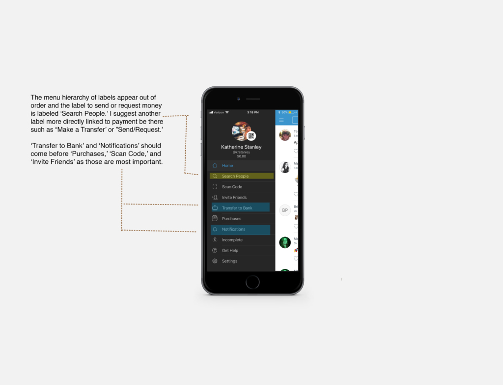
The menu offers many options but the order seems out of order and mislabeled. While the menu was easily discoverable, there are issues in the discoverability of some labels.Upon seeing first glance, I remember I couldn’t find the correct label to pay someone which is “Search for people.” I believe I was searching for something like ‘Send Money’ or ‘Make a Payment’, something directly related to money. And secondly, there are labels like “Scan Code” and “Invite Friends’ that I believe are less important than ‘Transfer to bank.’ It takes a couple seconds too long to find ‘Transfer to Bank’. Additionally, there is consistency in the labeling of clickable links such as those in the menu and payment form (‘Request’ and ‘Pay’) are in white.


