iOS’s keyboard, as one of the most commonly used keyboard, is a very well, fully developed keyboard system. It supports numerous of languages (including more than 2,500 emojis) and variety of layouts, and can smartly auto-correct the text in most cases.
iPhone Keyboard in different settings.
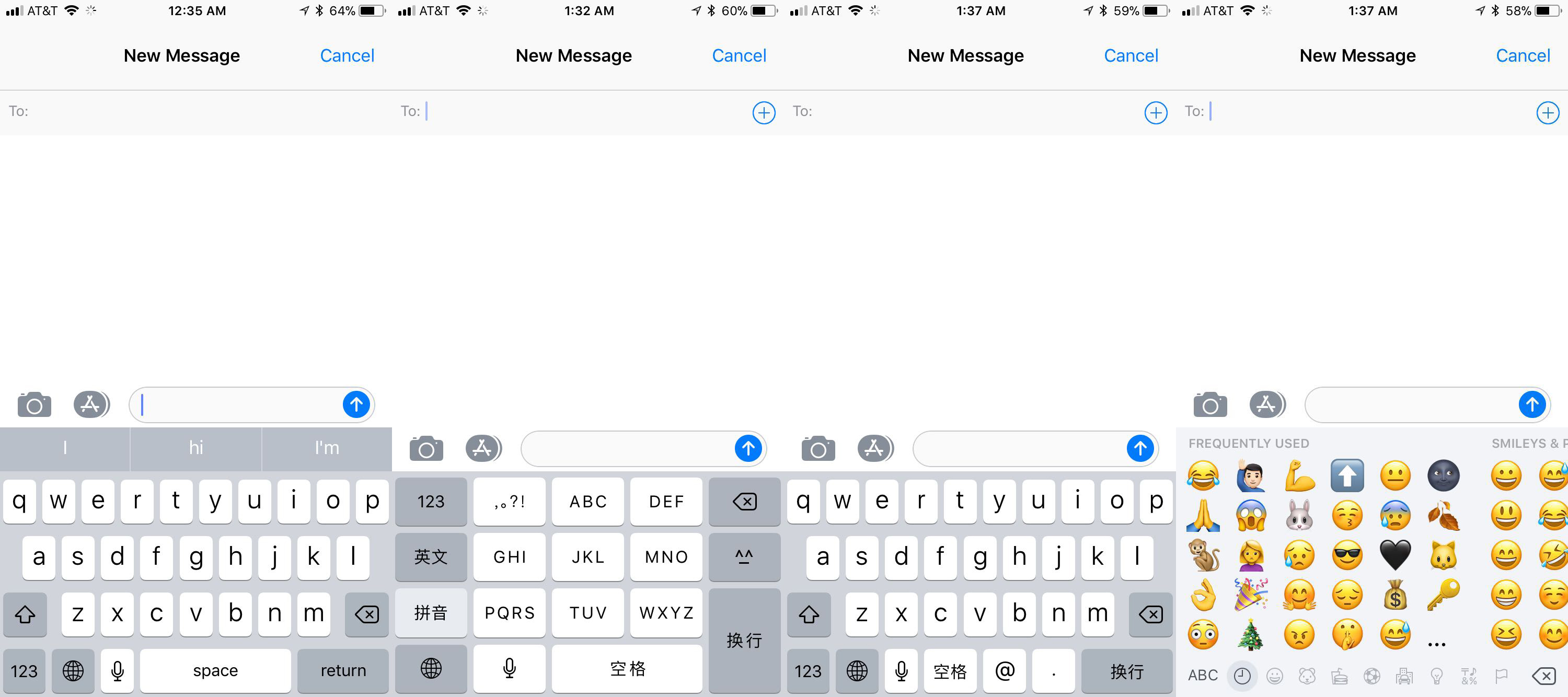 ( Left to right: English, QWERTY; Chinese (Simplified), 10 keys; Chinese (Traditional), QWERTY; Emoji )
Note: This critique focuses on iOS’s keyboard, and the research is based on iOS 11.2.5 that runs on an iPhone 6s. Some functions can be different if you have a different version of iOS or running on a different device such as an iPad.
Intro
In an earlier report, Sarah Perez displayed a diagram of research launched by Kantar Worldpanel in August 2017. According to that, iOS shared 35% of the smartphone market in the US. World widely, the number is slightly lower but still considerable large. The statistic shows that almost one-third of American adults are using an iOS system, which means here in the States, there are approximately 0.1 billion people are texting with an iPhones keyboard.
I myself am a long-term fan of Apple’s product. Since the year 2007, I started texting mainly with iOS keyboard (on an iTouch). Therefore, many “hidden” functions of the keyboard become a knowledge in the head to me. If you knew how to use these functions, your experience with iPhone can be much better. Such hidden functions often lack discoverability or understandability, which cause this considerately designed keyboard was usually underestimated.
Android or iOS, new versions or old, the basic arrangement of their keyboards are based on the American standard QWERTY keyboard. This allows new users can easily find either the shift key or any other keys such as space or return, as long as they have used a physical keyboard before. The usage of a physical keyboard has been repeated for so many times so that where the shift key and the space key should locate are become a behavioral level cognition. If you want to delete something, you go to the right side, and to type a space, you look down. Where these keys are arranged on the keyboard become somehow become a natural mapping. Therefore, with this inherited arrangement, most users can text with iPhone’s keyboard. And as long as people can text their friends, they won’t really complain about their phone, or more specifically, their phone’s keyboard. Even though, people still expecting a better experience.
Auto-Correct
The iPhone keyboard succeeds in providing such better experiences, in most cases. First of all, it allows you to mistype. For the reason that on an iPhone, the QWERTY keyboard has been shrunk down to a considerable small size, mis-typing occurs all the time, for the similarity of the actions to tap “T” and “Y”, there is only two millimeter’s difference. In this case, slips occurred on the performing stage of action. Instead of making the user to backspace and retype, the system would auto-correct the word by estimate what word the user actually wanted to input. For example, I always mistype “T” and “Y”. If I were trying to input the word “typical”, sometimes “ytpical” would be typed. The system would immediately auto-correct it and input the correct “typical” instead. On the other hand, as a second language user, mis-spelling also happens a lot. In fact, since auto-correct exists, many native speakers make lots of spelling mistakes. Mis-spelling, instead, is a knowledge-based mistake. The iPhone keyboard allows this, too. Even better, sometimes when I don’t know how to spell a word, I would simply type an approximately correct word and let the system do the rest. The auto-correct function makes my life so much easier in this perspective.
On the other hand, however, sometimes you will hate the auto-correct so much that you want to turn it off once and for all. For instance, when you were typing an uncommon, long and weird Scandinavian name, and you finally finished typing and click space, then “bang”, “Sigurjon” magically turns into “Sign on.” Fairly saying, I can tell that Apple’s designers have considered this mistake thoroughly. The key is you, the user, should not click the space button as you usually do. Instead, you can manually choose the “Sigurjon” displayed with a quotation mark above, listed with “sign on” and other guesses that iOS provided. Moreover, after you retype this word for several times, the system will learn that you intended to input this word and will stop auto-correcting it. (That’s why I can’t provide an image of this auto-correction, my iPhone has already learned this word.) Finally, you can always choose to turn this function off from the Settings. Even though, this process is still frustrating for many users. I have to say that there’s no alternative solution for the problem has come out since there’s a paradox exists within. Maybe we should just wait for a bigger database for spellings and a smarter AI been invented. For now, Apple designers have already done a great job by providing three alternative solutions.
Hidden Function, Shift & Caps Lock
Except for obvious function like typing, iPhone keyboard has a lot of hidden functions that can optimize user experiences in many ways. Some of them, such as the punctuation and number keyboard that signified with a key with “123” on it, or the microphone icon affords the function of the audio input, have a good discoverability and most users can discover them, since they turn the information into the knowledge in the world. After not too many times of using,  actions such as tap the “123” key to call out a punctuation keyboard will become a behavioral action and will be done really quick since it’s sub-conscious. Admittedly, “123” doesn’t signifies punctuation well. But on the one hand, without too much thinking, you will try to hit the “123” key to call out a punctuation keyboard. It is because, firstly, most people share a common understanding that a keyboard would always include a punctuation keyboard. And secondly, rare people would try the other keys have clear signifiers to other functions. I think Apple’s designers actually did a good job of taking advantages of user’s behavioral cognition. On the other hand, the way of changing the keyboard modes varied a lot of times. (I still miss that in earlier versions the keyboard has the “@” key on the first page, a feature that you can still find on Chinese keyboards.) Therefore, for many users who have experience on the iOS system, where to find this function (the left side by the earth icon) became a knowledge in the head, and a key with “123” can give a fairly enough affordance to them.
However, Apple relies on their user’s knowledge in the head too much. Take my girlfriend as an example, who become an iPhone user since last August. Before that, she had been using cellphones for twelve years and the Android system for seven years. Although she is experienced with using smartphones, she still couldn’t find some functions. She once asked me how to keep typing capital letters without repeatedly tap the “shift” button (the one with an arrow point upward). To me, it is a function that I use all the time: if you tap the key once, it will be highlighted, indicating one time of capital input; if you quickly tap the button twice, it will display a slightly different icon with a line lies below the arrow, and you can keep typing capital letters without hit this button once and once again. This feature provides a good feedback to users who know this function beforehand – whether my action effected and which mode was activated are both indicated immediately. However, for those users who don’t know this function before, this function is almost impossible to discover, for the reason that it doesn’t have a signifier. Although there’s a wide upward arrow as those drawn on the physical keyboard’s shift keys, which here affords the function “shift” to the users. However, this signifier doesn’t hint the function of “caps lock”. For a long-term iOS user, it might be very easy to figure out, even he doesn’t know this specific function. The gulf of execution might be quite easy to be bridged with several times of sub-conscious attempt. Tap and hold, doesn’t work? Double click, bingo. However, a new user such as my girlfriend might have a totally different process, for the reason that the Androids’ keyboard has a differently functioned “shift” key.
Hidden Function, Possibilities of Tap and Hold

Similarly, recently another feature was introduced with iOS 10. This function might not be so hard for an experienced apple device user to discover. If you tap and hold the earth key, a menu would pop-up, which includes the selection of different type method and one hand keyboard options, as well as a link to the keyboard setting menu, which is deeply hidden in the Settings. This function, again, is hard to be found unless you are so bored and keeping trying possible functions of each key. Honestly, this is how I found this menu. Furthermore, if I haven’t built up a conceptual model that base on my understanding of Apple products – sometimes a key has multiple functions, and in many cases the way to call it out is tap and hold, I won’t have such a behavior that tapping and holding different keys to see whether there are any secrets. If you actually keep trying, you will find some keys for letters, numbers and punctuations have some hidden input options. All these convenient functions are not fully functioning because lacking discoverability and too much reliance on the user’s knowledge in the head.
In my perspective, the reason for that iPhone keyboard lacks signifiers for hidden functions has two main reasons. First and foremost, Apple cares the simplicity and aesthetic of the interface’s visual layout a lot. In fact, Don Norman thought this is the main reason. “Apple has done the world a great disservice by emphasizing the appearance and actually making their products more difficult to use,” He said in an interview, “Apple has completely forgotten that an important part of design is being able to understand and use your stuff.” (Salim) Admittedly, Apple’s designers must have an aesthetic concern. However, I think they also considered elsewise. On an iPad’s keyboard, you can find more signifiers than on iPhones’. There is smaller grey icon/symbol on the side. On an iPhone, instead, because of the screen is much smaller, the size of the interface is limited. Putting too many icons/symbols on will surely damage the not only the visual simplicity but also the understandability. Too much information on a single key won’t be recognizable. Imagine a button smaller than a quarter inch and has two different icons of the same size overlapped, no one would be able to recognize anyone of them. The iPad’s solution won’t work as well, the secondary icon would be way too small to be recognizable.
Another reason is that, personally saying, Apple focuses more on its loyal customers, who usually already have built up a conceptual model of how to use their products that help them bridge up the gulf of execution. Likewise, if I were facing the same problem my girlfriend had, I would directly go to the shift key and try different actions with that key – tap and hold, double click, etc. don’t’t really have the same problem – after a while.
Nevertheless, the keyboard still needs to provide a better user experience to the new users, or users who haven’t dig into these hidden functions – just as Don Norman has stated that designers should not expect all their users would explore the instructions. In order to do that, I would suggest two different solutions. Firstly, providing an instruction in front would be helpful, just like many apps do. In fact, when some new functions were published, Apple usually provides a brief introduction beforehand. On the contrast, some super basic functions such as the shift key, or a well thought through new function like a single hand keyboard for both left handy and right handy people, don’t have such an introduction – neither when an iPhone was newly bought, nor when the system was updated. Another solution is specifically for the “shift” key. On an Android phone, there’s actually no such a function equals to the shift on a physical keyboard. That actually works. Instead of having a key with two different modes, it provides only the “caps lock” function. The users only have to tap it on or off, and the system would do the rest – a function that iPhone’s keyboard also has. Auto-caps the first letter of a sentence, auto-correct some familiar names or terms, etc. The two modes of iPhone’s keyboard are useful, but without discoverability, it will be useless.
Hidden Function, Shake to undo
Compare with the shift key and the type method menu, another hidden function is much easier to discover. What would you do if you mistyped something and feels anxious? Many would shake the device that they made the mistake with. If you did that with an iPhone when typing, a dialog box would pop-up as a f eedback, telling the user who didn’t know this function before that with the former gesture operation you can actually undo your last action. Instead of learned skills, it relies on people’s visceral level of cognition. Moreover, if you do this action for multiple times, the system will provide you a different dialogue box includes a redo function. With this gesture operation, iPhone keyboard provides a function to make up mistakes, as Don Norman has advised, “make it possible to correct problems directly from help and guidance messages”.
Conclusion
There are so many more aspects can be discussed about iPhone’s keyboard, such as the backspace operation, the transition between different typing methods, the emoji selection and the different skin color selection, AZERTY and QWERTZ keyboard support, T9 typing method, and etc. Although this post has pointed out a lot of problems of discoverability, these hidden functions actually enhanced the iPhone keyboard’s usability. The more functions a single product can provide, the more complexity there is. There will be nothing to complain about iPhone’s keyboard, as long as we don’t have to Google “hidden functions of iOS.” Just as Don Norman said, “complexity is good; It is confusion that is bad.”Reference:
Perez, Sarah. iOS and Samsung market share now tied in the US
https://techcrunch.com/2017/10/13/ios-and-samsung-market-share-now-tied-in-the-u-s/
Salim, Ayesha. Design guru Don Norman slams Apple’s ease-of-use “disservice”. 2015.
http://www.idgconnect.com/abstract/10261/design-guru-don-norman-slams-apple-ease-disservice
Norman, Donald. The Design of Everyday Things. Basic Books, 2013.