Image from accesibilidadweb.com
Usability and Accessibility had similarities and differences. However, when focusing on improving websites for those with specific needs it ultimately helps everyone. Unfortunately, most Usability Evaluations focus on the “average user” as the target use but when a user with a disability becomes the target user Usability will be improved for all.
Difference Between Usability & Accessibility
When reading and pondering about the words “Usability” and “Accessibility” they could seem like two words that have the same meaning. Usability is a form of evaluation that relates to how easy something is to use for the first time or learn to use for the future. This can be thought as through words such as “learnable” and “discoverable.” The parts of evaluating Usability include: discoverability, mapping, signifiers, constraints, and feedback. If the design of the object or website passes all of these parts then the design can be thought to have good Usability. This is still true while Accessibility is a term used to describe how easy it is for an individual who has disabilities to use something. This is achieved by ensuring that an object or website is designed with the senses in mind. This could be done through the visual design of the website as well as in the coding of the site as well. Accessibility is needed morally as well as legally under Section 508 that “requires that all government websites are accessible to disabled users (‘Usability and Accessibility: Looking at User Experience through Two Lenses’).” Even though both Usability and Accessibility have their differences – the former is concerned with the average users while the latter is concerned over those who need certain aspects programmed in legally – they have their similarities as well.
Similarities of Usability & Accessibility
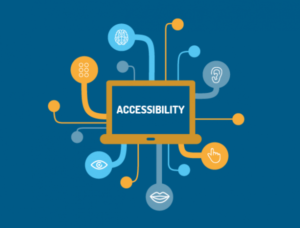
As defined by “Usability and Accessibility: Looking at User Experience through Two Lenses,” the most important thing you can do while designing a website is to keep all of your users in mind. If Accessibility is kept in mind Usability will follow. Accessibility means ensuring the website is clear, discoverable, with high contrast, flexible navigations and captions (“Web Accessibility”). This can help both Accessibility and Usability. After going to school in a highly Deaf population, websites, interfaces and tv monitors were highly accessible to those who needed them. This was primarily the case through captioning on everything including movies in movie theaters, providing different contact options such as texting options for 911 calls and the insurance of highly contrasted and clear website interfaces. However, this helped everyone not only the Deaf. I found that having captions everywhere helped me retain information while watching videos. And so, their similarities can be summarized by Accessibility ensures that websites have high Usability for those with Disabilities and Universal Usability would ensure that websites are Accessible all.
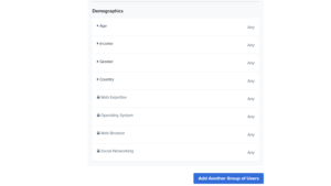
Problem: Most Usability Evaluations Use “Average Users” As Their Target User And Leave Those With Disabilities Out of The Equation
- Demographics used by Usertesting.com with no section pertaining to disabilities
Web Accessibility for Those with Disabilities
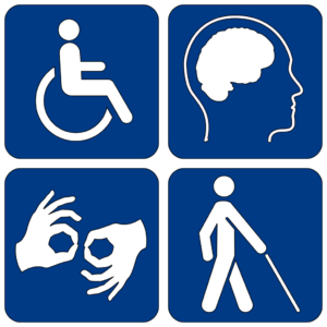
When Usability Tests are conducted the “average user” is usually the target user for the evaluation. However, this ignores those who are Blind, have Poor Eyesight or Color Blindness, Mobility Disabilities such as arthritis or loss or motor skills, those who are Deaf or Hard of Hearing, Epilepsy, and those who have Cognitive or intellectual disabilities (“Web Accessibility”). Accessibility issues – and therefore Usability issues – can stem from a number of things including, insufficient color contrast which can hinder those with blindness and color blindness (“Common Accessibility Problems: Good and Bad Examples in Modern Websites”). Specifically, this can be evaluated through auditing the code or using a Color Contrast Checker. Keyboard Traps and limited keyboard accessibility could create issues for those with limited mobility and a solution is coding websites to go “mouse-less” with joystick capabilities (“Common Accessibility Problems: Good and Bad Examples in Modern Websites”). Programming websites without “alternative text for non-text content” such as pictures could reduce the effectiveness of screen readers for individuals with limited sight or limited cognitive abilities (“Common Accessibility Problems: Good and Bad Examples in Modern Websites”). Making these small changes – mainly though code – could ensure any website can still have Usability even when it doesn’t work properly after software or hardware issues and accessible for all. Here, we can see that websites could be read to the blind and moved for the immobile but when it comes to the Deaf more work must be done.
 From Wikimedia Commons
Specifics on Deaf & Hard of Hearing Culture and Website Use
Because of my experience with the Deaf community, I wanted to focus on there specific needs. Sometimes a simple addition to the website’s code is not enough. More effort tis needed to correctly caption videos, using ASL in visual content to eliminate the risk of inaccurate captions and making sure the language used is straightforward enough when members of the Deaf community might not have English Language as their first language. What the report “Websites: Accessibility and Usability for American Sign Language Users” found that “for some videos that had dull color or distracting images, participants suggested that the video background should be neutral with an attractive color” and brevity (“Websites: Accessibility and Usability for American Sign Language Users”). Wouldn’t the “average user” want short concise information without any distractions? Using social media was also found to be a good avenue for distributing videos with ASL that lead back to the main website (“Websites: Accessibility and Usability for American Sign Language Users”). And wouldn’t an “average user” want to see similar content as well as a summary of a website before visiting? Creating a website that is visual attractive yet not distracting with a liberal use of ASL, captions and straightforward language will improve the accessibility for Deaf users and the focus on language and neutral design will help the Usability.
Improvements For One Group Can Support Improvements For Others
Overall, it can be seen that Accessibility and Usability can be focused yet collaborative. When Usability is concerned, discoverability and learnability are at the focus. Typically, this form of evaluation focuses on the “average user” as the target user. When Accessibility is concerned the use of the site in general for any person with disabilities is the primary concern. This focuses on the population missed by the Usability Evaluation. However, when combined a site is created that complies with Section 508, looks beautiful and functions well for anyone who searches the URL.
Works Cited:
- “Usability and Accessibility: Looking at User Experience through Two Lenses.” Usability.gov. December 16, 2013. Accessed March 28, 2018. https://www.usability.gov/get-involved/blog/2013/01/accessibility-and-usability.html.
- “Web Accessibility.” About Web Accessibility for Disabled People. Accessed March 28, 2018. http://www.web-accessibility.org.uk/index.html.
- “Common Accessibility Problems: Good and Bad Examples in Modern Websites.” Prototypr. June 22, 2016. Accessed March 28, 2018. https://blog.prototypr.io/common-accessibility-problems-good-and-bad-examples-in-modern-websites-a13efb7256ad.
- Kushalnagar, Poorna, Joan Naturale, Raylene Paludneviciene, Scott R. Smith, Emily Werfel, Richard Doolittle, Stephen Jacobs, and James Decaro. “Health Websites: Accessibility and Usability for American Sign Language Users.” Health Communication 30, no. 8 (2014): 830-37. doi:10.1080/10410236.2013.853226.

