Origamispirit.com delivers a successful user experience, clearly identifying it as a passion-pursuit website by Leyla Torres aimed at teaching and sharing the joys of origami. There’s room for improvement, but even as is, orgamispirit.com provides an enjoyable experience that makes users want to return.
Origamispirit.com clearly understands its users, which, according to Jesse James Garrett* in The Elements of User Experiences, is the core discipline of information architecture. It engages the user in what Garrett calls “the dance”: “The user moved around, and the system responds. Then the user moves in response to the system, and so the dance goes on.”
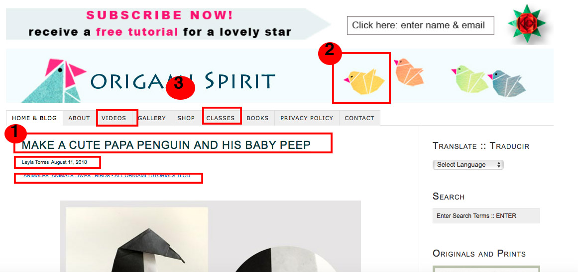
The visual treatment, consistency from page to page, high-quality video are its best features. The simple graphics and blog-style format along with navigation limited to the top of the page tell me that as an origami beginner, I’ll feel right at home (Figure 1). Yet, I appreciate that it’s not aimed at children. I can make something that appeals to an adult.
Constant Feedback and Orientation
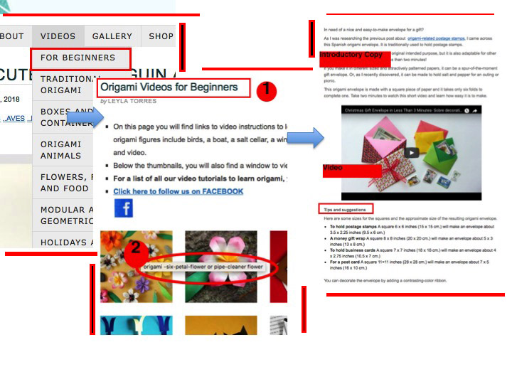
That’s born out as I hover over the top-nav. I easily find the videos. Beginner tutorials are at the top. With each click, I make successful progress toward my goal of finding something I can make (Figure 2). From each page, I can either return to the previous page, go to the “Home” page or choose an adventure by searching for keywords.
Community Spirit
Origamispirit.com seems to also be a community. Torres names people who have shared ideas or reference books and experiences she’s enjoyed.
Including time codes on the videos and providing an option to choose a language you want to work in shows a respect for the users time and comfort. Its presence also tells me that Leyla Torres believes this is an experience that crosses cultures and agendas.
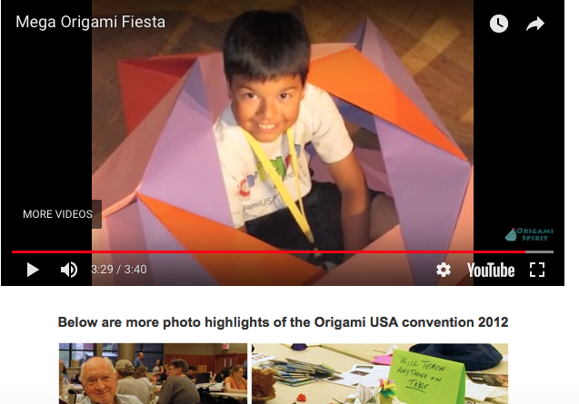
The community sensibility is at its best with Torres’s “Fun! – Non-tutorial” section (Figure 3) in the video drop-down list. This section shares the joy and passion, and opens visitors to lesser-known origami experiences.
Put-off by Pop-Up
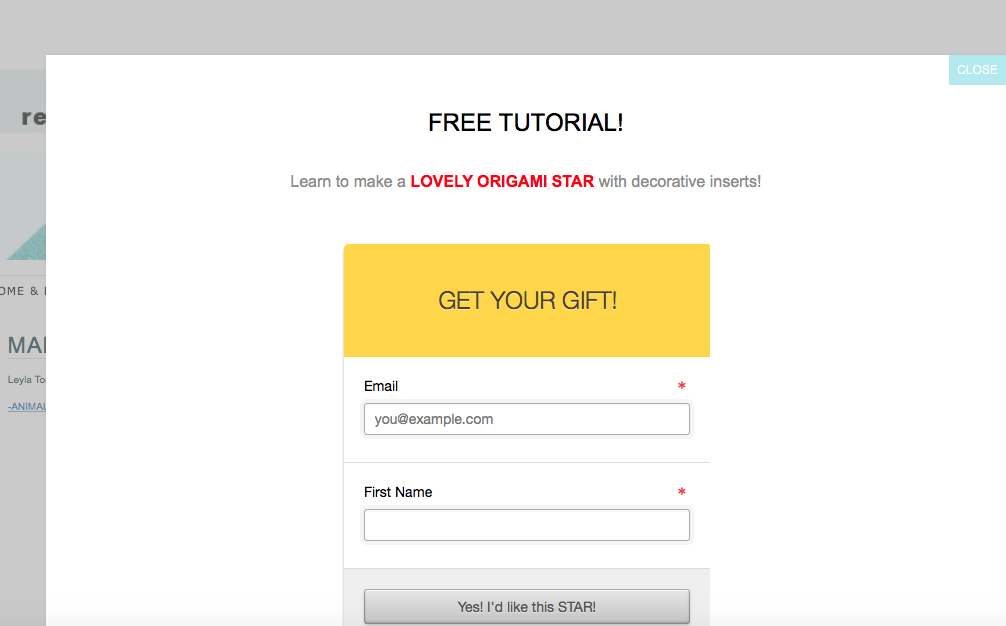
One thing that stood out as particularly off-putting was a pop-up (Figure 4) inviting me to join the email list in exchange for an origami plan. It seems out of place in a craft or art-type community, and unnecessary if I can enroll on the site. Even the placement – across the top of the page – of the invitation to sign-up for an email subscription seemed aggressive.
Recommendations
Community-building could be enhanced with more conventional layout while maintaining the ease of the site.
- I recommend moving the “privacy policy” and “contact information” out of the top nav to a footer.
- Across the top is an invitation to sign-up for an email subscription. This too could move to the footer.
- The Fun! – Non-tutorial section is so rich, I’d recommend moving it to the top-nav where it will gain more visibility.
The visual treatment could benefit from higher contrast. As it is, it feels “soft.” Deeper color tones, a less delicate typeface, or even including male hands in some of the videos give it a more intense feel. However, this is very subjective reaction and doesn’t truly diminish the experience.
*Garrett, Jesse James The Elements of User Experience: User-Centered Design for the Web and Beyond, Second Edition. New Riders, 2011. p. 81.