America’s Test Kitchen (ATK) has long separated itself from its Food Network siblings by its serious approach to cooking and a rich, subscription website. The experience is close to seamless as users are able to access and watch familiar television episodes and the tone of voice mirrors the on-air relationship that the ATK conveys.
While it’s not obvious if it is a fully responsive site, it does seem to be free from the “myth of the mobile user” as described by Peterson. Mobile once meant someone was out and about, and only needed certain types of information, but that is no longer the case. “People want to do everything on their mobile devices that they could do on their desktop computers – that is as long as you let them.”
ATK seems to want users regardless of where they are or the device they’re using. It keeps navigation simple regardless of mobile or desktop experience. It’s clear ATK understands its users desire to explore or solve a problem, and provides easy navigation for those journeys.
Once logged in, one is greeted by familiar faces of the television show, minimal top navigation, easy-to-grasp scrolling, and a search box that indicates the site will look for more than just a recipe.
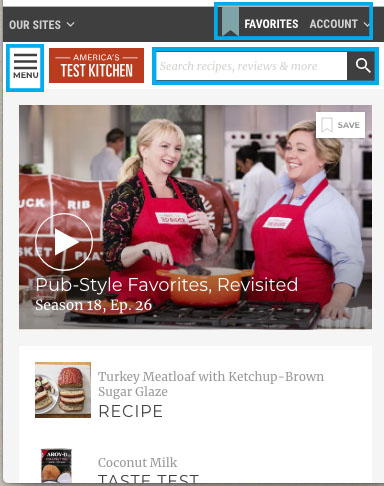
Access Favorites with Ease
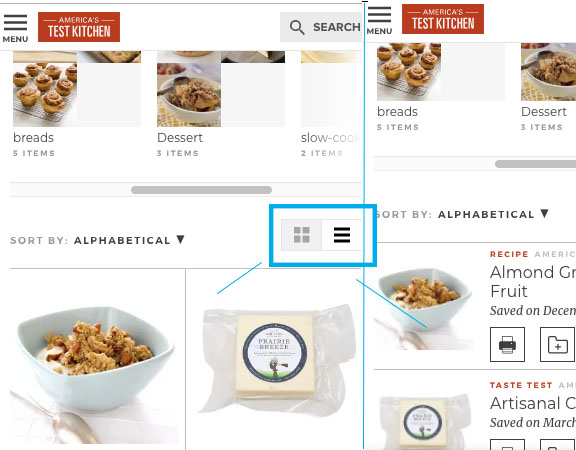
Other key features from the desktop experience are easy to locate and easy to use. Click on favorites, which bears the same blue strip on the desktop version, and the user will see all the recipes saved. It can be sorted by “collection,” “alpha,” or “date.” The user can view as boxes or a scrolling list. Both views include trademark professional images.
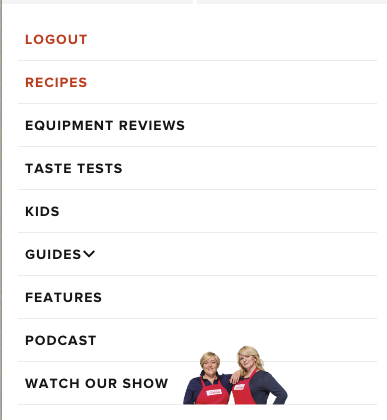
The navigation on the desktop is fairly simple, and is handily folded into a hamburger on a mobile device.
Opportunity for Improvement
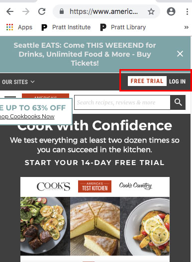
There is room for improvement. ATK is a subscription site, but pushes additional purchases and free trail memberships constantly. It creates a negative experience and can leave the user feeling that a non-subscription site might be just as good.

Peterson, Clarissa. Learning Responsive Web Design. O’Reilly. p. 224.