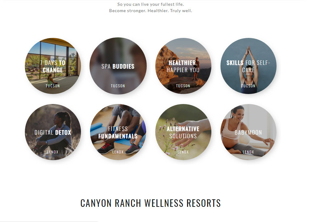
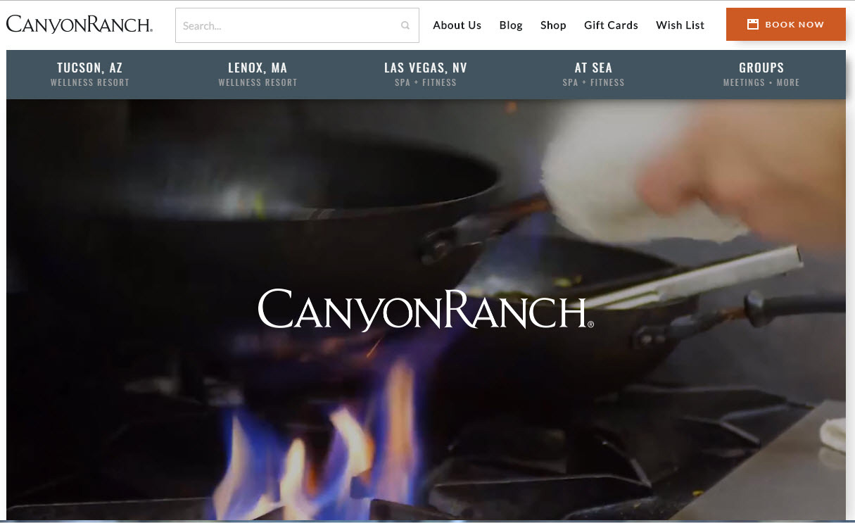
Canyon Ranch, the luxury destination spa, makes good use of visual interface design to convey a highly sensory experience for its desktop and mobile web users.
In particular, strategic use of text, shapes, and the size of the shapes along with high-quality video and dramatic contrasts among elements make the site attractive, drawing in even the shortest attention-span users. The elements are among those described in “The Essentials of Interaction Design” in chapter three of “About Face” by Alan Cooper, Robert Reimann, and Dave Cronin.
The elements used in the site make a big impact. Canyon Ranch’s web presence is essentially a travel planning site, but its use of visual interface elements make it seem much more.
Sensory Shove
The site makes excellent use of imagery, especially auto-play video. As Cooper, Reimann, and Cronin point out, it’s how the images are used. Whether on desktop or mobile, the user is greeted by a large, warm moving image.

Variation Adds Excitement
The images are of a consistent sensory expressiveness and vivid quality, but there is variation, which adds to the excitement of the visual interface. Only the top “hero” images are auto-play videos. Others are contained in static boxes. Still more are contained in round buttons that provide users with access to another level of the website. Because there are so many images on the site, users are likely to touch them as they scroll past, but even that is part of the experience with images emitting a flash of color when moused even in passing.

Centering
The typography is simple and its placement plays a roll in the overall message Canyon Ranch wants to convey. In both experiences the text is centered. It’s a very subtle invitations to users to make room for a centering breath or centering experiece.

Arranging Impact
The site content strategy pushes the strongest visual content and the most aspirational content to the forefront. Users might expect to see lots of recipes and healthy living blogs, but these are left for users to find through exploration.

