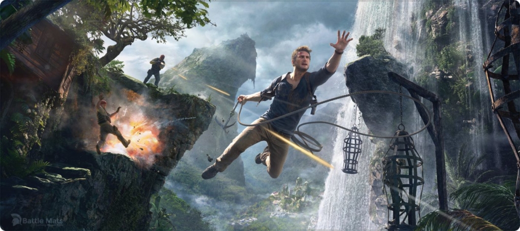
“Uncharted 4: A Thief’s End” is one of seven games of the Uncharted series, which is an action-adventure third-person shooter platform video game created and developed by Naughty Dog. This critique takes a closer look at how Uncharted 4 makes use of Don Normans Design Principles and uses them to lead the player through the game, specifically one of their main pillars of the game: traversal.
For the purpose of this critique I will address the user of the game as player.
Naughty Dog does something special in their game which is to use very little UI elements in their game in comparison to others.
These activity-centered controls help to give the player less cognitive interruptions, because there is no switching back and forth between controller, UI and screen. This also means that there need to be signifiers that lead the player to the desired goal.
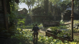
When looking at the traversal in Uncharted 4 and you look at the world created within the game it might not immediately be clear where one can climb. This is easily overcome in the game by making the ledges, which afford climbing, discoverable through visibly lighter colors then their surrounding. The grappling hook, which can be used to traverse the world, can also only be used in specific parts of the game. The game overcomes this issue by making the branches that afford using the grappling hook, signify that they can be used by being covered in rope. These branches are made even more discoverable through signals appearing when close enough to the element.
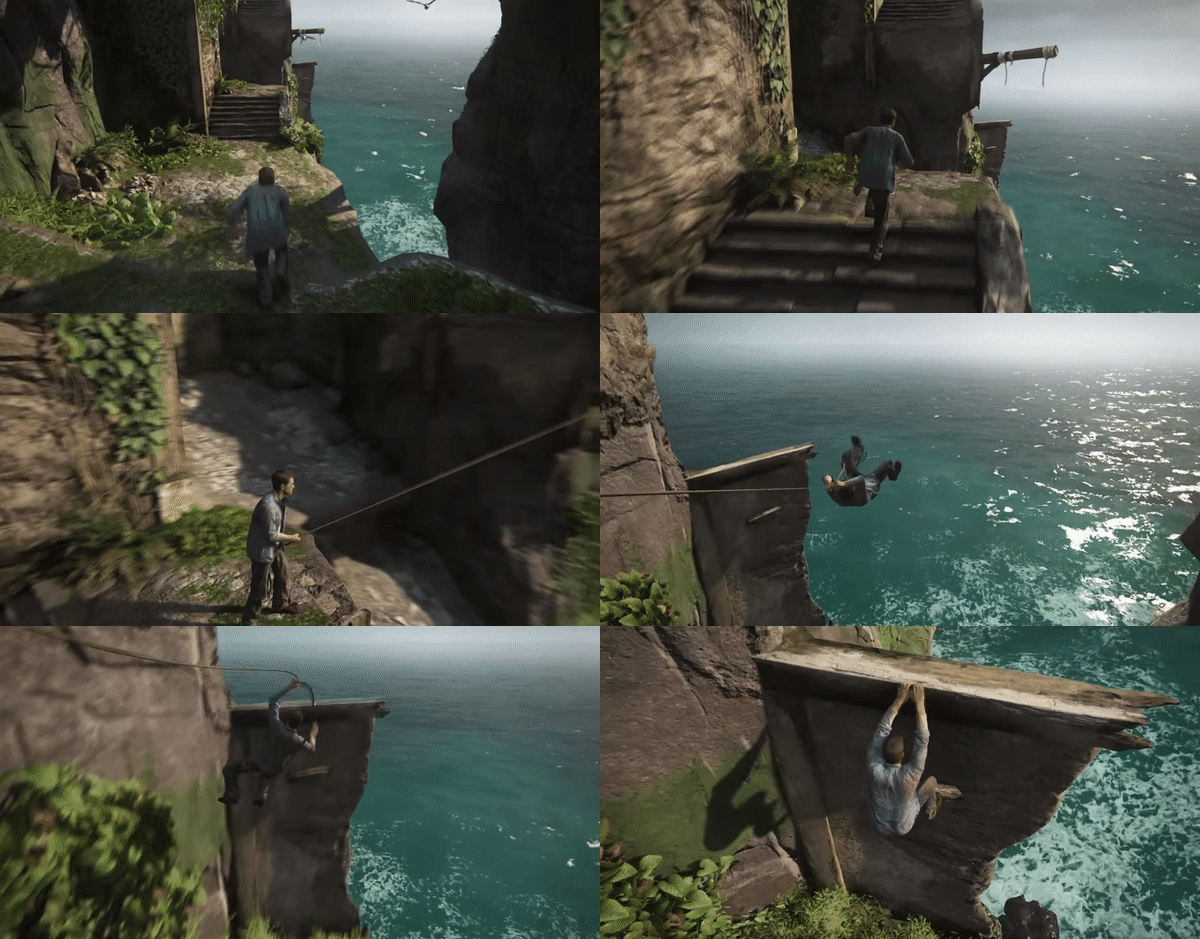
When playing the game the gulf of execution and gulf of evaluation should be as short as possible. Unfortunately, that is not always the case since the performance is restricted by having a controller to make movements that, like in Uncharted, are supposed to recreated the movements of a human. The only feedback given are the buttons that can be pressed, shaking of the controller when something important happens and audio and visual indicators on screen to indicate that the desired action was actually started, performed and completed.
The mapping within the game can be confusing at times but that is mainly due to the constraint of having a controller as the input device. When the player is to perform an action the button sign is the same as the one on the controller but they do not indicate what the action will result in. The only feedback that the player gets are the actions that the playable character is performing, in the following example pulling the piton. A solution could be to further explain and map the action to the signal by writing “pull” next to the triangle or using a pulling motion with the controller through the joystick buttons.
The conceptual model within a game can differ greatly so in order to clarify the character in Uncharted is a normal human. The path that the player can traverse is given a semantic constraint by not giving the player anything to hold on to or putting things outside of their reach. Would this be a game with a character that could for example fly this constraint and the conceptual model wouldn’t apply. On a behavioral level the player is given the time to interpret these constraints by not letting the character reach out for ledges.
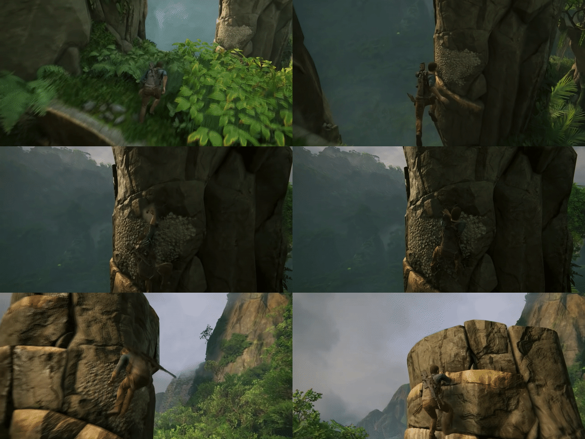
The game makes a lot of use of the players behavioral level of psychology by having moments during traversal where the player has to react quickly to grab onto another ledge.
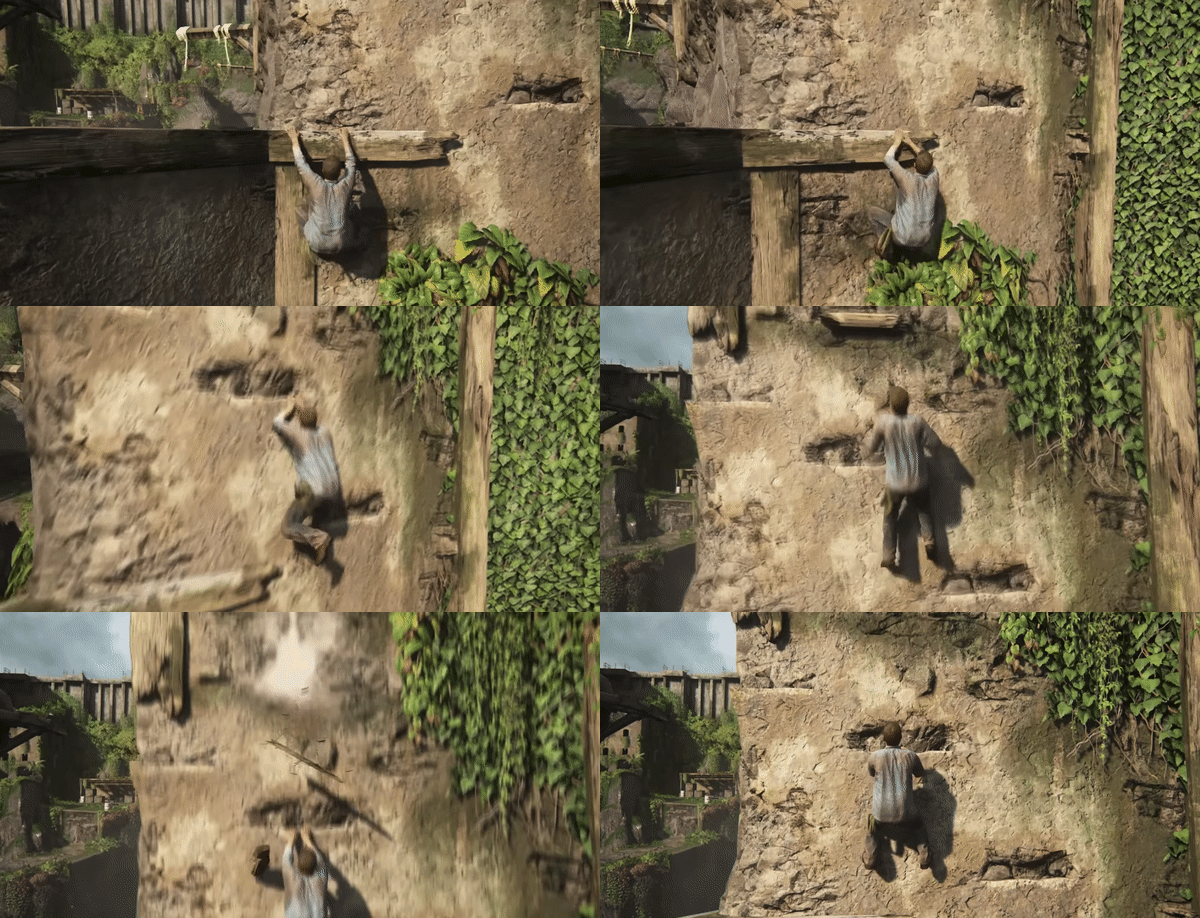
All these aspects create a flow for the player and there is room for action-based-slips. Full attention is continually required, which keeps the player engaged and makes the game fun.
