User experience professionals are currently positioned as the greatest potential perpetrators of, as well as the first line of defense against abusive design. We must understand the nuanced modus operandi behind dark design practices and examine our own and others’ context, intent,, and execution. This discussion on dark patterns seeks to encourage our Pratt community to advocate for user-centric design as future professionals.
What are dark patterns?
A dark pattern mainpulates human cognition to implement deception functionality that is not in the not in the user’s best interest. The first light was arguably cast on dark patterns in 2010 by UX Practitioner and academic of cognitive science, Harry Brignull, who defined a dark pattern as “a user interface that has been carefully crafted to trick users into doing things” (Brignull 2013).
A team at Purdue University expanded on Brignull’s magnum opus, restructuring his dark pattern typology into five contemporary strategic categories for practitioner-level comprehension and application: Nagging, obstruction, sneaking, interface interference, and forced action. Strategies can be used in tandem, and each strategy is used for various reasons and with varying degrees of deception, but in all instances stakeholder needs are valued over the users (Gray et al 2018).
Dark pattern strategies:
1. Nagging
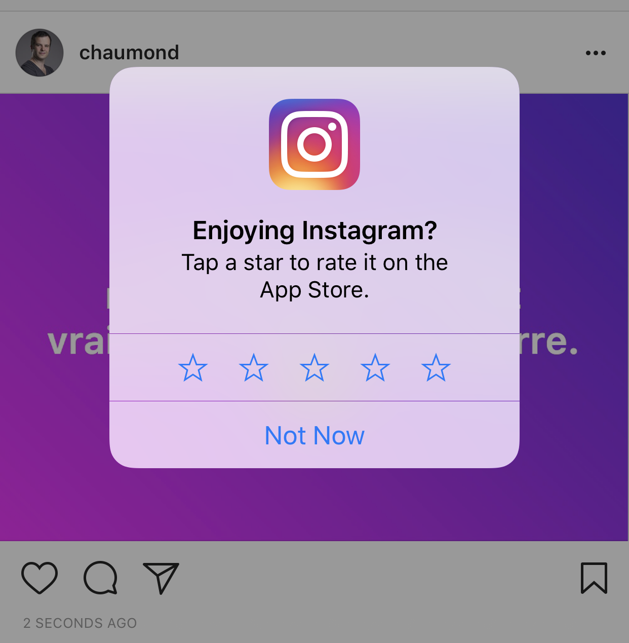
On an interface, nagging is a “reduction of expected functionality that persists beyond one or more interactions” (Gray et al 2018). Nagging typically presents as a repeating intrusion not related to what the user is currently trying to accomplish through obstructions, like pop-ups. Instagram (see Figure 1) and many other apps nag users to rate their product with a pop-up that gives the user no option to discontinue the cycle of nagging.
2. Obstruction
Gray et al (2018) defines obstruction design as “impeding a task flow, making an interaction more difficult than it inherently needs to be with the intent to dissuade an action.” In terms of trolls on the bridges of Norman’s gulf of execution, this obstruction monster is quite gnarly. Remember our classmate Kerry’s woes of not being able to unsubscribe from Winc, the wine app? Winc obstructs users intentions of canceling or skipping an order by making them contact support outside of the app if they don’t skip by a certain date.
3. Sneaking

Designers use sneaking to avoid divulging important information to the user, usually done by hiding, disguising, or delaying the information. Sneaking is a very common technique to get a user to complete an action they might not otherwise (if only they knew the whole story). Tidal, the music streaming platform (see Figure 2), uses sneaking by foregrounding their “Start Free Trial” button without revealing the user will be charged after the 30 days are over.
4. Interface Interference
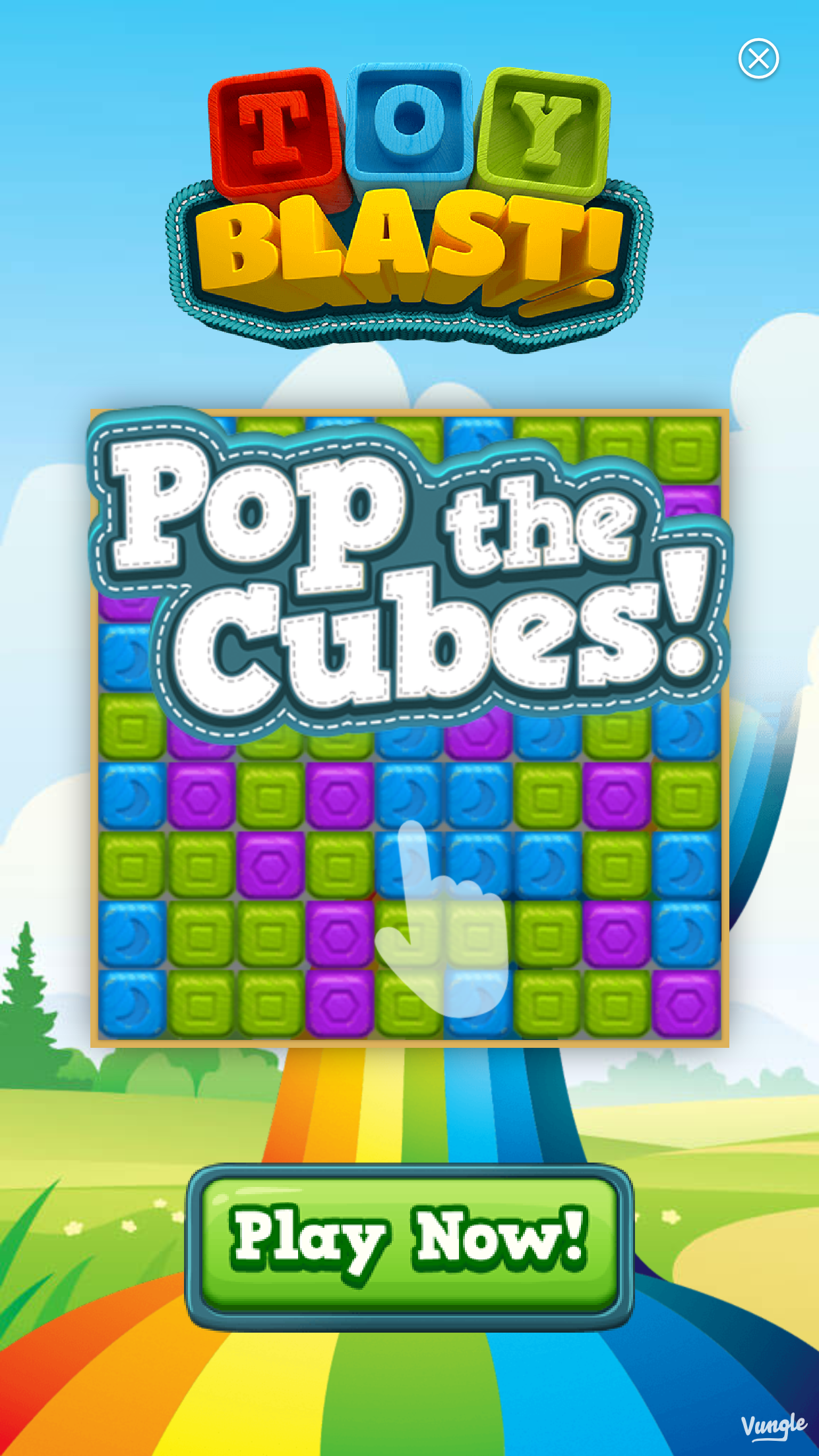
An interface interference is “any manipulation of the user interface that privileges specific actions over others, thereby confusing the user or limiting discoverability of important action possibilities” (Gray et al 2018). Pop Cubes (Figure 3), tricks users into clicking “Play Now”, which loads a site on another page, instead of starting the game.
5. Forced Action
Forced action is a strategy in which users are “required to perform a specific action to access (or continue to access) specific functionality” (Gray et al 2018). A virtual twist of the arm is used by products like Candy Crush, which forces users to either wait, ask their friends, or purchase credits to keep playing after their lives have run out.
Bringing dark design to light
Dark patterns are not the same as anti-patterns, or unintentional usability consequences of designer naiveté. But identifying the intent behind dark pattern designs isn’t so black and white (there is no design studio in a lair with a twisted Tim Gunn pattern-making to deceit for profit). Designing products requires balancing stakeholder and user needs while accounting for organizational pressures —it’s never a simple trade-off.
Within dark design, there are different shades of darkness that need to be examined. I’ll leave you with this anecdote: While my friend was working on a 2016 Presidential campaign, their team discussed using preselection, a sneaking and interface interference strategy, to make donations recurring. The team prioritized their fundraising goal over the fiscal capacity of the user, but rationalized that they were prioritizing the user’s ultimate goal of not electing someone accused of sexually assaulting at least 19 women to the highest seat of American government. What shade of dark is this?
References:
Brignull, Harry. “Dark Patterns: Inside the Interfaces Designed to Trick You.” The Verge, August 29, 2013. https://www.theverge.com/2013/8/29/4640308/dark-patterns-inside-the-interfaces-designed-to-trick-you.
Gray, Colin M., Yubo Kou, Bryan Battles, Joseph Hoggatt, and Austin L. Toombs. “The Dark (Patterns) Side of UX Design.” In Proceedings of the 2018 CHI Conference on Human Factors in Computing Systems – CHI ’18, 1–14. Montreal QC, Canada: ACM Press, 2018. https://doi.org/10.1145/3173574.3174108.