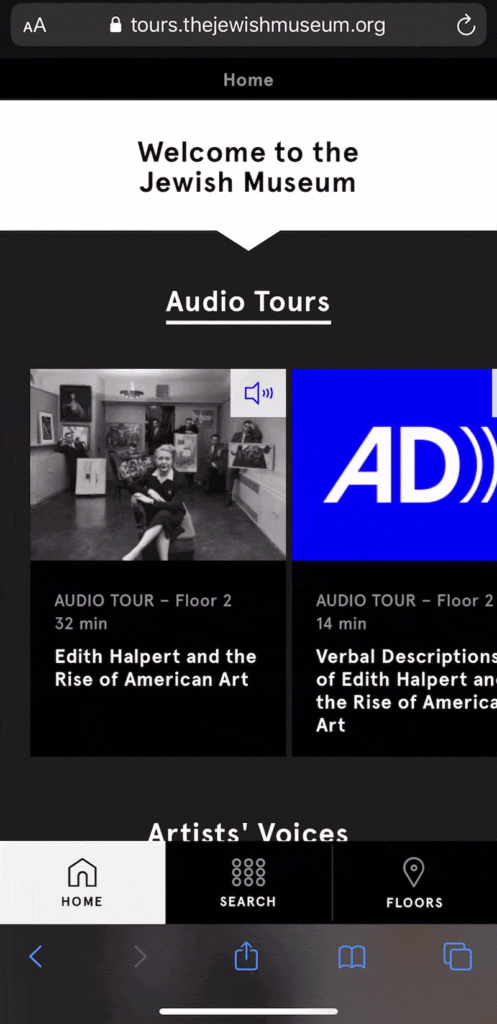
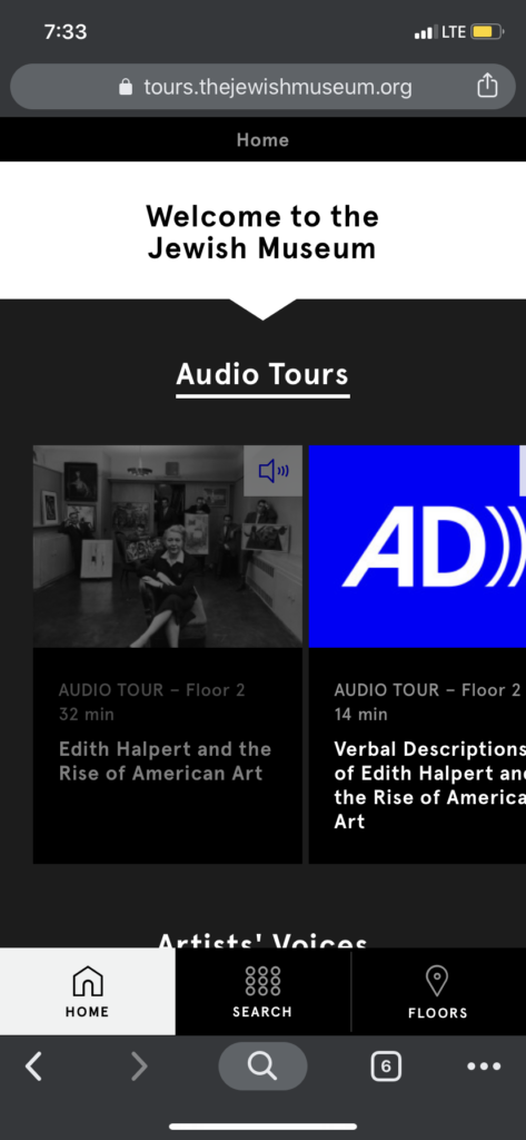
The Jewish Museum launched a mobile-optimized audio tours website in July 2019, hoping that it would be a tool to “illuminate works of art from the Museum’s collection, highlight a range of perspectives, and provide an engaging experience for visitors of all backgrounds.” In order to get an understanding of how users were using the newly launched website, the digital team from the JM reached out to Pratt’s Center for Digital Experiences. I worked with Agreya Gandhi, Xin Su, and Ye Yilan to conduct usability testing on the website and offer a series of recommendations for potential refinements to the user interface.
Setting the Scope and Building a Test
We first met with JiaJia Fei, Director of Digital at the JM, and Carlos Acevedo, Digital Asset Manager. JiaJia and Carlos were canny collaborators—they already had an understanding of potential challenges museum patrons might be running into with the audio tours, and were very familiar with the museum’s audience demographics and how that might translate into participant profiles for testing. Over the course of the conversation, we decided to focus on two groups: older users who represent the museum’s core audience but might find difficulty using a mobile web interface, and younger millennial users who might be more interested in using a modern mobile website to enhance their museum experience.
After meeting with JiaJia and Carlos, the team worked on recruiting participants and creating tasks for the study. The tasks came easily: we decided to focus on the two main functions of the website, the guided audio tours and the museum object search. We developed two tasks that would hopefully mirror a typical user experience. The first would ask users to take one of the guided tours available on the website. The second would ask users to find an object of interest and search for an audio clip using information provided on the museum label. From there, we created participant consents and a usability testing moderator script that would allow us to keep conditions consistent between tests and participants.
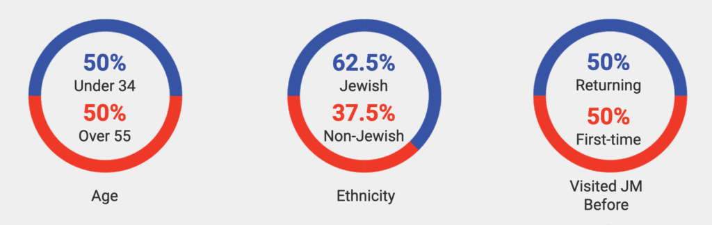
Unfortunately, recruitment did not go as smoothly. While the JM was kind enough to provide us with access to their volunteers and docents, it was difficult to coordinate a visit to the JM’s Upper East Side location with potential participants, especially with the Thanksgiving holiday looming. The team ultimately decided to recruit on site at the museum. We were able to complete 8 usability tests with actual museum visitors during the course of a single Sunday. The participant group ended up fitting very closely into the visitor profiles we were looking for, with half of participants older than 55 and half in the 18-34 year old age range. Half were returning visitors to the JM, while five out of eight, or 62.5%, identified as Jewish.
Conducting the tests
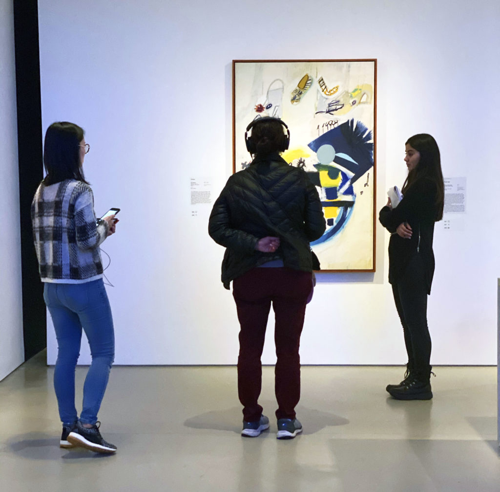
Testing on-site meant we were thrown a few curve balls. It was inevitable. We were testing in an open environment, with people who hadn’t expected to be taking part in usability testing that day. Even though we’d spent time designing tasks and writing detailed scripts to prepare for the tests, when it came down to it, a lot of the participants wanted to experience the museum on their own terms. They didn’t always follow tasks as given—which the team ultimately took as a good thing. We wanted to see how visitors were engaging with the website in context at the museum, and this was as close to a true experience as we could observe. All our participants were generous with their time and comments and provided us with excellent insights, which were invaluable as we developed our recommendations.
Findings and Recommendations
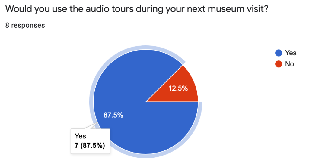
Participants were really positive about the audio tours website, with one user saying, “I really like that. It’s exactly the kind of information I’m looking for in a museum app,” and another stating, “I would spend more time here” now that she knew this information was available to her. Every single participant said that the website improved their experience at the museum, and seven out of eight said they would make use of the website if they returned to the museum.

However, many of the participants ran into similar challenges using the website. After coming back together to discuss our findings as a team, we came up with three recommendations for refinements to the website that would improve usability and create a more seamless experience for museum visitors.
Recommendation 1: Provide clearer instructions for wayfinding
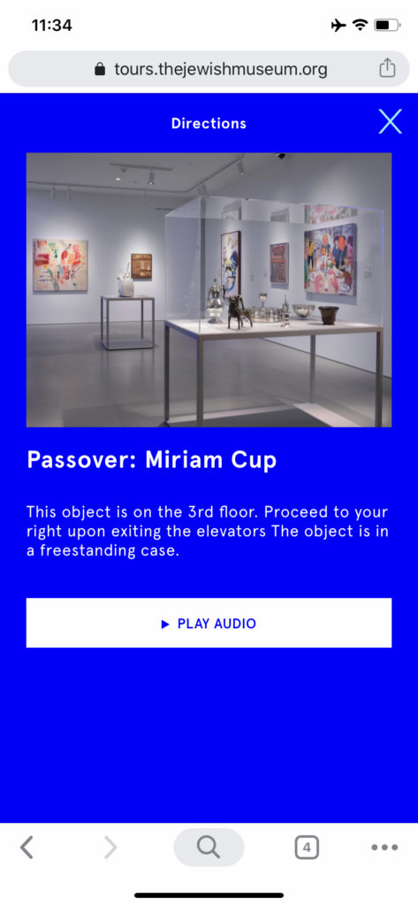
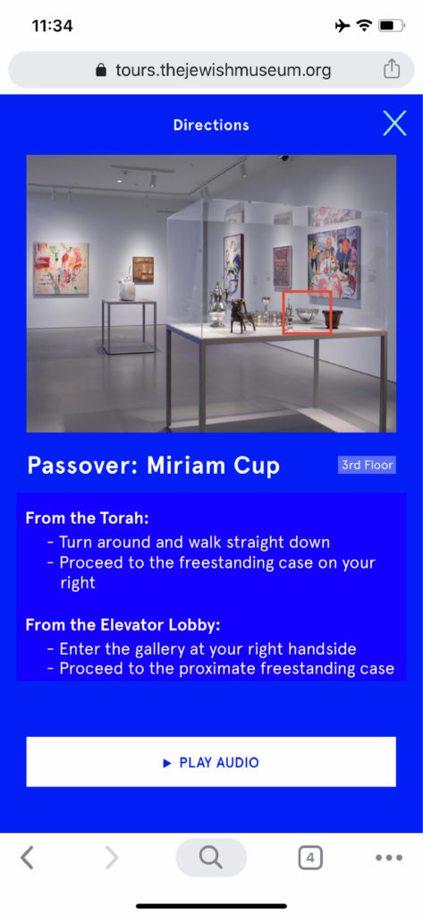
One of the most common points of confusion was with wayfinding between objects in the guided audio tours. Users had difficulty following the directions provided and finding objects. In order to make it clearer for museum visitors, we made a series of recommendations:
- In images where multiple objects are depicted, add a highlight or box around the subject of the audio guide.
- Add icons or markers to help locate the object on a floor or in a gallery.
- Break up text directions into bullet points for more succinct step by step directions.
- Give the user navigation options. If the user is navigating between objects, give them information from one to another. If the user is starting from the beginning of the exhibit, provide them with another set of directions.

Recommendation 2: Change the color of the bottom navigation buttons
Users also had a tough time finding the navigation button that would take them to the search page. Some participants would scroll through the entire home page and would only notice the bottom navigation buttons after they reached the end of the page. Some users even confused the search icon that was part of the mobile Chrome browser for the website search.
We recommended changing the color of the buttons to make them more visible. The black of the current design tends to blend into the home page, making it difficult for users to spot. We also recommended changing the background color of the search page from blue to black, to create more consistency between pages on the website and to not create a situation where the blue buttons would blend into the blue background.
Recommendation 3: Make search result links more discoverable
Our final recommendation is to modify the way search result links are formatted. Users had a tough time figuring out how to play audio clips after they used the search function. It wasn’t immediately clear that the red text was meant to be a link.
We recommended adding a circle around the play button icon to make it more obvious, and the add an underline for the text to make use of the overall web understanding that links are underlined. These would provide users with more clues on where to click for more information.
Conclusion
The team put together a full report of our methods and findings, and created a presentation to communicate what we learned with JiaJia and Carlos. In our discussion, Carlos was enthusiastic about our suggestions. These had been problems the team at the JM had noticed before, but our testing was able to provide real experiences and insights into what was happening on the user’s end.
In some ways, it felt like the flexibility to let users deviate from plan yielded some of the best observations and insights. Our job was to build a framework for the test with our scripted tasks and let them fill in the rest. Letting them wander and get stuck showed us how they really wanted to use the product, which allowed us to make recommendations that would most benefit them in the end.
For a copy of the full usability test report, with more detailed methods and findings, click here. To view our presentation slide deck, click here.