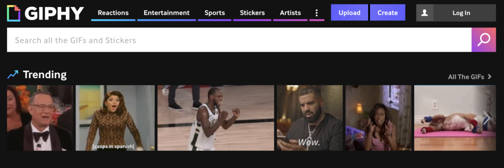
Giphy is a multimedia search engine and content distributor most known for their animated, looping GIFs. Giphy’s many integration platforms include Instagram, Slack, and Twitter, but this critique will focus solely on its mobile app for iOS and the experience it provides for both searching and creating content.
Search and send a GIF
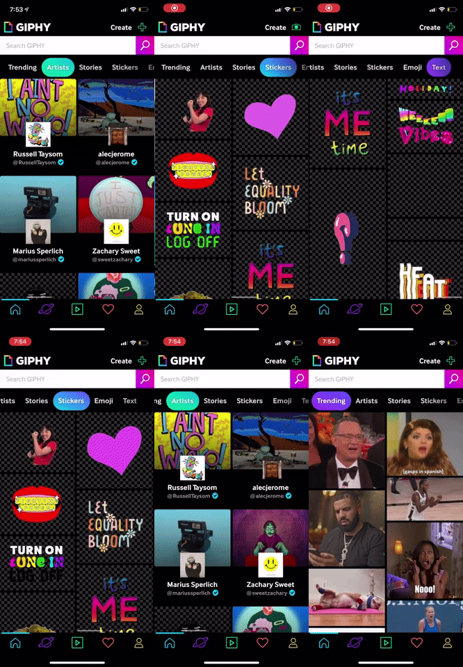
Upon login, users land on Giphy’s home screen and are welcomed to the experience with Giphy’s trending GIFs. iOS users will immediately recognize the familiar five-page navigation bar at the bottom of the screen that is consistent with many mobile apps.
Rather than labelled page options, the navigation draws upon users’ mental models to map its icons to different functions. For example, the planet icon maps to the Explore page and the heart icon maps to the user’s Favorites.

From the default trending tab, users can find other featured content by swiping left and right anywhere on the screen to switch tabs or selecting a new tab from the top navigation bar. As the user navigates between tabs, the selected tab gains color among the black background, offering an immediate signifier of the user’s current location. The cut off and fade out of the right most tab option suggests continuity that encourages left-right scrollability.
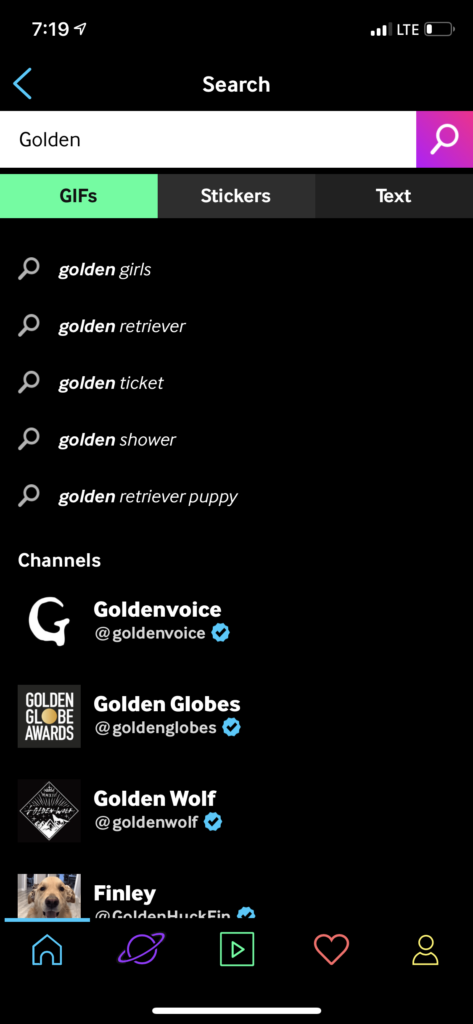
Alternatively, if the user already possesses the intent to discover a specific genre of content, they can use the search bar directly. As the user types, predictive suggestions populate underneath. This allows the user to draw upon knowledge in the world rather than knowledge in the head exclusively, helping the user select the search phrase that best matches their needs.
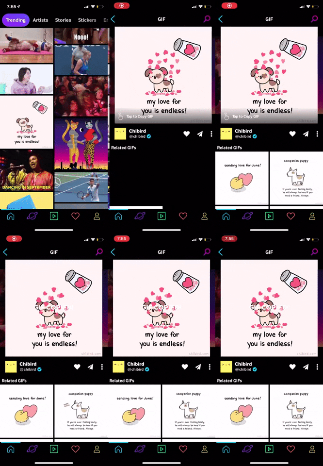
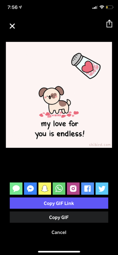
Once the user has selected a single GIF, an icon appears in the bottom left corner of the GIF with a caption to “Tap to Copy”. Upon clicking, a screen overlay appears to give immediate feedback that the GIF was copied successfully and is ready to be pasted into the user’s destination.
Alternatively, the user can select the paper plane icon to be shown a row of logo icons offering sending shortcuts. The myriad of available icons allows the user to use recognition rather than recall in order to determine the avenue which they want to send their GIF.
Create a new GIF
On the home page, an icon flashes between a “+” and a camera to signal the option to create new content. Indeed, tapping on the icon opens the camera to capture a new picture or video. While users may select files from their existing camera roll, the interface encourages them to create a GIF in the app by opening the front-facing camera by default.
Giphy provides numerous constraints that guide the user towards successful creation. For example, the toggle at the bottom indicates that GIFs or stickers are the only available content types, and the reel cycles through the available camera lenses.
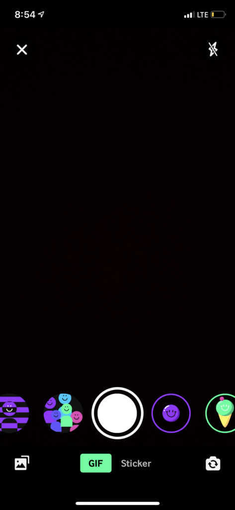
As a user records a new GIF, a red border begins to snake the perimeter of the screen to indicate the remaining recording time available. Once the border completes the full perimeter, recording stops automatically. This additional constraint not only visualizes the length of a recording, but also prevents the user from exceeding the recording limit, thus avoiding the need to crop the recording afterwards.

Favorite
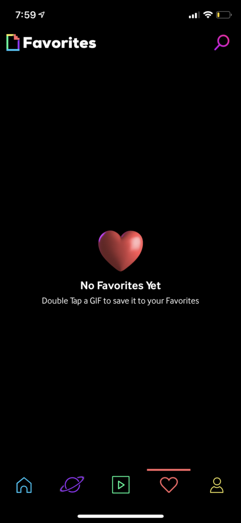
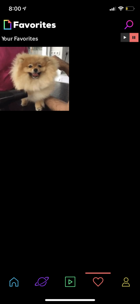
First time visitors to the Favorites page will find instructions to double tap to like and unlike content, following the familiar Instagram action that has become ubiquitous across mobile apps. Alternatively, users can also tap the heart icon on a GIF’s page and will receive immediate visual feedback when they like or unlike a GIF.


Drawbacks
Long Press Shortcut
One of Giphy’s drawbacks is its poor discoverability in relation to shortcuts. For example, long pressing a GIF opens a module that allows the user to share, save, and copy a GIF without having to navigate to its page first. However, Giphy never offers hints that this functionality exists, and its poor visibility decreases traffic to the feature. This hidden functionality only poses a minor usability problem (2) on the severity rating, as the user can still accomplish their goal from the GIF page instead.
Solution:
Implement an icon/caption combination similar to the “Tap to Copy” described above upon initial download of the app.
Play and Pause Content
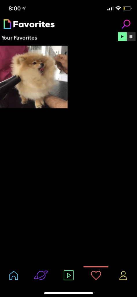
Even more hidden are the play and pause buttons that control content playback throughout the app. App content replays by default; in order to pause this playback, the user must first favorite a GIF, then navigate to the Favorites page to toggle on the pause button. If a user unfavorites their only liked GIF, the toggle disappears, and the app becomes stuck in its current state. In fact, users who never favorite an item in the first place will never discover this functionality at all. The severity of this usability problem is major (3), as there is no alternative path to undo the pause once the toggle disappears.
Solution:
Make the play-pause toggle available in the same position on all tabs, and allow the user to select their default play or pause when they initially download the app.
Summary
Overall, Giphy’s mobile app offers an entertaining and captivating experience to discover and produce new animated content. GIFs are presented in a never-ending feed that appeals to the visceral level and encourages a limitless mentality. At times, the constant motion may feel overwhelming, but Giphy’s trove of content offers every user a GIF that will make them smile.
