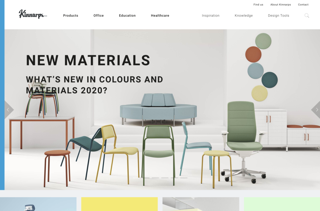
What does Kinnarps do?
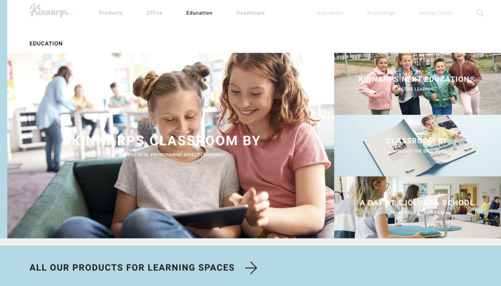
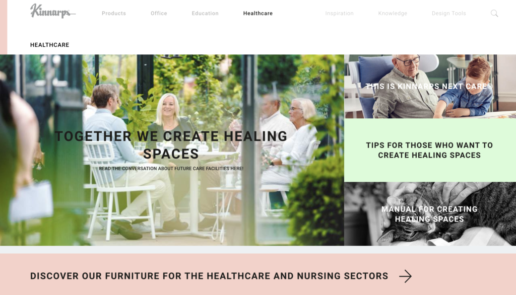
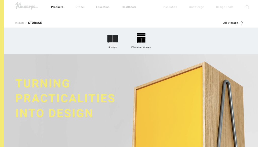
Kinnarps is a Swedish product company that owns several brands(Kinnarps, drabert, MARTINSTOLL, etc.). Their core products are office products, education products and healthcare products. In their website, you can find all their products, each product details as well as how to purchase it through third-party dealer. They have a great organization of the product details, from giving a product sustainability index to product brochure and video descriptions. You can also find the inspiration of their design through this site, designers’ knowledge behind the products and design tools they explored. Overall, this is a very user-friendly and informative website to shop and visit.

The elements of User Experience: User-centered design for the web
by Jesse James Garret
This book talks about user experience and why it matters, and introduces the five elements of user experience – Surface, Skeleton, Structure, Scope and Strategy. He also mentions about the basic duality of user experience, which is one called Product as Function and another called Product as Information. Because of this duality, user experience design divides and merges into different concept of design based on the five elements (see image below). The author uses a lot of examples to illustrate five elements in details and how to approach them successfully.
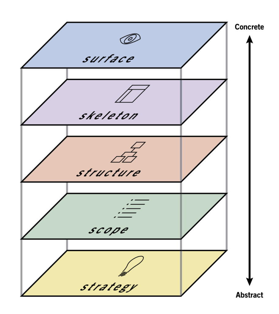
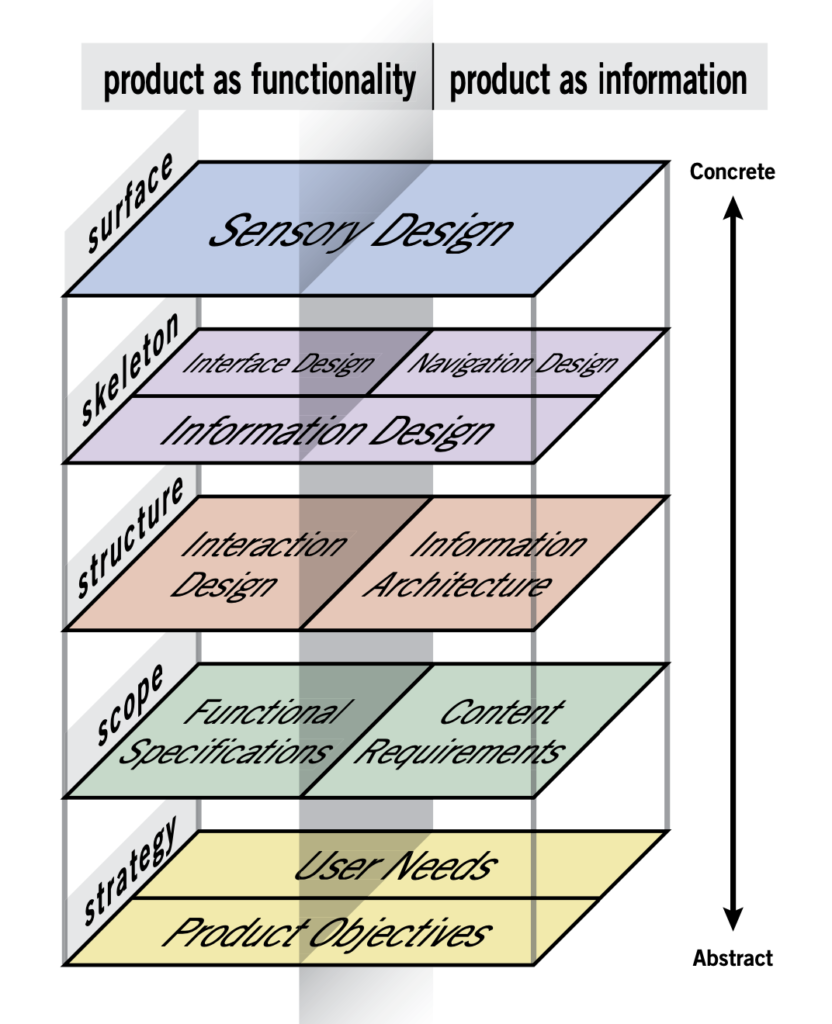
The five planes (Five elements from top to bottom)
- Surface -visual presentation that made up by images, text, and other visual elements.
- Skeleton -the placement of those visual elements in order to maximize efficiency of the user experience.
- Structure -the arrangement of navigational elements to direct users through the whole process.
- Scope -features, functions and contents that the website offers.
- Strategy -“What do we want to get out of this product?” and “What do your users want to get out of it?” —Jesse J Garret.
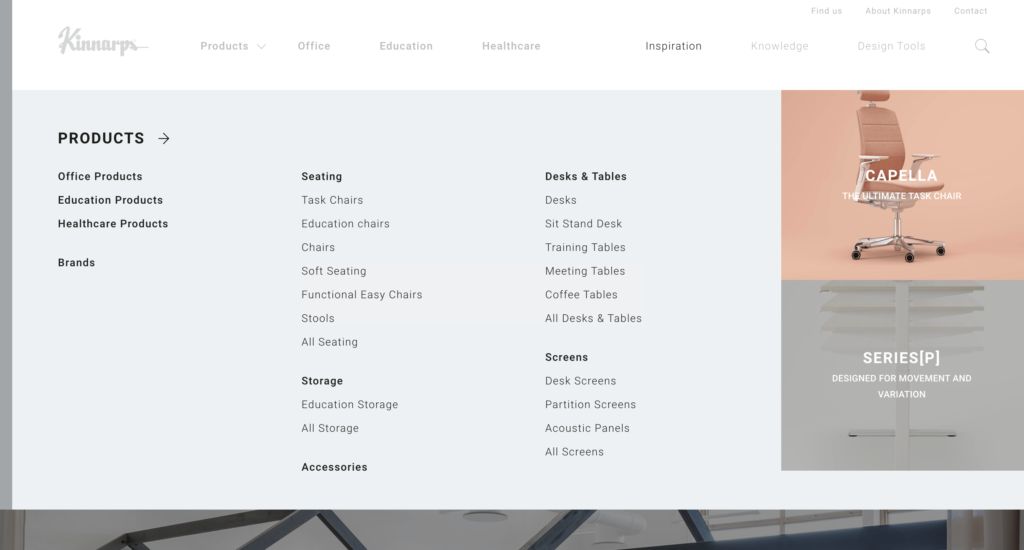
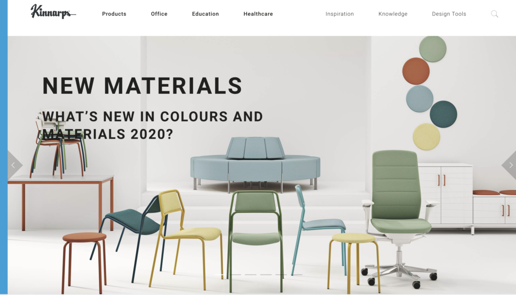
The landing page: kinnarps.com 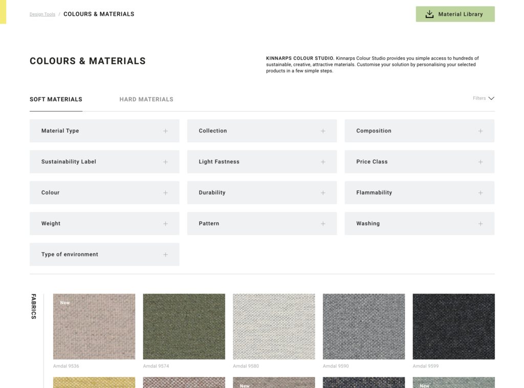
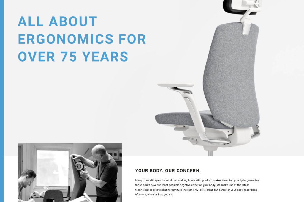
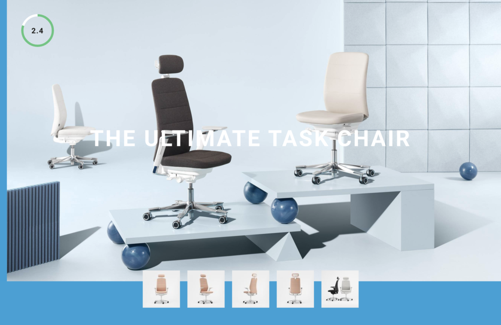
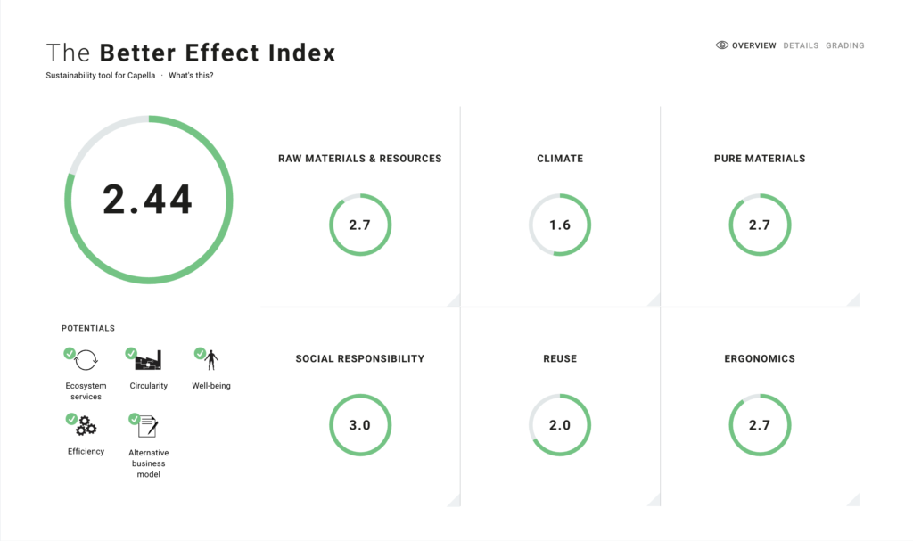
Looking into the website based on the five elements ( from bottom to Top)
Strategy
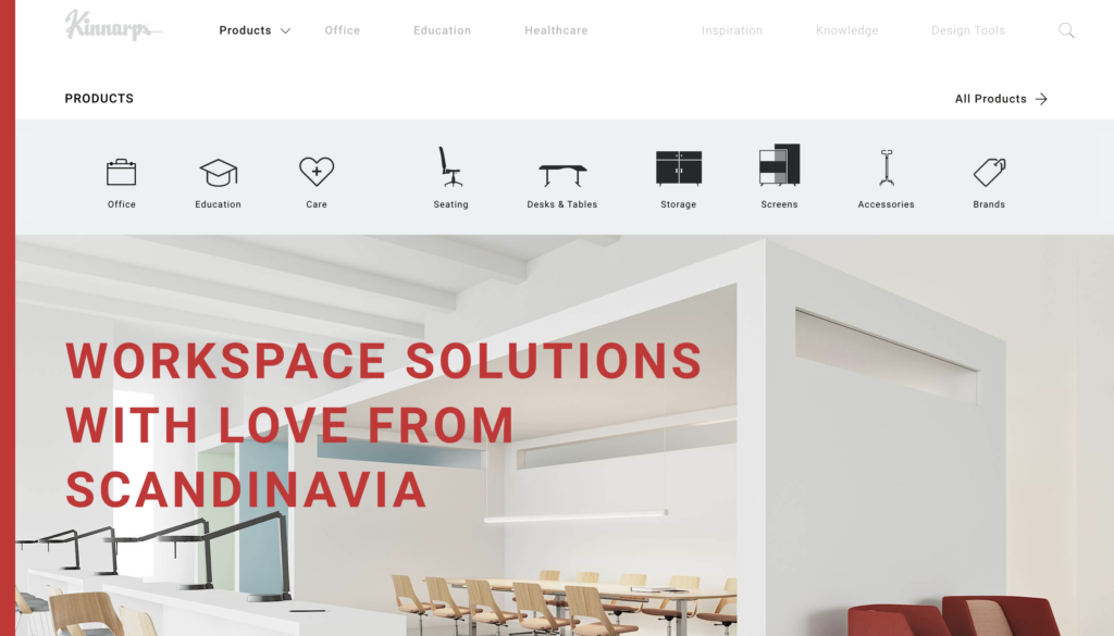
In the main menu, as a user, I understand what I can get out from this website. There are choices like products in general, products in different categories, inspiration of their design and knowledge behind what we see of the products. If I am a shopper, I fully understand the website’s structure and I can easily get what I want through the features they have in the product details page. If I am a designer who comes to check out others’ products, I can learn a lot from their structure of organizing their ideas and know why their products are better or worse. As a business owner, it’s fundamental that our business model is clear to the users and the website has all information users need in order to decide if that product is the right one for them. And also, our branding is clear and specific. We are passing a message that we focus on user-centered design and ergonomic design providing the customizable choices to the users. We cares about the environments, and the users benefit for the long run, so we provide sustainability index for the users.
Scope
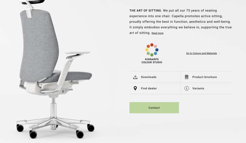
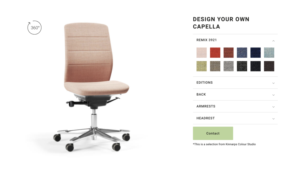
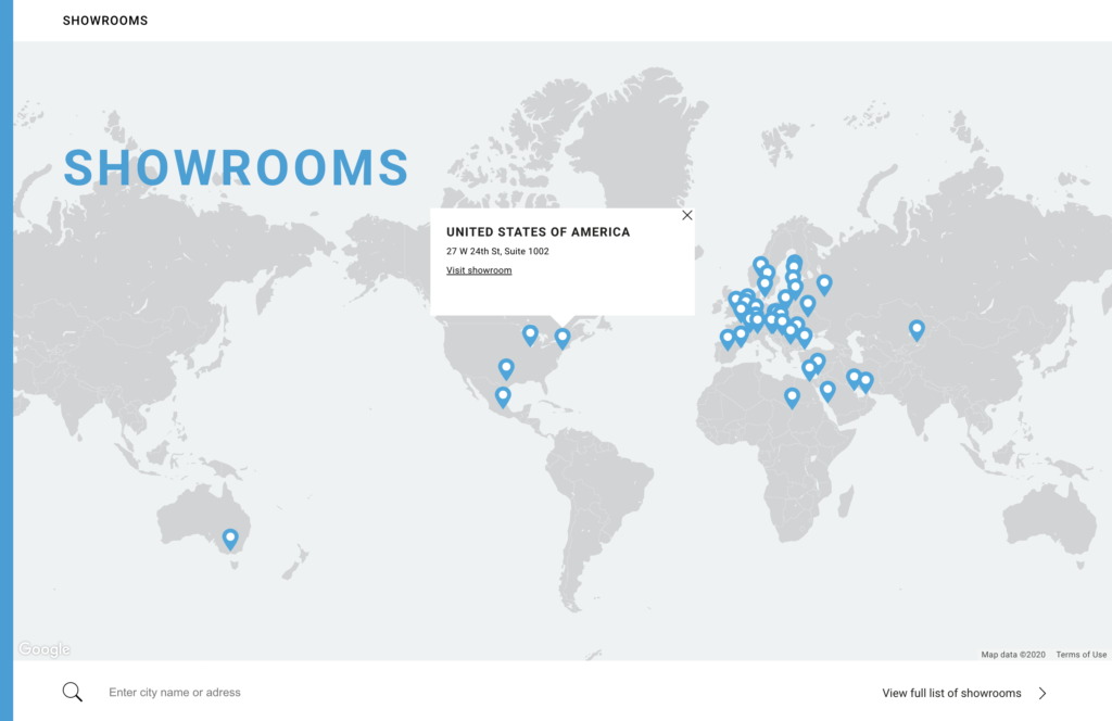
Just like what have been mentioned in the strategy, this website has clear scope of all the features and functions. It’s a website that not only contains all their products information, but also their concept of design and human beings. The contents of the features can be organized into XXX groups. One is category and gallery combined products. One is products information, including product descriptions, assembling manual(Product brochure), Customization, design inspiration, sustainability index and ways to purchase. Another one is additional information including inspiration, knowledge of the design and design tools. The last one is company information, who we are, and how to find us.



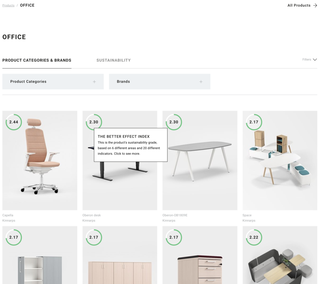



Structure
The structure of this website is very easy to follow. There are a lot of expandable contents but all linked together in a way. It has a very clear and pleasing hierarchy for the user. Not only the big structure of this site is well managed, but also the small structure such as menu bar and information related on the menu bar. The customization process is very easy to follow by any types of users because of the structure layout of all elements and contents.
Skeleton
The interface design is clean and simple. All the navigations are predictable and design itself follows their brand identity. There is no any overwhelming design. Images of the products and the concept they try to convey dominate the whole site with navigations along.
surface
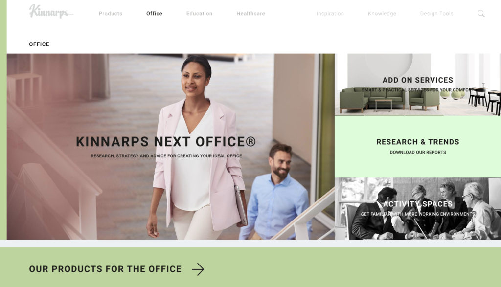
The visualization of this website gives a health, happy and comfortable sense. The color combinations go along well with each other and work differently in different sections of information through out the whole website. It help the users to identify brand identity and build up the trustfulness of the company. Besides color usage, the nice images quality enhance the user experience. All human activities images are well related to the header. The product images are nicely shot and edited to allow the users to have an immersive visual pleasure. The color and size changes give the hierarchy of information and help users to understand what is more important.
Overview
This website in general is well designed. I enjoy browsing it as well as learning small design details from it. All of opinions are based on my personal understanding of the book: The Elements of User Experience: User-centered Design for the Web by Jesse James Garret. Check out this website and the book!
