To begin with: An Introduction on 500px.com
500px.com is a website for both professional and amateur photographers to present, critique, sell, and purchase photographs or their service. Thus, because of the commodity here are high-quality photos and the selling process requires advanced knowledge on licensing, the website may target more experienced audiences. As a professional photographer myself, I choose 500px as my priority platform for image presentation for many years. The website has changed a lot since then but in a much better way.
Brief Discussion on Jesse James Garret’s Book
The core concept of this book is Jesse’s “Five Planes”, which I will list below:
- Surface
- Skeleton
- Structure
- Scope
- Strategy
As we going through the planes by this order, it is easy for us to deconstruct any website. The surface is mostly about visual elements; the skeleton is the design framework; the structure is about information architecture and nevigation; the scope is related to the web application and other functions; Finally, the strategy is about the business core.
However, if we examine a website backwardly, it may be more understandable whether or not the website is a success. And this what we will do here.
Strategy of 500px.com
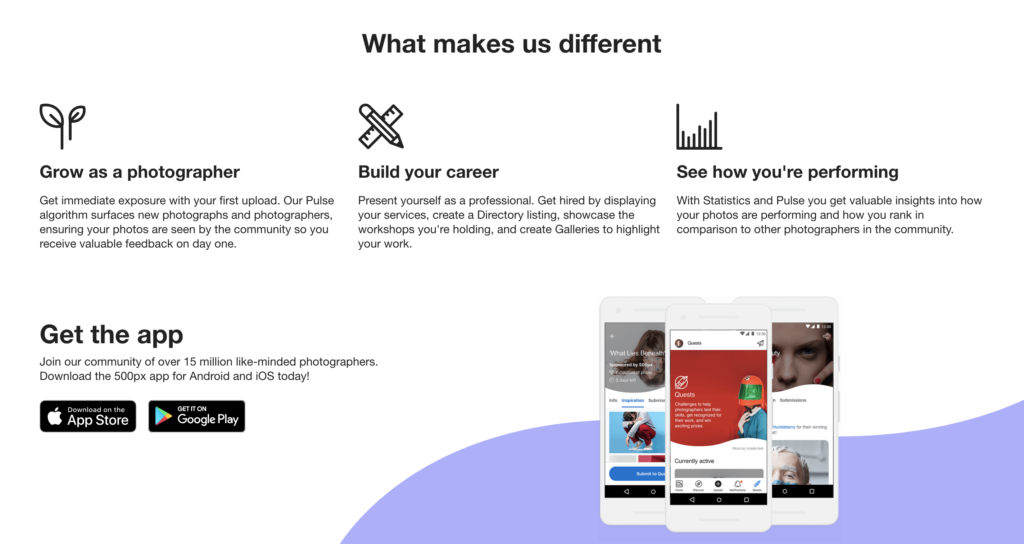
500px.com is never designed for general Instagram users or beginners. The function of this website is way beyond a social media platform and it is not designed for the small business owners who sell normal commodities. They have a very specific goal, which is creating a community for professional photographers and buyers to exchange high-quality photography services. You can check the purpose of the website just below the home page image.


Scope of 500px.com
Since the target audience of this website is divided into buyers and photographers with an emphasis on photographers, the function of this website is also divided into two parts. For the buyers, they will experience a purchasing process just like other shopping websites. All related functions should be installed on this website. For the photographers, they need to manage both selling functions and advertising functions on this website.
Structure of 500px.com
Since the emphasis of the user is the photographer, 500px.com has a very clear structure to provide services for the user. It is easy to follow the website to register as a photographer and the dashboard page can lead to a clear instruction on what to do next, for example, to view other’s work, to present own works, to business-related functions, etc… Though the function of this website could be complex, the navigation of information is quite instructional and direct.

Skeleton of 500px.com
Honestly, even if I could tell the website tries very hard to manage the design style by adding space between blocks, the overall design style is not well. The spacing is unbalanced and it may cause the user to lose focus.
Surface of 500px.com
Just like the Skeleton of the website, I think the design elements are not balanced and don’t have a sense of priority in many ways. It may also need to add some dynamic icons or colors to attack new users.
Conclusion
As a long time user, I don’t have any complaints about the function of this website. The concept is practical and easy to manage. It still helps me functionally, but I also realized that I don’t really enjoy working with 500px.com anymore. If we examine more data on the website, we can obviously see that the website is losing audiences too. Maybe it is time for them to design the website in the near future.