The COVID pandemic hurts the world economy badly but brings a positive impact in one industry, which is the gaming industry. I’m a gamer, but before COVID I only watch gaming videos when I am stuck in a game. However, during the pandemic, I spent much more free time to watch e-sports or live streaming games, which I never watch before. That’s how I found Huya.com. I use mobile devices to watch most of the time, thus I’ll critic on Huya’s application instead of the website in this critique.
A brief introduction of Huya.com
Huya is the No.1 game live streaming platform in China and it will merge with the 2nd large game live streaming platform in China soon. As one of the largest gaming communities in China, it has all sorts of videos about live streaming or anything related to this industry.
1.Organization System: how Huya categorize information
A traditional video or live streaming application mainly categorizes their video by content, for example, documentaries, thrills, or comedies. However, Huya doesn’t divide gaming videos by the content of games. For one thing, the total number of games suitable for live streaming is limited because the gaming industry is not as productive as the film or television industry. For another, games that have the most reviews share one common feature, which is competitiveness. Though there might be people who watch farming games online, the majority of users are there to watch gamers compete with each other. Therefore, it is not reasonable to organized games by the content of type. As a result, Huya chose to categorize games by gaming devices and play method, and there is 3 basic category:
- Online multiple players game
- Offline Single Player game
- Mobile device game

Huya also creates a category for users to discuss all that related to games, but this is not the core business of the application.
2.Labeling System: how Huya represent information
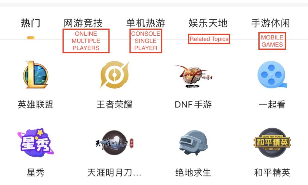
The way Huya labeling reflects what I just talk about, which is how they category gaming. Since the most important feature of a game live streaming is competitiveness, Huya wants to use labeling to navigate their user to the right live game streaming.

The first orange block covers 2 characters, which represents “competitiveness”, the second one represents “hot and trending games”, the third one means “Entertainment” and the last one is “leisure”. Any user can clearly understand the differences here.
3. Navigation System: How Huya browse or move through information
Though Huya’s organization system and labeling system are quite different from other streaming video applications, the navigation system is designed with the same ideas.

It has top navigation(the labeling) and a hamburger menu for people to quickly jump to their interesting video category. Then, you can scroll down videos to select. At the bottom, there is a fixed navigation bar that allows you to go directly to entertainment, subscriptions, discoveries, and your files. I think this is boring and plain. In short, there is nothing unique here.
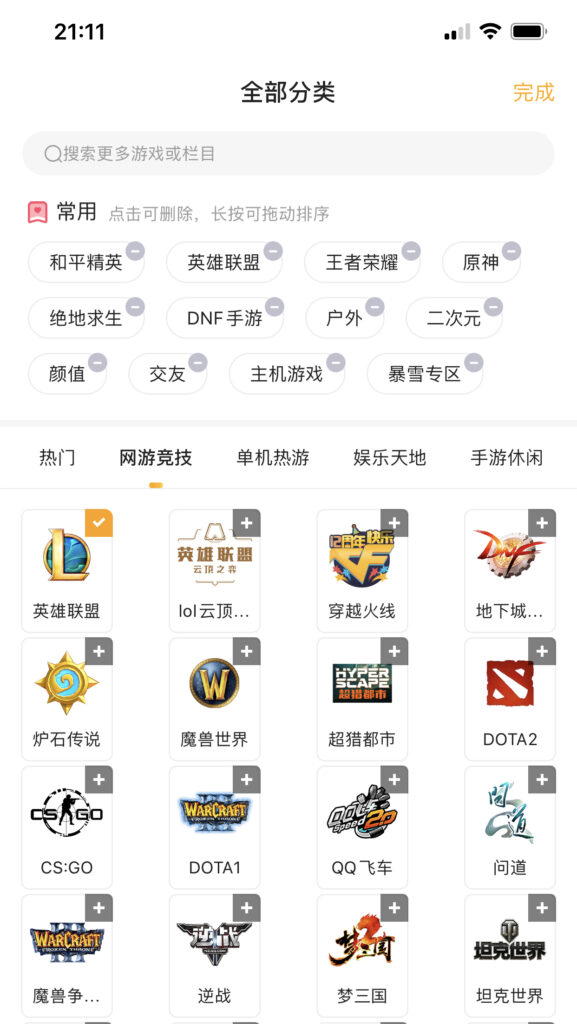
However, under the hamburger menu, there is a sub-navigation grid, which is very intuitive and can reflect how the category method influences the whole structure.

This navigation page is divided into two-part. The first part is the labeling pool. The second part is the logo grid. What interesting about this design is when you chose a game under, the system will create a tag on top. Thus, even if you switch from a different category you can always navigate yourself to the destination.
4. Search System: How Huya search information executing or search against an index.
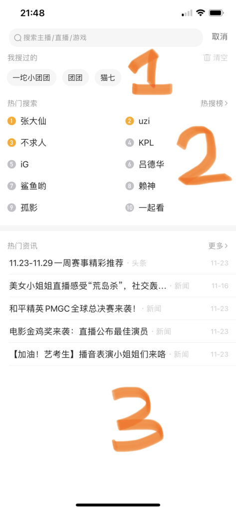
Huya’s search system has nothing noteworthy to examine. The pretext on the search bar represents the gamer/LiveCode/game. Under the search bar, there is a search history and top search result list. After these two sections, there is a top news list. This means you have to know what you want exactly to use this search system. On the other hand, to offset the insipid searching function, there is a discovery function on the homepage.

5. Conclusion
As the top-ranking live stream gaming application, Huya did a great job on organization and labeling system, which is the cornerstone of this application. Though the navigation and search system has nothing remarkable, it finishes the job. Therefore, overall this is a great app for the user.