Empathetic design.
Empathy is defined as the capacity to understand or feel what another person is experiencing from within their frame of reference. Empathetic design integrates this mindset of placing oneself in another’s position into the design of products. In this design critique, we’ll look at the navigation application, Waze, and how they’ve incorporated empathetic design into their digital experience.
A glimpse into Waze.
Waze operates as a traditional GPS navigation system in its function of providing directions, while also employing the use of crowdsourcing to provide real-time updates on traffic and routing based on feedback from other drivers.
Waze has two apps – ‘Waze’ and ‘Waze Carpool’. In separating the two, Waze has considered the motivations behind why people would be driving, one of which might be getting to work where carpooling is a very common practice.
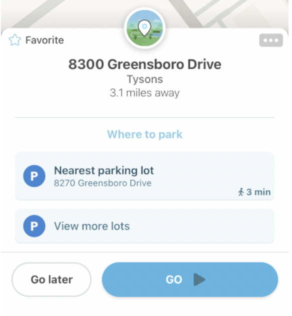
When using the ‘Waze’ app and inputting an address for directions, Waze will suggest parking lots that are nearby the destination (see Image 1). By doing this they have considered the full experience of the user’s journey, which is not just getting from point A to point B, but also includes parking.

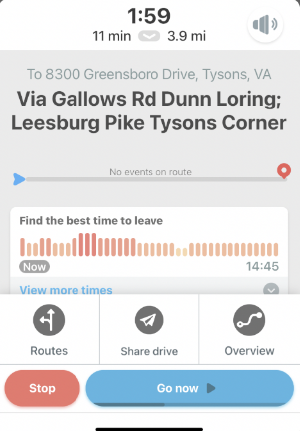
Displayed below in Image 2 includes a timeline of best times for a driver to leave for their destination, which considers that some drivers use GPS not just for immediate directions, but to also monitor traffic conditions for future travel. Aside from those who don’t like to sit in traffic, there are also motorcyclists or those that drive stick shift who find it difficult to drive in traffic and would therefore find this useful to their context.

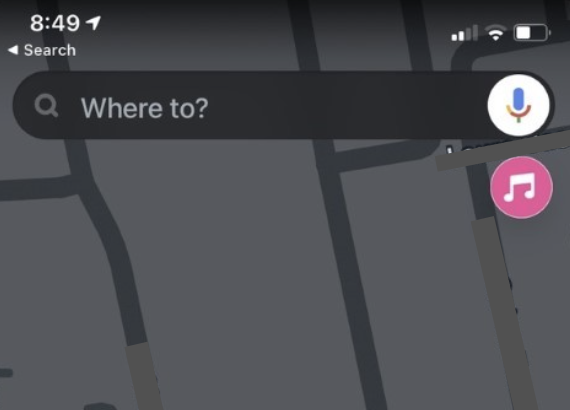
Waze has included a microphone function in their address ‘Search’ feature, allowing users to speak their destination address rather than type it (see Image 3). They have thoughtfully considered that users are often driving while using GPS, and have limited ability to use their hands to type. This same consideration was used in the placement of the music integration icon on the main page. Users can integrate their Spotify playlist directly to Waze, thus avoiding the need to use their hands more often than they need to.

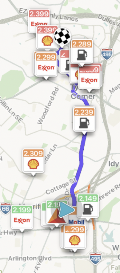
As mentioned, drivers are not always going from just point A to point B when en route to their destination. Waze has paid mind to this fact, and included common reasons a driver might need to stop along the route; gas, food, pharmacies, urgent care and lodging are a few categories to point out. The driver can include these stops into their trip, and Waze suggests stops that are en route to their destination (see Image 4). This allows for the parent driving their hungry kids home from soccer practice to find a nearby drive-thru, or the tired traveler to find a place to rest for the night.

To conclude.
Through the use of crowdsourcing feedback and updates from users, Waze keeps drivers apprised of the latest traffic conditions, accidents, and even hidden speeding cameras. They go beyond a traditional GPS by keeping the many needs of drivers central to their design.
In conclusion, Waze has showcased a good example of empathetic design through their digital app. They have taken careful thought and consideration of the user’s motivations and goals. Waze has effectively implemented features that show that the designers have really put themselves into the user’s shoes when creating this product.