Venmo is a digital wallet app that can be used to conduct personal or business-related payments. It’s a service that has gained popularity in the past few years, and having been around for a while, it’s rolled out some new features. The mobile app has undergone a recent redesign, so I’d like to examine the way empathic design is employed to make a convenient, satisfying experience for the typical Venmo user.
Empathic design is described by Dorothy Leonard and Jeffrey F. Rayport as a way for designers to understand their target users — to “identify needs that customers themselves may not recognize.” Using methods designed to get at the core needs, motivations, and mindset of users, empathic design is a “low-cost, low-risk way” to bring satisfaction and pleasure to customers.
Making Payments
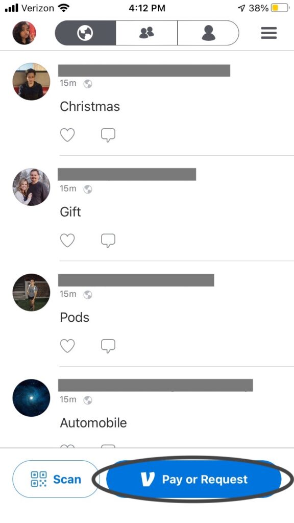
Venmo is, at its core, a way to send and receive money. Therefore, it makes sense that the most prominent button on the app is the “Pay or Request” button, which allows users to send or request money from other users.

In addition to typing a name, username, or other identifying feature to select a recipient, Venmo also supports a QR code scan — this is a convenient way for people in the same place to exchange Venmo details without having to go through the cumbersome task of spelling out a name or email. This feature could have been implemented as a response to users who need to split a bill at a restaurant, or other similar situations, in which senders and recipients are in the same place at the time of payment.
Venmo additionally remembers who a user has previously interacted with on the app, for ease of re-finding that information. This shows that the design team thought of people who regularly don’t have cash on hand, or pay people for rent, utilities, or other recurring expenses.
Preventing Errors
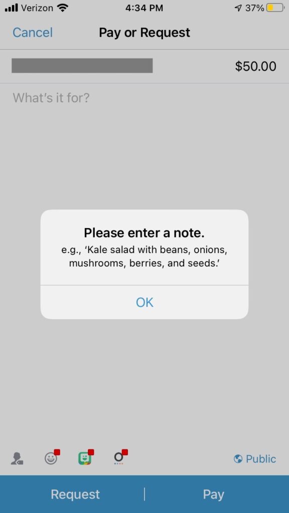
Any product that handles money needs a way to help users feel safe entrusting their information to it. Venmo does this very well by preventing errors and accidents on multiple levels. Most importantly, it’s very difficult to “butt dial” a payment to someone, because the user must input a message accompanying the payment. With a blank message field, the payment won’t go through, making it difficult for users to pay or request by accident, or without thinking about why they’re going through this process.

By making it difficult to do something by accident, Venmo prevents a great deal of user frustration — an important part of empathic design. Making a mistake can make users feel angry, upset, or like they’ve done something wrong, which aren’t good emotions to associate with a product. Venmo cuts down on this and thus its users are able to associate it with much more positive feelings.
Social Features
Beyond its most functional use, Venmo is also an app that people use to connect with each other, with options that make it function somewhat like a social media site. By adding features that allow users to like and comment on each other’s payments, customize who can see payments, and set profile pictures, Venmo supports the impulse for online sharing. Though it might not be vital to the payment process, social features help users have fun using the app, making it a pleasant and satisfying experience.
And even besides having fun, these social features have some practical uses as well. Seeing someone’s profile picture can help a user be sure they’re sending money to the right person. Receiving a like or comment can assure users that their payment was received. And despite the tendency for people to overshare, many users (including myself) enjoy the option of making payments “private” so that nobody but the sender and the recipient can see the details.
Final Thoughts
As a Venmo user for several years, I have always been satisfied with my time using the app. With new features rolling out to enhance the user experience, it’s clear that the product designers take care to meet and even anticipate users’ needs, by following the principles of empathic design.
