PROJECT SUMMARY
A team of 4 graduate students of experience design at Pratt conducted 8 moderated user tests to help improve a new website created by their client, Empire Clean Cities.
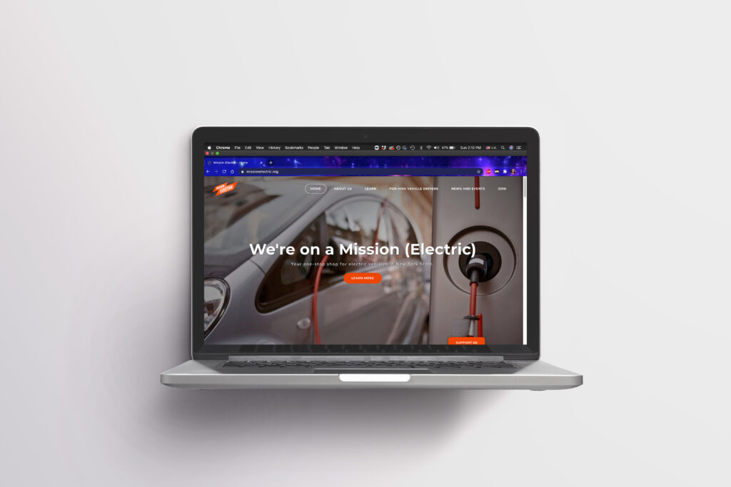
Product: Mission Electric website on desktop
Team:
- Aichen Guo
- Amiya Dewan
- Chris Denney
- Qilin Zeng
Steps taken:
- Identifying goals and target users
- Recruiting participants
- Designing user test script
- Conducting moderated user test
- Presenting results
- Creating a detailed report
Tools used: Zoom, Google docs, Google sheets, Google slides, Adobe illustrator
My role: The team split up roles so that everyone had an equal amount of participation. My role included communicating with clients and team members, brainstorming ideas, recruiting users, conducting 2 user tests and assisting with 1, analyzing findings and coming up with recommendations for a specific section of the website, creating mockups for said section, writing the methodology section of the report, reviewing and editing the entire report, and presenting my findings to clients.
THE CLIENT
The Mission Electric website is an electric vehicle campaign and a source of information regarding resources, events, and funding incentives to help users transition to electric vehicles. Mission Electric is developed by Empire Clean Cities, a New York-based environmental nonprofit and local US DOE Clean Cities Coalition whose mission is to ensure clean air for future generations.
PROCESS
Identifying goals and target users:
The first step was to meet our clients over a Zoom video call to find out what their main goals were for the Mission Electric website and what specific features they wanted our team to test. The goals were as follows:
- To find out the effectiveness of the Learn Pages and the News and Events Page
- To find out whether users are able to learn about EV charging options
- To find out whether users can find a list of EVs that would suit them
- To find out if people feel like they can take action from visiting the Mission Electric website (long term goal)
Our clients also provided us with a list of user profiles to fit their target audience, all based in New York. Our team decided to recruit participants based on 2 of these profiles:
- Individual or family living in single family home or equivalent, owns a car and is affluent or Tesla-fan
- Individual who is young, college student or recent graduate who is environmentally conscious
Recruiting participants:
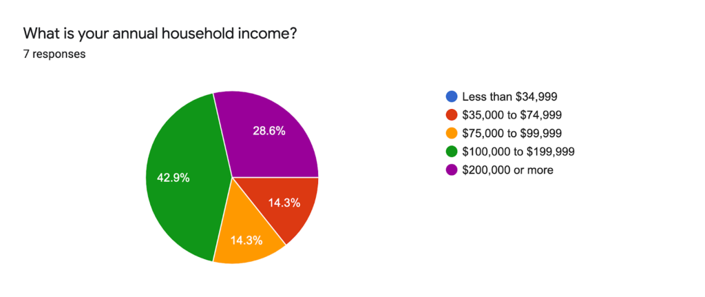
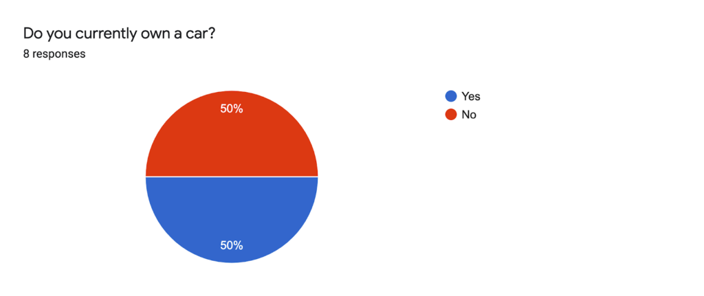
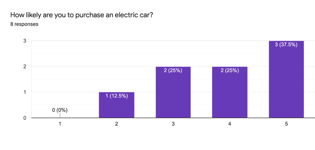
Based on the user profiles provided by our client we reached out to individuals through our personal social networks. 8 participants were recruited over email and asked to fill out short questionnaires to find out their demographics and categorize them into the user profiles before the test. The following infographics represent our participants profiles.

Designing user test script:
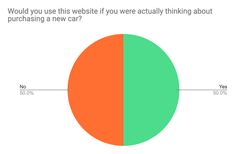
The user test consisted of pre-test questions, 6 main tasks and post-test questions. The aim of the pre-test questions was to find out how much participants already know about EVs and what factors are important to them when deciding to buy a car. The post-test questions were asked to get their overall feedback on the website and to find out whether they feel like they can take action based on their experience with the website (long term goal). The 6 main tasks were as follows:
- Based on the homepage: What do you think the site’s purpose is? What do you think you’ll be able to do on this website?
- Find out what financial benefits you would have from purchasing an electric vehicle rather than a gas one, from this website. Do you think it’ll be more or less expensive to own an electric vehicle compared to a gas one?
- If you get an electric vehicle, you may want/need a charging station in your home. Find out how you would get one installed where you live.
- If you cannot install a charging station in your home, you may need to charge your vehicle somewhere else. Find out whether there are public charging stations near you.
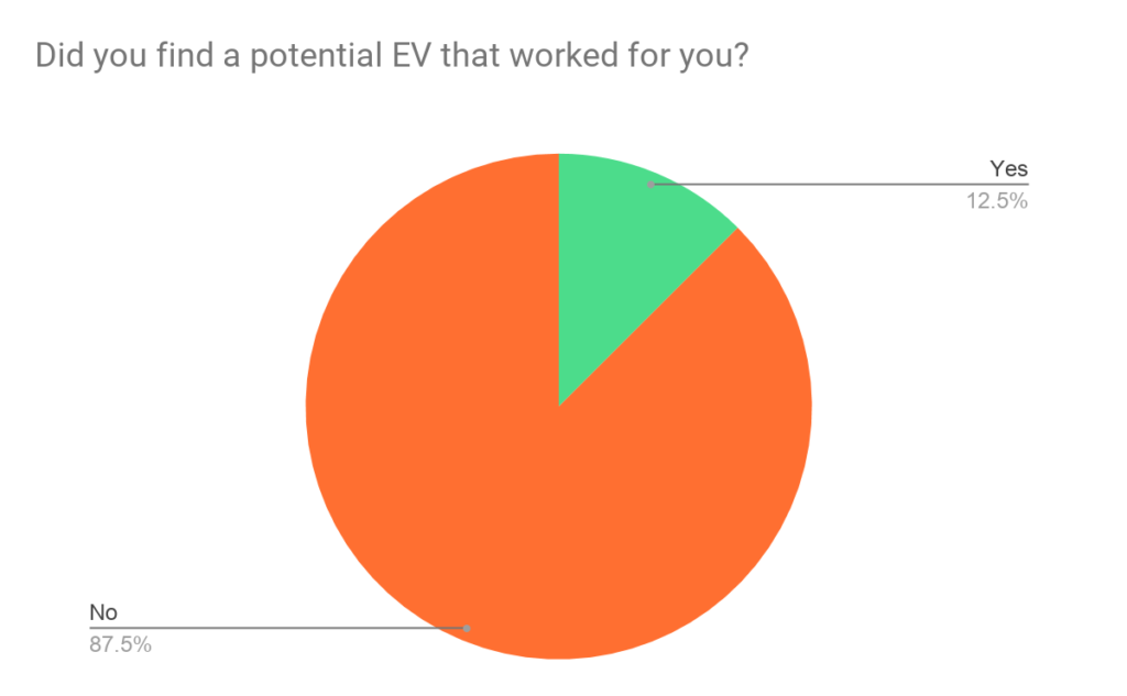
- Based on the factors you mentioned earlier that are important to you, find out what type or model of EV would work best for you.
- Electric vehicle technologies are rapidly improving and innovating. Find out the latest news, announcements, events and updates about electric vehicles.
Each task was accompanied by some follow-up questions to find out how users felt about their experience and two ratings: one for difficulty of task completion and one for clarity of information.
Conducting moderated user test:
Over one week, each participant met with 2 team members over a Zoom video call for the user tests. One team member followed the user test script to guide the participants through the tasks while the second team member took notes on a prepared Google sheet.
Results:
Teammates got together over Zoom calls to discuss findings and identify unique problems. The problems found were prioritized by the number of times it was encountered and the location of it on the website. Based on this, the most major problems were categorized into 4 findings and corresponding recommendations were discussed by teammates. Each teammate had the responsibility of summarizing one finding, writing down corresponding recommendations and creating mockups.
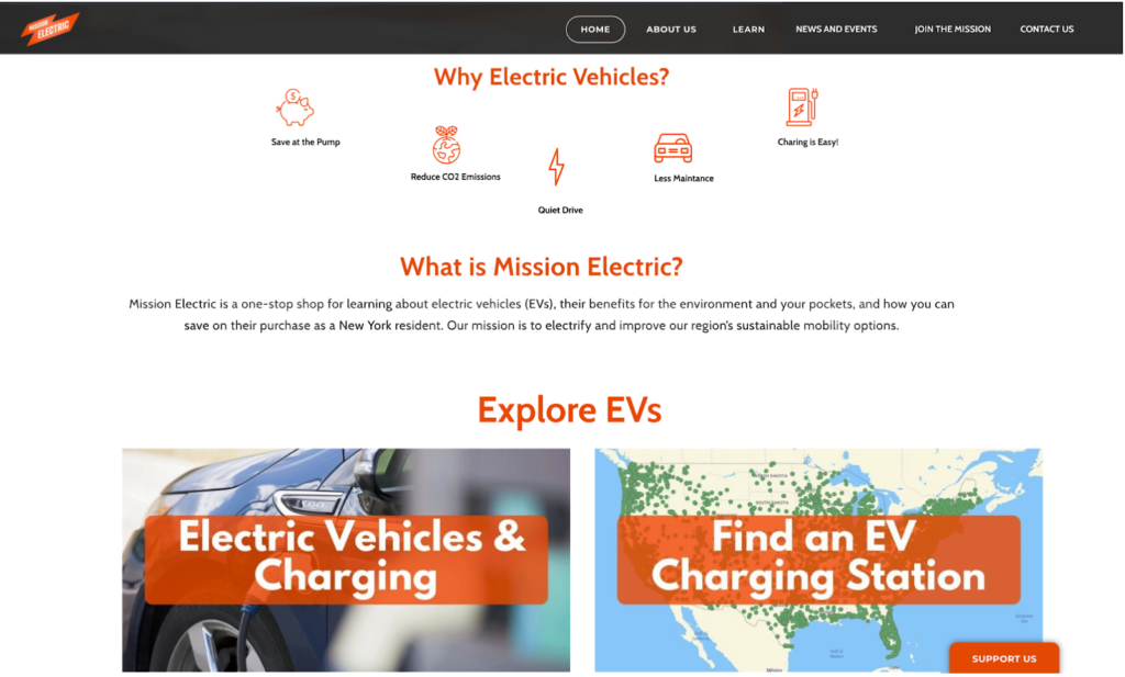
Finding 1: Participants expressed a certain extent of confusion toward the purpose of the website based on the landing homepage
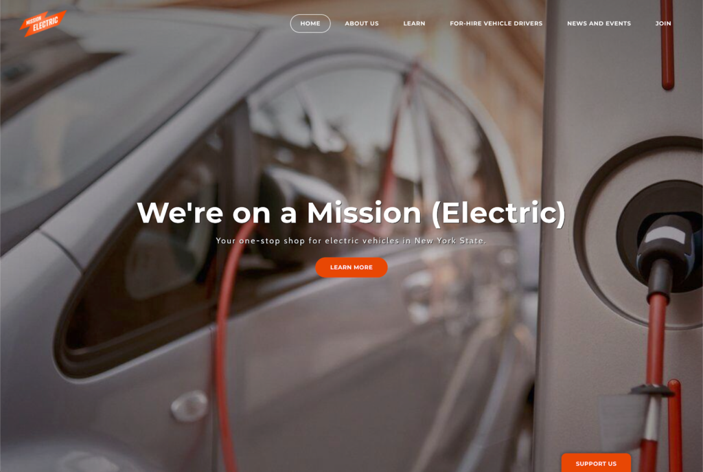
Current landing page 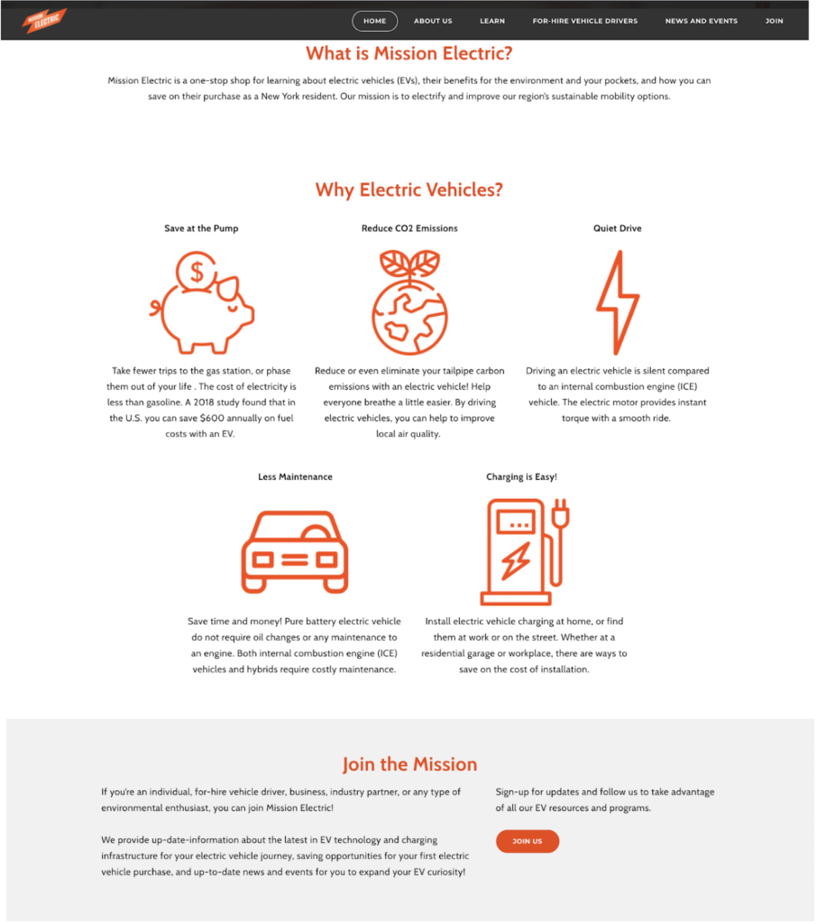
Currently under the fold
These were the major problems that resulted this finding:
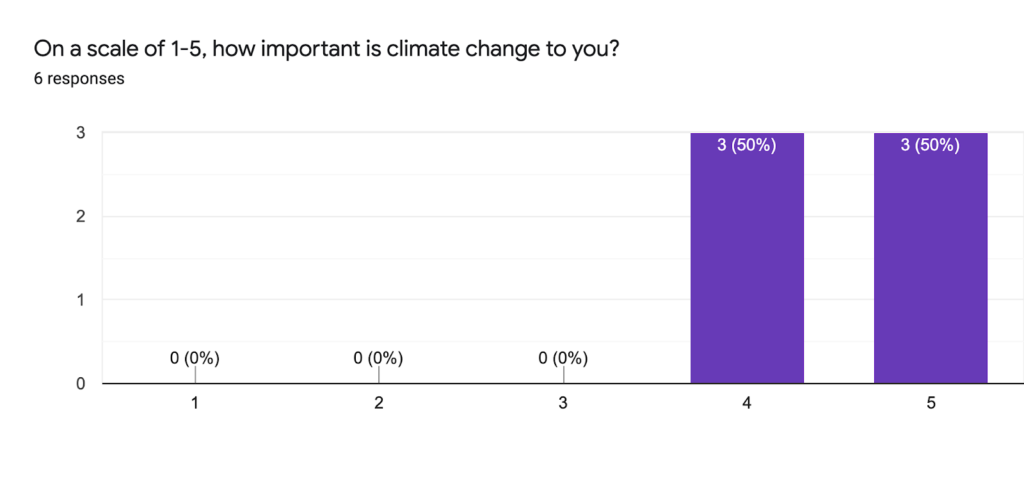
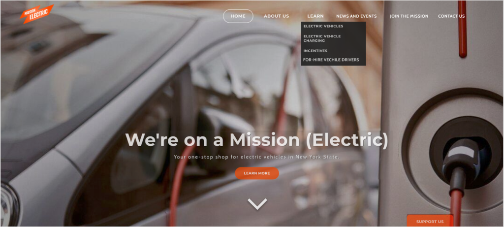
- The landing homepage lacks instructional information for new users, especially without scrolling. Only 1 out of 8 users scrolled down immediately.
- On the navigation bar, the “For-Hire vehicle driver” tab confuses users’ understanding of the purpose of the website. 4 out of 8 participants expressed their confusion about the purpose.
- The information on the homepage is overwhelming. 5 out of 8 participants mentioned that the landing page’s information is a bit text-heavy and repetitive.
Recommendations
The following recommendations and mockups were made by our teammate Qilin to help improve the problems towards the first finding.
- Add an indication of scrolling down on the landing page
- Rearrange the navigation bar to reduce user confusion
- Rescale the size of icons and reduce text
Finding 2: Participants were not satisfied with the amount of information provided on EV models, especially their costs
The major problems that lead to this finding are:
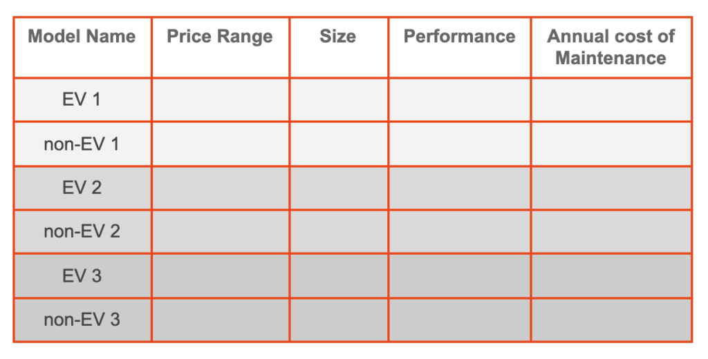
- Participants were unable to find enough information on EVs, especially regarding factors that are important to them when choosing a vehicle. Some specific factors they mentioned that were important to them are up-front purchase cost of EVs, annual cost of maintenance, charging costs, different price point examples, safety features, class options (luxury, sports, etc) and such. 7 out of 8 users mentioned during this task that there was not enough information on the EV page for them to find a suitable EV.
- Participants were unable to compare the cost of owning an EV to a non-EV. Between two of the tasks, participants mentioned 6 times that they would prefer to see a cost comparison of EVs against non-EVs to be able to understand the financial benefits of owning one over the other.
Recommendations
The following recommendations and mockups were made by myself to help tackle the aforementioned problems:
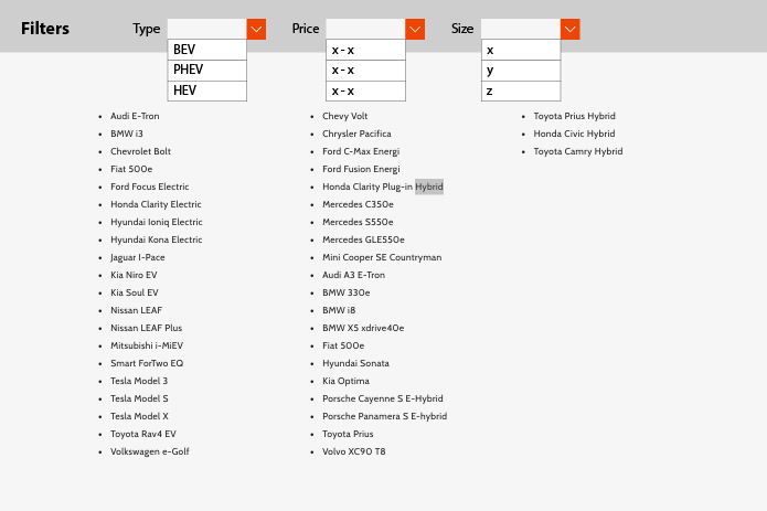
- Categorize EVs into groups based on factors that are important to users, rather than only “type.” One way to do this is by using filters.
- Link each model on the list of EVs to their manufacturer page so users can do their research quickly instead of having to look up each car separately.
- Create an infographic with a few examples of EVs and non-EVs showing their features and cost breakdown.
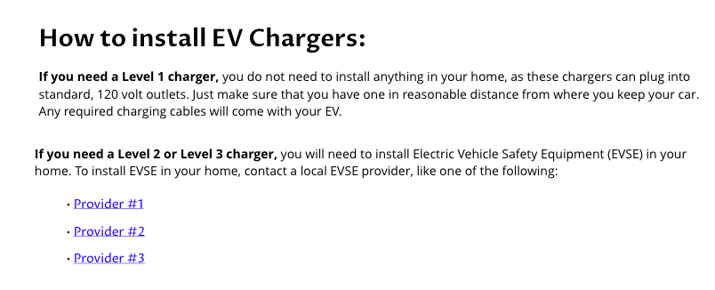
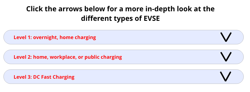
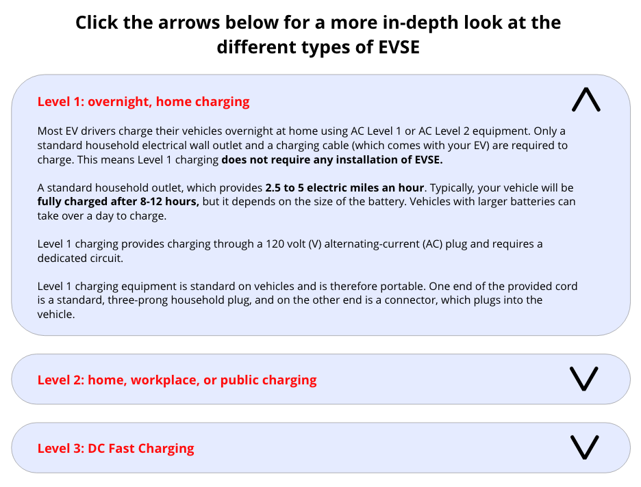
Finding 3: “Installing Charging” section lacks clear instructions
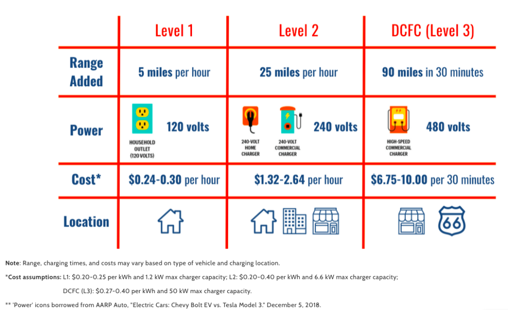
Current graphic for “Installing Charging” 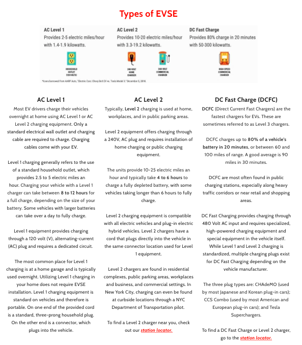
Current Types of EVSE (right)
The following problems lead to this finding:
- The current graphic doesn’t provide users with clear directions to follow in order to install a charger in their home.
- The information on the “Electric Vehicle Charging” page isn’t organized to allow users to find the information they want efficiently or effectively.
Recommendations
These recommendations and mockups were made by our teammate Chris to tackle the aforementioned problems:
- Provide a specific “How to install a charger” section that gives users concrete steps they can take to install a charger in their home, if they need to.
- Cut down on information where possible; make the “Types of EVSE” section more concise and less intimidating.
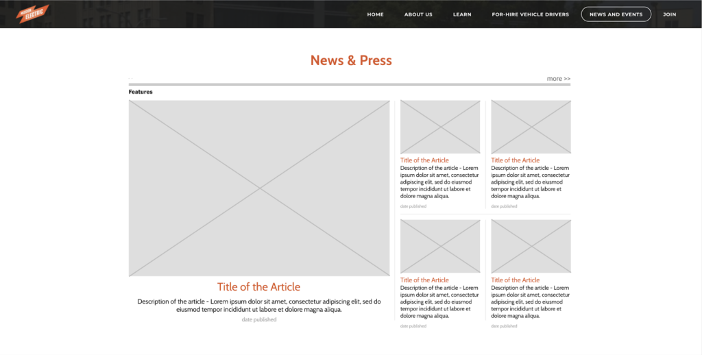
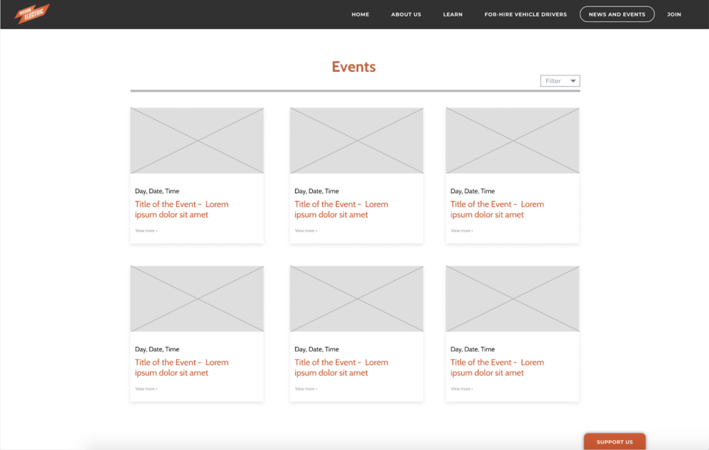
Finding 4: Participants expressed frustration towards the News and Events page’s layout and contents
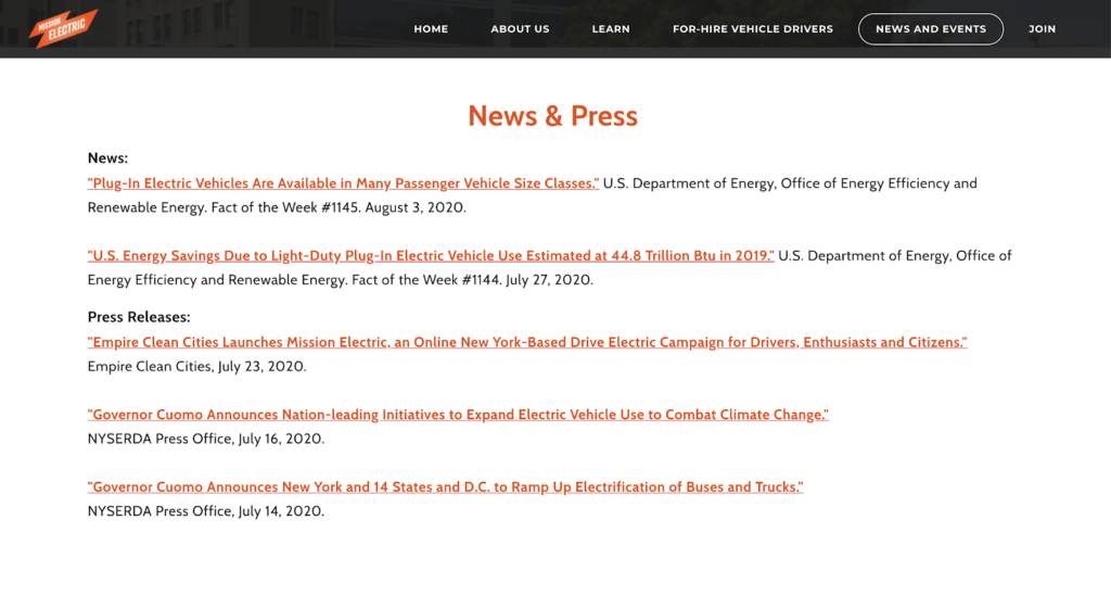
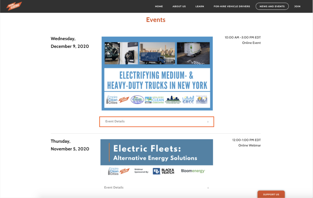
These problems were associated with this finding:
- The News section is not presented in an attractive way as people think it looks like citations. Participants expected the layout to include pictures and short descriptions.
- The News section lacks updated and interesting news. Participants expected to read more about recent articles on EVs rather than legislation and discourses.
- The “Event Details” button is hard to notice in the Events section. Events could potentially be difficult to navigate due to the vertical layout if there are more events listed.
Recommendations
The following recommendations and mockups were made by our teammate Aichen:
- Both News and Events sections should include more recent articles and webinars on EV models.
- Redesign the visuals of the News section with incorporations of more images.
- Redesign the layout of the Event section and add a filter function.
PRESENTATION AND REPORT
The user test results were summarized and shared with our clients at Empire Clean Cities in the form of a Google slides presentation.
Afterwards, the entire process and results of the evaluation were explained in detail and shared with our clients via an evaluation report.
By the reaction we saw at our final Zoom meeting after our presentation, it was confirmed that the clients were very pleased with our evaluation. They were happy that we covered all the areas we discussed when identifying the goals of the evaluation and they found our recommendations useful. My teammates and I are excited to see how the Mission Electric website reflects our evaluation in the future.
REFLECTION
Communicating with teammates, solving problems, conducting user tests and communicating with our client, all remotely, was very interesting and definitely taught me a lot. One specific thing I learned is that keeping track of data remotely, especially when it involves so many people, requires a high level or organization and consistency.
What could we have done differently?
These were some of the limitations with our user test:
- Since the test was designed in a particular order, the tasks’ order might have impacted the ease of achieving later tasks. For example, when completing one task users may have come across some of the features of the website, like the EV charging station locator. This may have made it easier for them to find that feature for a later task. Considering discoverability of features towards the beginning may have helped us design a better user test script.
- Internet quality may have impacted the completeness of the test. Due to unstable internet connection, some of the data collected for some participants were not consistent. Keeping better track of the exact questions that were answered may have helped with this issue.
- Potential deviation between user tests and the actual users’ experience. There is a possibility that the participants gave high ratings for the ease of completing a task and clarity of information without paying too much attention to the content. This is because for certain tasks, despite the high ratings, participants mentioned frustrations with the content itself. A different approach to post-task questions, instead of difficulty and clarity ratings for all tasks, may have helped with this issue.