The Project
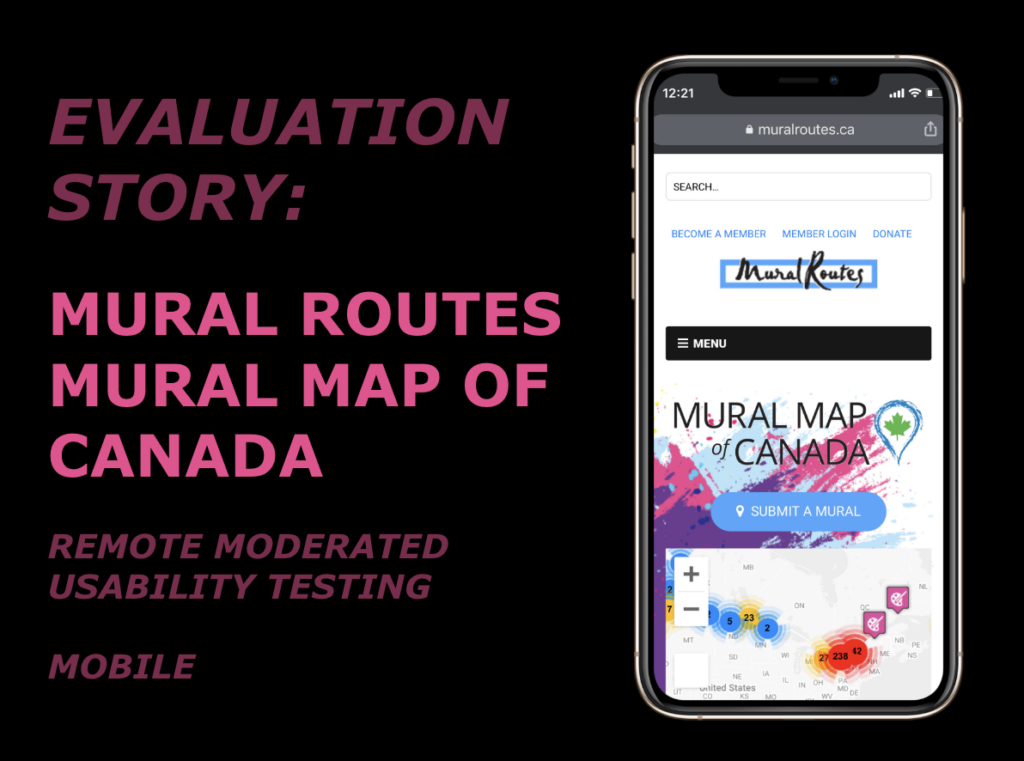
This semester, our team executed a remote moderated user testing study to evaluate any obstacles and design challenges confronting mobile users of Mural Routes’ Mural Map of Canada. In all, our study involved six participants who were new to Mural Routes, to best understand the site from the perspective of novice users.
Duration
10/2020 – 12/2020
Our Team
Kyle Kisicki — MS Information Experience Design, Pratt Institute
Raunak Jangid — MS Information Experience Design, Pratt Institute
Zane Castillo — MS Data Analytics and Visualization, Pratt Institute
Tools
UserZoom Go, Miro, Slack, Zoom, Doodle, Google Docs, Google Slides
Client Background
Mural Routes is a not-for-profit organization serving a community comprised of mural artists and enthusiasts across Canada. They support a number of initiatives to foster an appreciation of public art; a primary function of their website is their Mural Map of Canada. This feature houses an archive of geographically mapped murals, with the capability for users to search for content and upload new submissions.
Mural Routes is a necessary organization for locating street art in Canada, relied upon by a wide audience, including film crews (to scout locations) and by artists (as a platform for their content).
Client Goals
At the outset of our project, my team interviewed Mural Routes’ managing directors Jackie Santos and Marta Keller-Hernandez to define our project scope. Before our discussion, we established goals to assess client needs:
- What are their goals and expectations from this study?
- Who are their primary and secondary users, and do they want to expand their audience?
- Are there any specific tasks we should focus on in this study?
- What has been the feedback by the users?
- What is the long term goal of the website?
In the course of our interview, we learned that Mural Routes was looking for support with their Mural Map of Canada (specifically as it pertains to novice mobile users). This is due to the fact that the website needs to be accessible for first-time users. They are most likely to return if they enjoy their first experience with the site.
Their aims included:
- Understand obstacles preventing novice users from finding and uploading content using the map
- Help users share content and draw traffic to the site
- Connect users with artist information
As mobile users account for 43% of Mural Routes’ traffic and allows for the most relevant content search and photo uploading, we asked about a mobile focus with the Mural Routes team for our study. They have not optimized the mobile version of the site, so users encounter a number of issues. For this reason, the clients agreed that a mobile focus would be most helpful for their redesign efforts. We also found that they have a strong social media presence, with Instagram leading their engagement.
Methodology
To execute our study, I contributed to participant recruitment by drafting a consent agreement, distributed by our team to students within the Pratt Institute. We decided upon this recruitment pool as it would represent an art-savvy community of novice users. All of our participants claimed an active interest in art and design. As an incentive, we offered an Amazon gift card as a token of appreciation for participating. Ultimately, we ended up with six test participants.
Our remote moderated user testing took place on UserZoom Go (formerly known as Validately). This platform allowed us to walk participants through a series of tasks meant to test their ability using Mural Routes’ Mural Map for the first time.
Tasks
To serve as a basis for our evaluation, we designed the following scenario and tasks:
You are in Canada for your vacation, and you came across this website that informs its users about Murals in Canada. You visit this website, and you wish to accomplish these tasks:
- You have an image of mural art that you took at Oak Lake, and now you wish to upload it on Mural maps with all the information.
- You want to look for Realism Mural art near the Toronto area, and also try to connect with the artist of a particular mural.
- You wish to share a Mural art on the preferred social media platform of your choice. How would you do that?
For each testing session, a moderator from our team walked the participant through a test script, explaining the purpose of the site as well as a scenario to provide content for these three tasks. Our other team members observed user behavior, took notes and flagged potential usability issues.
After each participant completed the three tasks above, we completed our interview with the following questionnaire:
- How easy or hard did you find these tasks?
- Was there any point in time during the test that you feel frustrated using the website?
- What are your final thoughts about this webpage?
- How would you redesign the webpage? What would you do differently? Would you move sections?
Analysis
Upon completing our interviews, we poured through interview notes to make this table of usability issues that arose in each session. From this point, we determined the four most prevalent areas in which participants encountered usability challenges:
1 – Improving map clarity and scope
2 – Updating share functionality
3 – Avoiding long scrolls on mobile devices
4 – Optimizing search and filtering functionality
Recommendations
Improving Map Clarity and Scope
- The first main issue we encountered in our study was that participants struggled to find their bearings and interpret content displayed on the map. Our first recommendation to this end involved restricting the map scope exclusively to Canada. As it exists, the map is integrated with Google Maps, allowing users to accidentally scroll away from Canada and lose their frame of reference. By locking the map to Canada and identifying major points of interest on the map, users are more likely to stay on course and locate relevant content.
- In addition, participants reported that color-coded, geo-tagged content was not clearly identified on the map. Certain entries were red, yellow, and blue, with several different shapes to indicate different mural content. We recommend that Mural Routes implement a key (as pictured below). By formally identifying what each shape and color represents, Mural Routes would clarify their map layout.
Updating Share Functionality
- The ability to share content from Mural Routes on social media is essential for generating traffic on their site. Because of this, participants expressed surprise that the only options available were Facebook, Twitter, Pinterest, and LinkedIn. We recommend integrating share options for Instagram and Tumblr, as well as a “copy link” feature to help users share mural content by email or any other social media site of their choice.
Avoiding Long Scrolls on Mobile Devices
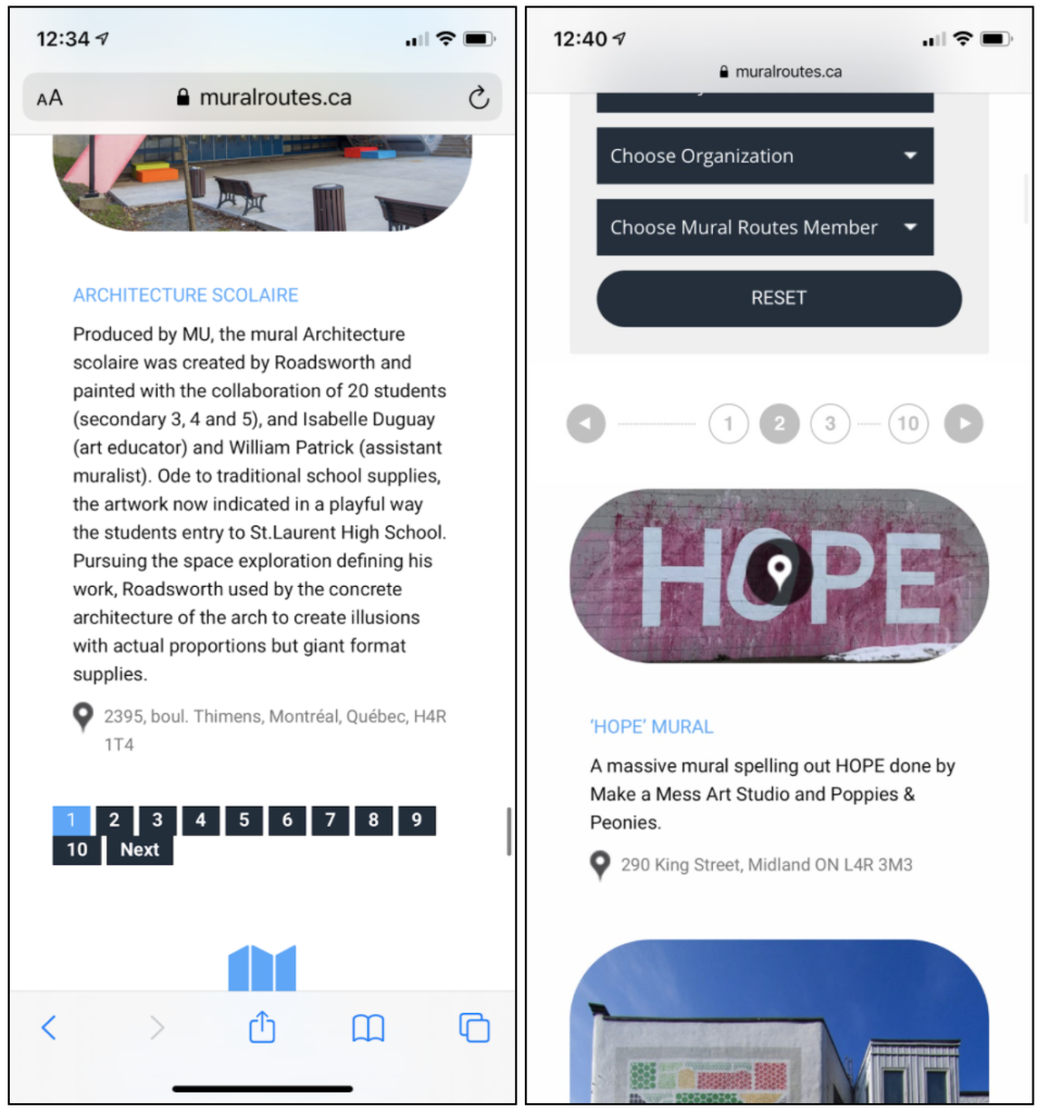
- Respondents also found the site too reliant on scrolling, with too much content listed per page. As the site was designed for desktop users, this feature should be optimized for mobile users by truncating the amount of text content displayed for each mural. To this end, we recommend reducing the amount of content displayed, leading with a featured image of each mural, and a short text preview. For more information, users may select a “more info” tab to access the desired page.
- We also recommend listing tab numbers above search results, so that users do not need to scroll to the bottom of each page to find this navigation feature.

Optimizing Search and Filtering Functionality
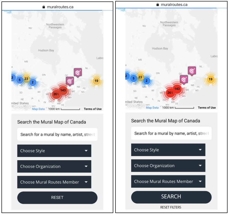
- The final aspect of the site we identify in our study regards the search and filtering function. This feature is essential for users to refine the murals displayed on the map. We found that many of our participants encountered a common error when trying to execute a search. Many reported that the “reset” button was located where they would intuitively expect a “search” button. Due to this, participants would accidentally erase the filters they applied in attempt to find search results. We recommend that Mural Routes replace the reset button with a search button, and relocate the reset button to a less prominent area onscreen.
- In addition, participants noted the lack of actionable feedback when executing searches on this site. Without any clear indication, the map displays fewer results on the map as filters are selected, but there is no feedback to make this clear to a user who does not expect this result. We recommend adding a running list of multiple applied filters that are visible to users, as well as a notification that only a portion of all available results is being displayed.

Reflections
My teammates and I were very excited to present these findings to the clients, who were ultimately very receptive and appreciated the feedback. Several of the points we raised resonated with their own experiences and user feedback, while others were surprising. They are currently in the process of fundraising to support a website redesign, and intend to use our results to inform the final product: restructuring the mural map and potentially developing a mobile application specifically to archive mural art geographically.