Background
The Andy Warhol Museum holds the most extensive collection of Andy Warhol’s artwork and archival material and is one of the most comprehensive single-artist museums globally. The Andy Warhol Museum website was analyzed, focusing on user behavior between local and non-local audiences. We dived deeply into the website’s digital analytics throughout this project and provided recommendations and a dashboard for the museum to understand its online users’ needs and resulting behaviors.
Team
Katherin Aristizabal, Sean H. Gao, Cathy Hu, Sapphire Hilton, Yuki Shimano
My Role
Analyzed Google Analytics data
Co-created the interactive Dashboard
Identified key findings and created mockups for recommendations
The Problem
The Andy Warhol Museum adjusted its target audience due to the COVID-19 pandemic. They are a top destination for visitors to Pittsburgh and formerly marketed themselves primarily to tourists. A subset of Andy Warhol enthusiasts would make the trip mainly to visit the museum. COVID-19 transformed everything, and they redirected their focus to the local Pittsburgh audience. Along with that shift in strategy, they restructured their website navigation. The Warhol now sought an analysis of their Google Analytics for insights into the success of the restructured navigation and the behavior of local vs. non-local audiences.
Goal
The goal of this project was to deliver insight on ways to ensure that audiences have a seamless experience with The Andy Warhol Museum’s website by analyzing Google Analytics and answering the following questions:
- How is the newly implemented navigation bar performing?
- How does the behavior of local vs. non-local audiences compare since the museum’s strategy shift made during the pandemic?
- What types of content are audiences engaging with?
Our Process & Methodology
Client Meeting
March 23, 2022
Met with the client and collected background information on the organization, their needs, and pain points. We were able to confirm the scope & goals of the project.
Data Analysis
Time frame: 4/1/2021 – 4/1/2022
I analyzed of museum’s current & legacy Google Analytics data to come up with findings and recommendations on the navigation bar. I also assisted in conducting additional research like a comparative analysis of similar artist-specific museums.
Data Visualization
Using Google Data Studio we designed a customized report displaying the museum’s aggregated business data from Google Analytics.
Metrics used were: key performance indicators (KPIs) like website reach, website engagement, sessions, popular content, and behavior by device.
Reporting Insights & Recommendations
Presented & created a report detailing findings and recommendations to the client.
Met with the client after the presentation to answer any questions and to do a deeper dive into our findings.
Limitations: While reviewing the website’s Google Analytics data, we discovered a lack of Event Tracking, meaning it was not easy to understand what content the users were engaging with and why the goals were performing the way they were.
Big Picture Findings
Local audiences prefer using mobile devices to access the website
Users are not using site search
Local audiences check the Calendar for upcoming events more than non-local audiences
The lack of event tracking is a missed opportunity
Referral traffic behaved better than paid social traffic
You can view all the findings and recommendations in our final evaluation report and presentation linked below.
Findings & Recommendations
The following summarizes the essential findings and recommendations I developed as a team contributor and researcher.
Main Finding: The updated navigation is a promising start, although some modifications can be made
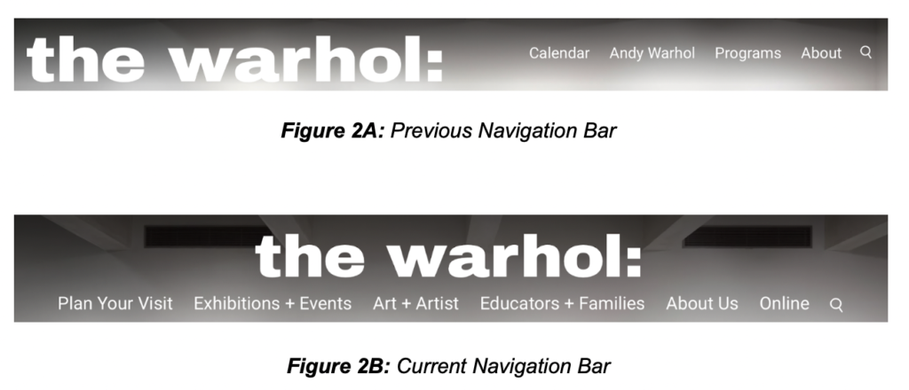
Finding A: The museum decided to restructure its navigation bar to include robust content and have a more comprehensive website structure.
An analysis of the before and after navigation bar redesign, revealed that more people were interacting with the website after the redesign implementation (June 2021). There was an increase in the number of entrances (+2.03%) and a decrease (-1.14%) in the number of exits from the homepage. After visiting the homepage, users tended to go directly to the admission page to get more information on visiting the museum.
Finding B: Only 1.03% of users used site search. This percentage is deficient because 98.97% of users did not use site search.
A comparison in site search usage between the old and current navigation bar showed an increase in overall usage (+0.28%). Before the new navigation bar was implemented, 0.70% of users used site search compared to 0.98% usage with the new navigation bar. This shows that the changes implemented affected how people use the search function.
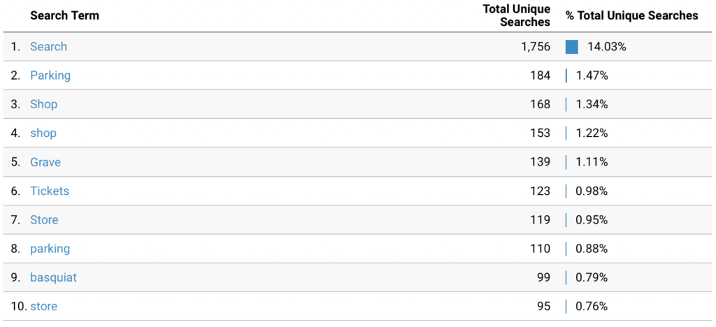
Finding C: A usability issue was detected. The most searched term was “Search” (14.03%), and the second most searched term was “Parking” (1.47%). “Search” being the top searched term is part of a usability issue where users are double-clicking on the search icon and then prompted to a “results for search” page.
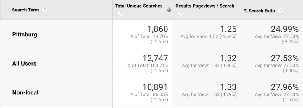
Finding D: Local audiences used site search 14.7% of the time, and non-local audiences used site search 86.5%. These percentages make up 1.03% of the total time individuals used site search. Locals are not utilizing the site search as often as non-locals, but they have a lower percentage of search exits.
Main Recommendation: Increase Visibility & Functionality of Site Search
Recommendation A: I propose creating an extensive and detailed search bar on the landing page while including examples of information users can search for and/or links to content pages that will interest the users and can fix the usability issue. The proposed search landing page will also promote content that has low engagement rates like “Read” and “Watch”.
Recommendation B: Adding a search field to the navigation bar can increase site search visibility. The search icon can become lost within the navigation bar, and highlighting the search function with a search field can increase users utilizing this tool.
Next Steps
Next Steps
We recommend that the Andy Warhol Museum consider the following:
Upgrade to Google Analytics 4
Adding SEO Meta Descriptions
Adding social media sharing options on key pages
Conclusion
The client was receptive to the findings and recommendations throughout our presentation and had several questions about the metrics we measured as well as a breakdown of the monthly interactive dashboard.
Based on the findings, our report recommended five significant changes we each thought would improve the website and the way Google Analytics is utilized in the Andy Warhol Museum’s digital strategy:
- Adopt a mobile-first design approach
- Increase visibility & functionality of site search
- Present events upfront on the homepage
- Track events on Google Analytics
- Reconsider budgets on paid social traffic
This experience working with a major museum in the US was eye-opening in the ways that digital analytics can improve user experience and inform the ways users are using digital platforms whether that be web, mobile or social media.


