Zocdoc offers an online platform for patients to search and schedule appointments for medical or dental care. Although users can access the service through both a mobile app and a desktop website, this critique focuses on evaluating the Zocdoc app on an iphone, through the lens of concepts and principles introduced in Don Norman’s The design of everyday things.
1. Overall impression on visuals.
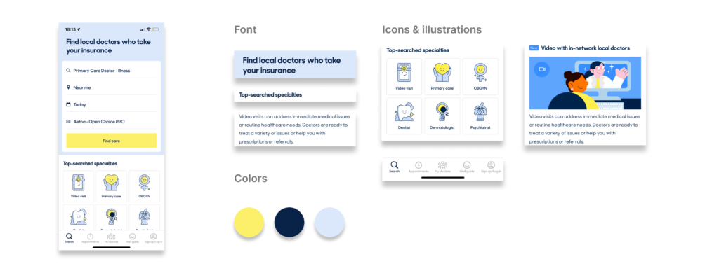
From the first look, it could be seen that the app effectively uses a variety of visual elements to affect users’ visceral level of processing. The right amount of text combined with icons make the interface look organized and clean. Sans serif font is used, together with a nice and bright color palette. The cute icons create a friendly impression, saying to users that booking a doctor could now become simple and easy. Overall, users’ immediate perception of the app is that this is a modern, contemporary application, which will make things easier for them to achieve their goal.
2. Sign up/log in
On the sign up/log in screen, the conceptual model is well applied. Asking users to register for an account or sign into their account before searching and booking a doctor makes great sense in this scenario. As the app guarantees to find a doctor that accepts the user’s insurance, there is a need for providing the user’s personal information such as name, contact, insurance policy, etc. Because of this, an account is needed for the user to store and secure their information.
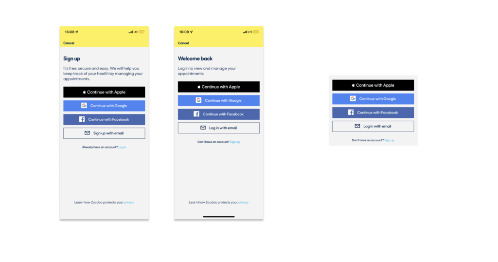
In addition, this screen is where the concepts of knowledge in the head and knowledge in the world are used. Four buttons on the sign up/log in screen acts as cues perceived by users as ways to create a new account/log into an existing account. These are the knowledge in the world available for users to do their task without figuring it out themselves. By choosing one of the buttons to move forward, the user will have to use knowledge in their head to remember their information from other applications to use in Zocdoc.
3. Search for a doctor
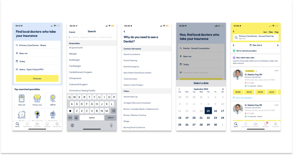
One of the key features that Zocdoc provides its users is searching for an in-network doctor. As this is the primary task for a lot of users, the app search page appears right after the user signs in. There are many elements that contribute to the high discoverability of this feature. First of all, on the search page, there is a title on top saying “Find local doctors who take your insurance”. Right below the title is a form with form fields asking for information such as type of doctor, location, time, insurance, combined with a button with the label “Find care” signifying where to click after filling in the answers for all the form fields. Secondly, on the navigation bar at the bottom, it is clear that the user could click on the magnifier icon with text “Search” underneath to go to the search page.
Once the user understands that the search page is where they go to perform the doctor searching task. By clicking on the first form field, a new page with a list of all doctor types and the phone keyboard instantly emerges as a feedback for users. The same pattern applies for other form fields. Whenever the user clicks on a field, a form of feedback appears. Depending on the type of information asked, what arises could be an on-screen keyboard which affords typing, or a calendar which affords choosing a date.
For these feedbacks to appear in the user flow, it could be seen here that the app designer clearly considered users’ behavioral level of processing in the design process. The designer understands that users who seek solutions for their problems in a digital product, scheduling a doctor appointment online in this case, will have a certain level of digital literacy. They have learned to use phone applications and they are familiar with how an app works, how things appear on the screen. By understanding that users will expect an outcome whenever they click on a form field in an app, the designer creates feedback for each task to provide reassurance for the user. Hence, the app experience is smooth.
Another design principle utilized here is constraint. The search bar on the doctor search page with a gray text saying “Try dentist, migraine, flu shot, or doctor name” acts as a useful constraint for possible types of search: doctor types, symptoms, doctor names.
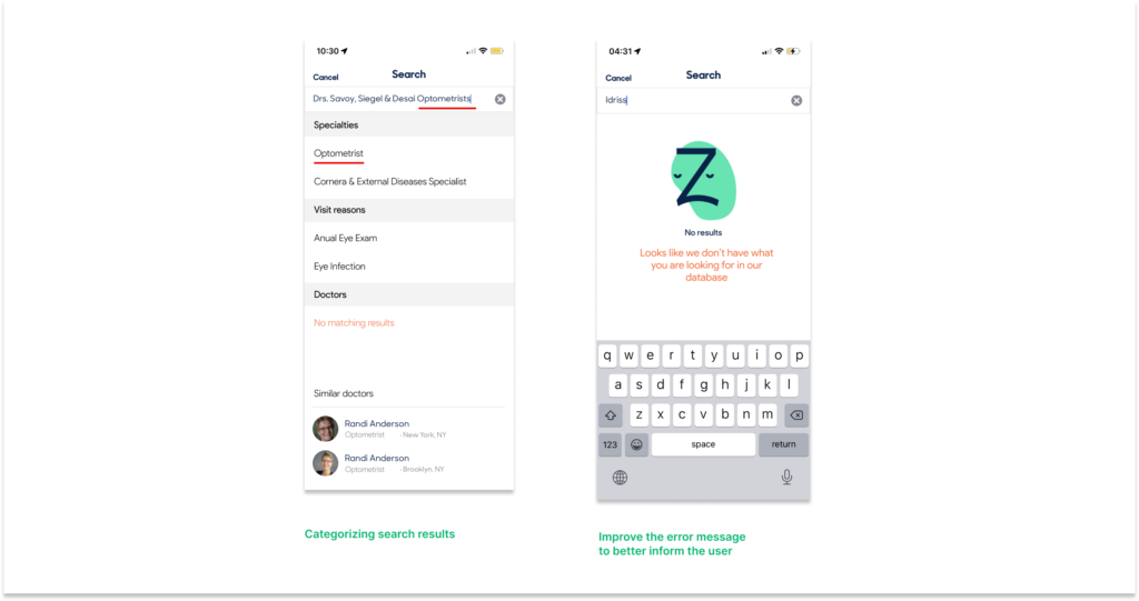
The app performs well when users search by types of doctors or symptoms. However, when the user searches for a doctor name that is not participating in Zocdoc, one of two scenarios will arise. Either the system tries to match the keyword with its database and suggest search results or it will announce that no result is available. In both cases, the user is confused.
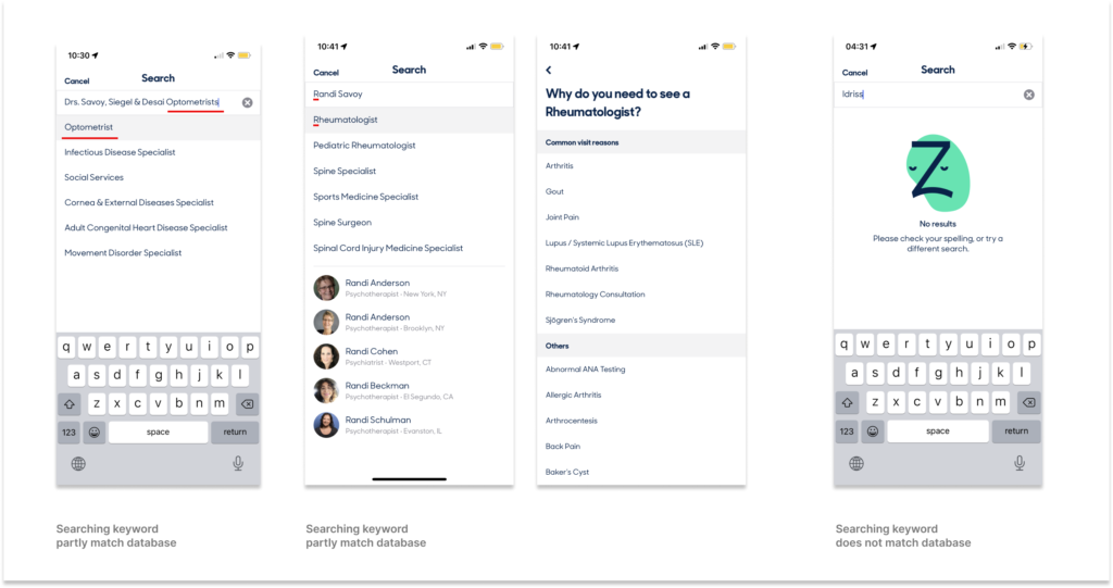
From the figure above, it can be seen that when the keyword partly matches the database, even though the user is trying to find a specific doctor office, the results are suggesting a type of doctor and move forward to ask for a specific symptom. In the other case, when Zocdoc lets the user know that no result is available, the error message is not clear for the user to know that this is a result of the limited database system. In this situation, the user is making a knowledge-based mistake because they lack knowledge about the app database, and repeating this same task could lead to the user’s learned helplessness. Recommended solutions for this problem would be to add more constraints to the type of search, categorizing search results or improve the error message to better inform the user.
