Abstract: The Bay Ridge Center, a non-profit community organization providing support for older residents of southeast Brooklyn, wanted to test the usability of its newly-redesigned website, focusing in particular on its user-friendliness for seniors. After conducting a series of moderated remote user tests with a sample of older participants, a team of researchers with Pratt’s Center for Digital Experiences determined that while the website covers an impressive amount of information on a range of services, there were some findability issues that impacted accessibility.
Project Summary: As part of a team of researchers with Pratt’s Center for Digital Experiences, I took part in conducting a usability study of the website of the Bay Ridge Center, a non-profit senior center in southeast Brooklyn. The team (consisting of myself, Melissa Bowden and Jennie Lin) set out to determine how easy it is for seniors to navigate the Center’s website generally, and to find ways to make information about the organization’s various services as accessible and findable as possible. We conducted six moderated remote user tests (MRUTs) with senior users (defined for the purposes of the study as individuals over the age of 60). Data from these tests was then analyzed, and several usability improvements for the website were formulated and presented to the client.
You can read our full report here, and view the accompanying slide deck here.
The Bay Ridge Center: Community and Care for Brooklyn Seniors
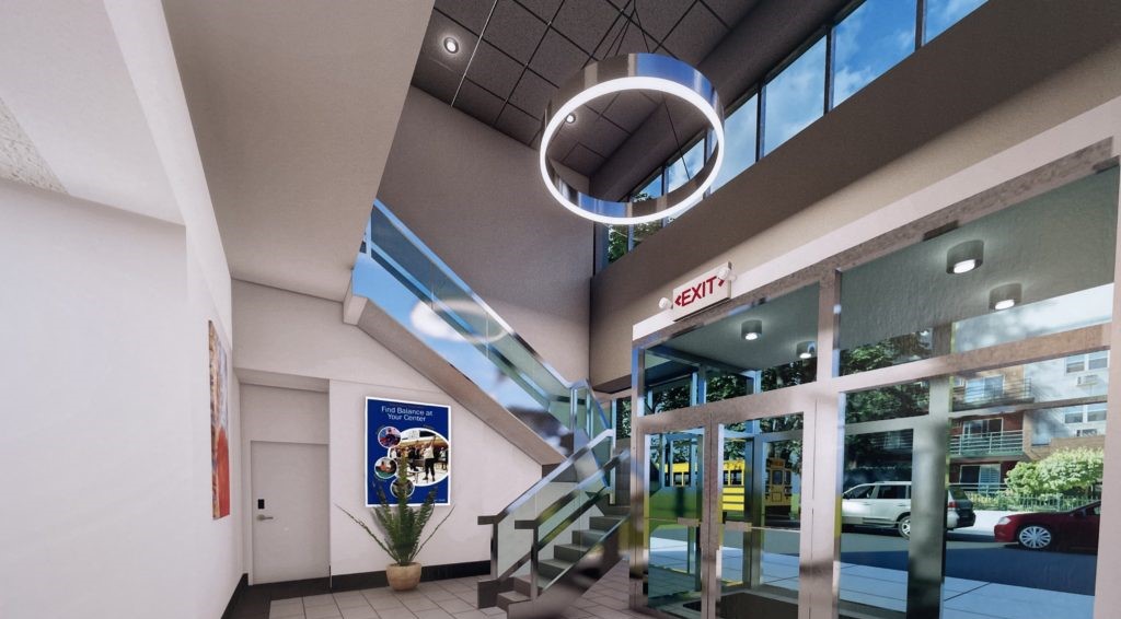
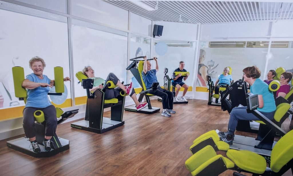
Since 1976, the Bay Ridge Center has provided a range of vital services to the seniors of southwest Brooklyn, including continuing education classes, fitness and wellness resources, nutritional support, and community engagement. In early 2023, the Center will be moving to a new, 21,000-square-foot facility and expanding its programming offerings to service an aging population.
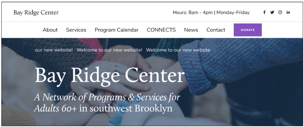
To go along with this exciting new chapter in the organization’s history, the Center has revamped its digital presence with an updated and redesigned website: bayridgecenter.org. The website includes information about the Center’s mission and impact, outlines the various services it offers to its members, and features a calendar of classes and events.
Meeting THE CLIENT
Our project began with an initial meeting with the client, in which they discussed the operational mission of the Center and gave us an idea of the composition of their membership base. The client was primarily interested in getting overall user impressions of the website redesign, and also expressed a desire to increase traffic to the site. While analyzing website traffic was outside the purview of our study, we thought we could approach this particular client need indirectly, through focusing on findability, ease-of-use and a positive affective experience: if users enjoyed using the website, they would be more likely to return.
Designing Digital Experiences for Non-Digital Natives
Through these discussions and our own explorations of the website, the research team eventually formulated an overarching question to drive our study:
How easy is it for seniors to find information about the Bay Ridge Center’s services on the organization’s website?
Referring back to this question would help us in every step of the process, from framing our user profiles to designing our tasks to running the tests. It also helped to highlight one of the unique difficulties we would face:
How do you design an understandable digital space for an audience that is generally less comfortable with navigating such a space?
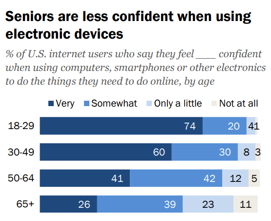
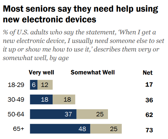
Senior users face particular challenges when it comes to technology and the internet. A 2017 Pew Research study found that “just 26% of internet users ages 65 and over say they feel very confident when using computers, smartphones or other electronic devices to do the things they need to do online” (Anderson & Perrin, 2017, p.10).
Pew Research findings showing seniors’ relationship with technology. Source: “Tech Adoption Climbs Among Older Adults.”
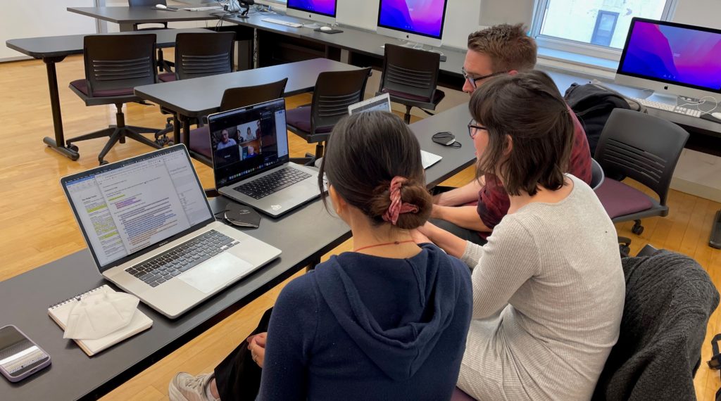
This potential discomfort our target user base has with technology would impact not only what we wanted to focus on, but how the tests would ultimately be run. Users might be unfamiliar with video conferencing platforms such as Zoom or data collection methods such as Google Survey, and anticipating difficulties that could arise from this unfamiliarity was front-of-mind for the research team.
Recruiting the participants: Engaging older users
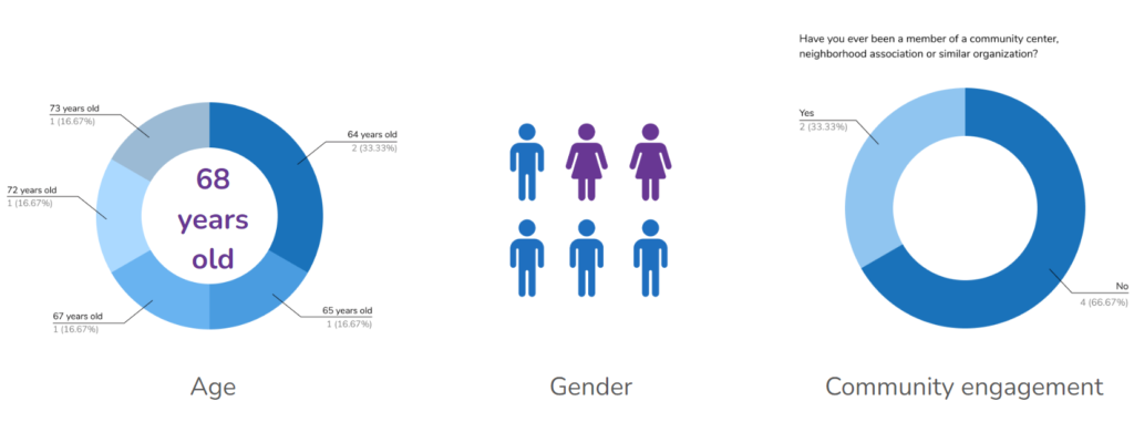
Once we had formulated our overarching research goals, we began the process of participant recruitment. Initially we were interested in recruiting actual or potential members of the Bay Ridge Center community, and formulated our ideal user profile accordingly. Our ideal users were:
- Seniors over the age of 60
- Living in Bay Ridge or the surrounding neighborhoods
- Who have experience with or are interested in joining a community organization
Unfortunately, partnering with the client on recruitment proved logistically challenging, and social media posts on various Bay Ridge and southeast Brooklyn community boards went unanswered. Cognizant of the restricted time frame of the project, we moved to convenience sampling, through which we recruited 6 participants who fulfilled the most important characteristic of our target user profile: age.
Designing the Study: Prioritizing the discoverability of services and programs
While recruitment was ongoing, we began designing the study itself. After spending time with the website and reviewing our communication with the client, we created the following task scenarios:
- You’re planning on meeting some friends at the Bay Ridge Center on Wednesday. Find out when it opens.
- You’re interested in exercising more, and would prefer doing so in a group class. Find an in-person exercise class next week at the Bay Ridge CONNECTS location.
- You have a friend who is homebound and is interested in receiving food support through the Bay Ridge Center. Will he receive meals on holidays?
- You would like to keep up to date on the Bay Ridge Center’s programs. Find out how you can sign up for the Bay Ridge Center email newsletter.
These tasks were designed to simulate a range of user behaviors and needs. We started with a relatively common task: finding the hours of operation. From there, users would move to locating information on specific services and programs. Finally, we wanted to highlight the newsletter, as we thought it would be a good way to help with the Center’s stated desire of increasing outreach to current and potential members.
Collecting the Data: Pros and cons of remote testing
Once we had recruited participants and drafted test materials, we were ready to start running the tests. Tests were conducted via Zoom, and each session was recorded so it could be reviewed later. Users shared their screens and moderators observed as they attempted to complete the task scenarios outlined above. Users were encouraged to “think aloud” during the process, giving their feedback, feelings and impressions as they went.

During our user tests, in addition to the primary goal of collecting data on the website, we also gleaned valuable firsthand insights into the pros and cons of the MRUT method itself. As we had expected, working with older users presented some unique challenges; both of my participants were unfamiliar with video conferencing, and one of them had particular trouble sharing his screen. While we eventually solved the issue, it clarified for me the benefits of conducting an in-person test with regard to technical troubleshooting.
On the other hand, the fact that my users were able to take the test in their homes, using devices with which they were familiar, greatly increased their level of comfort. I believe conducting the test in-person, particularly in a formal usability lab setting and on an unfamiliar device, would have added stress to an already potentially stressful process, and negatively impacted user performance.
Moving forward, I believe the ideal testing environment for working with seniors would be a moderator going in-person to the user’s home. This would of course present certain logistical challenges in terms of scheduling and travel, and would require drawing users from a smaller pool of potential participants. However, when one considers that seniors are more likely to experience mobility issues that make it more difficult to travel to a testing location, researchers working with this demographic should be prepared to be flexible and accommodating. If this is not possible, I believe remote moderated testing to be the best option; however, moderators should be prepared to help the user navigate a range of possible technical issues when setting up and running the test.
Analyzing the Data: Synthesizing results and determining priority fixes
Once we had completed the tests, the research team began the process of reviewing and analyzing the data. Transcripts were made from each session’s recording so that we could pull relevant user quotes. Moderator notes and observations were reviewed and recordings were revisited as necessary.
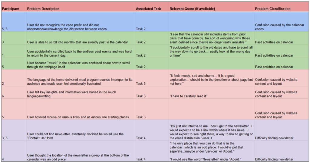
The research team consolidated similar issues into problem classifications. From there, five issues were chosen as those to prioritize in our recommendations:
- Users had difficulty finding the Center’s hours
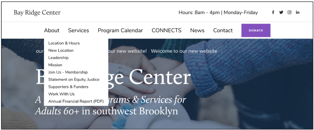
- Users were confused by the “New Location” link in the navigation bar, and the fact that it opened to an entirely different website
- Users did not understand or notice the Center’s calendar key
- Users were unable to find a way to sign up for the Bay Ridge Center’s newsletter
- Users were slowed down by blocks of text with no clear calls-to-action
With our problem list prepared, we moved on to creating recommendations for potential fixes of each issue.
“Marvelous resources,” but some discoverability and formatting issues
Users generally responded positively to the Bay Ridge Center’s website. They were impressed at the breadth of information it contained covering the organization’s many services and programs. Users thought it has a strong, consistent aesthetic, and liked how it organized its pages in bold bands of color. They appreciated that thought had clearly been given to accessibility, with prominent headers and blocks of text in a large, reader-friendly font ideal for individuals with vision problems.
“The website is thriving. It contains marvelous resources [for] the community.”
— User 2
Overall, the website gave a positive impression of the Center itself:
“I would definitely recommend [the Bay Ridge Center] to anyone who might be in that area and looking for services…or a place to volunteer.”
— User 1
However, as outlined above, there were some issues related to discoverability and formatting that affected users’ ability to complete certain tasks easily and efficiently. In our recommendations for these issues, we tried to suggest simple-to-implement yet effective fixes. We recommended that the client:
- Display the center’s opening hours in a clearer and more intuitive way
- Move “New Location” link to a new position to distinguish it from internal links, and have it open as a new tab
- Include event locations in calendar titles and use sentence case in program descriptions
- Redesign “Chatterbox Newsletter” page to incorporate e-newsletter signup form
- Left-align content and add clear call to actions to make the information on the “nutrition programs” page more readable
I’ll briefly highlight three of our recommendations below; more detailed explanations and the other two recommendations can be found in our report.
ISSUE 1: Users had difficulty finding the Center’s hours
In Task 1, we wanted user’s to find the Center’s hours. We were somewhat surprised at how difficult it was for users to complete this task, with a success rate of only 40%. The hours can be found on the homepage, as well as in the website’s footer, as shown in the demo below:
Users tended to scroll past the hours on the homepage. Some navigated directly to the “Calendar,” expecting to find the information there. Users that did find the hours in the footer were confused by the wording: the footer presents the Center’s hours as “Office Hours,” and some users did not know if that meant there were different hours for the Center itself.
“None of the drop-downs just states the hours…I feel frustrated…it should be at the top of the page.”
— User 2
RECOMMENDATION 1: Display the center’s hours in a CLEARER and MORE intuitive way
To solve this issue, we recommended adding the hours to the header, and changing the wording of the footer to fit web design conventions:

ISSUE 2: confusion caused by “New Location” link in navigation header
The next issue had to do with the “New Location” link in the website navigation bar, which directs users to the dedicated website of the Center’s new facility — 15bayridgecenter.com, as opposed to bayridgecenter.org. You can see a demonstration of the path in the video below:
While this separate website contains important information about the Center’s future home, it proved confusing for some users. Half of participants clicked the “New Location” navigation bar link at some point during their session, and were thrown off by 15bayridgecenter.com’s different layout and the lack of a navigation menu. They were also frustrated when they could not find a way back to the main site:
“This is kind of weird, I lost the ability to go back to the main page. It might be better for this [page] to also have the same heading as the rest of the website. It should be more seamless [to go] back to the main website.” — User 1
RECOMMENDATION 2: Nest “New Location” link under “About” menu, Have it open as a new tab
In the interests of finding the easiest-to-implement fix, we suggested moving the link from the top-level of the navigation menu and nesting it under the “About” dropdown. While users could potentially still navigate to 15bayridgecenter.com by accident while searching for something else, this new location makes that less likely. We also suggested that the link open as a new tab, which would provide feedback to the user that they had gone to an entirely different website, as well as allow them to navigate back more easily.
ISSUE 3: Users had difficulty reading the program calendar
In Task 2, we asked users to find an in-person fitness class at Bay Ridge CONNECTS, the Center’s storefront satellite location. Classes and other programs are listed on the “Calendar” page, which features an embedded Google calendar. Most users navigated to this page without hesitation; however, once there, they had some difficulty completing the task, due to the key of unintuitive codes that indicate where a class is located and whether it is virtual or in-person.
While some users scrolled right past the codes, others noticed them, but then had to keep scrolling back up to refer to them while they were perusing the calendar.
“It seems like the in-person classes are really kind of scattershot in that there’s lots of different in-person classes, but they’re not characterized in any way that allows me to quickly look for them.” — User 6
RECOMMENDATION 3: include event locations in calendar titles
Since the page uses an embedded Google calendar, we were cognizant of the limitations the client might face in their ability to redesign it; because of this, we wanted to be sure to keep our fix as simple and easy-to-implement as possible. To this end, we recommended removing the location key entirely and implementing new naming conventions for calendar entries (i.e. prefacing each program with a VIRTUAL, BAY RIDGE CENTER, BAY RIDGE CONNECTS labels).
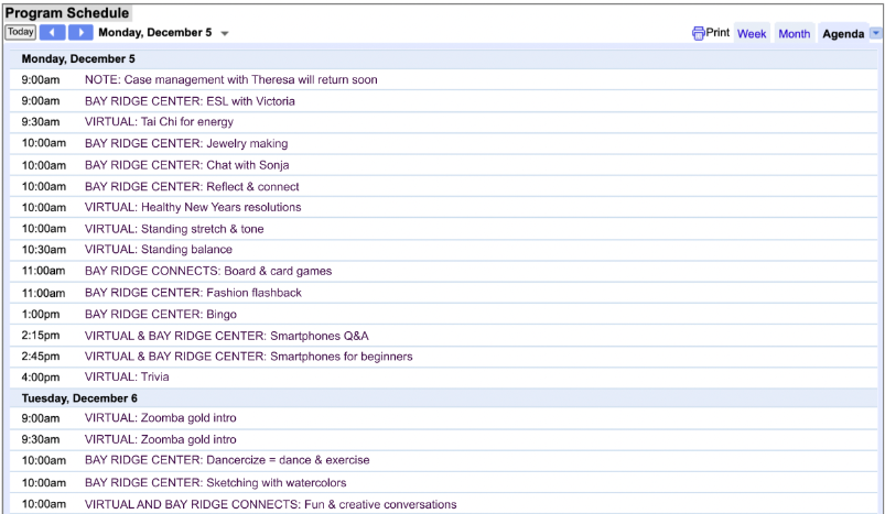
This proposed fix would help users who had missed the calendar codes entirely, and avoid users having to scroll back up to remember the codes while trying to parse the calendar.
Project Retrospective: We’re invited to the groundbreaking!
Final Presentation and Client feedback
After we had compiled our report, we put together a slide deck and presented our findings in a Zoom call with Marty Siederer, our main point of contact with the Bay Ridge Center.
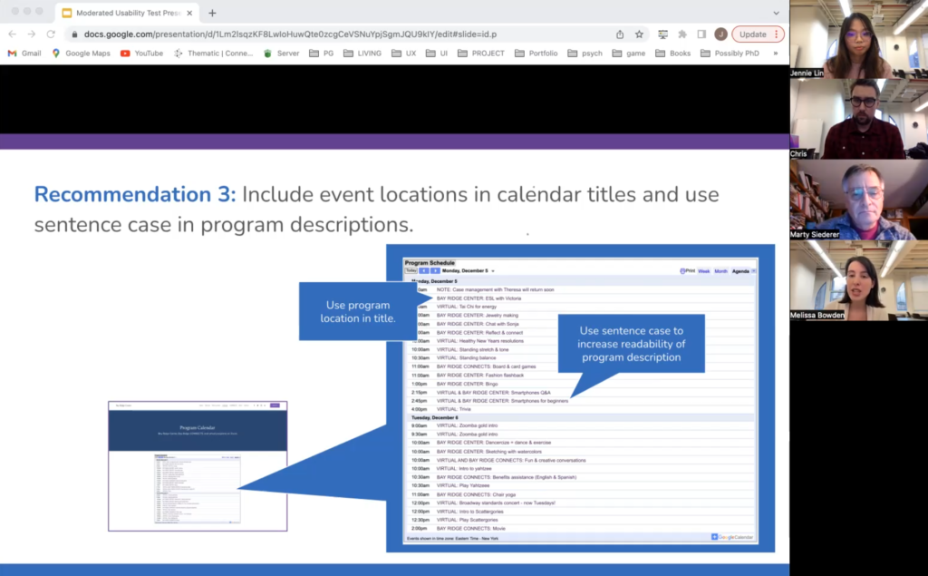
Overall, Marty was impressed by the findings and recommendations, particularly on the calendar and the “New Location” link. He liked that we had recruited users from the Center’s membership demographic, and appreciated that we had approached the work with an awareness of the unique difficulties faced by seniors when it comes to the adoption and use of new technology. He mentioned the Center was considering initiatives to help seniors set up and use technology and the internet in their own homes, and that making the website as easy-to-use as possible would be key to the success of this initiative:
“So we’re putting together [a program where] a Geek Squad of students…does a needs assessment for a senior, then we go out and get them the equipment…then [the students] will install that stuff and say, ‘Hey, here’s how to work the printer.'”
— Marty Siederer
In recognition of the team’s work, we were invited to the opening of the Center’s new facility in 2023!
“Once we have that groundbreaking or ribbon cutting, we want you guys to be there. You guys played a role in how we reach out to people and get them involved.”
— Marty Siederer
research TakeAways and final thoughts
Given more time, I would have liked to work more closely with the Bay Ridge Center on the recruitment of participants. During our introductory meeting we proposed possibly scheduling a day of testing within the Center itself, and while the client initially seemed open to this idea, it did not ultimately materialize. I would be curious to see what sort of data we would collect when running tests in-person, with actual members of the Center. Of course, working with non-member seniors gave us unique insights as well: as our participants were entirely new to the Center, its programs and offerings, and the website itself, they better simulated the behavior of new or prospective members.
This project has sparked my interest in the information-seeking habits and technological abilities of seniors; moving forward, I would like to look into the usability and UX research on this particular user segment. As usability experts, this is a core demographic whose needs we should be considering while assessing interfaces and platforms; by designing with seniors in mind, we can ultimately make our products more accessible, understandable and easy-to-use for all.
Works Cited
Anderson, M. & Perrin, A. (2017, May 17). Tech adoption climbs among older adults. Pew Research Center. https://www.pewresearch.or/internet/2017/05/17/tech-adoption-climbs-among-older-adults/.
