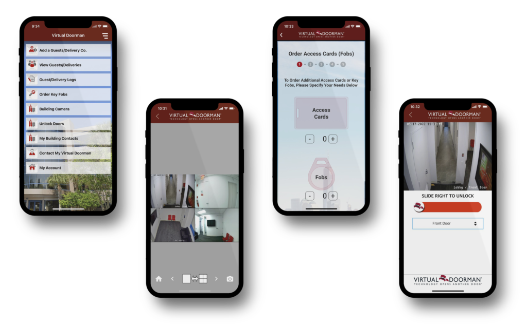
Virtual doorman is a remote doorman service that can be accessed by residents and property managers of multi-unit buildings through a mobile application to manage building-related activities. It is used for security and access control purposes like remotely greeting visitors and providing them access, accepting packages and deliveries, and virtually monitoring the building security cameras.
Adding a guest
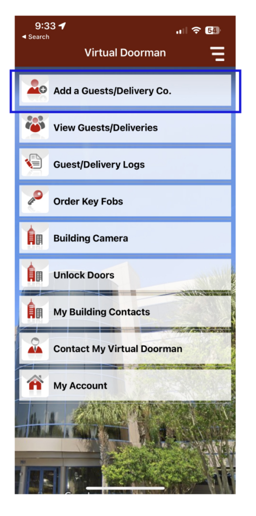
The landing page of the application clearly indicates the different actions that can be performed by the user. The icon along with its adjacent text – ‘Add a Guest/Delivery Co.’ wrapped in a rectangular container makes it appear like a button thus acting as a signifier to the user informing that the button affords clicking and letting the user add a new guest/delivery company. Once clicked, the button is highlighted, and the user is navigated to a new page to enter the guest/company details giving instant feedback. (Figure 1)
Hamburger menu
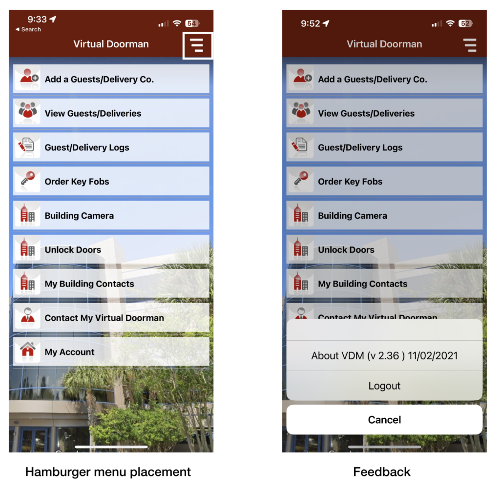
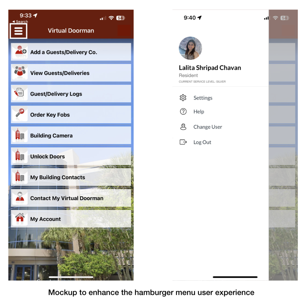
The hamburger menu does not utilize knowledge in the world and is in the top right side of the screen. Also, when clicked upon, the hamburger menu does not follow the user’s mental model of a screen sliding in from the side on top of the current page displayed. Although the hamburger menu does not follow the mental model or utilize knowledge in the world, it gives feedback and provides visibility of its current state by highlighting the menu options that appear on the bottom of the screen and greying out the background. (Figure 2) The user experience can be enhanced by using the principles of conceptual model, signifiers, feedback, and knowledge in the world by moving the hamburger menu to the top left of the screen and providing feedback where a screen slides in from the left. (Figure 3)
Unlock Vestibule Door
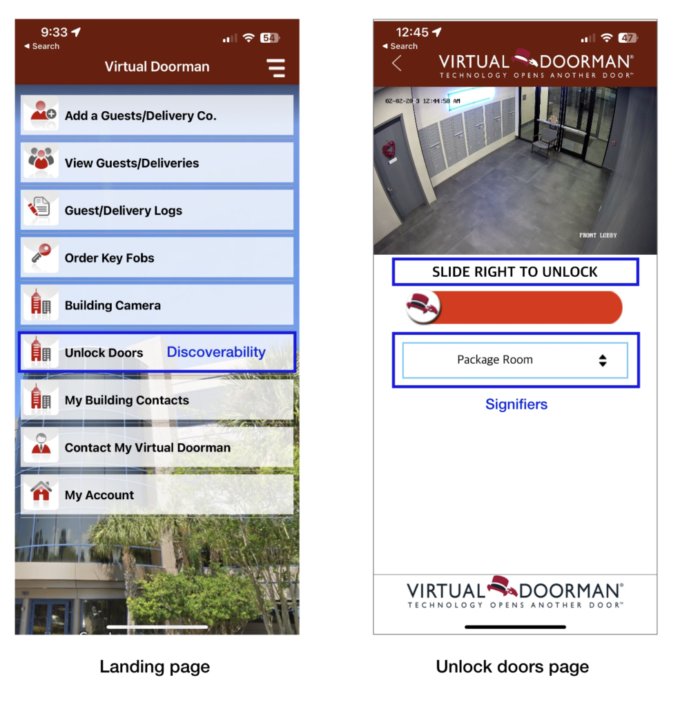
The most used function in the application is – Unlock doors. The button to perform the task (unlocking any building door) is discoverable on the landing page of the application and the icon coupled with the text on the button act as signifiers informing that the button affords clicking to unlock building doors. When clicked, the users receive feedback as they are navigated to a new page with a sliding bar to unlock the doors along with a drop-down menu that acts as a signifier and informs the affordance of clicking to select the door to be unlocked. The default door selected in the drop-down menu is the ‘package room’ door. Once the correct door is selected and the user slides to unlock that door, the selected door remains open only for 5 seconds which is just enough time for the user to get in. Thus, logical constraints are applied to restrict the duration of the door being unlocked. (Figure 4)
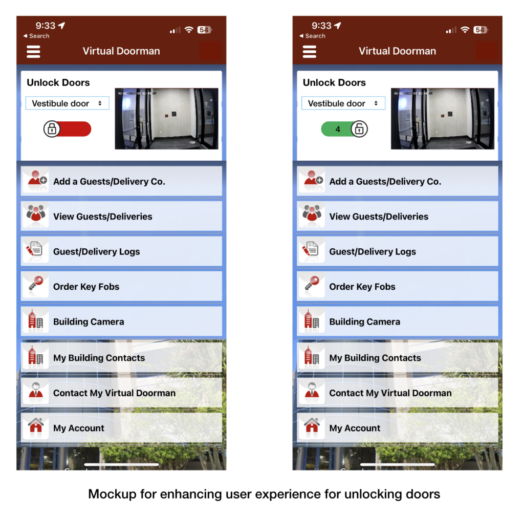
Despite the presence of adequate signifiers, affordances and feedback, the user experience while performing the task to unlock the vestibule door is still frustrating. Since, this is the most performed action on the application, the user experience can be improved by (Figure 5):
- Improving discoverability: Moving the button to unlock doors to the landing page.
- Using natural mapping: Using a lock icon instead of the Virtual Doorman icon to denote that the door is locked/unlocked.
- Improving feedback and visibility: Using red for locked and green for unlocked doors.
- Leveraging conceptual model: Using the conceptual model of an on/off toggle switch instead of the sliding bar to unlock doors.
- Changing the default door for the drop-down menu to ‘Vestibule door’
To conclude, currently the Virtual Doorman offers a convenient and secure means to manage resident’s daily interactions with visitors, delivery services, and other building-related activities. Using the design principles and concepts discussed above the Virtual Doorman can better their user experience and offer an efficient means to carry out these interactions.
