Client Overview
The Metropolitan Museum of Art (Met) is one of New York’s leading cultural institutions, boasting over 5,000 years of art from across the world. Their mission statement is as follows:
“The Metropolitan Museum of Art collects, studies, conserves, and presents significant works of art across time and cultures in order to connect all people to creativity, knowledge, ideas, and one another.”
Metropolitan Museum of Art Mission Statement
As part of this mission, the Met has a strong digital presence that helps to expose visitors to art in a variety of forms and modalities. Key to this digital strategy is the Met ‘Perspectives’ webpage, which aims to surface deep dives on pieces of art across multiple themes and content types. My team was tasked to help the Met understand the current user experience and expectations of the Met ‘Perspectives’ mobile webpage to help inform the Met’s future product roadmap through user research.
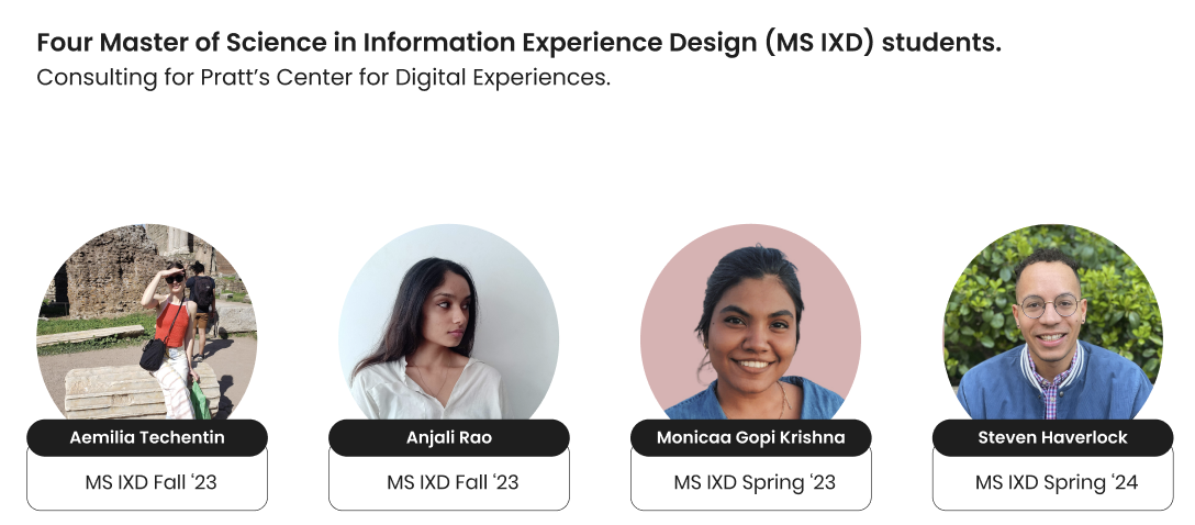
The Research Team
The research team consisted of four graduate students at Pratt in an advanced UX Research Methods course. Within my team, I led the research project management, data analysis and content writing work streams. All of us participated in moderating eye-tracking research sessions, conducting web analytics and synthesizing findings with relevant recommendations.
Our Process:
Typically the research team would determine the appropriate UX research method based on an initial client consultation and development of research goals. For this project however, our client reached out to specifically leverage our Eye-Tracking and Analytics expertise as this does not exist within their organization. This distinction was important as our research goals were developed with a pre-determined methodology.

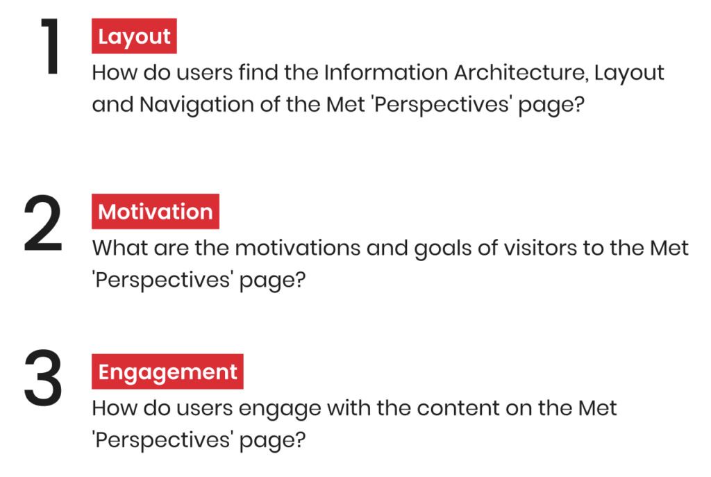
Research Goals: Layout, Motivation & Engagement
Based on our broad objective of understanding the user experience and expectations of the Met ‘Perspectives’ mobile webpage, we identified three distinct research questions with our client:
Participant Recruitment
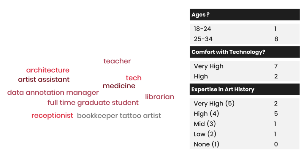
Our participant recruitment criteria prioritized researching users that were:
- Young adults
- Comfortable using mobile technology
- Non-Professionals in Art History
Given the usage of eye-tracking as one of our methodologies, we also screened participants for an eye or vision problems, as eye-tracking software does not work effectively for users with abnormal eye shapes. Ultimately, 9 representative users were recruited via email invitations and our personal networks (visual demographic breakdown below).
Research Methodology: Eye-Tracking, Surveys & Behavior Analytics
This study was a mixed-methods study, meaning that multiple research methods were used to triangulate findings. This approach combined qualitative and quantitative research insights which increases the validity of findings and the level of insight that a researcher could provide.
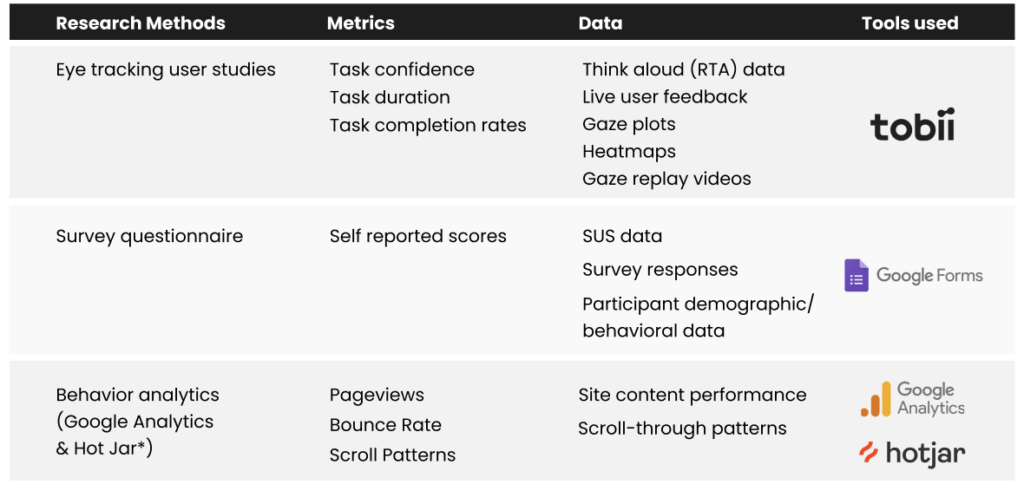
Eye-Tracking
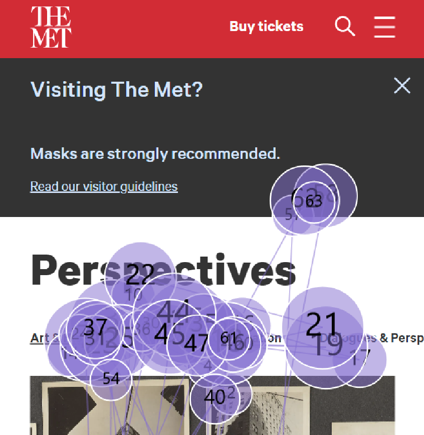
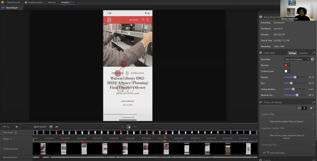
Eye-tracking was conducted using the Tobii Pro Nano software. Tobii Pro records a participant’s eye movements while they look at a digital interface and allows the researcher to view a user’s gaze patterns (specifically fixations and saccades).
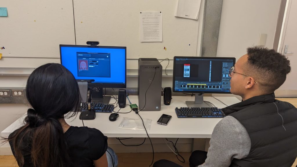
The Eye-Tracking method works by having participants perform a series of user tasks with minimal interruption. Eye-Tracking

Eye-Tracking differs from a standard usability test in that user feedback and reactions are collected after task completion, rather than during the tasks. The moderator plays back the participants gaze pattern recordings and prompts them for additional context / information. This method is known as retroactive think aloud, or RTA.
Survey
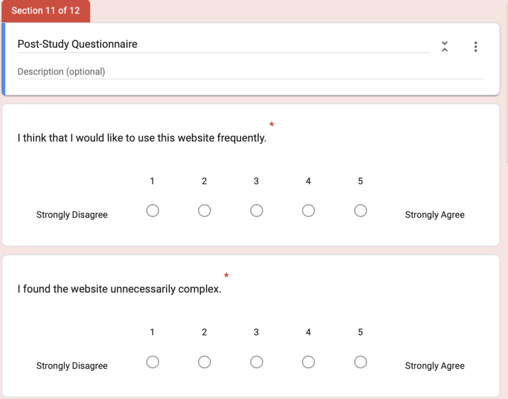
All participants completed a survey questionnaire via Google Forms following completion of the user tasks. There were two parts to the survey:
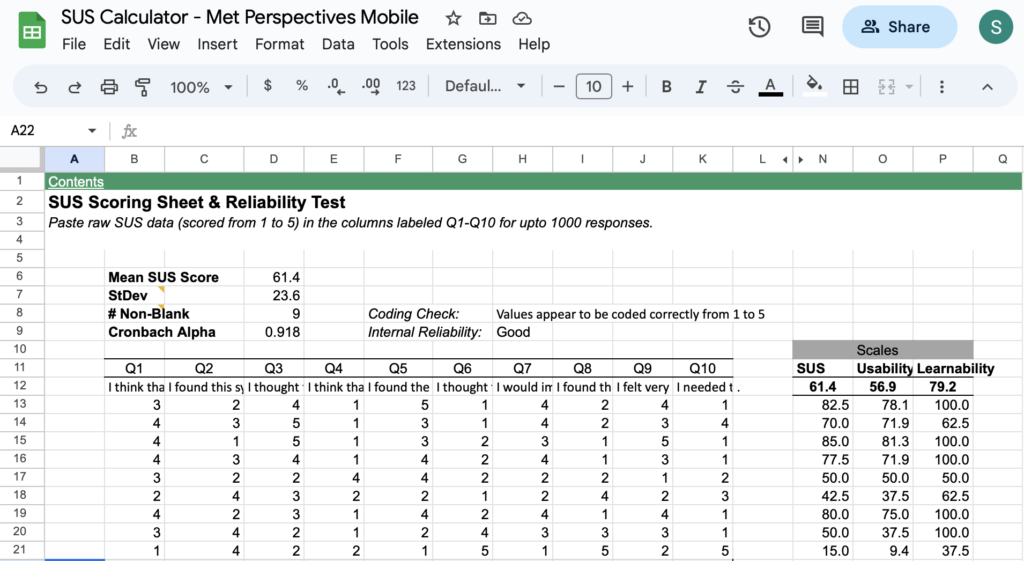
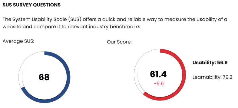
- System Usability Scale: Participants completed the System Usability Scale (SUS) survey which asks a set of 10 usability-focused questions to benchmark an interface’s usability on a scale from 0 – 100 (with the average score being 68).
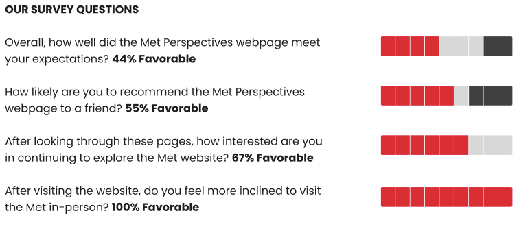
- Sentiment Questions: Participants also answered questions about their expectations for using the website and likelihood to engage with the Met virtually and physically in the future.
Behavior Analytics: Google Analytics & Hotjar
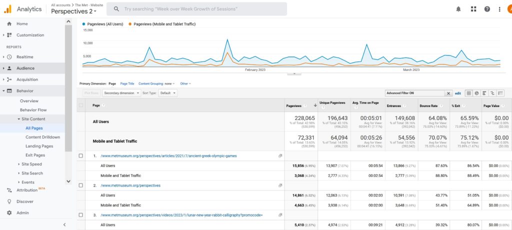
To supplement our eye-tracking and survey findings, we utilized the Met’s Google Analytics and Hotjar pages to develop a stronger understanding of user behavior.
Google Analytics provided quantitative data on how user’s engaged with the Met Perspectives page and Met website overall. We were specifically interested inn figures around content engagement, page views and user paths.
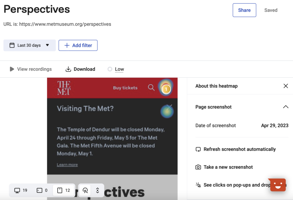
Hotjar provided heat maps of user engagement with different pages as well as recordings of user interactions with content on the site. Due to relatively low mobile user traffic on the Perspectives page, we had limited Hotjar data but leveraged what was available.
Data Analysis: FigJam
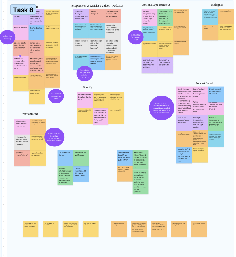
Quantitative metrics and qualitative observations were initially captured using an Excel spreadsheet organized by task and participant. Following completion of all of our eye-tracking studies data was migrated to Figma and thematically analyzed using the affinity diagramming approach in Figma. Behavioral Analytics were brought in to reinforce findings as appropriate.
Findings & Recommendations
Our final slide deck report is linked below. The following is a summary of the key findings and recommendations we developed as a research team.
Overview
Our users found the Met Perspectives mobile webpage to be a modern and aesthetically pleasing interface. Survey results indicated that most participants would recommend the webpage to a friend and they felt more inclined to visit the Met after interacting with the Perspectives page. However, the SUS questions indicated overall usability challenges with the site which were reinforced by our findings.
The Met Perspectives mobile webpage received a score of 61.4, almost 7 points below the average SUS benchmark. Specifically, questions focused around usability scored 56.9, underscoring the opportunity to make meaningful usability improvements to the website. We identified 3 primary findings with accompanying recommendations based on our research.
1. Navigation on Perspectives page
Our research demonstrated that users faced challenges navigating both to the Perspectives page as well as within the page. Specifically, we observed that:
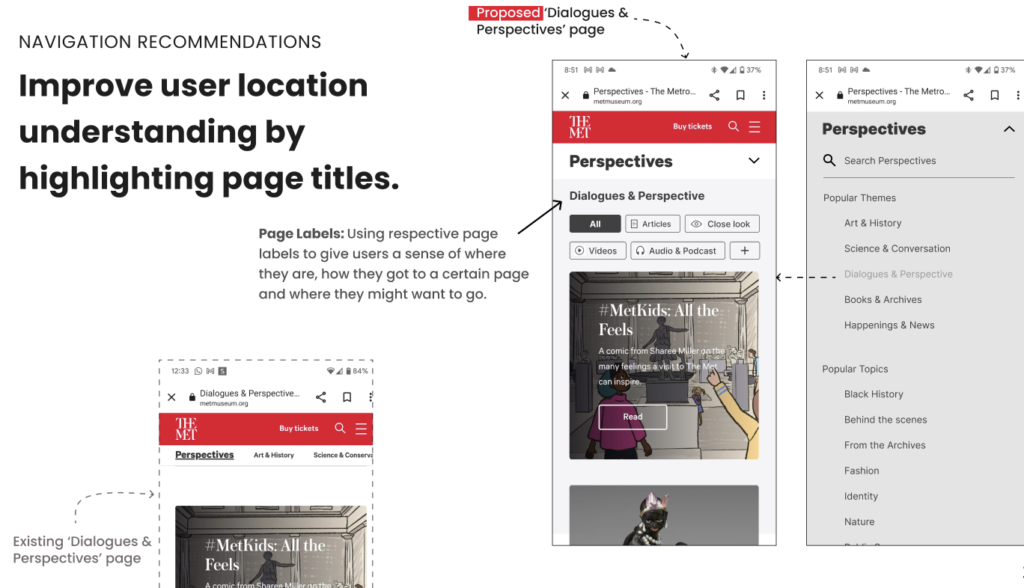
- Page labels hindered wayfinding
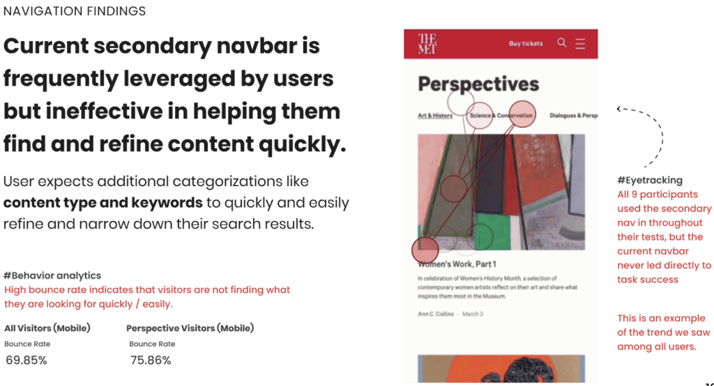
- Secondary navigation bar was ineffective
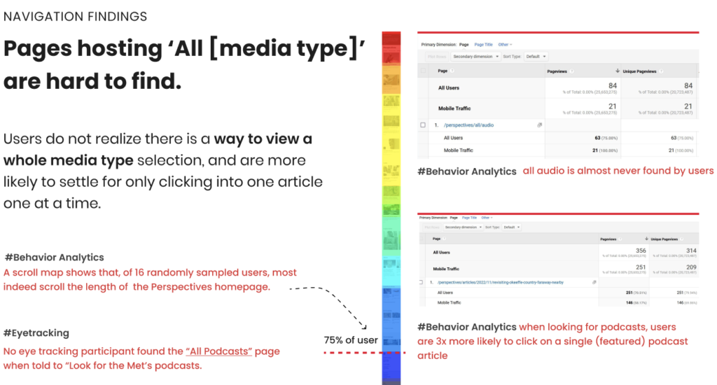
- Pages hosting media type repositories were difficult to find
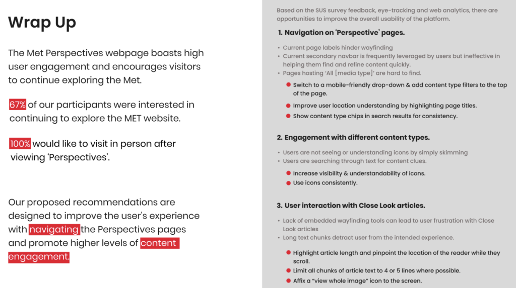
Fortunately, we were able to identify opportunities to mitigate some of the navigation challenges outlined above. Our recommendations were as follows:
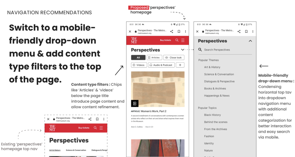
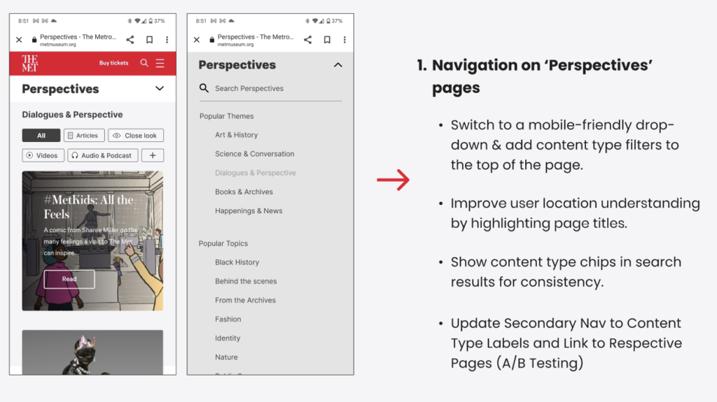
- Switch to a mobile-friendly drop-down menu & add content type filters to the top of the page
- Improve user location understanding by highlighting page titles.
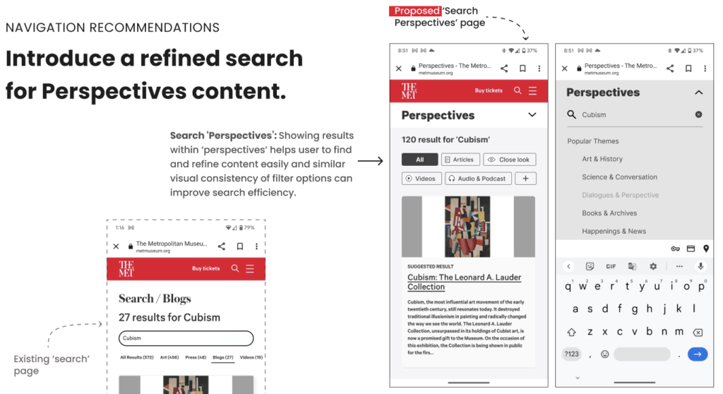
- Introduce a refined search for Perspectives content.
We believe that the implementation of these navigation recommendations (summarized below) would address the user’s existing wayfinding difficulties and improve their ability to orient themselves within the webpage.
2. Engagement with Different Content Types
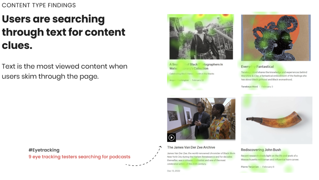
While content engagement is the primary purpose of the Perspectives webpage, users faced challenges with identifying their desired content types quickly and accurately. Specifically, we observed that:
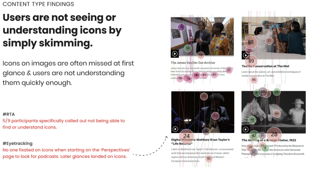
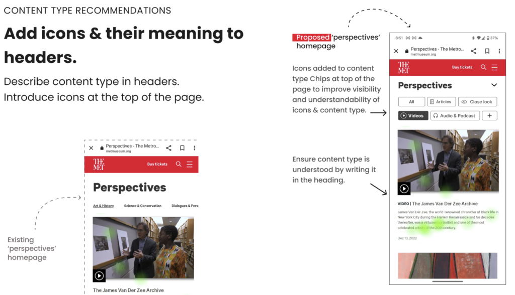
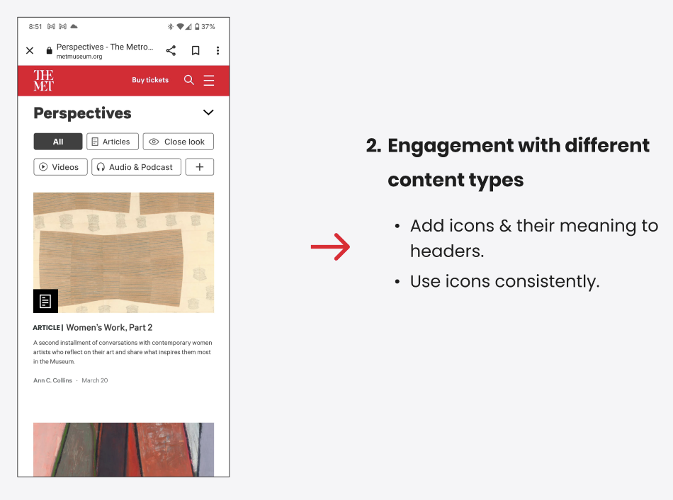
- Users are not seeing or understanding icons by simply skimming.
- Users are searching through text for content clues.
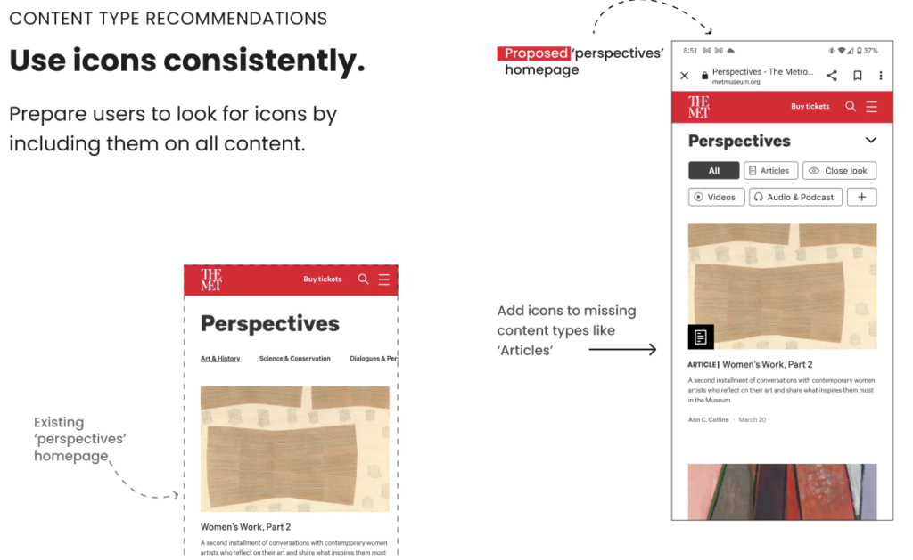
Icons were being used throughout the Perspectives page to help users identify the content type but it was not working as expected. Icons were applied inconsistently and there was nowhere for the user to confirm the icon’s purpose. Our recommendations for this finding were grounded in increasing consistency and clarity of labels:
- Increase visibility & understandability of icons.
- Consistency in usage of icons.
By making these small changes to define icons upon the user’s first interaction with Perspectives and applying them across all content types consistently, we believe that user’s ability to engage with content effectively and identify their desired content type will improve.
3. User Interaction with Close Look Articles
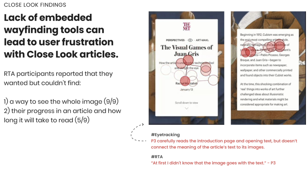
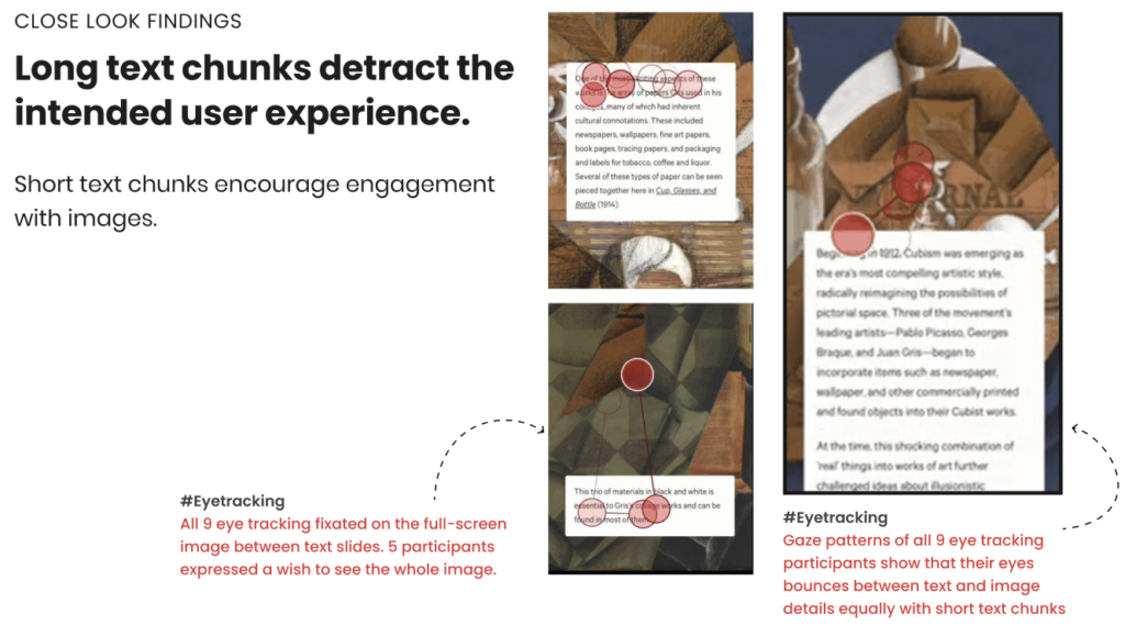
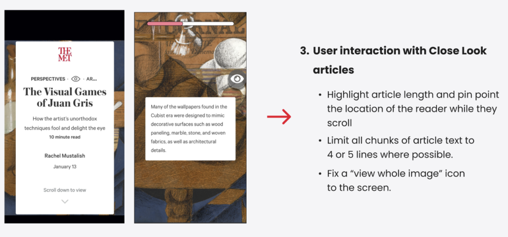
Task 5 directed users to read through a ‘Close Look’ article on the Met Perspectives page. These articles provide an image-centric deep-dive into a particular piece of art or artist collection. Our participants read the article, ‘The Visual Games of Juan Gris‘ and surfaced multiple usability challenges during their eye-tracking sessions:
- Lack of embedded wayfinding tools can lead to user frustration with Close Look articles.
- Long text chunks detract from the intended user experience.
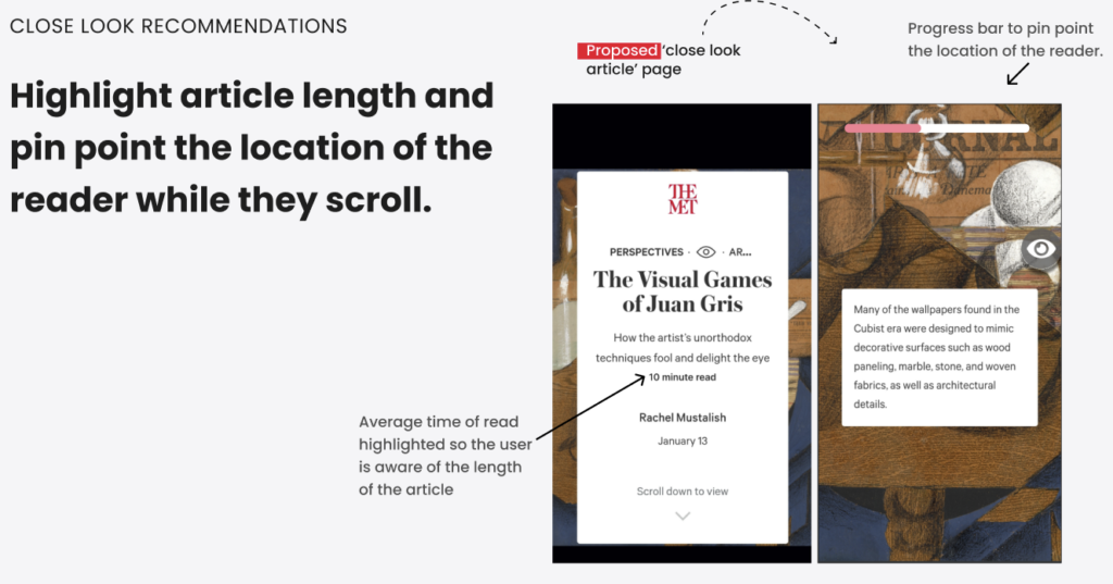
The issues identified within the Close Look articles largely centered around a user’s desire to know where they were in the article and their ability to engage with the imagery. Our recommendations aimed to address these concerns with simple additions / typographic choices:
- Highlight article length and pinpoint the location of the reader.
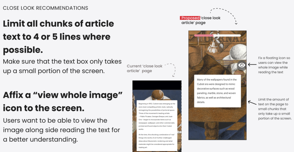
- Limit all chunks of article text to 4 or 5 lines where possible.
- Affix a “view whole image” icon to the screen.
The inclusion of average time of read recommendations and a progress bar would help to address the user wayfinding challenges identified within the Close Look articles. Limiting length of text chunks and providing the ability for mobile users to view the entire image should improve image engagement and balance gaze patterns between text and imagery.
Conclusion & Future Direction: Content in Context
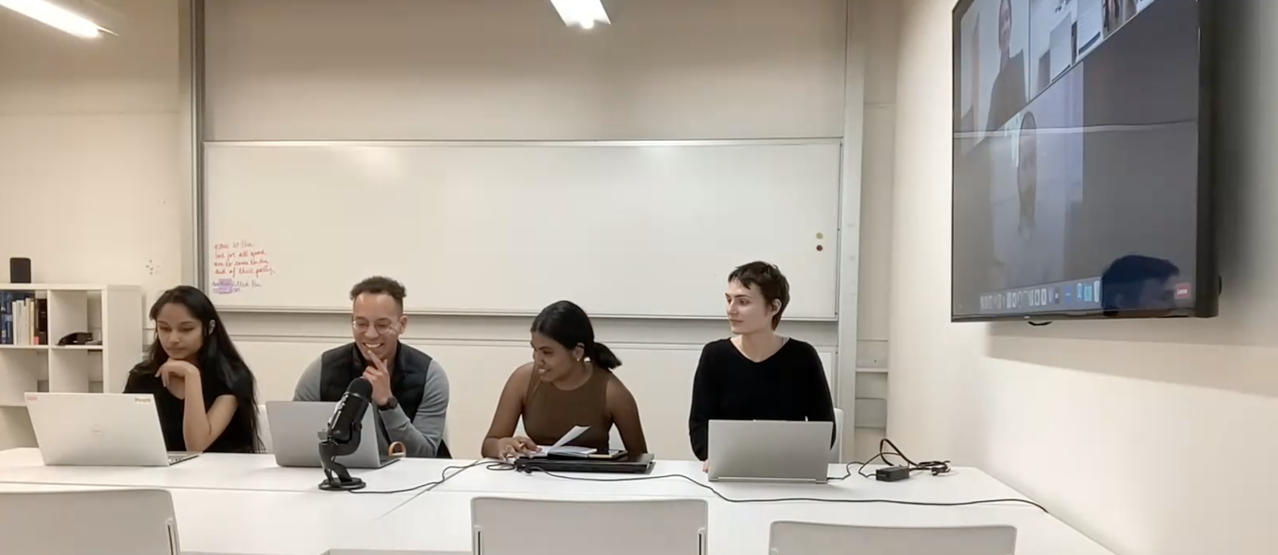
Our findings and recommendations were well-received by the Met. Specifically, the focus on content organization and media types aligned with existing hypotheses held by the Met and provided additional data to support further investment in exploring these changes.
In terms of next steps, we recommended the following:
- Simple A/B Test: Given the findings around content organization, an A/B Test updating the secondary navigation labels and hyperlinks to reflect media types would be low-lift and further validate our research findings. Our team pre-programmed a test in Google Optimize on behalf of the client, with a primary emphasis on bounce rate.
- Scoping of Dynamic Filter: The dynamic content-type filters were a strong recommendation that we believe would meaningfully improve the usability and findability of content on the Perspectives page. However, we recognize the current sites structure does not support dynamic filtering of content. Getting an estimate of effort required for the change would help to determine whether a wholesale change is feasible and whether to focus on small labeling updates throughout or a redesign.
- Expanded Testing: Our sample size was relatively small for both the eye-tracking study and the behavior analytics. To increase confidence in scroll maps / heat maps and further generalize findings, we’d recommend recruiting additional users to repeat the study and strengthen our findings.
A One-Page Summary is available below summarizing our findings:
