Project Summary
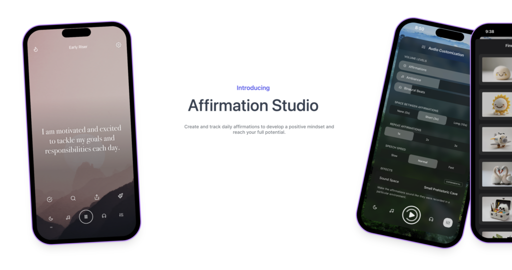
Founded in NYC, Affirmation Studio is an app that aims to help people benefit from daily positive affirmations. Through these statements the app can help to improve people’s mood, boost their self-esteem, and increase their confidence. The project goal was to identify areas of usability improvement that can be made so that users would want to use Affirmation Studio as a part of their wellness routine. A moderated user testing was conducted with eight participants to identify usability problems on the app and provide potential solutions. On the basis of usability testing reports, four recommendations were given to help improve the usability of the Affirmation Studio application.

Duration
6 Weeks
Our Team
Tanmaya Jyothula,Eloisa Rodriguez, Gabriella Nachman, Radhika Mehra
My Role
User Testing, Recruiting Participants, Conducting Moderated User Tests, Analyzing and Synthesizing Collected Data, Identifying Recommendations, Creating Final Report and Presentation.
The Process
The study adopted the synchronous remote user test method to carry out the usability testing. The team conducted moderated usability tests on eight different participants. The tests were conducted remotely through Zoom (six tests) and in-person (two tests). The users attempted to complete the tasks given to them and were asked to provide feedback as they navigated through the app’s interface. The client wanted to focus on assessing the overall usability of Affirmation Studio and identify any areas that may be causing confusion or frustration for the users.

Moderated User Testing
The user test was conducted to observe users and how they interact with the application. The team sought to find answers for the following questions:
- What are users’ initial reactions to the landing screen after the initial onboarding experience?
- Are the icons intuitive? Do the users know what they mean before and after interacting with them for a bit?
- What is the user’s reaction to the affirmations playing? (Number Played, Voice, Speed, Ambiance, etc.)
- What is the user’s reaction to using the AI affirmations experience?
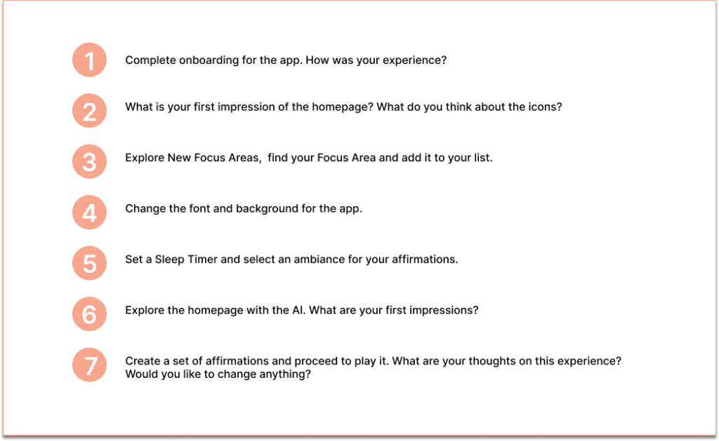
A set of seven tasks were developed by the team, the users completed the task scenarios that were developed and evaluators analyzed the results to identify important issues and difficulties. Each test was administered by at least one team member and detailed notes and insights were captured from all the tests. The participants were presented with the following tasks to complete:
Recruiting Participants
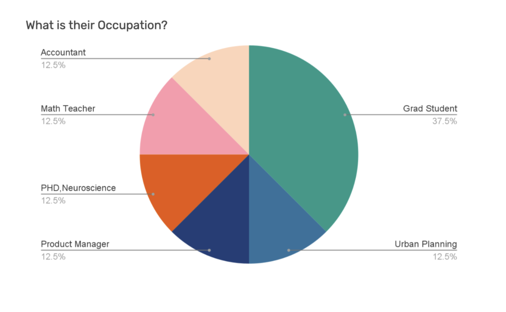
Each of the four team members were responsible for recruiting two participants for the study and conducting the test sessions for these users. This resulted in a total of eight moderated user tests being conducted for the study. The target user group is female, early 20s – mid 40s, who are interested in personal development and mindfulness practices. The participants were recruited on this basis and they were screened using a set of questions which are:
- Do you use meditation/mindfulness as a resource to take care of your mental health? Yes/No.
- Are you looking for new ways to manage your mental health?
- Do you have any interest in any of the following? Meditation, Mindfulness, Journaling, Personal Development and Positive Affirmations? Yes/No.
Moderated User Testing
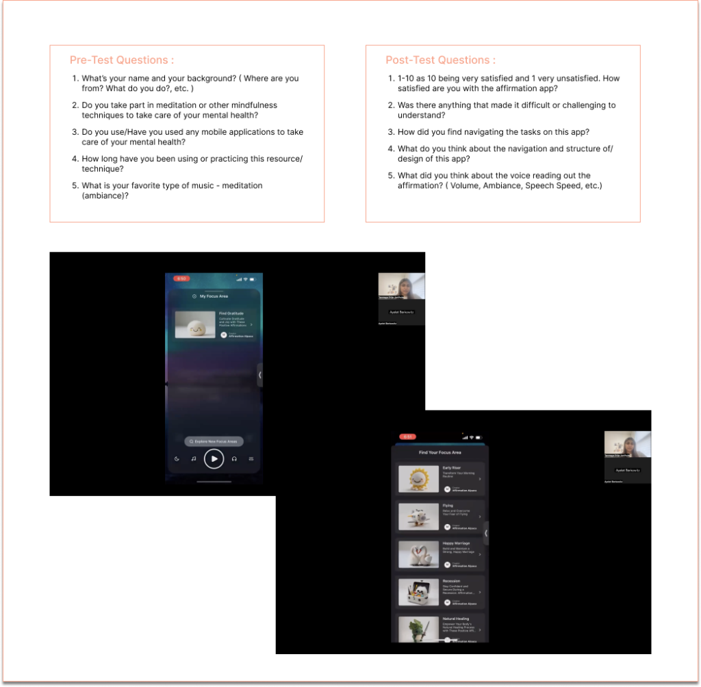
The users were first asked a set of pre-test questions to learn about the wellness techniques and practices the user currently follows and also to capture their preliminary demographic information. Six of the tests were conducted and recorded over zoom and two tests were conducted in person. The users downloaded the app on their phone and completed the tasks as they voiced their thoughts throughout the process. After the completion of the tasks, the user answered a set of post-test questions, voicing their overall thoughts and opinions on their experience using this app.
Data Analysis
The user tests revealed several usability issues with the app and we noted and consolidated all the issues after all the tests had been completed. We then analyzed the data to find similar issues and observed common patterns in user behavior and difficulties. After analysis, the group synthesized four key findings and suggested recommendations for the improvement of the user experience.
Findings and Recommendations
Recommendation 1
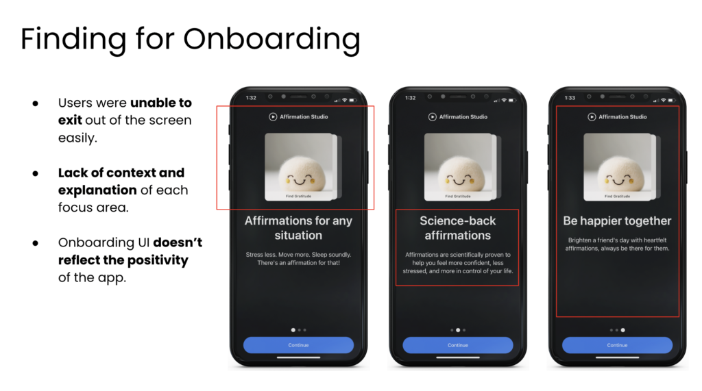
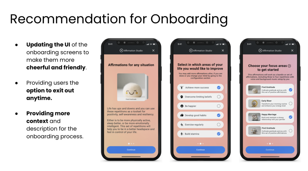
Improving usability and navigation of Onboarding
The users found the onboarding to have difficult navigation, was lacking key information and found the screen’s UI to be dark and not reflective of the positive nature of the application.
Recommendation 2
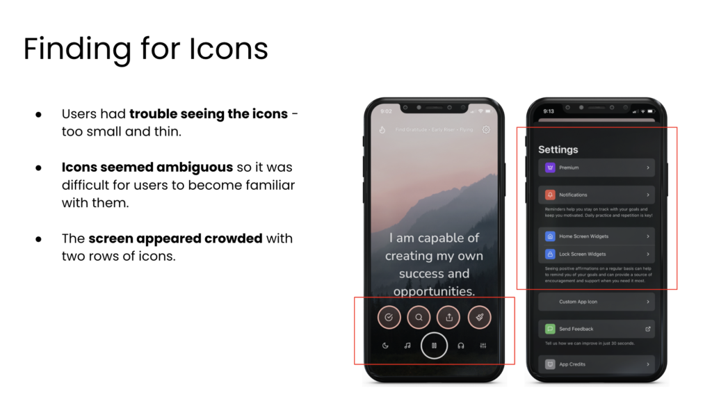
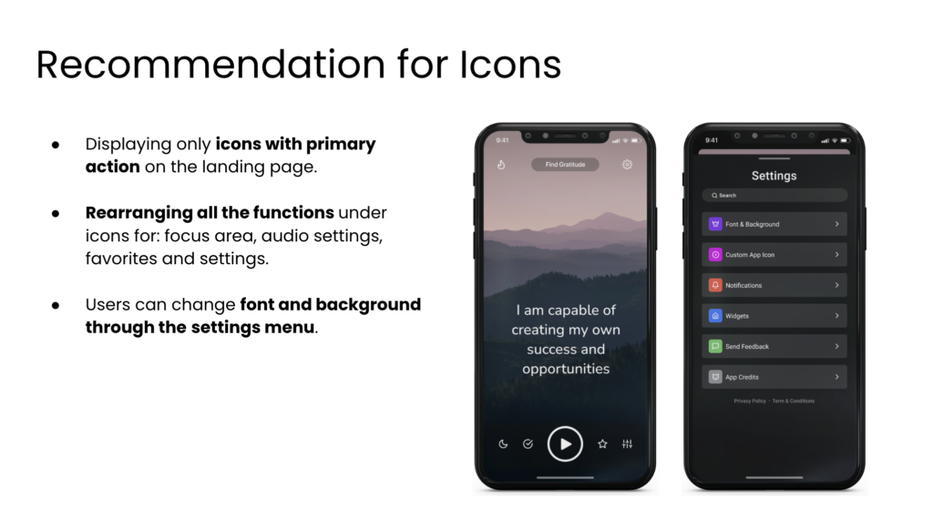
Decluttering Icons on the Landing Screen
The users had trouble seeing the icons clearly and were overwhelmed with the volume of icons present on the landing screen. This led to trouble navigating through the screens as they weren’t sure where to click first. They found the icons too ambiguous and this led to further difficulty is navigation and recognition of different features and sections.
Recommendation 3
Creating Intuitive User Flow for Focus Area
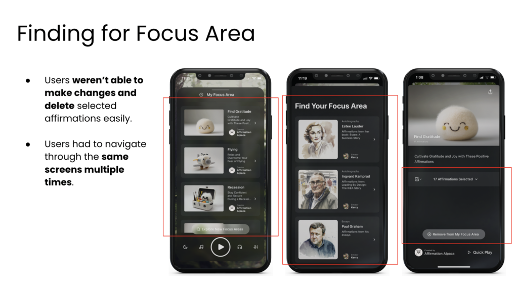
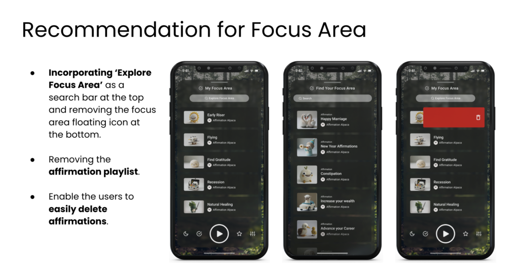
The users had difficulty navigating through the focus areas there were multiple paths leading to similar screens and the icons provided weren’t clear or intuitive. They were also unable to make changes to selected options easily, and couldn’t edit the playlists of affirmations they had created.
Recommendation 4
Providing Customization for Voice of Affirmations
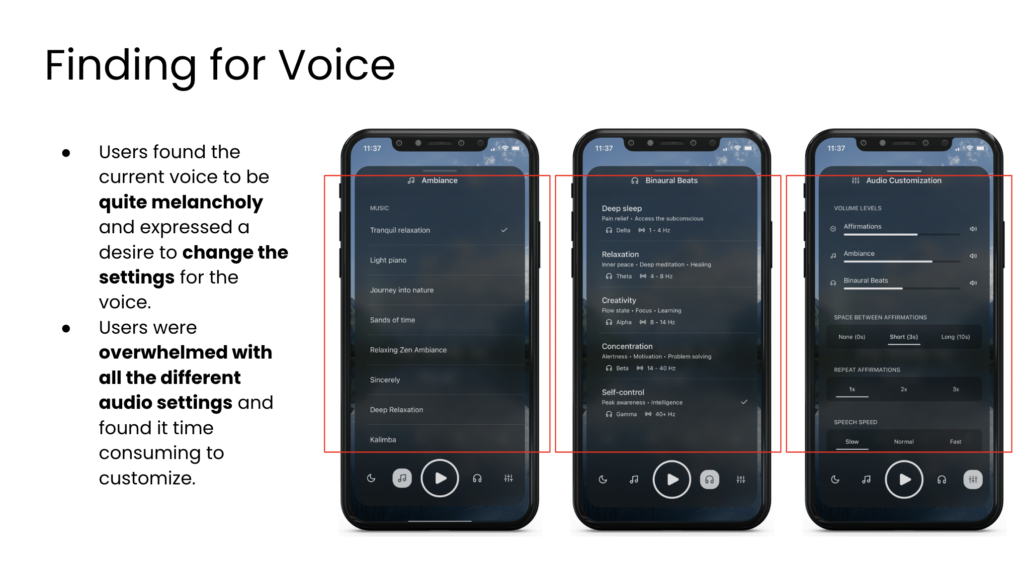
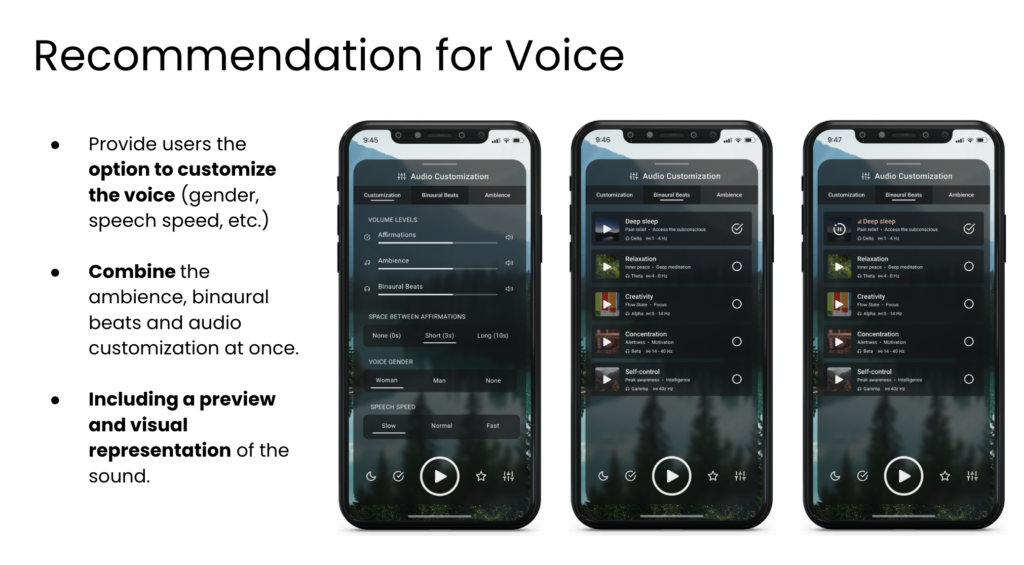
The users felt that the current voice that reads out the affirmations to be melancholy and depressed. They expressed a desire to make changes and customize the settings of the voice to their preference. The users were confused with the different audio settings weren’t sure how to adjust the different features provided to them.
Conclusion
In conclusion, through this study and tests conducted, the team was able to identify key pain points and usability issues from the participants. The app is a unique experience that aims to help users in self-improvement and provide a positive boost to the day with the help of positive affirmations.
If we were to keep working on this project, we would conduct additional user testing with the AI feature on this app (as the AI features are still in the beta phase) and gather more input about the user’s needs and expectations for using AI integrated within the app.
The clients were very impressed with the findings and recommendations. They would like to implement the recommendations and continue making changes to the app to make it more intuitive and improve the app’s user experience.
I thought the goals were very well defined.I noticed there are more edits on the onboarding screen. It looks very well thought through It looks very well thought through.
Kerry ( UX Designer , Co-Founder of Affirmation Studio)
Please view the client presentation here.
Please view the detailed user test report here.