OVERVIEW
reSTORE is a storytelling marketplace where formerly incarcerated people (FIP) businesses can promote and sell their products and services. We’re an initiative started by Witness to Mass Incarceration, a non-profit dedicated to improving and empowering the lives of incarcerated and formerly-incarcerated people.
ABOUT WITNESS
From invisibility and victimization to empowerment through documentation, leadership training, organizing, and advocacy, Witness to Mass Incarceration creates a community that changes the narrative surrounding incarcerated and formerly incarcerated people.
We started reSTORE so FIP-owned businesses have a central place to promote and directly sell their products and services. This site is an extension of The Map Project, a resource to connect and promote these businesses, as well as organizations that support re-entry.
Our Process

THE PROBLEM
From the kickoff call, we learned that FIP were constantly facing challenges including:
- Stigmatization of FIP creates barriers to find success after incarceration; remove the word re-entry
- FIP lack support with operating businesses; a path from incarceration to financial success and lower recidivism
- FIP businesses lack visibility due to lack of centralized marketplace and challenges with technological literacy
THE SOLUTION
The goals and the scope of this project are:
- Support FIP-owned businesses by creating a infrastructure/marketplace to help sell their products and services or receive donations
- Leverage storytelling to humanize FIP and encourage consumers to engage with them as people to support their businesses
- Create partnerships with other organizations to grow the community and support the overall mission
EXPLORATORY RESEARCH
GOALS:
- To gain a deeper understanding of stories of FIP and FIP-led businesses and find an effective way for storytelling
- To identify how different stakeholders interact with key flows on the current Witness website
ECOSYSTEM MAP
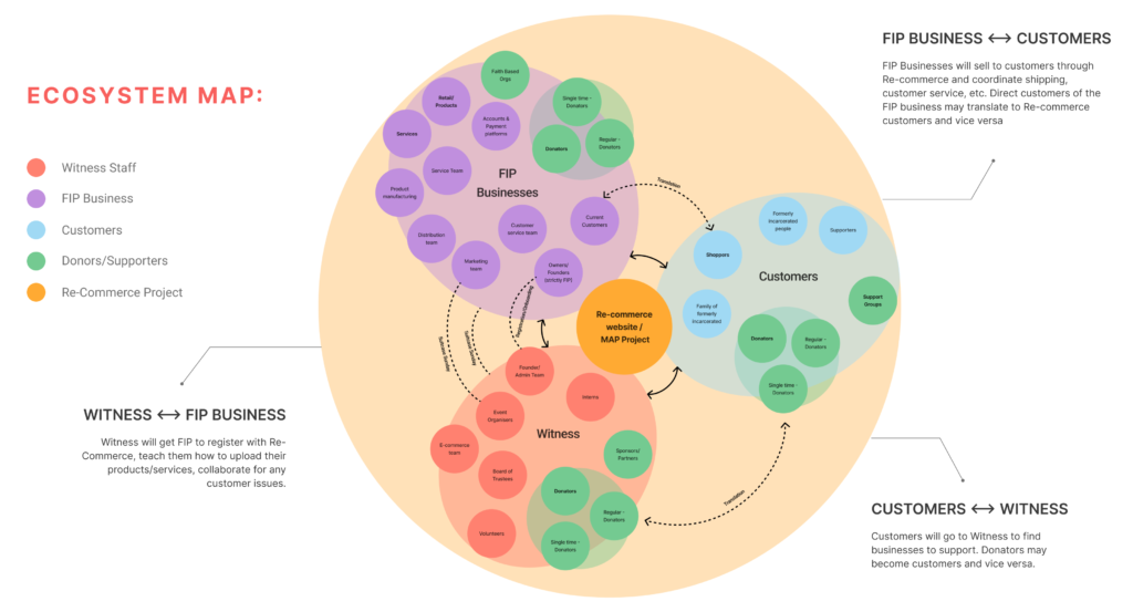
We first mapped out all the key actors on an ecosystem map – Witness, FIP businesses, and customers – and how they interact with each other and the site.
LITERATURE REVIEW
Literature review uncovered useful information about our main user group of formerly incarcerated people:
- 1/3 adults — more than 70 million people — have some type of arrest or criminal record. To put this in perspective, about the same number of Americans have college degrees right now.
- Key components that influence personal development and successful reintegration post release are talent, and acceptance and self esteem.
- Understanding the user’s educational level and how that impacts the prevalence and complexity of writing should be a major consideration.
TECHNICAL ANALYSIS
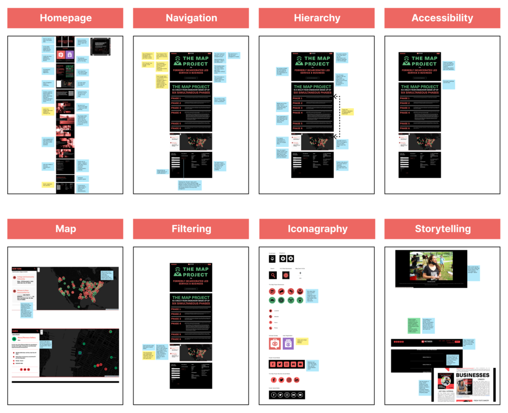
Our team conducted a technical analysis of the current website for Witness to Mass Incarceration, and discovered that:
- Site has little storytelling elements for FIP as it is now
- All stories are siloed to the “blog” navigation page
- Blogs are in standard article format
- Map project storytelling is effective – graphic, lists out in phases
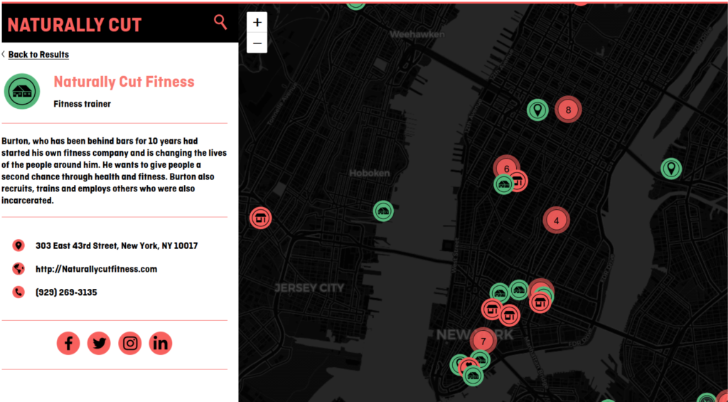
- Finding a business can be difficult for users
- Map icons are confusing and needs a refresh/clarification
- Lack of humanizing the community (through imagery, quotes, etc)
INTERVIEWS
We interviewed two user groups: customers (3) and FIP business owners (3). For customers we asked about their shopping habits and their thoughts on mass incarceration/the formerly incarcerated.
Customers said:
- They were unfamiliar with mass incarceration but willing to support
- Stigmas associated with FIP but hearing reviews increase trust
- Convention of eCommerce are important for building trust
- Knowing the backstory increases willingness/interest to buy
FIP Business owners said:
- They consider their criminal background an essential part to their journey to becoming business owners
- A source of motivation for them is giving back to the community
TESTING
- In testing the current site, users struggled with:
- Registering a business for the Map Project. The form was lengthy and the user couldn’t review.
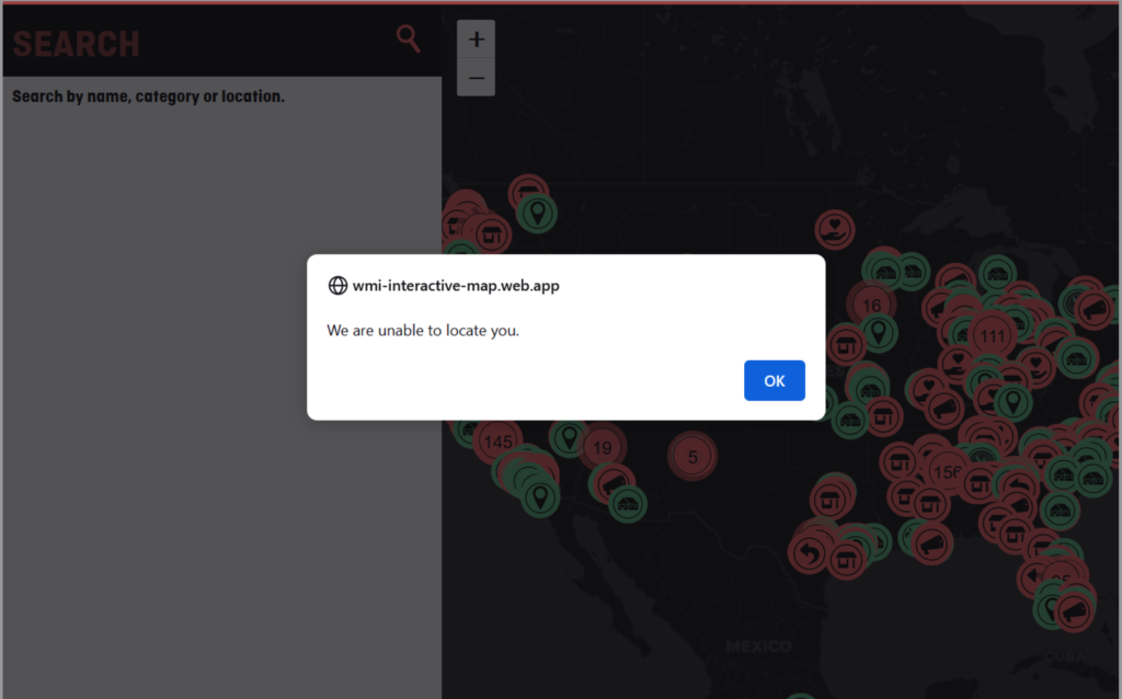
- Searching for a business through the Map. There was a search error when they pressed enter, or when there were no results. A lot of the time, searching simple words brought back no results.
- Color meaning on the site. The red and green icons could mean right or wrong, but its not clear exactly why red and green are used. The black everywhere combined with the red felt severe and aggressive for users.
ORGANIZATIONAL PRINCIPLES
Organizationally, the goals of this project are to:
- Use storytelling, visual imagery and language to humanize FIP
- Support key stakeholders: FIP, FIP-businesses, FIP families and Allies with different journeys:
- FIP businesses: Promote / Engage with customers and other businesses
- Customers: Connect with FIP businesses and support
- Witness: Form Community between FIP Business owners, FIP, FIP families and allies.
- Partner with FIP and non-FIP to uplift and make visible the FIP community
DESIGN PRINCIPLES
Our How Might We Statements helped us solve our well-defined problems by framing our goals into actionable phrases.
How might we…
- Utilize eCommerce mental models in search filters to help users find FIP businesses within the resource of Re-Commerce?
- Encourage purchase by humanizing FIP through images/videos of FIP business owners, quotes, and graphics like timelines on the business landing page (dynamic storytelling)?
- Create a sign up flow for FIP businesses that’s easy and quick for the businesses to fill out and for the admin of the site to implement. Consider FIP literacy and technical skills?
- Prioritize UX writing and content strategy to effectively create community and break stigmas for FIP?
INFORMATION ARCHITECTURE
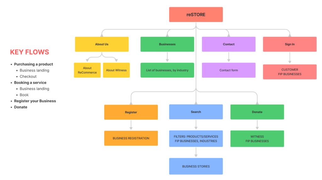
The information architecture we designed places a strong emphasis on storytelling alongside the e-commerce aspect of the website. We have identified four key flows that users can engage with: purchasing a product, booking a service, registering a business, and making donations.
STYLE GUIDE
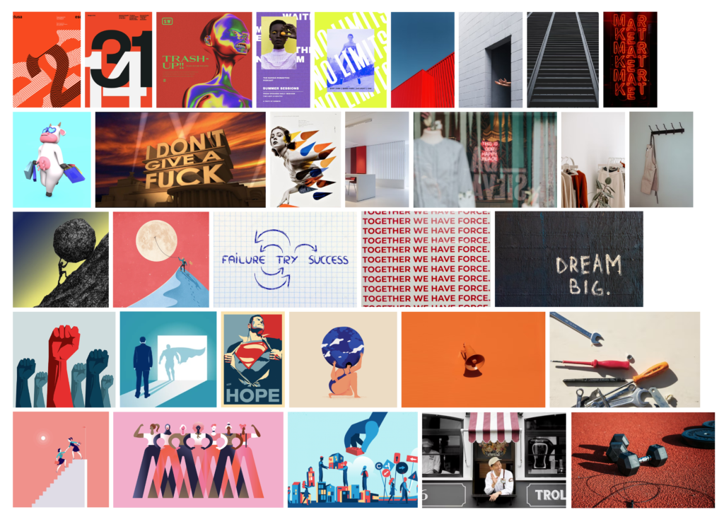
Mood-boarding
Mood boards helped us visualize our findings from our research. We compiled imagery for the following keywords:
Colors
We wanted to keep the energy of the Witness brand, but make it less severe/scary. We kept the Witness Red but removed a lot of the black to make it feel less harsh. The white background made the site feel ecommerce – oriented and clean.
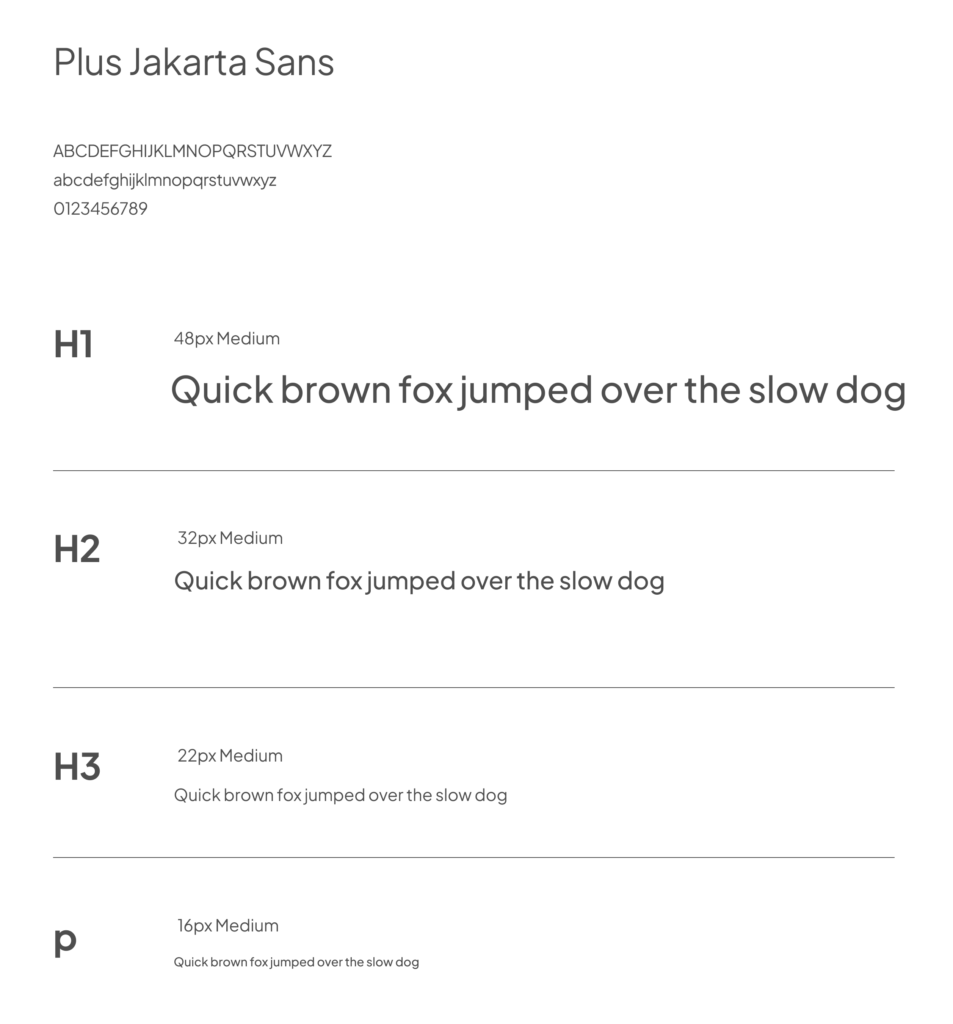
Typography
In picking a font, we wanted something that could be bold, but also clean and professional. It also needed to be a font that could match with any brand that was hosted on the site. For this, we chose Jakarta Plus Sans.
MVP WALKTHROUGH
We designed the main tasks that each of our users would most frequently complete while using reSTORE:

We made it a point to put storytelling up front and center to drive the narrative of reSTORE, as well as humanize the FIP business owners. As described by the users we tested, showcasing the story of a brand encourages them to buy.
See our final prototype here.
EVALUATIVE RESEARCH
In evaluating our prototype through user testing, we found a few key pain points:
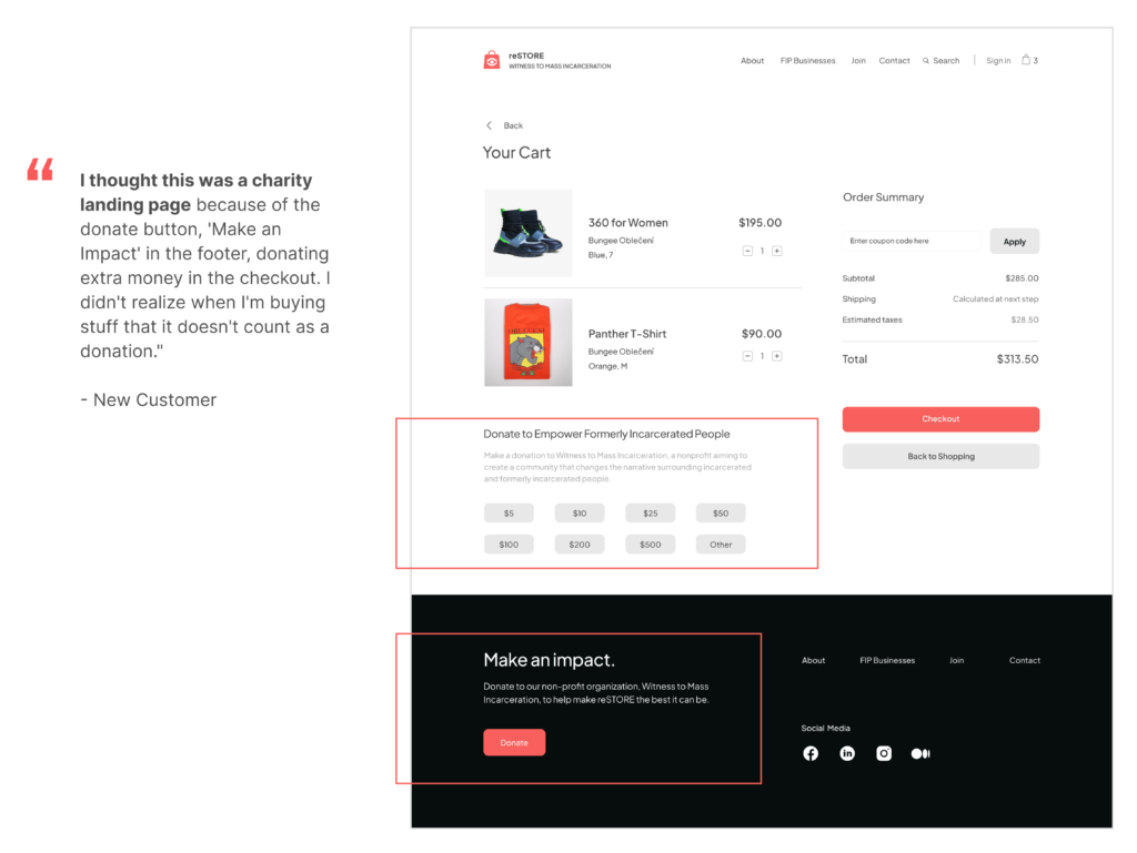
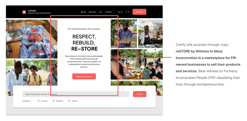
- 3/5 users were not sure what ReStore does – Charity page? Stock images?
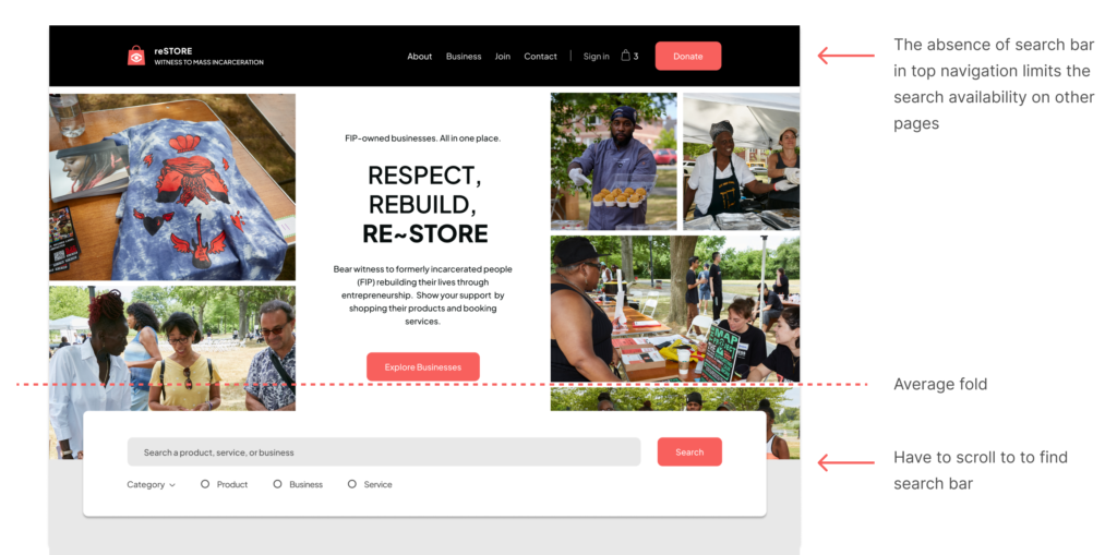
- Users couldn’t search easily – The search bar wasn’t available above the fold on the landing page, and it wasn’t present on any other pages within the site.
Iterations:
- Change copy on landing page to state more clearly what reSTORE is.
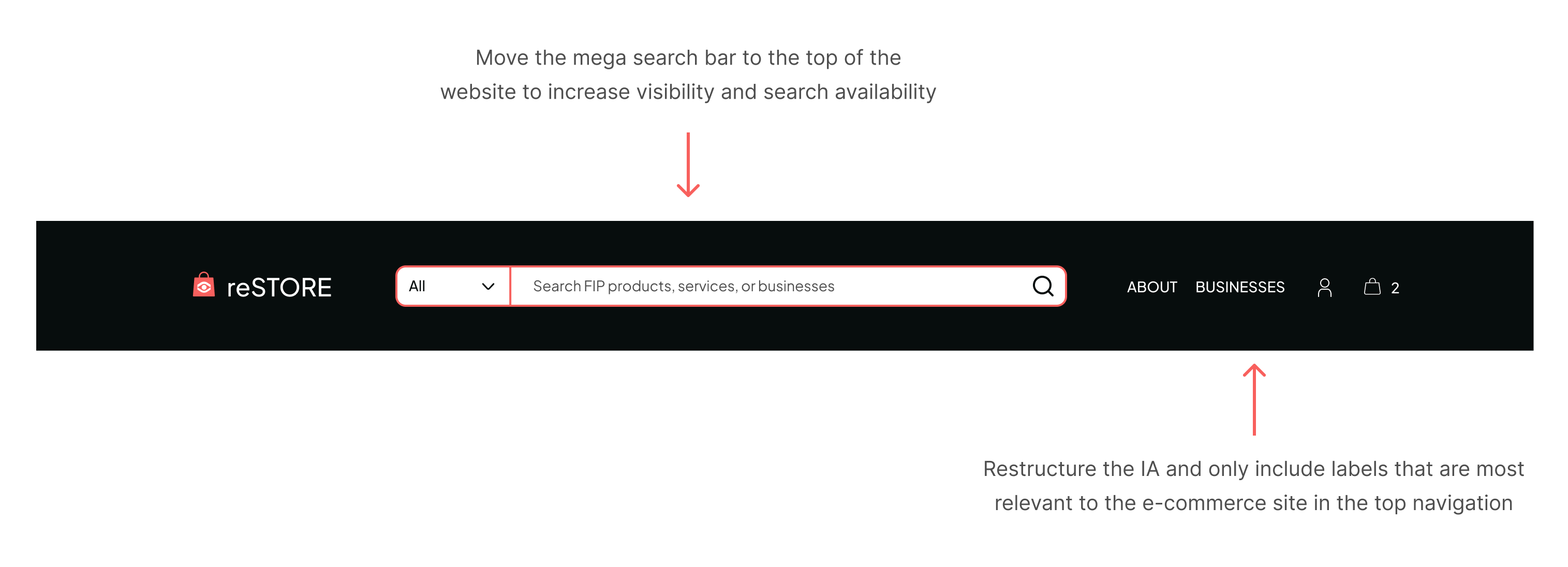
- Remove ‘Donate” button from navigation, as it is more consistent with the standards of a charity site.
- Remove the floating search bar and place it permanently into the navigation, so it’s easy to use at any point. (This is also consistent with e-commerce standards)
NEXT STEPS
Integrate a version of The Map Project into reSTORE
- An interactive map with filters, intuitive icons, a key, and light storytelling included in order to find and learn about FIP businesses and their owners
- A way to explore the businesses on reSTORE
- A visual representation of the entrepreneurial successes of FIP across the country
- Ties reSTORE more closely into The Map Project, and Witness
- This requires a separate custom coding project within Shopify
Make homepage more product-focused
- Have a product carousel, or photo animation, showcasing multiple products from multiple vendors, that’s updated weekly to make sure no business gets preference
- Will better show it’s an ecommerce site to people outside of the FIP community (FIP, family members, friends)
- Right now, its best to align more with Witness to draw in community members
- As reSTORE grows its customer base, they can switch their content to cater to customers outside the community
- From a content strategy perspective, product highlights require consistent updating, and Witness currently doesn’t have the bandwidth
