Dyslexia – a lifelong condition that affects reading, writing, spelling, and speaking. It is estimated that approximately one in five people are impacted by this disorder. It is crucial to ensure that individuals with dyslexia have access to assistive technology that enhances their accessibility and OpenDyslexic- by Abbie Gonzalez does just that. In this blog post, we will explore the OpenDyslexic Font, a typography innovation designed with dyslexic individuals in mind.
Understanding the Experience of People with Dyslexia.
People with dyslexia face unique challenges when it comes to reading and processing written text. Traditional fonts can often make it difficult for them to distinguish between different letters and words due to the crowding effect. With a bit of Web code, Victor Widell is making it easier for others to understand how reading with dyslexia might feel.
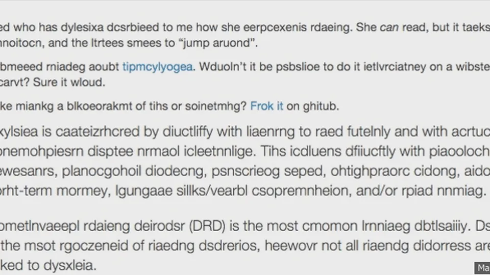
This example may not be universally applicable to individuals with dyslexia, as the condition can vary in symptoms and severity. Nonetheless, the simulation serves as an effective tool for introducing others to the concept of dyslexia. It clearly demonstrates how reading can become significantly more challenging, — and that’s one of the things educators and peers need to understand when dealing with someone who has dyslexia.
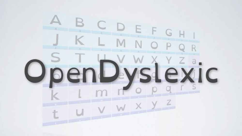
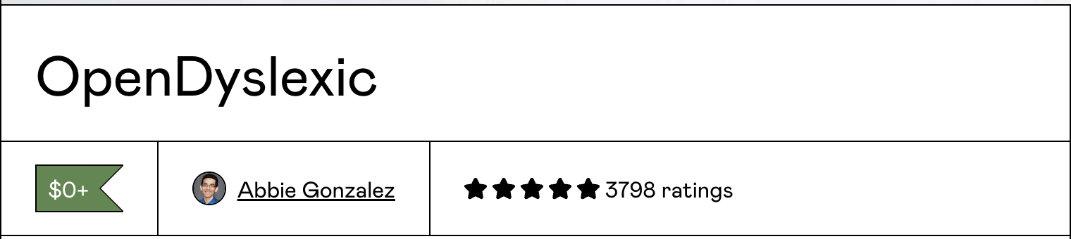
OpenDyslexic: Font Design with Dyslexia in Mind.
OpenDyslexic is a new open-sourced font designed against some common symptoms of dyslexia such as letter crowding, confusion with certain letters, and reading fatigue. The font employs various number of features that make it accessible, such as-
- Increased letter spacing
- Thicker strokes
- Curved letters
- Reduced serifs
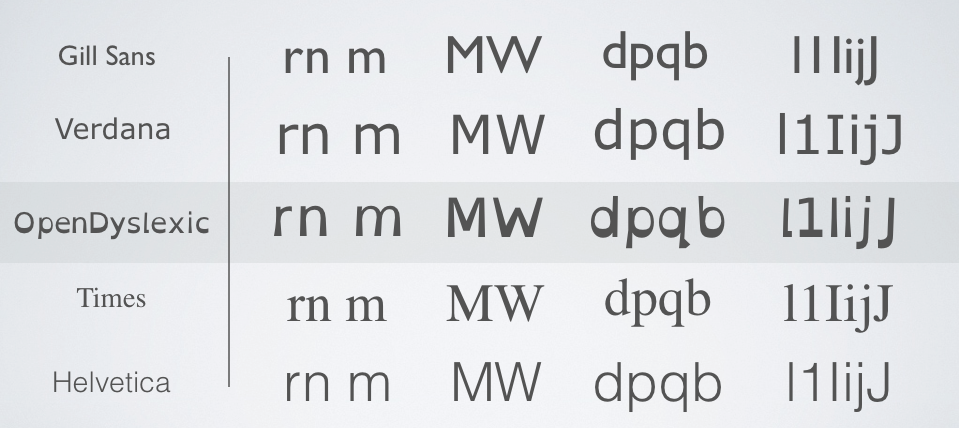
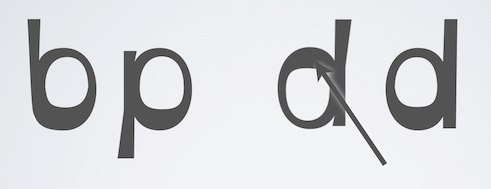
The typeface includes regular, bold, italic, and bold-italic styles, and 2 typefaces: OpenDyslexic, and OpenDyslexic-Alta. Letters have heavy weighted bottoms to indicate direction. Readers quickly figure out which part of the letter is down which aids in recognising the correct letter. Consistently weighted bottoms can also help reinforce the line of text. The unique shapes of each letter can help prevent confusion through flipping and swapping. The OpenDyslexic font is specifically designed to address the low-level visual processing and crowding issues that dyslexic individuals often experience.
- Utility: The font utilizes a unique design that addresses the common problem of letters and words appearing to “float” or flip. This design approach aligns with the medical model of disability, recognising dyslexia as a neurological condition and providing a specific solution. By making the text more stable and readable, the font enhances the utility of written content for dyslexic readers.
- Usability & Accessibility: The well-considered design of the OpenDyslexic Font not only improves usability but also aligns with the social model of disability. It recognizes how typographical elements, such as fonts, can create obstacles for individuals with dyslexia. By addressing common difficulties in reading and offering a more accessible reading experience, this font eliminates these obstacles and fosters inclusivity. As a result, it creates a smoother and more accommodating reading experience for people with dyslexia.
- Affordability: One of the key strengths of the OpenDyslexic Font is its affordability. It’s available as a free download, making it accessible to a wide range of users. This affordability factor aligns with the biopsychosocial model of disability, as it acknowledges that individuals with disabilities often face economic constraints. By providing the font for free, the creators have taken steps to ensure that cost is not a barrier to accessing a tool that can significantly improve the reading experience for people with dyslexia.
- Cross-Platform Compatibility: The OpenDyslexic Font is designed to be compatible with a wide range of platforms and devices, such as computers, e-readers, and mobile phones. This level of compatibility enables users to access the font across different media formats, accommodating their diverse reading preferences and requirements. By aligning with the medical model’s focus on providing assistive tools for individuals to overcome specific impairments, the OpenDyslexic Font allows people with dyslexia to effortlessly incorporate it into their everyday lives.
- Desirability: Dyslexic individuals may prefer to use the OpenDyslexic Font over other fonts for improved readability, making it desirable within this context.
Conclusion
As we continue to develop technologies and solutions for individuals with disabilities, the OpenDyslexic Font reminds us that accessibility can be achieved through thoughtful design choices, broad compatibility, and affordability. By embracing these principles, we can create a more inclusive and equitable world where everyone, regardless of their abilities, has access to the tools they need to thrive.