
Introduction:
LinkedIn is a professional social networking platform designed primarily for career development and networking. Users can create their custom profile to showcase their skills, experience, and education. They can further connect with industry peers and potential employers, making it a hub for job searching, recruitment, and business networking. It also allows the users to create posts and join groups.
This article will attempt to analyze the LinkedIn Website using Don Norman’s principles of design, including visibility, feedback, constraints, mapping, affordances, and other usability factors.
Let’s Begin!
Note: It is recommended to view the images on a desktop screen for better understanding of the UI elements.
1. Home page succeeds in avoiding a cognitive overload!
The home page includes several sub-sections including the navigation bar, profile box, profile statistics, posts, LinkedIn News, and much more. Despite having numerous sub-sections, the UI performs well viscerally due to the proper use of white space, visual contrast, textual hierarchy, and iconography. Furthermore, LinkedIn’s interface takes inspiration from the ubiquitous design of Facebook/Instagram, harnessing the knowledge in the world to create a pleasant, familiar experience of creating posts, messaging, and creating a custom profile.
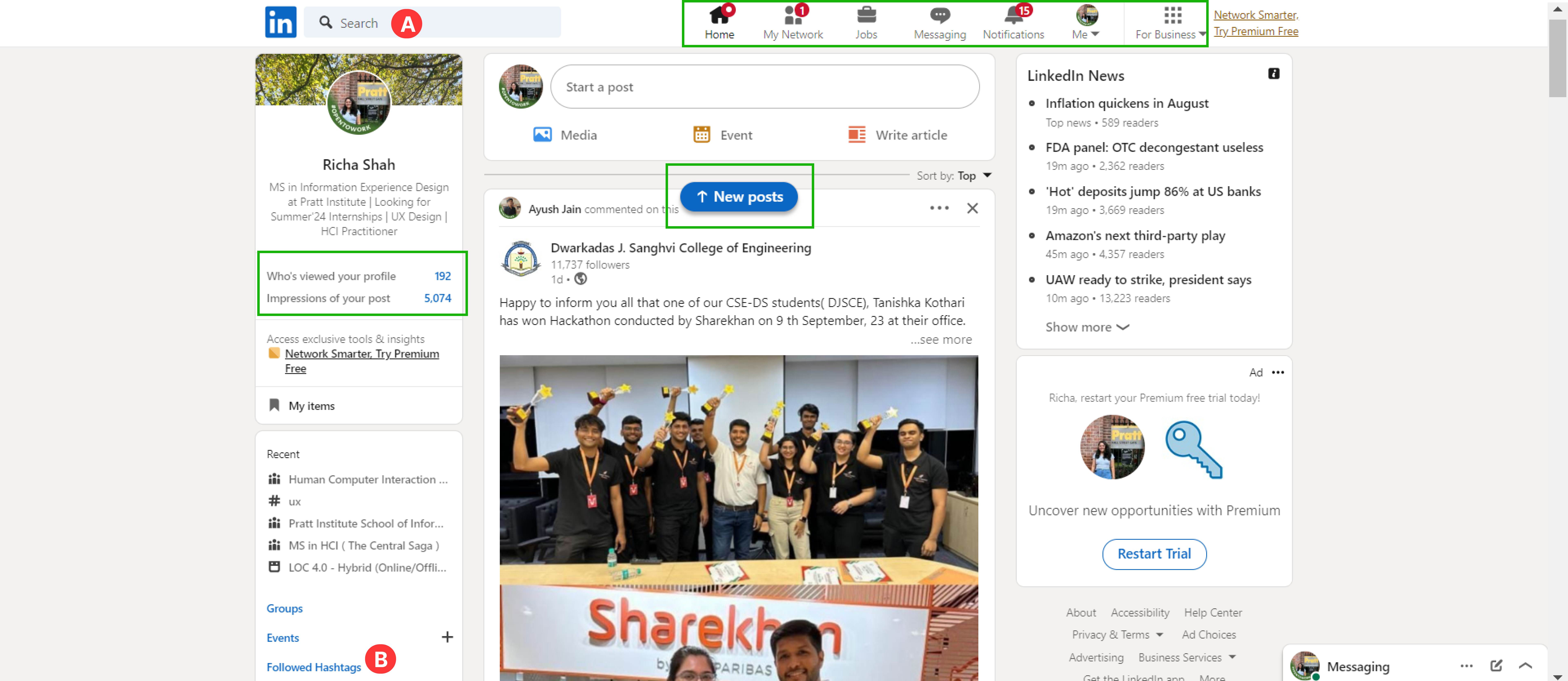
The icons in the navigation bar act as great signifiers; they not only intuitively map with the user’s mental models but the labels underneath confirm the affordances/ functionality in each tab. This ensures smooth navigation between various tabs. LinkedIn’s interface also provides feedback through various visual cues and notifications. For instance, notifications for new messages, connection requests, and profile views are displayed prominently, keeping users informed about their activity on the platform. (Indicated by the green boxes, Image 1)
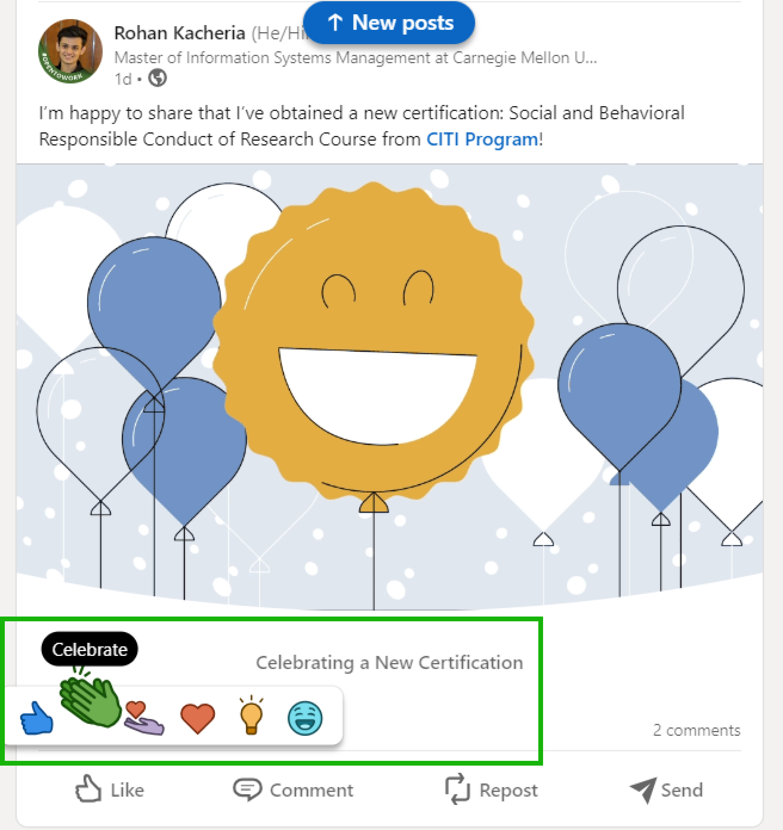
The use of animation while providing reaction to posts makes the feedback more engaging for the one who created the post and also motivates other users to react to it. (Image 2)
Suggestion/ Scope of Improvement:
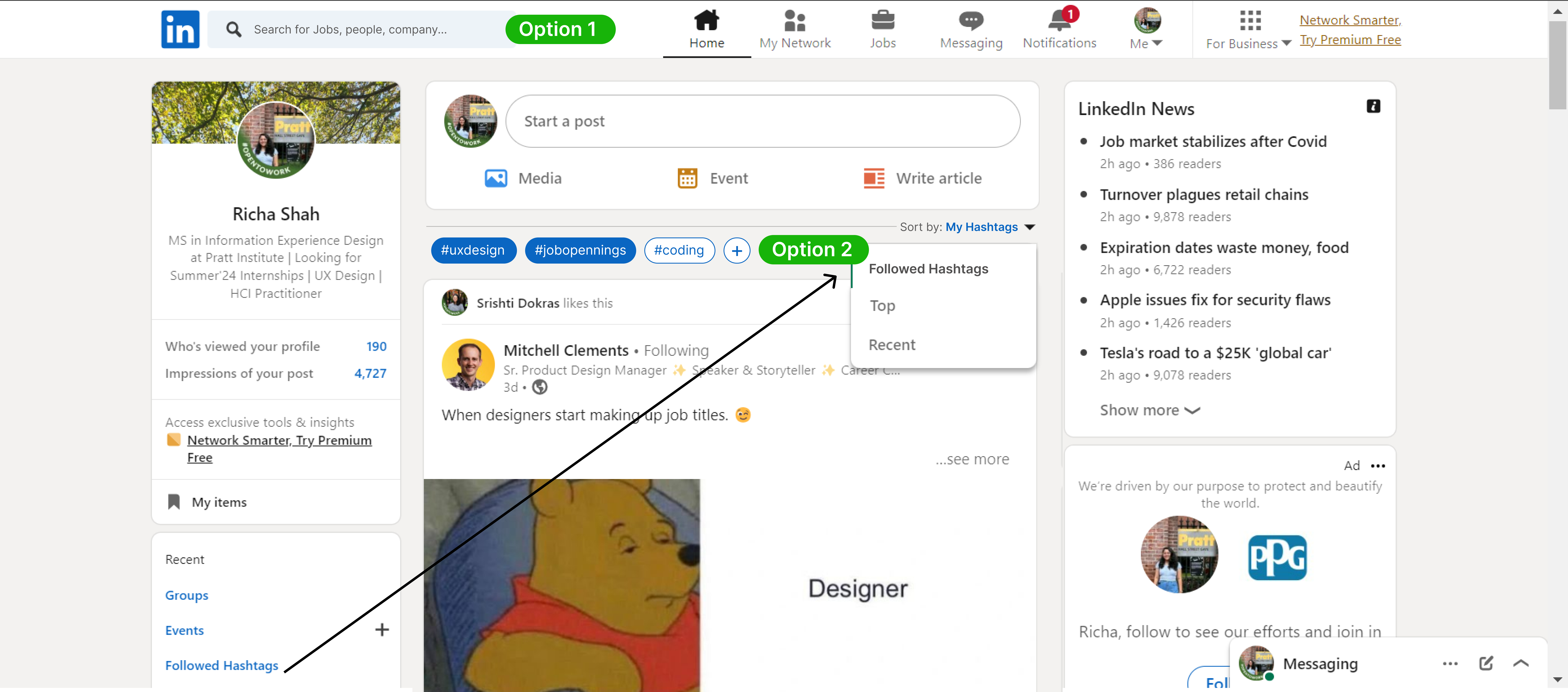
The discoverability in terms of finding relevant posts/content for the user can simply be improved by tweaking the search tab keywords from “Search” to “Search for Jobs, people, company…” (Option 1, Image 3) and using the hashtags in the left column as filters. (Option 2, Image 3)
2. Poor discoverability and visual categorization in the “My items” section
The “My items” section allows the user to save posts, articles, events, job listings, and much more. However, this option is not easily discoverable, requiring careful scrutiny to locate it. Note that there is no mention of my list or my groups in the navigation bar or my profile, meaning it’s a constraint that expects users to spot these functionalities on the bottom- left column of the homepage (requiring knowledge in the head). This thereby also creates a gulf of execution.
Suggestion/ Scope of Improvement:
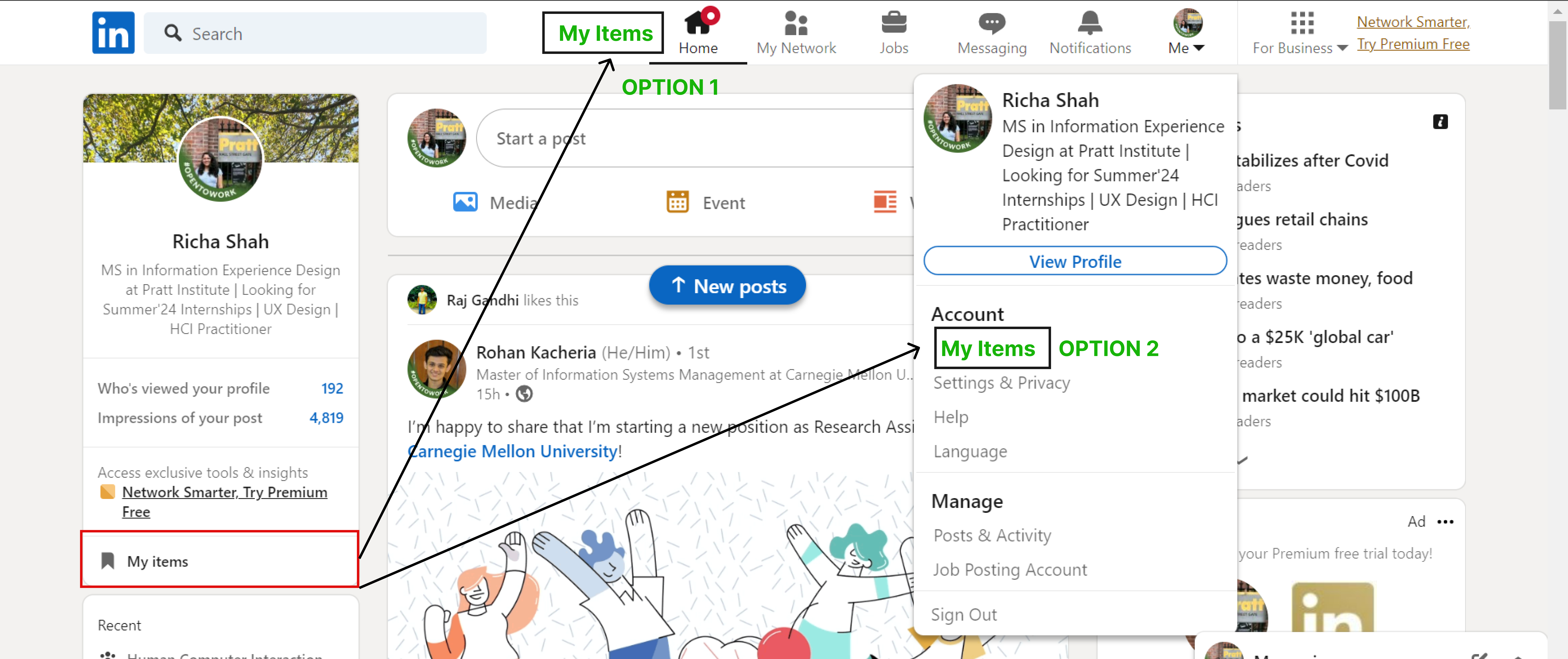
A) To improve its discoverability, “My items” can be added to the sub list under the “My profile” tab or directly in the main navigation bar. (Image 4)
B) Allowing the user to make custom categories within the saved “My Items” section for example: “IT domain”, “job listings”, ” important articles”, “portfolio tips”, etc can further increase the utility of the feature. (Image 5 and Image 6)
Providing better affordances while creating a post
The circular icons in the bottom left corner fail to afford functionalities like schedule an event, create a poll, celebrate an occasion, etc. Most users might not be aware of these options and might simply ignore them while creating a post. For example, the clock symbol (Point A, Image 7) might be a good signifier, however it’s not affording the fact that users can schedule posts for later.
Suggestion/ Scope of Improvement:
This gulf of execution can be eliminated and better affordances can be created by labeling the signifiers (i.e. the icons). Furthermore, in case the user clicks on the cancel “X” icon by mistake (i.e. a slip occurs), a popup notification appears allowing the user to go back or save it as draft. However, it is better to include the “Save Draft” button within the post screen as well to make the user aware of all the options available. (Image 8)
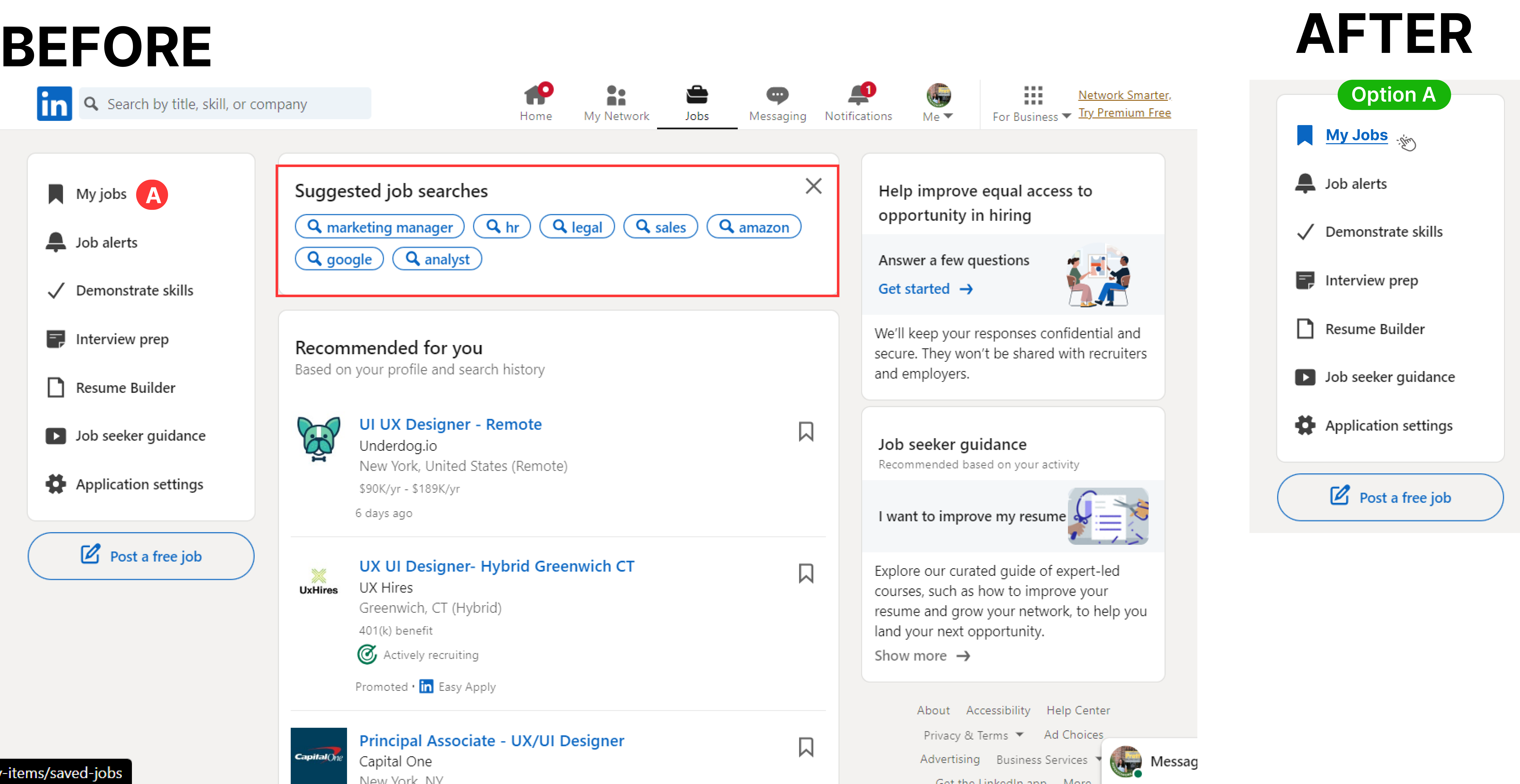
Lack of feedback in the “Jobs” tab
Missing feedback animations in the left column (Image 9 BEFORE) makes it look like a static list instead of navigational elements. This creates a gulf of execution.
Suggestion/ Scope of Improvement:
- The solution to providing better feedback can simply be changing the color and font weight of the element when the user hovers over it in the left column (Image 9 AFTER)
- Furthermore, there are areas where mapping could be enhanced. In the “Jobs” section, the filters and search options are somewhat dispersed, which can make it challenging for users to find specific job listings. Improved grouping and visual cues could streamline this mapping and make job searching more efficient.
- There are also instances where constraints could be more apparent. For example, when editing a job posting, the “Save” and “Cancel” buttons are not visually distinctive enough, potentially leading to unintentional changes. Strengthening the visual contrast between these options would help users better understand their choices and reduce the risk of errors/slips.
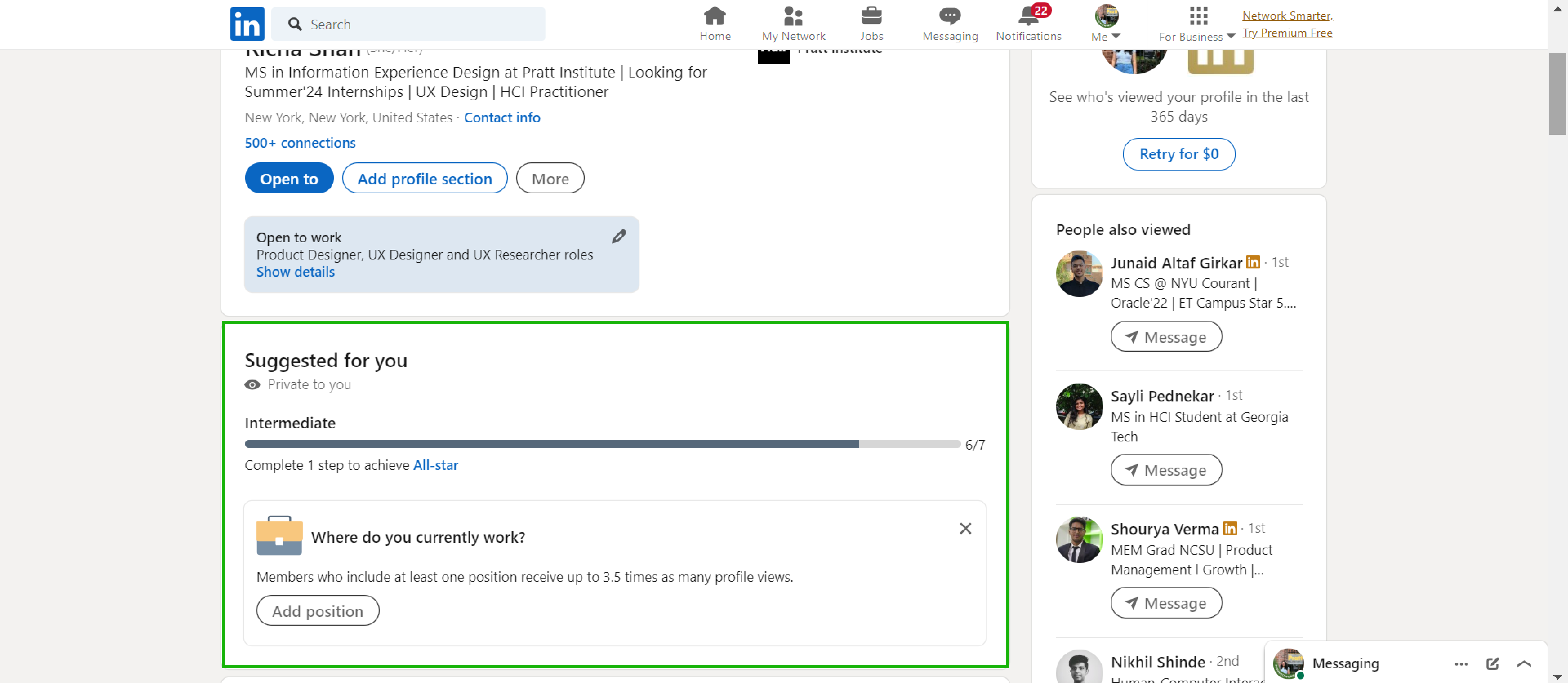
“My Profile” tab encourages the user to complete their profile
The My profile section thoughtfully informs users where they are and the remaining steps to complete their profile info using a progress bar. This progress bar is an effective feedback that aids users in estimating how much more they need to complete thereby strengthening their profile. By doing so, the gulf of execution and evaluation are bridged, since users know exactly what to expect, what they can do and if they are doing it right. (Image 10)
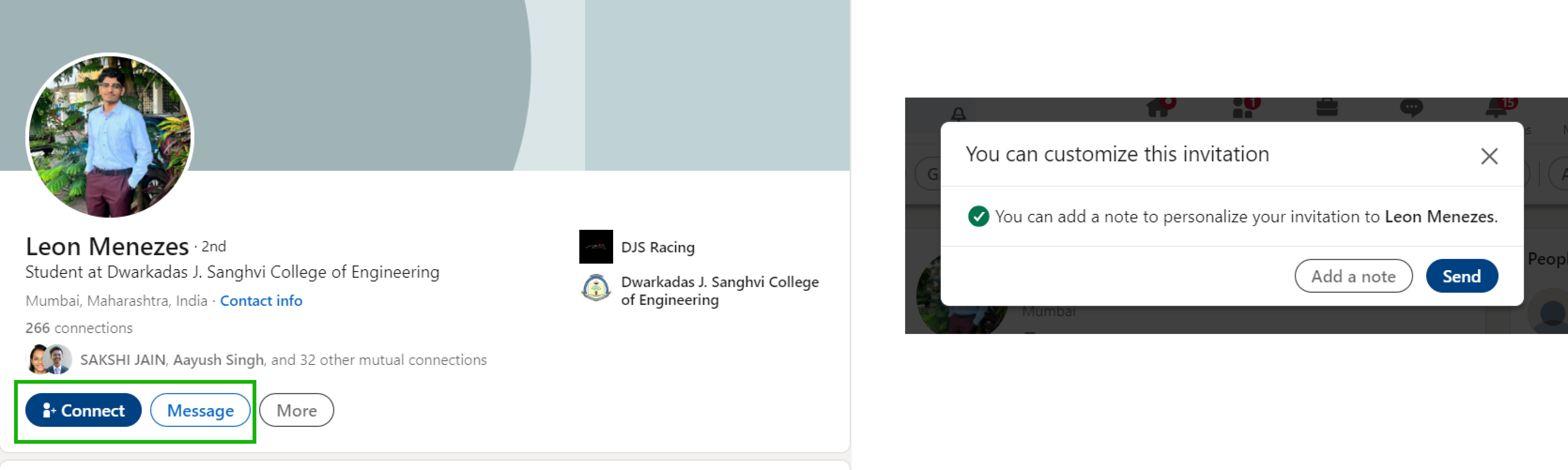
This section also has good mapping. For example, the “Connect” button is placed right beneath the user’s profile, making it clear that clicking it will send a connection request to that person. When a connection request is sent, a confirmation message appears, reassuring users that their action was successful. This further eliminates the gulf of evaluation. (Image 11)
Conclusion:
Overall, the LinkedIn interface greatly adheres to Don Norman’s principles of design. It is a great example of a clean interface with mindful functionality meant for networking, job opportunities, and sharing insightful content. However, the above mentioned fixes can significantly improve its user experience and help the user to use a particular functionality to its full potential.