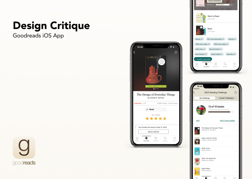
Introduction
Goodreads is a social book cataloging app, a subsidiary of Amazon that allows users to add books to their personal bookshelves, rate and review books, get recommendations, and connect with other readers. This article will critique the design of the app based on the usability concepts mentioned in Don Norman’s Design of Everyday Things.
1. Homepage and Navigation
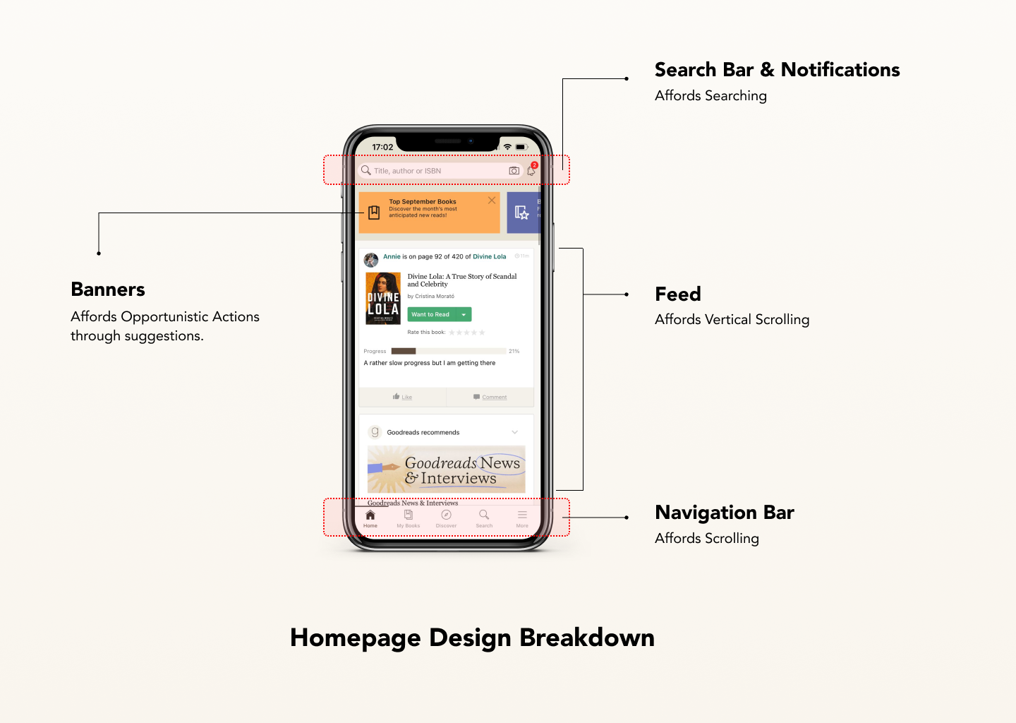
The homepage (Figure 1) uses the concept of knowledge in the world and visual elements of color and contrast, to increase the discoverability of the available functions – It is divided into 3 parts, the search bar and notifications panel at the top, the feed in the middle which affords scrolling, the navigation bar at the bottom which affords navigating through the app.
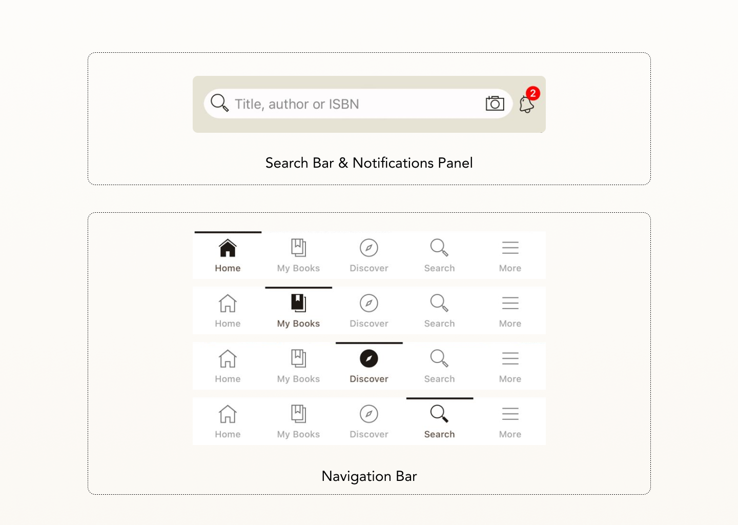
The Search Bar (Figure 2) is placed at the top which can afford to search for books based on their name, author, or ISBN which is signified by a helpful placeholder text attribute. The notifications (Figure 2) are provided in the top left corner, which improves discoverability while also creating attention through emphasis by using a bright red color to indicate the number of new and unread notifications.
The Navigation Bar (Figure 2) has icons with their names, which follow natural mapping according to their respective functions. Also, when the icons are clicked, the colors are inverted which helps the user understand the action has taken place by providing immediate visual feedback. The homepage also allows opportunistic actions by prompting the users to click on various banners (Figure 1) like Votes, Boos of the month, etc.
2. Adding a book to a shelf
Books are displayed in categories called ‘Shelves’ which can be organized and customized according to personal needs. The conceptual model of the ‘Shelf’ feature is closely tied to users’ mental models of physical bookshelves and libraries.

The CTA button displays a ‘Want-to-read’ ( Figure 3) option with a downward-facing button (⌄). A single button is split into two parts but it offers no information on how to access it or add it to the shelves. The visceral reaction is to tap the button without noticing it’s been split into two. When it’s tapped in the middle, it gets added to the ‘Want to read’ shelf and changes color to provide visual feedback but when it’s tapped in the corner (Figure 3), it brings up the other shelves which can cause confusion creating an action-based slip because it is not signified properly while also decreasing the discoverability of the capabilities. It causes a bridge between the designer’s conceptual model and the user’s mental model.
Solution
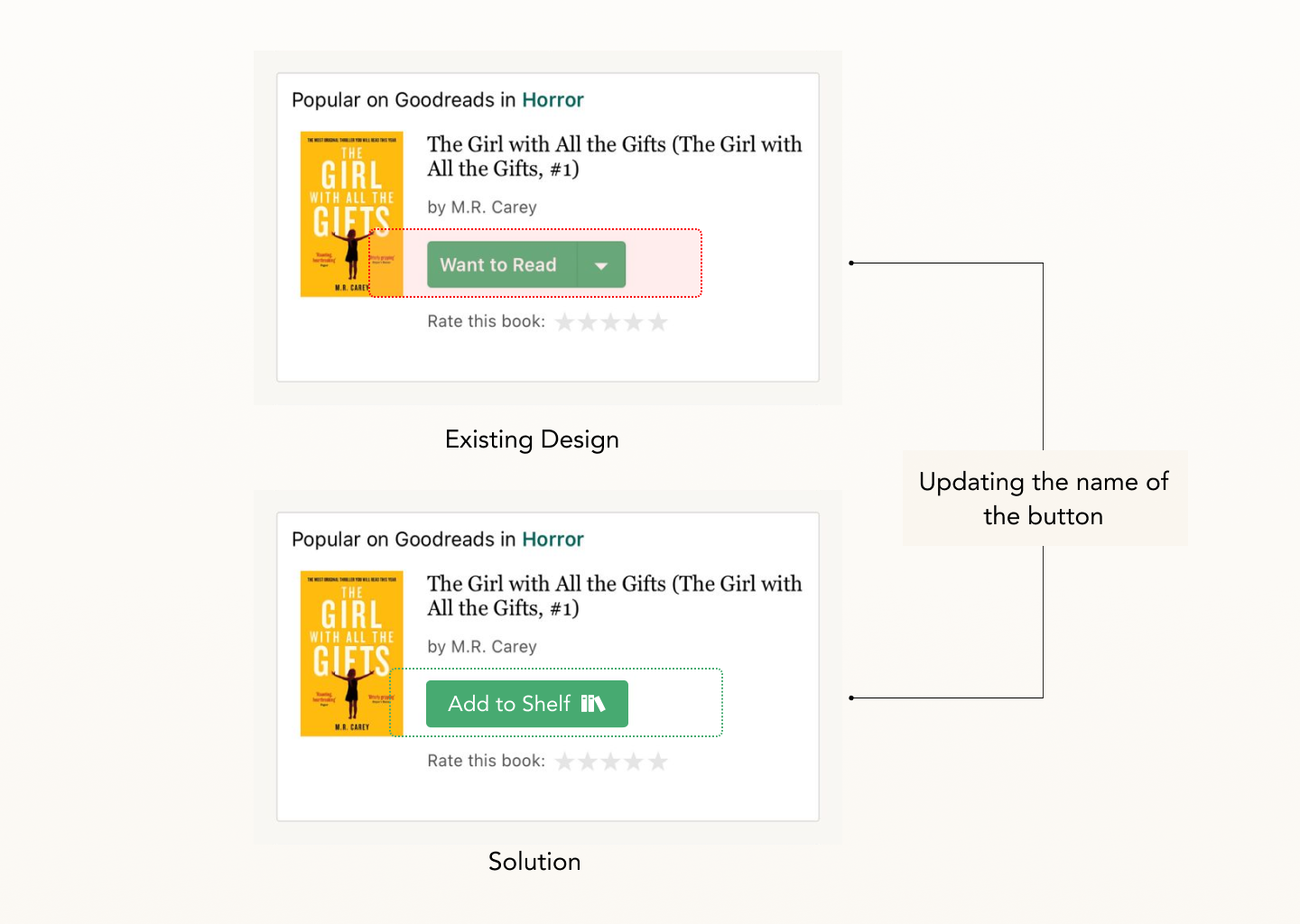
Replacing the name of the button from ‘Want to Read’ to ‘Add to shelf’ (Figure 4). By doing so, it affords to add books to respective shelves, while also signifying multiple shelves can exist and can be added accordingly. It helps mimic how bookshelves are used in the real world by creating a good system image that communicates how the conceptual model can be used accurately.
3. Rating and adding a review for a book
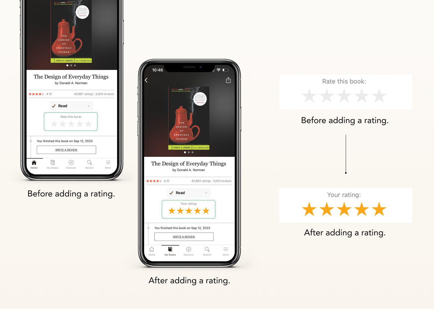
The app prominently displays book covers, titles, and author names, increasing discoverability and making it easy for users to recognize and locate books. To add a rating, the blank stars afford to be rated which is signified by the user prompt: ‘Rate this book:’ which prompts the user to enter their respective rating for the book. The number of colored stars indicates the rating by providing visual feedback (Figure 5), and it also places a logical constraint by not allowing a book to be rated above 5 stars. In addition to the stars becoming colored, the user prompt changes to: ‘Your Rating,’ (Figure 5) providing textual feedback at the same time.
When the user tries to add a review to the entry, there is no clear feedback to confirm that the rating was recorded, leaving users uncertain about whether their input was acknowledged. This might cause a struggle for the users in bridging the gulf of execution without the necessary feedback to know about the result of their actions.
Solution
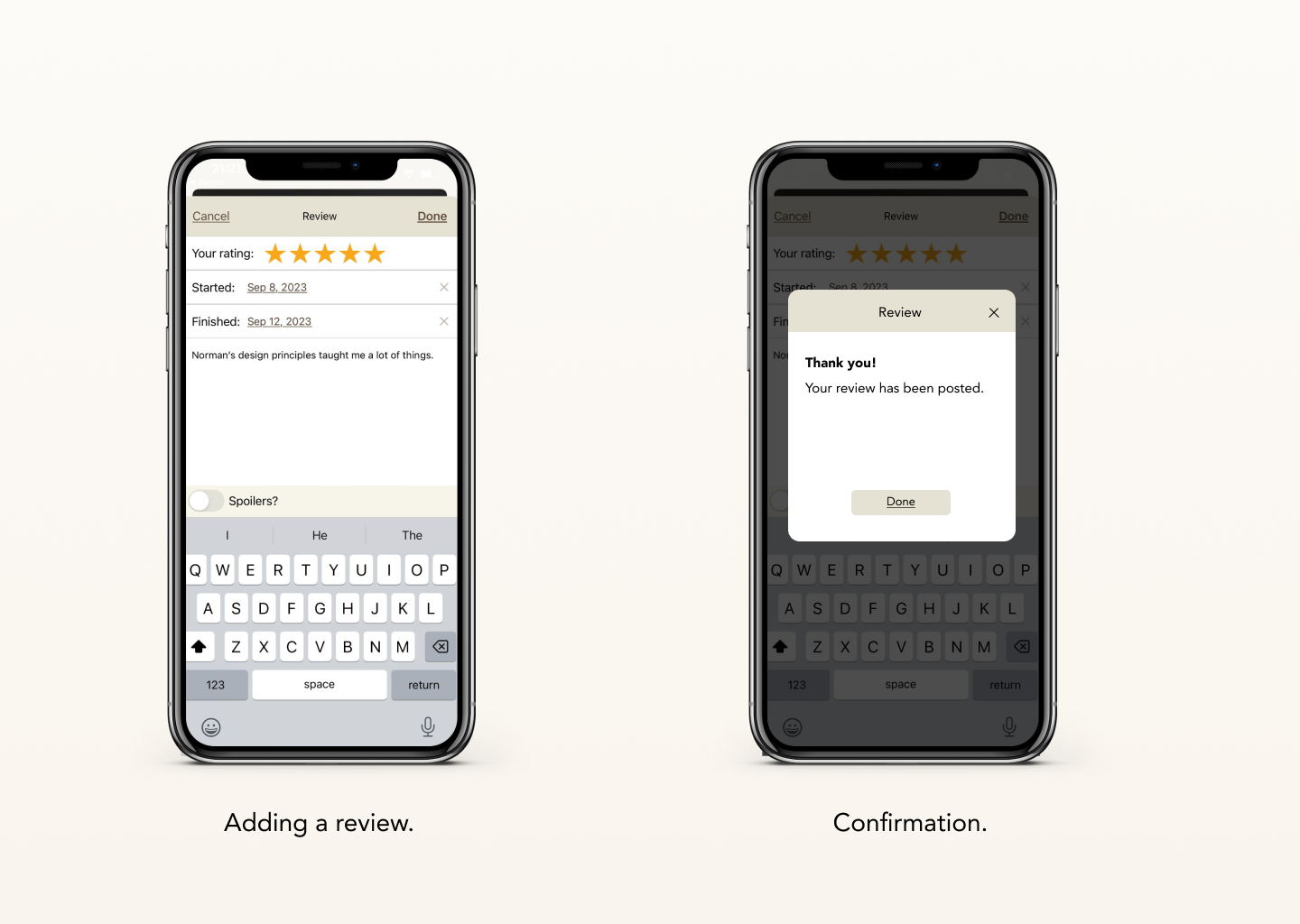
To successfully bridge the gap arising in the gulf of execution while recording a review, a confirmation screen (Figure 6) that the review has been posted can be implemented to provide instant feedback for the action performed.
Conclusion
The Goodreads iOS app excels in certain aspects of design, such as affordances and feedback. However, there is room for improvement in terms of conceptual models, particularly regarding the ‘Shelf’ feature and the ‘Add a Review’ process. By adhering to Norman’s design concepts and applying the recommended changes, Goodreads can enhance its usability thus preventing learned helplessness which a user can tend to go through if they’re trying to figure out how the shelf feature works.