A gone-case study of a Telecommunication company’s approach to entertainment
To begin with, I’m not much of a Television-person, unless I’m alone in the apartment! The reason I mention my dependability on a Television, is because it is one reason I have had to interact with what I call a jarring digital experience.
Airtel is a telecommunication company that offers a Direct To Home entertainment product in India. There are several ways a user can subscribe and recharge this service. We shall focus on the latter. And I am using a user focused approach by being the scapegoat myself, because the emotion is also important in User Experience and this needs to be felt (no puns intended). I want you to imagine the case in point as describeds, and with the simple visual narration — rather a perspective — that I have encased, so you may also create your own viewpoint (mind-map) of the User’s Experience, as a second person account of User Centered Design, because what’s central to one user might differ to another.
So the story gets a bit technical now. I am required to match my experience with Mr. Don Norman’s principles, and I personally feel we will also talk about Heuristics here. Heuristics play an important role in our real and digital worlds. And we will stress mainly on Affective Heuristics subliminally, because we are often left with emotionally-led responses when we are faced with the limitations of a bad User Experience — resulting in my case from the absence of essential Availability Heuristics (AKA Making decisions based upon information that is easily available), which is clearly something I have experienced while using the Airtel digital collateral because of the faulty UI design and the related Information Interaction experience of the Website in question: https://www.airtel.in/dth-recharge
“But what is Aesthetics without Usability?”
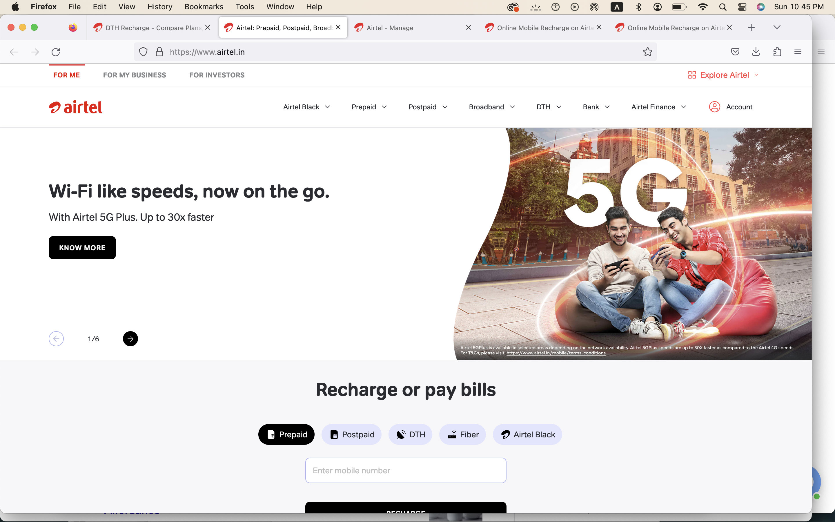
Let us jump right in and critique based on Don Norman’s principles, before I get to why I find this User Experience so limiting. Look at this landing page. Pretty, right? But what is aesthetics without usability? I’ll elaborate further why I make this rather rhetoric question.
Our main subject of discussion is going to be around the Constraints — namely physical and logical constraints, the gulf of execution, discoverability, the gulf of evaluation, memory lapse slips, and mainly learned helplessness. Our keywords for critique are based on my bad experience as a user trying to recharge my monthly subscription online, and using both the Website and the App due to the digital mediums inability to result in desired action, and inter-connectivity of a single user interaction.
“I felt stuck with a badly designed UI, whereas it’s a badly tested design as well.“
I often wonder how a telecommunication company of such large scale business doesn’t realize the errors of their Website, and corresponding actions on the App, which is part reason why I conclude it could also be because of a (read lapse in) responsive design that has not been streamlined for different devices, in my case an Apple MacBook Pro M1 (2021), and an iPhone XS Max (2019). I also feel the devices that are discontinued and also the older Apple devices face Usability issues often because they fall out of the designer’s consideration category. This is a big problem that is often being left unanswered in the digital domain, and it’s not a new one, but a recurring case. I’ll explain why.
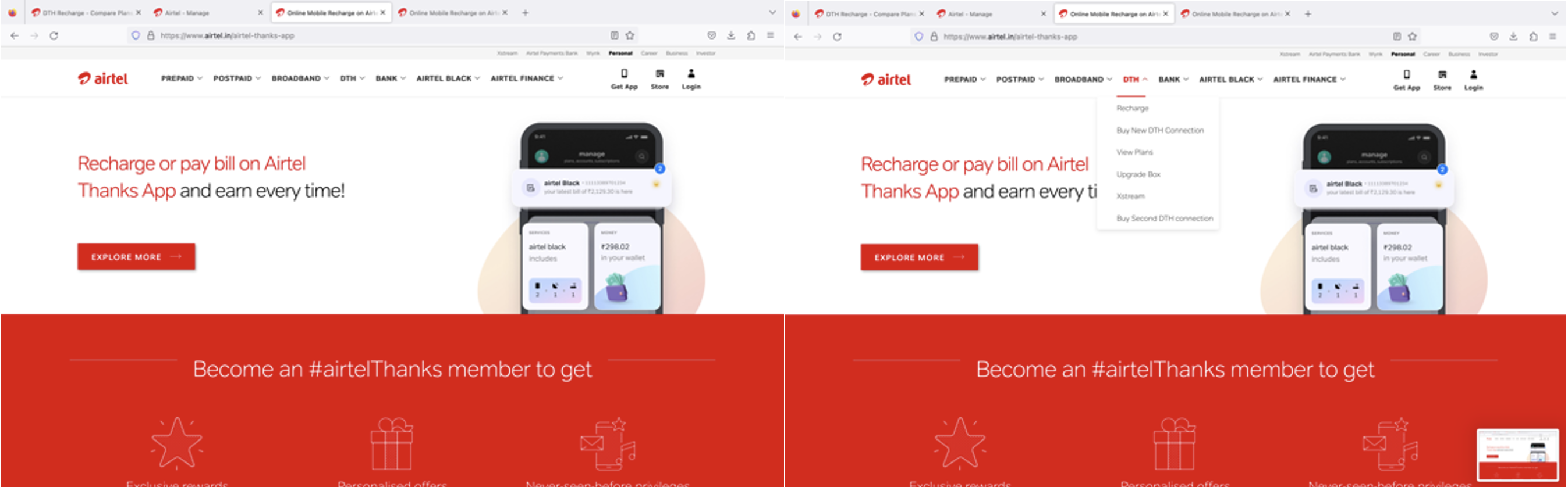
On first look the discoverability of the components seems clear, but as we select from the menu dropdown, it’s interesting and frustrating to note that while we can recharge the DTH, we cannot modify the channels — I do not see any options in the menu. And the hunt begins! I would add the “Add/Remove Channels” Tab here to support the concept model. It’s a case of the missing discoverability.
Let us also note, that my (user) problem with this Website doesn’t end here. While it may seem that the Signifiers are in place, but due to the resulting missed or misleading actions upon interacting with the digital touch points, I have faced issues when trying to add or remove channels online, a request that is fairly easy to do through a registered mobile phone in the real world! More on that after we finish our discussion on the recharge UI. From a business perspective, the addition or removal of a channel correlates to cost. From a personal vantage point, I get to choose my choice of entertainment (yeah, contradictory to the introduction of this article) or make a saving. It is thus very important to my well-being!
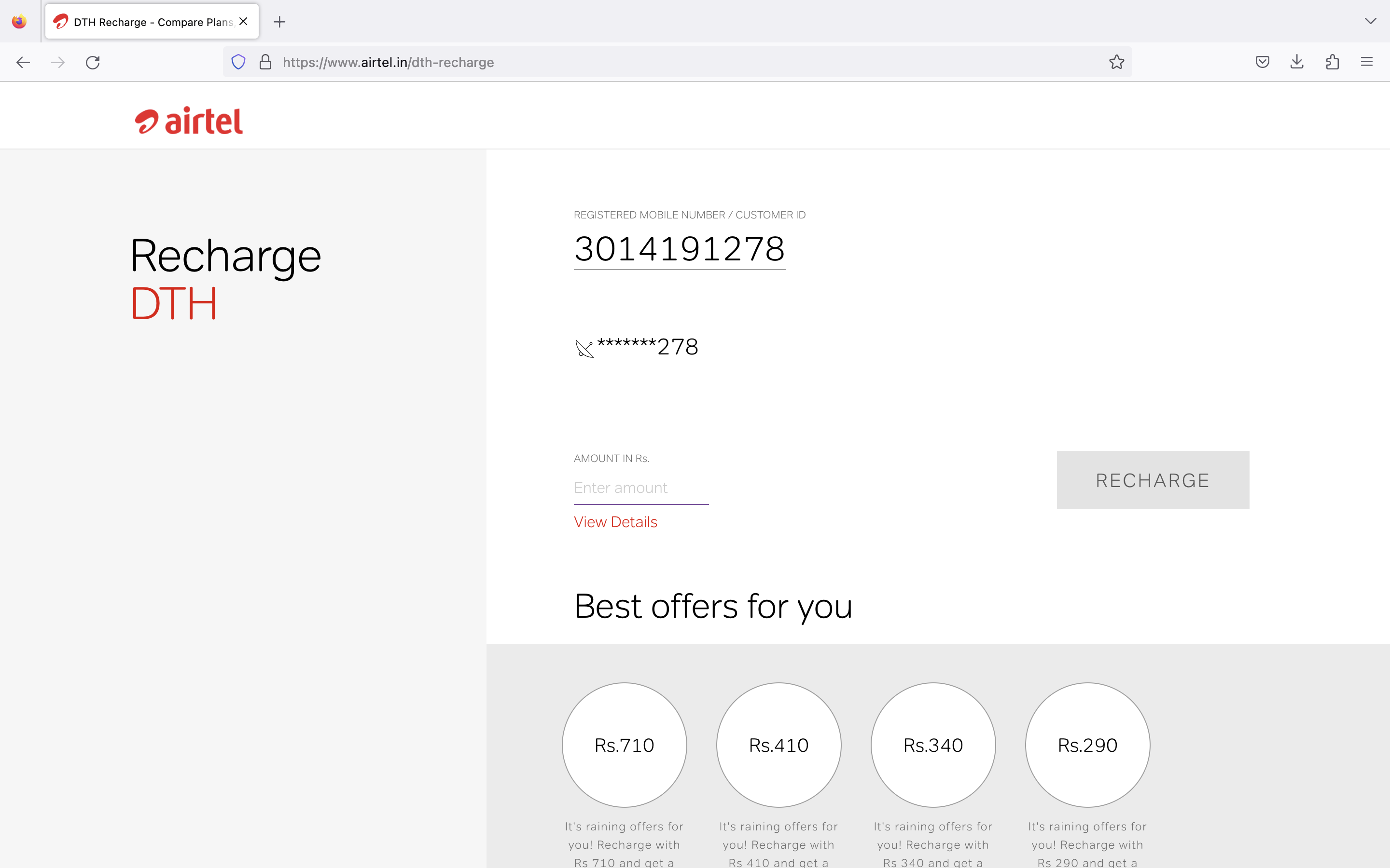
So above, we see the Webpage for the recharge, but do you notice, how the ‘amount’ details section does not prompt the user on the exact dues, despite Login? One has to do guess work. And if we enter an amount that overlaps an existing plan amount option — listed visually at the bottom of the page in four circles — we get a faulty transaction, and the next action is not a recharge, but a few calls to the Customer Service end. I would add the ‘Current plan’ amount in ‘figures’ under the Recharge tab, so discoverability is enhanced.
Okay, let us look at this problem of affordance again. We have the system image in place, but the Usability not so much. The best offers exceed my average monthly rent, so I would rather opt for the customized plan that I already have, every time. Also because I do not see a better (offer to) match. The user needs and appreciates more transparency in the e-commerce domain, is what comes to mind. Also, I often see the DTH Account number (ending with 278) displayed on screen, and somehow think it’s a mobile number and get wondering. I think this is an example of a bad conceptual model. And their design is confusing as some labels are missing, and usually ends in a slip, as I move to the App just to see if things are working there, but to my disappointment they are not. I would add the term “Account number” as a label followed by (under) the digits.
So a simple action is taking all the time (I tried thrice) and is compensated with unwanted and unexpected errors.

I feel the ‘Service Overview’ section with my balance should appear on the preceding screen, with my plan details, so I can gauge my recharge for the month. This webpage is a taxing gulf of execution, although it’s aesthetic.
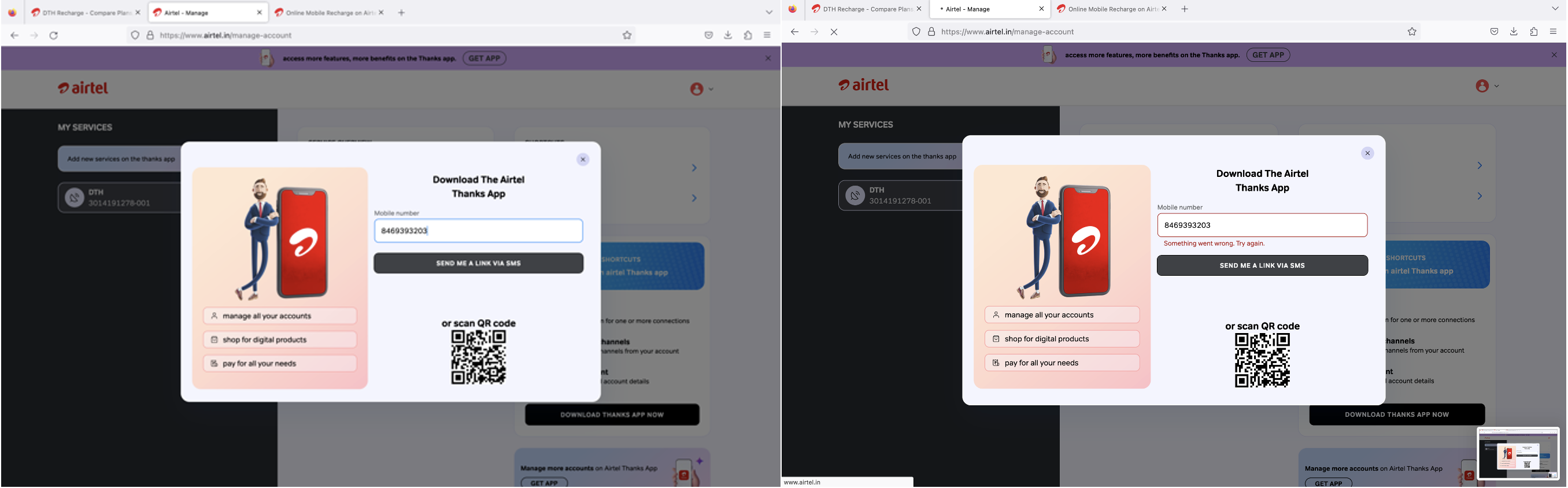
If we look at the menu on the right, and click on the Add/remove channels button, we enter an endless loop of inaction, and are unable to do the desired action. And we experience a resulting glitch in the natural mapping. I would allow this action to be completed on the website too.
The below image makes me think of the gulf of evaluation being a large one, because when I click on the Add/remove channels button, I am taken to a Pop-up which then asks me to enter my mobile number, so that it can perform the next action on the mobile phone! And to my astonishment, even then, I’m unable to perform the desired action on the App. I have never seen such a problem elsewhere, where a website directs an action only on one mode, and redirects unnecessarily. Moreover, after entering the data in the field, my mobile number in this case, I get a repeated error message. So a simple action is taking all the time (I tried thrice) and is compensated with unwanted and unexpected errors. I see Feedback for the user, but this is not helpful as there is no immediate resolve being offered. I feel compelled and forced to install and use their App at this point, and that too it doesn’t work properly, nor does it allow me as a user to complete the desired action.

I am being redirected to start from the beginning on the next screen! Talk about usability nightmares! This website needs retesting ASAP. And of course also some knowledge on why the user problems have been ignored this long.
“This website needs retesting ASAP. “
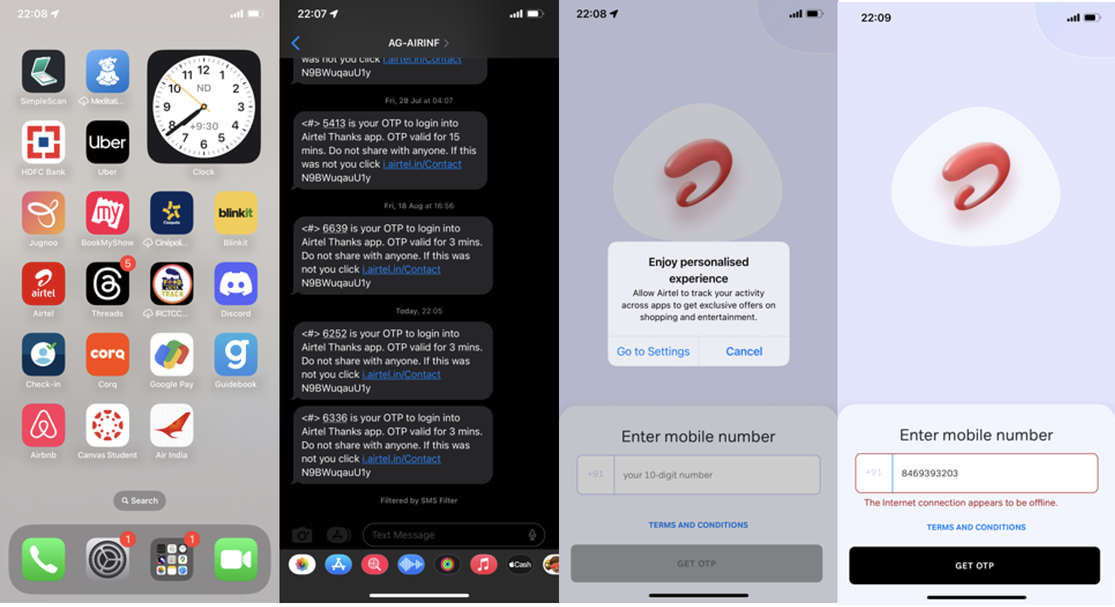
“And on the mobile interface, the company reveals how it would like to track my data!”
And to add to the misery, post the traumatic experience where pictures (read screenshots) speak a thousand dilemmas, and bear zero solution, and as I return to the website, I find the usability issues on repeat. And on the mobile interface, the company reveals how it would like to track my data! I would definitely use a better form for content permissions, and make it a ‘On/Off’ switch for the user to provide consent for data sharing / tracking transparency. This user journey is a clear an unfortunate case study of a learned helplessness since I despise using the Airtel website and App both, every time I have to recharge my DTH connection, and have even resorted to using traditional recharge methods by visiting the store itself. Visiting the online experience should aid the user and make their life easy, but the Airtel DTH online recharge case study is actually contradictory to that expectation.
Overall, it’s a fair looking website design, but that doesn’t settle a bad user experience, does it?