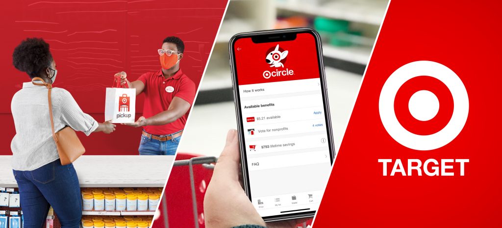
Target is your everyday general store containing items from a blender to halloween decorations. Filled with deals, this US chain is recognizable for its bold red target logo, an inviting coffee smell coming from Starbucks in select Target stores, and ultimately, a store layout that makes you feel like you’re supposed to go through every aisle. Thanks to Target and its offerings, it’s very easy to come into the store for only one thing, and come back out with a cart full of items. To enhance your Target experience, there is a membership program known as a Target Circle where you can load offers and deals onto your Target Circle membership and there is a Target app that helps you find items in the store, order items for pickup/delivery, look for deals and create shopping lists (just to name a few features). Packed with features—below we’ll be talking more about the app:
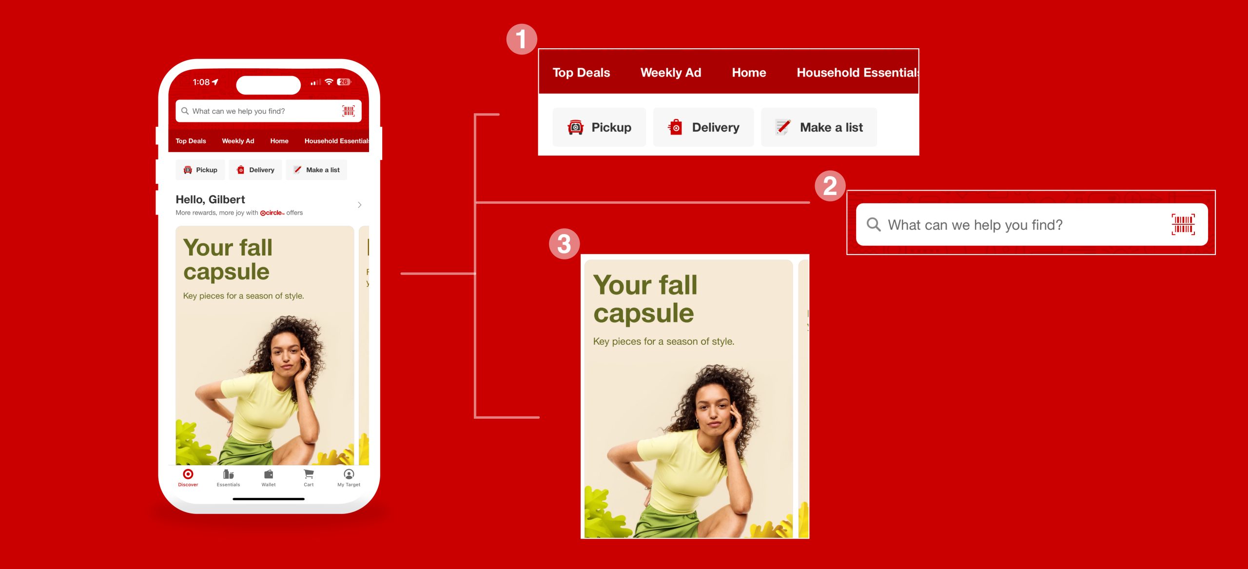
Discover — The First Thing You See When Opening the App
Upon opening the app, the user is greeted with the Discover page. Ironically this page is very discoverable but very hard to understand because of the number of options you have, making this tab feel very overwhelming. The visceral reaction may be to scroll as soon as going into the app or to search something, both actions of which makes the shopping categories (image 1) disappear (located below the search bar(image 2)). Although the goal of the Discover tab feels like it’s to discover any new products and acts like a space to market different products, it feels like it should be more important to highlight the shopping categories and the “pickup, delivery and make a list” buttons more upon opening the app. The contrast between the search bar on top with the red background makes the search bar very discoverable—however the discoverability of the search function becomes less consistent as you explore the other tabs and eventually disappears altogether. With multiple items being offered from Target, the search bar should be present on all tabs. Additionally you can scroll vertically to continue seeing a wide range of different product highlights and deals. As you scroll, some images are cut off (image 3) at the right of the screen, making it a great signifier that you can scroll horizontally as well.
Finding Deals
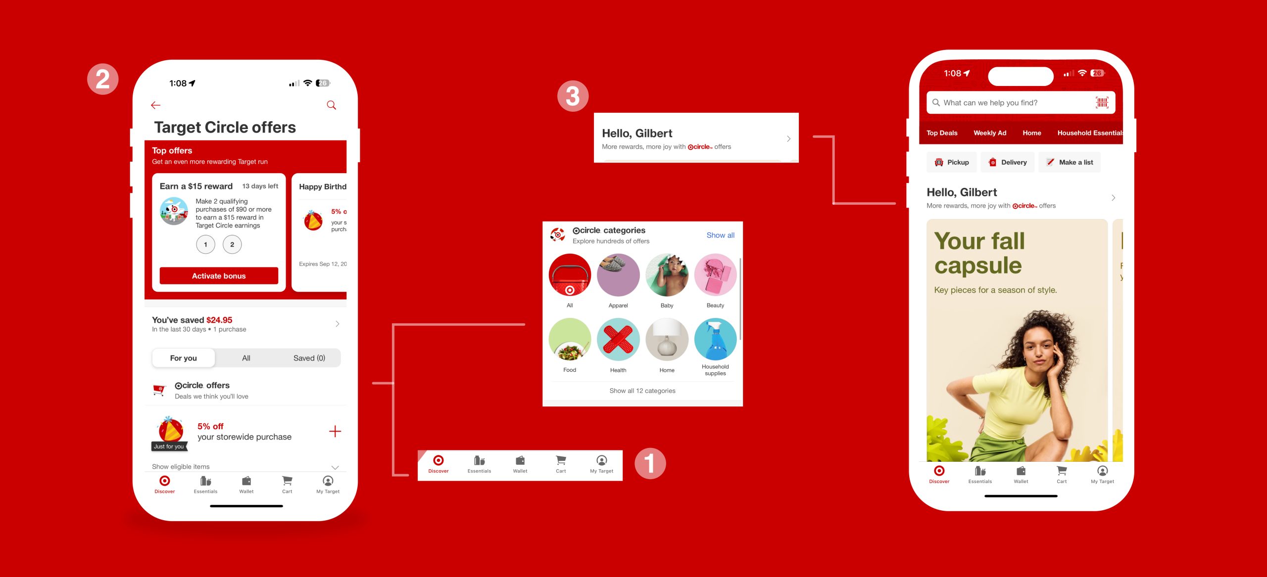
After navigating the first tab in the app (image 1), your goal may be to get new deals! In order to use those deals (or coupons for a lack of better words) you need to load them into your Target Circle using the Target Circle offers tab (image 2). Other parts of the app makes it easy to discover that you can load offers to your membership but it’s hard to understand how to find these offers—making this a feature that needs improvement. In order to find these offers you need to go back to the Discover tab and click under it says “Hello, Gilbert” (image 3). Although it says something about Target offers, it doesn’t explicitly signify that this will direct you to the list of offers other than the arrow on the right. This is the only way to get a list of Target Circle offers and my solution is to make it a tab of its own. In addition, your visceral reaction may be to skip the “Hello, Gilbert” area because it’s not highlighted as a button like the other parts of the Discover tab.
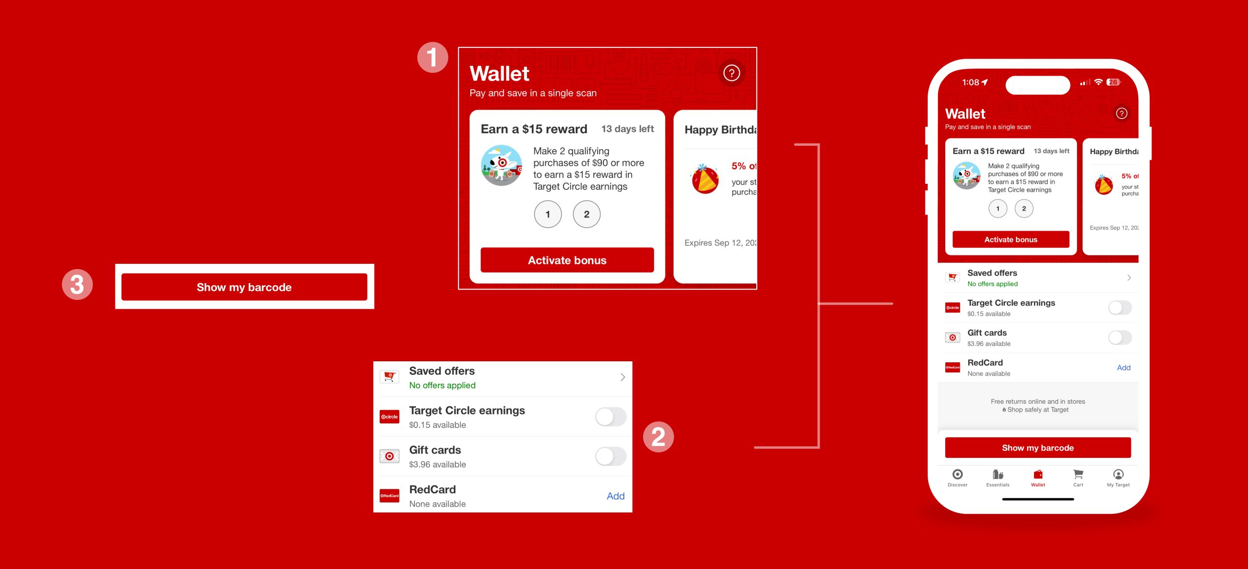
Wallet — Checking Out In-Stores
The wallet tab is by far the clearest and simplest mapping. Unlike the Discover tab that introduces you to an overwhelming number of user pathways, the wallet tab has very limited buttons. The user is greeted with important Target Circle deals (image 1), and toggles that affords the ability to pay in different ways while checking out your items at Target (image 2). There’s great feedback when tapping on the toggle, giving you the option to redeem all or some of your gift cards/Target Circle earning while checking out. And finally on the bottom, the user can “show my barcode” (image 3) so you can scan it while at checkout. Although there may be a lot of learning involved to use Target Circle—logically, you’re constrained to having to click “show my barcode” to be able to scan your membership barcode while at checkout.