
Design Critique: Amazon (iOS APP)
The Amazon app is a popular iOS and Android application, widely used as a digital interface that facilitates online shopping for millions of users worldwide. With an extensive global user base numbering in the millions, this application serves as a comprehensive hub, offering a vast range of products and services for online shoppers.
Account settings
In the Amazon iOS app, the discoverability of Account Settings is relatively low. This means that users often struggle to find where to access and manage their account-related preferences and information. The “Account Settings” in an e-commerce app like Amazon are crucial for users to customize their experience, manage payment methods, addresses, and privacy settings. However, after clicking the account icon (Figure 1), the options are not readily visible or accessible in the app’s main interface (Figure 2), unless the user is very familiar with the app. To find “Account Settings” after clicking “Your Accounts,” users still have to scroll all the way down to find “Account Settings” (Figure 3), which requires several clicks just to access “Account Settings.” This lack of discoverability creates unnecessary constraints for users and hampers the overall user experience. Moreover, the absence of clear feedback mechanisms can leave users frustrated when they cannot easily locate essential account management options.
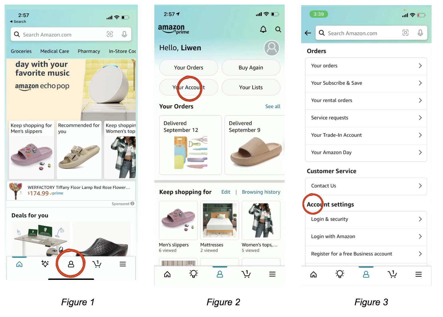
Recommendation: To improve the discoverability of Account Settings, Amazon should consider making this section more prominent and accessible. For example, they could include an “Account” option in the bottom navigation bar or use a recognizable user icon by ensuring that users can easily find and access their account-related features without needing to search deep within the side menu after clicking Account icon.
The log-out feature
The discoverability of the log-out feature in the Amazon app is relatively low, requiring users to search for it within the side menu (Figure 4) and click on ‘Settings’ (Figure 5), then scroll all the way down to click the ‘Sign Out’ button (Figure 6). Logging out is an important action for users who want to secure their account or switch between multiple Amazon accounts. However, the log-out option is not as prominently placed as core shopping functions, making it less intuitive to find. Some users might think it would be found at the Account icon (Figure 1) since there is ‘Account Settings’ (Figure 3), but the absence of clear signifiers or affordances makes it difficult for users to make this connection.
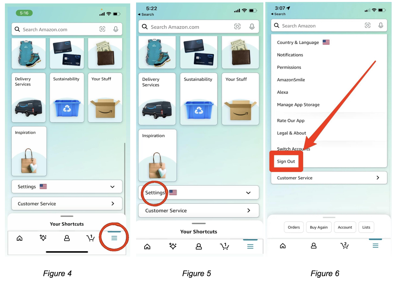
Recommendation: To enhance discoverability, Amazon should place account settings and the log-out feature in the bottom navigation bar. This familiar location ensures easy access. Use clear iconography and labels like “Account” and “Log Out” to provide affordance signifiers. Align with common app design conventions to meet user expectations (Mappings), and provide clear feedback upon interaction (Constraints).
Product Availability
In the product availability section of the Amazon app, users often select product attributes like color and size before being informed about its availability (Figure 7). This lack of feedback on availability represents a significant issue in terms of discoverability, as users may only realize that a product is unavailable after choosing a specific configuration. This creates a frustrating experience and can be improved through better signifiers. Ideally, Amazon should provide clear feedback to users before they make choices that might not be available, aligning with the principle of constraints. This could involve displaying stock availability status, such as “In Stock” or “Out of Stock,” alongside color and size options, improving mappings and providing vital feedback. Additionally, some items in the app do not clearly indicate whether they are in stock or out of stock (Figure 9), further highlighting the need for consistent and visible signifiers for stock status. Addressing these issues would enhance the overall shopping experience by making it more efficient, predictable, and user-friendly.

Recommendation: Amazon can improve the user experience by displaying stock availability status, such as “In Stock” or “Out of Stock” alongside color of the product and size options. Providing feedback to users before they make choices that might not be available.
Conclusion
The Amazon app offers a robust platform for online shopping, featuring an extensive array of products and services. However, there are noticeable areas for design improvement. Enhancements in user interface clarity and the discoverability of essential features, such as account settings, would significantly enhance the overall user experience. Additionally, streamlining product availability could further elevate user satisfaction. Despite these areas of improvement, the Amazon app remains a widely-used and valuable tool for millions of users worldwide.