DoorDash is the largest platform for online food ordering and food delivery in the United States. This platform allows the user to search for restaurants and stores, view menus and ratings, add items to the cart, and place orders for delivery or pick up.
Landing Page
The search bar at the top of the page allows the user to search for items or restaurants. Shortcut buttons below the search bar take the user to corresponding topics. Filter buttons representing types of cuisine are below the shortcut buttons, which allows the user to filter for the type of food they desire. The icon on the filter button plays an animation when it is tapped, giving the user immediate feedback. The search bar, the shortcut buttons, and the filter buttons are good signifiers, which provide good discoverability.
The bottom navigation bar contains five buttons. Each button consists of an icon and a label. The icons are common and illustrative symbols. The icons and labels provide clear clues about the destinations of the buttons. Additionally, when the user taps each button, the icon is highlighted in red and the corresponding page is shown. This provides the user with immediate feedback and good discoverability.
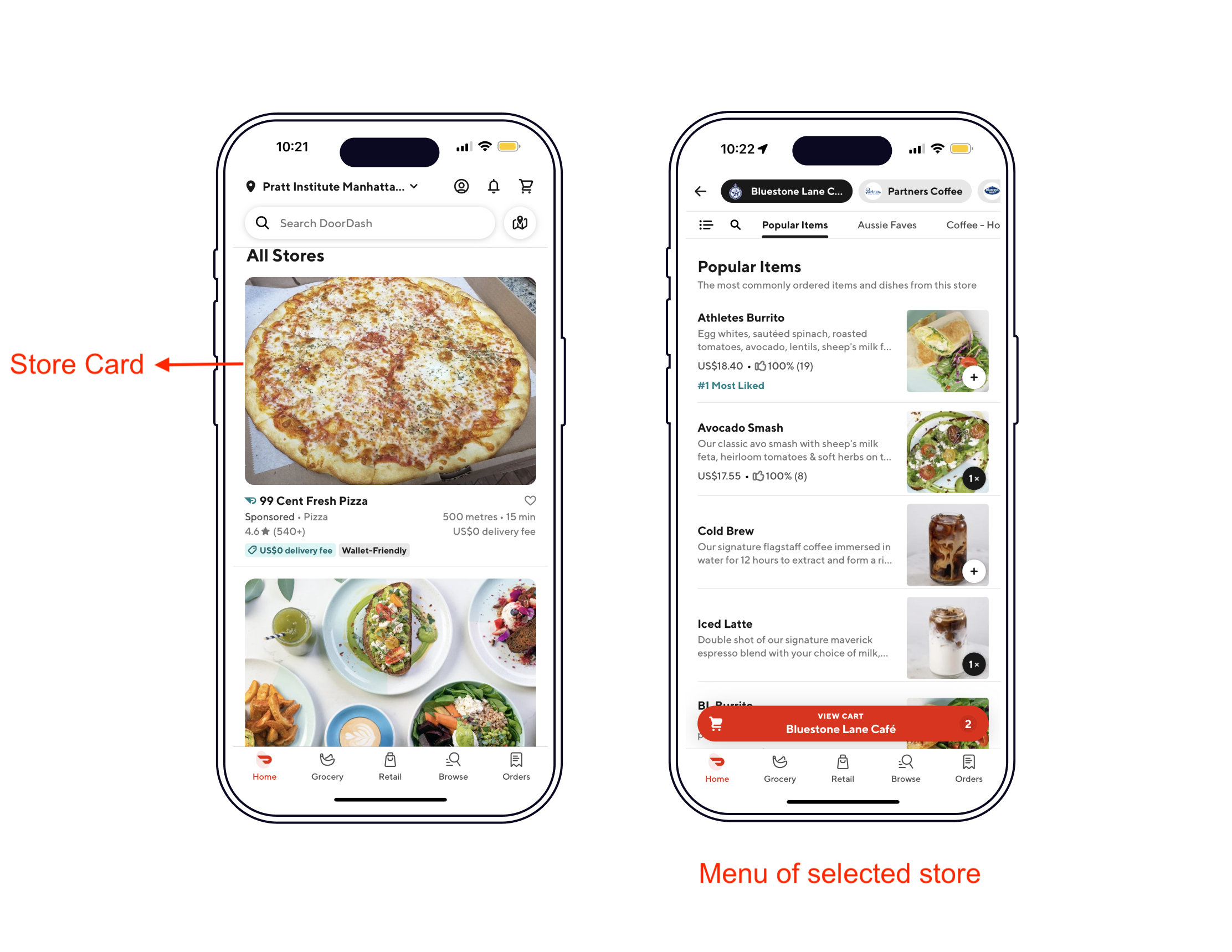
Store Menu Page
The user can tap a store card to access the menu of the selected store, and tap the “plus” icon button next to an item to add it to the shopping cart. After adding an item, a full-width floating button with a “shopping cart” icon, the name of the store, and the number of added items will appear at the bottom of the screen, just above the bottom navigation bar.
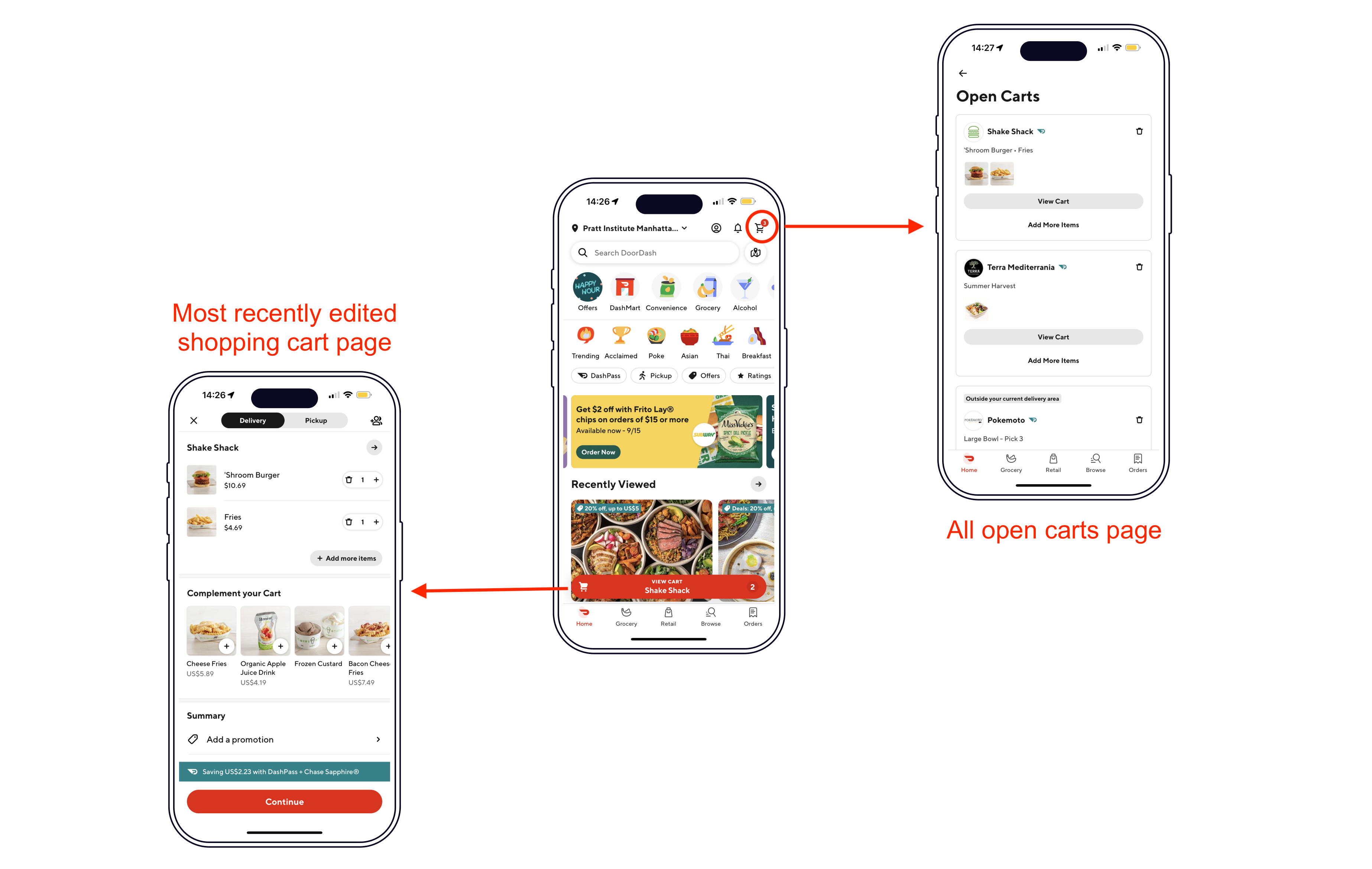
The user can go back to the landing page with the top-left back button, and then visit and add items from other stores. The app displays the number of open carts at the top-right corner of the screen with a “shopping cart” icon button.
However, the bottom floating button and the top-right button share the same “shopping cart” icon. It’s reasonable for the user to assume that they share the same functionalities. However, they lead the user to different pages – the bottom floating button leads to the most recently edited shopping cart and the top-right button leads to all open carts. Additionally, the number on the bottom floating button represents the number of items in the most recently edited shopping cart, while the number on the top-right button represents the number of open carts. They are bad signifiers and cause a lack of understandability. This leads to user confusion and bad discoverability. To eliminate user confusion, the bottom floating button can be removed. The user can still access the shopping cart by going to all open carts from the top-right button, and then tapping the appropriate cart.
Shopping Cart Page
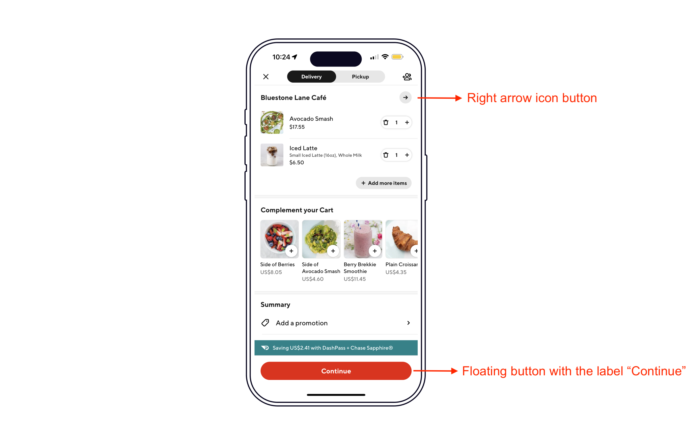
The shopping cart page contains a right arrow icon button at the top-right corner. This is a bad signifier as it can lead to a gulf of execution. A right arrow is commonly used to represent the next step, which some users understand to be the checkout page, but the aforementioned right arrow icon button leads to the store menu page. Therefore, it can result in a slip if the user intends to move forward to the checkout page by tapping the right arrow icon. To bridge the gulf, the right arrow icon should be replaced with the label “View store”.
In addition, a floating button with the label “Continue” at the bottom of the screen is used to go to the checkout page. This is a bad signifier since the word “Continue” is ambiguous and does not provide a clear clue about its destination. Users intending to go to the checkout page might be confused by the destination of the button, which leads to bad discoverability. To clarify the destination of the button, the button should be relabeled “Go to checkout”.
Checkout Page
The checkout page requires the user to confirm information about the order. When the user edits numeric fields such as phone number and credit card number, the numeric keypad is shown. This is a good constraint because it limits the user input to numbers, so as to avoid slips from illegal input.

Conclusion
In conclusion, DoorDash has a convenient user interface that provides a variety of functionalities. Despite some usability issues, it is overall a good application for food ordering and delivery. With some improvements, the food ordering process can be made more accessible to even first-time users.