
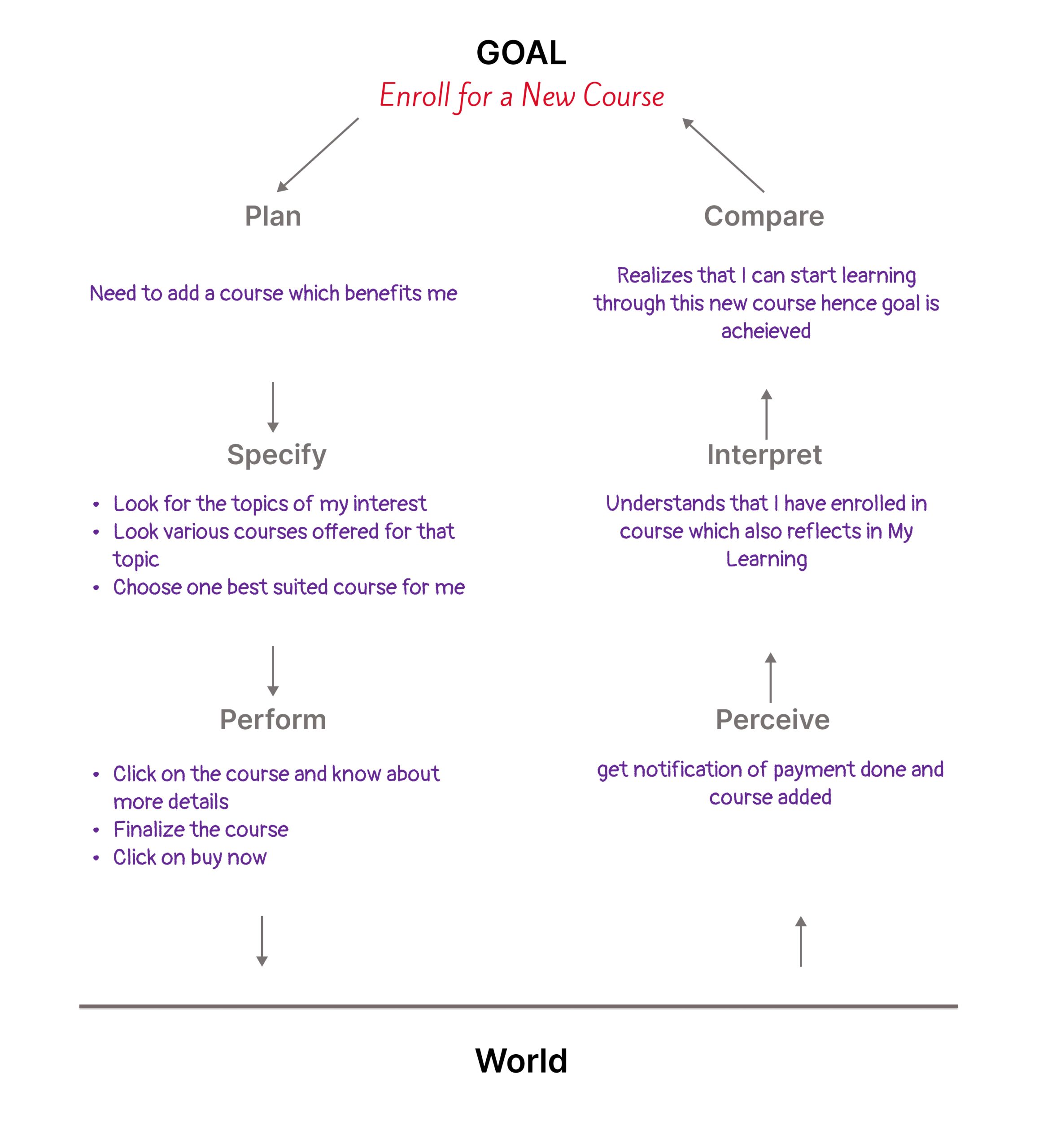
The Udemy (Online Video Courses) is one of the popular online learning platforms, allowing access to students as well as educators. It grants users access to a diverse array of courses tailored to their areas of interest. These courses, though requiring payment, offer the flexibility of self-paced learning. Users have the option to either download the course videos for offline use or stream them online.
In this critique, I will assess the platform’s interface design by applying Don Norman’s principles, and evaluating its strengths and areas for improvement. This analysis specifically focuses on the user interface for students, rather than educators.

Bottom Navigation Bar
Overall all the icons on the bottom navigation are easily discoverable as they match to the user’s mental model also known as the conceptual model. Very often users have used apps that have navigation at the top or bottom. In terms of grouping of icons, the design here follows the Gestalt principle of grouping similar things together. Overall grouping, proximity and mapping are well executed while working on information architecture. (In this case, important or actionable things are grouped together). All icons act as a signifier as well as they signify a particular action.
Once a user clicks on one of the icons on the bottom navigation the icon turns black (filled) which gives immediate feedback to users that they are on that page.

My Learning
This page allows users to go to their selected courses and view their progress. Once users click on My Learnings, they get to see a list of all the courses they have already taken and amount of courses they have already completed. This subconsciously satisfies users as they visually see the progress of every course and it drives their immediate visceral responses.
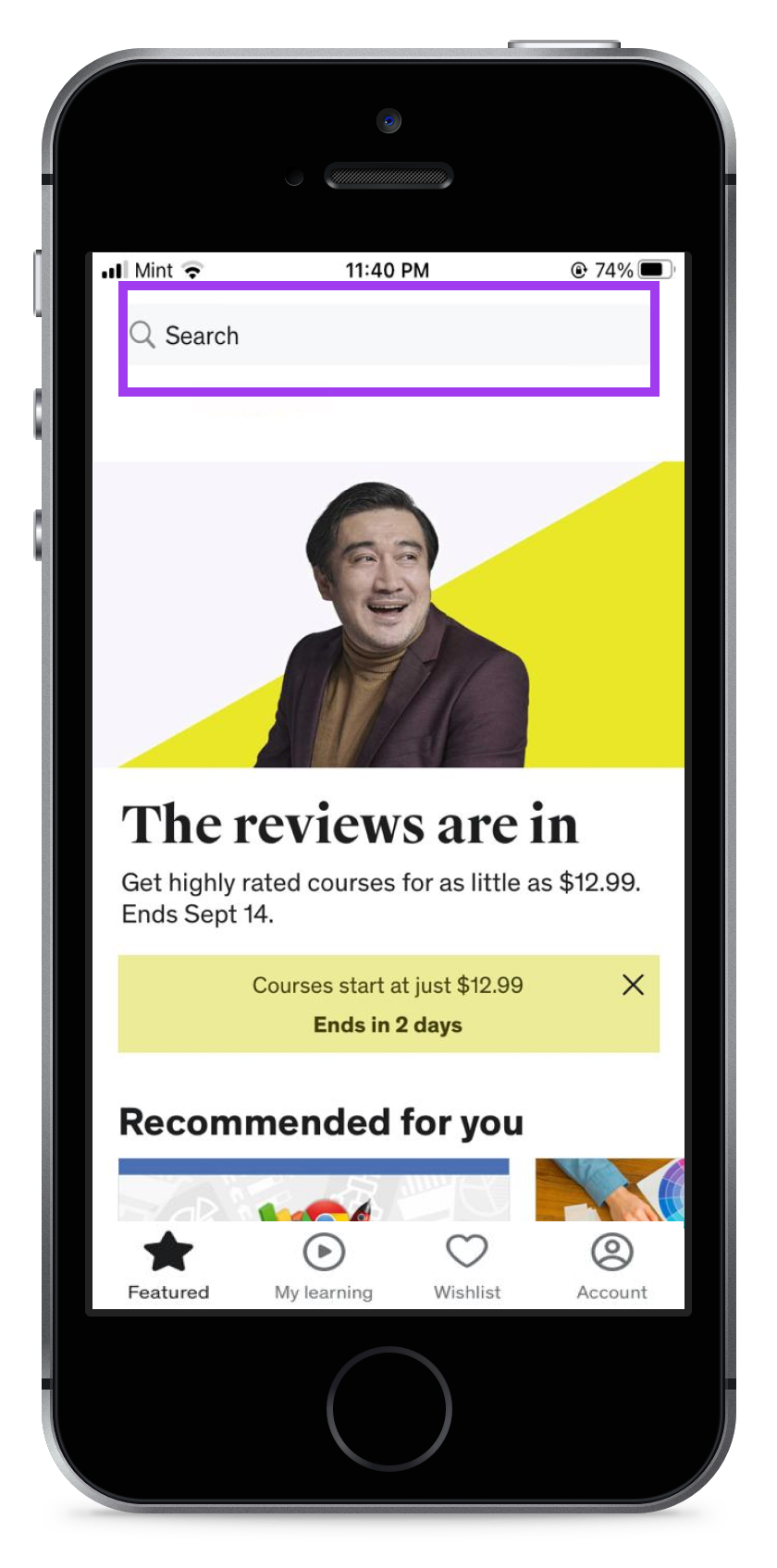
Search
The search Icon on the bottom navigation bar allows you to search for courses that act as an Affordance. The same Icon signifies (helps users understand) that one can search for courses here and hence it acts as a signifier as well.
The mapping of the search icon seems a little unusual according to the user’s conceptual model and procedural memory. Oftentimes times it is found at the top of navigation, specifically top right corner. One might not need a separate tab/page for it that way you can minimize the options making users less confused and more focused on choosing their actions.
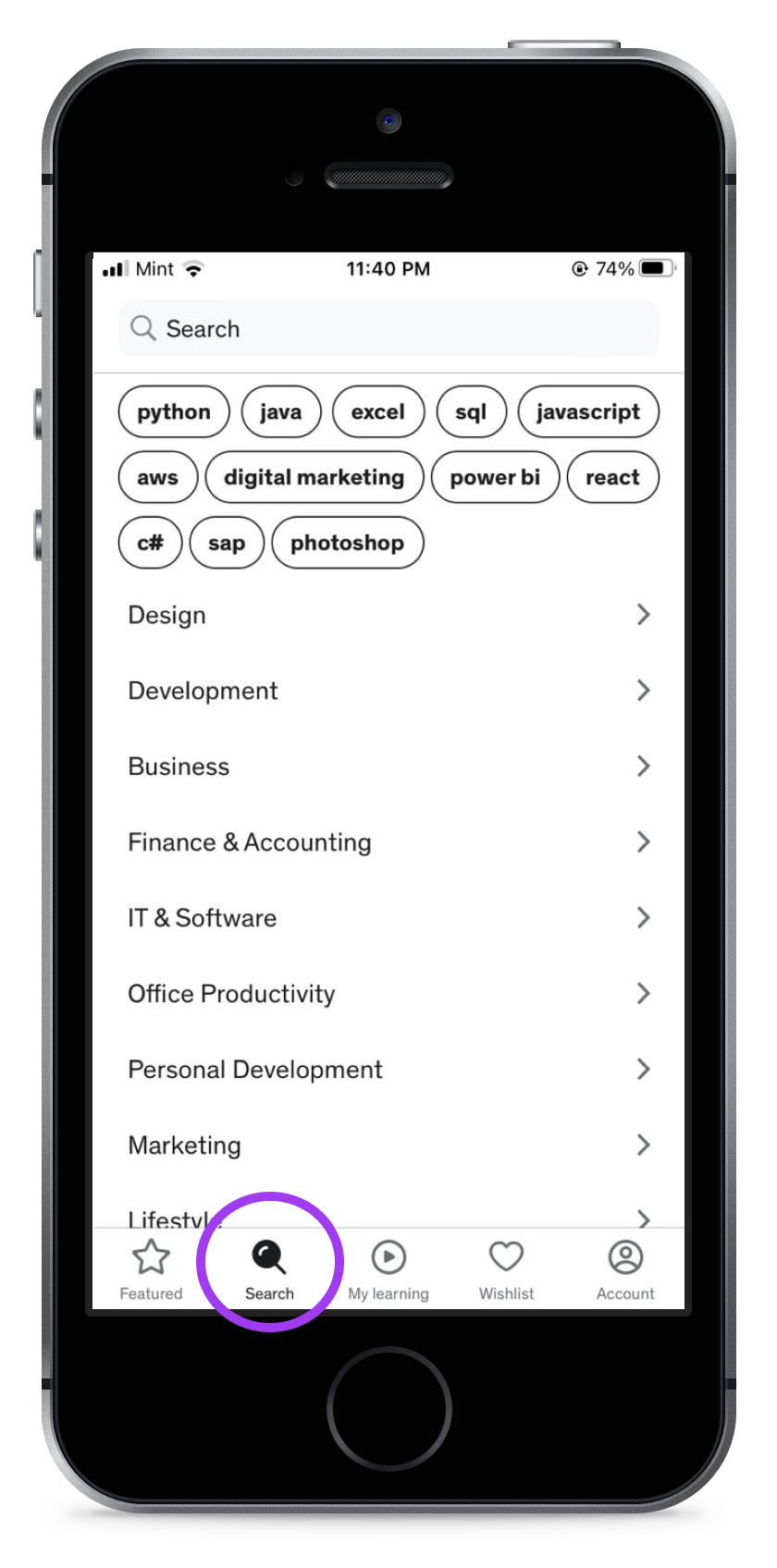
Once a user clicks on search they get various categories/prompts from which users can choose their area of interest and the app shows courses related to that particular subject.
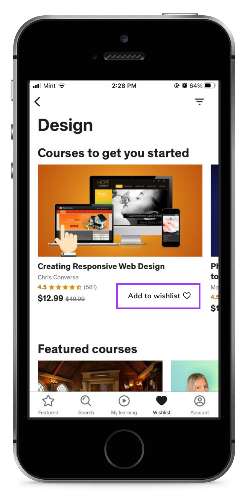
Wishlist
Once users click on the wishlist they see various course categories to choose from (which has a side arrow as a signifier.) Once users select one category, due to a lack of signifiers they get stuck. There is no easy/quick option to add the course to wishlist. One has to click on course(which is not specified but understood by users due to the conceptual model and system image) Once they open a particular course and scroll down a bit, they can add that to the wishlist (which has a signifier but lacks discoverability.)

Account
All the options on account menu has sub-options which are indicated by side arrows which acts as signifiers in this case. Though grouping and mapping of certain options needs certain improvement.
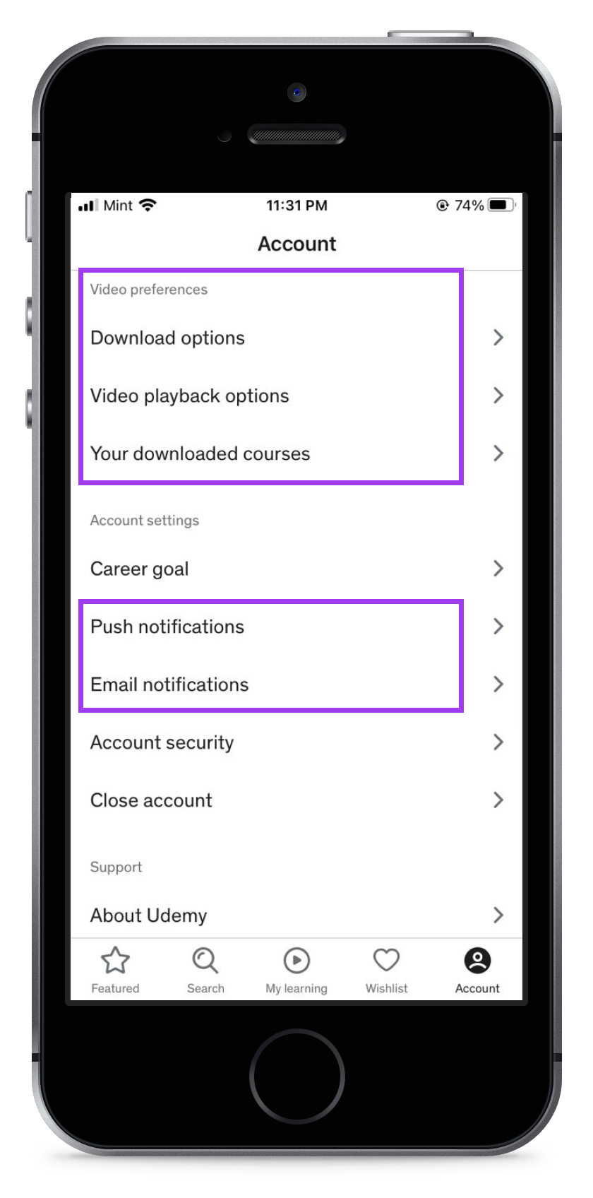
Video Preferences can be grouped together and termed under General settings or video settings which should be separated from Account.
This can displayed on the main app interface under Settings or Menu icon.
Push Notifications and Email notifications can be grouped together under notifications and that can go under General Settings as well.
Final Reviews/Suggestions
Overall, I would consider this application as good design as it follows most of the Norman’s principles, although certain minor improvements can be done to make it even better. As it is a online video courses/ learning app it has constrains of one way communication. A student cannot really interact with it. Featured and My Learnings pages seem well designed having appropriate mapping with a decent amount of feedback.
The Design of the Wishlist and account pages can be improved by grouping similar things together in the account and terming them as general settings and by adding discoverable signifiers for the wishlist under every course in the wishlist section.
As discussed above, the mapping of the search icon can be changed to the top navigation bar. Even though the bottom navigation bar is discoverable, adding shadow or color to it would make it highly discoverable.