
Bandcamp is a popular online music platform that allows independent musicians and labels to sell and distribute their music directly to fans. As a company, Bandcamp stands out among its competitors, it has continuously challenged the music industry in order to favor artists and create a healthier ecosystem between fans, labels and fans. The app is no different. Attempting to compete with strong forces in the music streaming industry, their strong company ethos challenges standardized practices and gives music enthusiasts, like myself, a glimmer of hope that music culture is not lost and that there is an exit sign from which to escape the algorithmic echo-chamber that other services are desperately chasing.
One of its standout features is the Bandcamp Radio, a free radio show episode collection consisting of the Bandcamp Weekly, The Metal Show and The Hip Hop Show. These shows offer a selection of tracks from the platform’s vast catalog curated by the host, and often include interviews that highlight a diverse range of genres and artists. Users can discover new music, support independent musicians, and enjoy a curated experience. The feature is beautifully guided and intended, but the user experience is – unfortunately – not so seamless.
When entering the radio section of the app, the screen is split in two. The top section focuses on one show, displaying a description and a play button. Below it is a gallery of artworks held in cards with labeled dates. Reminiscent of album covers, the user is prompted to scroll through the page as if scavenging through crates at a record shop. Here issue (i) emerges, there is little information on each card and the visual cues create more confusion than clarity. When clicked, the feedback is automatic, bringing the user back up to notice the selected card is now on focus. When played, all of the songs featured in the radio episode expand– you can jump through them and purchase by simply following the icons signifying the correct action. This is an incredibly refreshing experience, comparing it to other competitor’s long-format curations which lack a direct reference to songs played. Yet when snooping through the other radio shows, we find issues (ii & iii) concerning what is currently playing.
i) Ambiguity and frustration in the card gallery due to lack of content labels.

Within the card gallery, users can see that there are special series of shows “The Hip Hop Show” and “The Metal Show” labeled on the art covers. Yet the rest of the cards remained ambiguous. Why is this? Each image contains a rendition of what appears to be an artist, hence, as a possible conceptual model for a user, it suggests that each episode without the show label focused on one artist. If the user is like me, it will take a couple of reddit forums and a scavenger hunt through the Bandcamp website to understand that the other shows without a label are from Bandcamp Weekly, which contain diverse music styles and artists. On their desktop version, once you’ve managed to reach their radio episode reservoir, you will find the familiar artworks and dates accompanied with the show title and a short description. For some reason, for the android app, they forfeited rudimentary signifiers that tell the user what the show is about.
Solution:
Include the title label in each card, it will act as a signifier indicating the content available in that card.
ii) Confusion regarding now playing display in the card gallery.
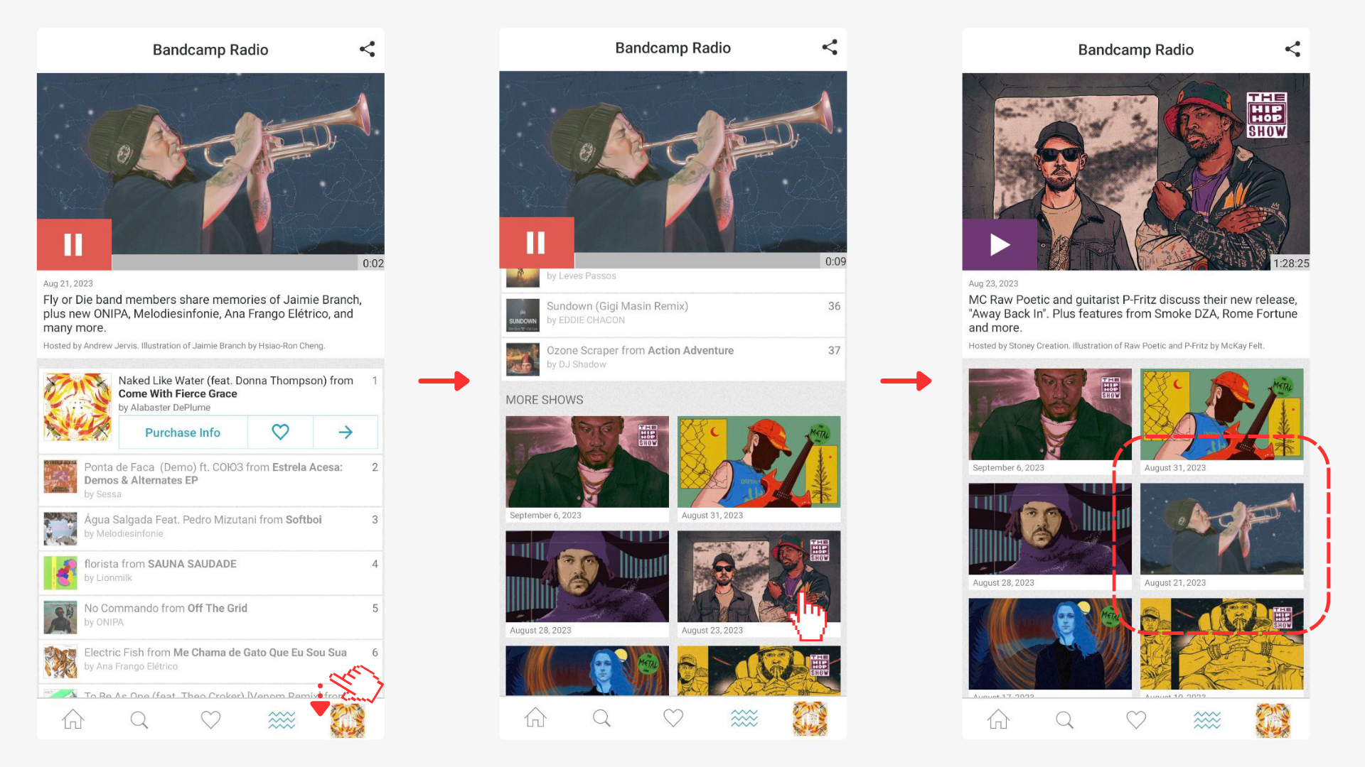
Once you’ve hit the play button, a prompt feedback response opens a beneath the artwork showing all the songs that will play in that radio episode. Continue scrolling and you will find a continuation of the initial page, a list of all shows hosted by Bandcamp. Clicking on one of these will provide an automatic feedback refreshing the top section to an extended description of the show you’ve chosen while the first show still plays. Scroll back down and you will find your show there… if you remember which one you originally picked. The app lacks a signifier indicating that you are currently playing the show.
Solution:
Add a signifier that highlights which show the user is currently playing. This can be done through a variety of tools such as a light outline box around the show that is playing.
iii) In the now playing section, the system image the on the song currently playing and the radio episode currently playing.
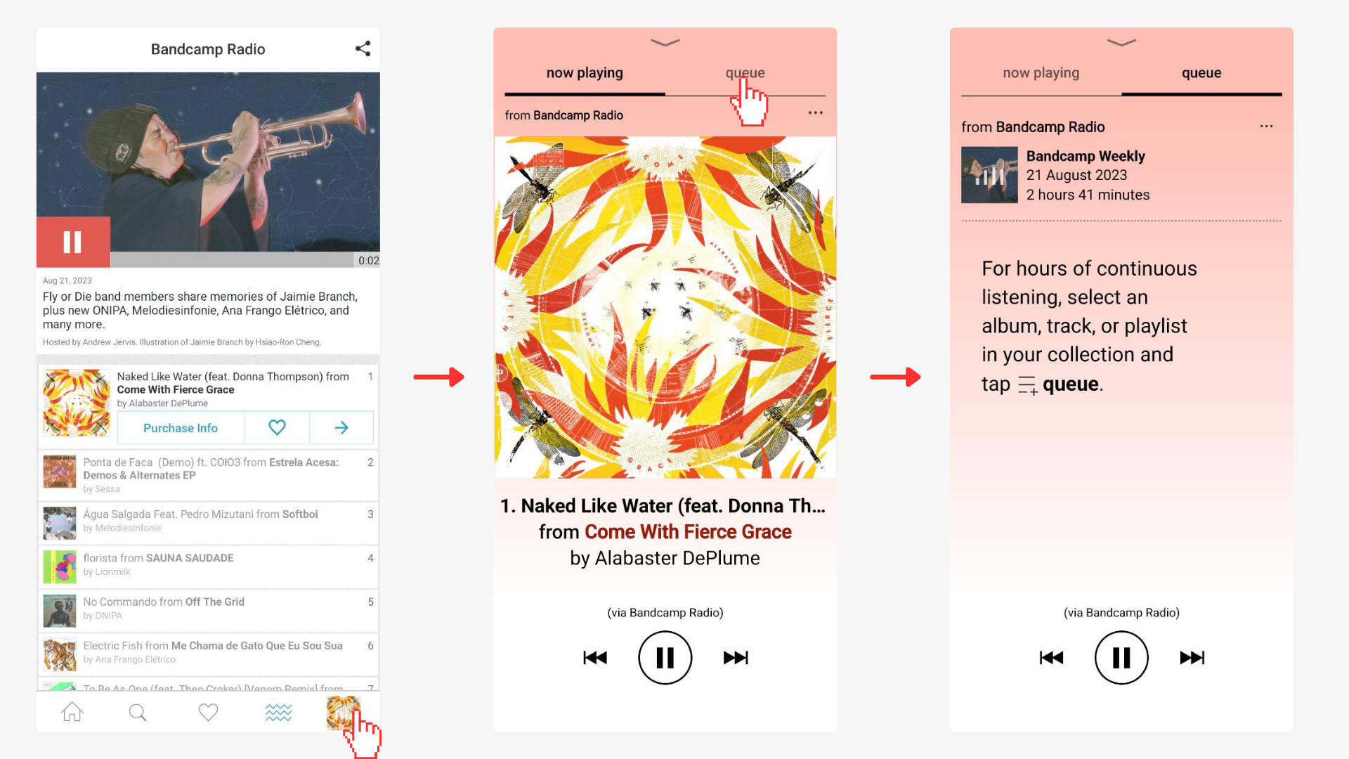
On the lower right corner of the screen, you will find a square logo showing what song is currently playing, affording an expansion of information concerning this title. Yet the relationship between the song that is currently playing and the radio show currently playing is poorly mapped in multiple stages of this process, thus the system image fails to paint the appropriate conceptual model. There is the option to toggle between now playing and queue in this space, I will go over each one of these:
Now Playing:
The song displayed is what is currently playing, yet the user never picked this song necessarily. So it acts like a foreign entity. The “1.” is the only clue referring to the radio episode, which could easily be confused as part of the song title. The solution to this would be to add a label to the perceived structure saying from which radio episode this song is playing.
Queue:
When on queue, the Bandcamp Weekly radio episode information will appear– this is the first time that the title label “Bancamp Weekly” is displayed. When clicked, this title will take you to the Bandcamp radio page, where, if you had explored but not played another radio show, you will have that as focused instead of what is currently playing and the information that is pertinent to the initial intention. Thus the signifier failed to associate the correct action with the effect trying to be achieved. Queue refers to the songs that will play next, thus the conceptual model of the user is not met and the system image fails once more. To fix this, I suggest adding the entire song list under the radio episode title here.
Solution:
Clearly mark the relationship between radio show playing and song playing. This needs to be done in both the now playing and queuing sections, assuring there are the necessary labels mapping the experience and that the actions fit the conceptual model of the user.